XIN SGCQ Hotpot

  • 2016

  • Communication
    Branding and Identity

Commissioned By:

XIN SGCQ Catering Co., Ltd.

Designed In:

China

XIN SGCQ Hotpot is a famous catering brand that has already experienced two-decade development. The client considered the existing logo obsolete and unfashionable. Thus, in order to improve the brand recognition, we designed a novel logo which could easily be recognized and represent Sichuan hotpot style.
view website

  • CHALLENGE
  • SOLUTION
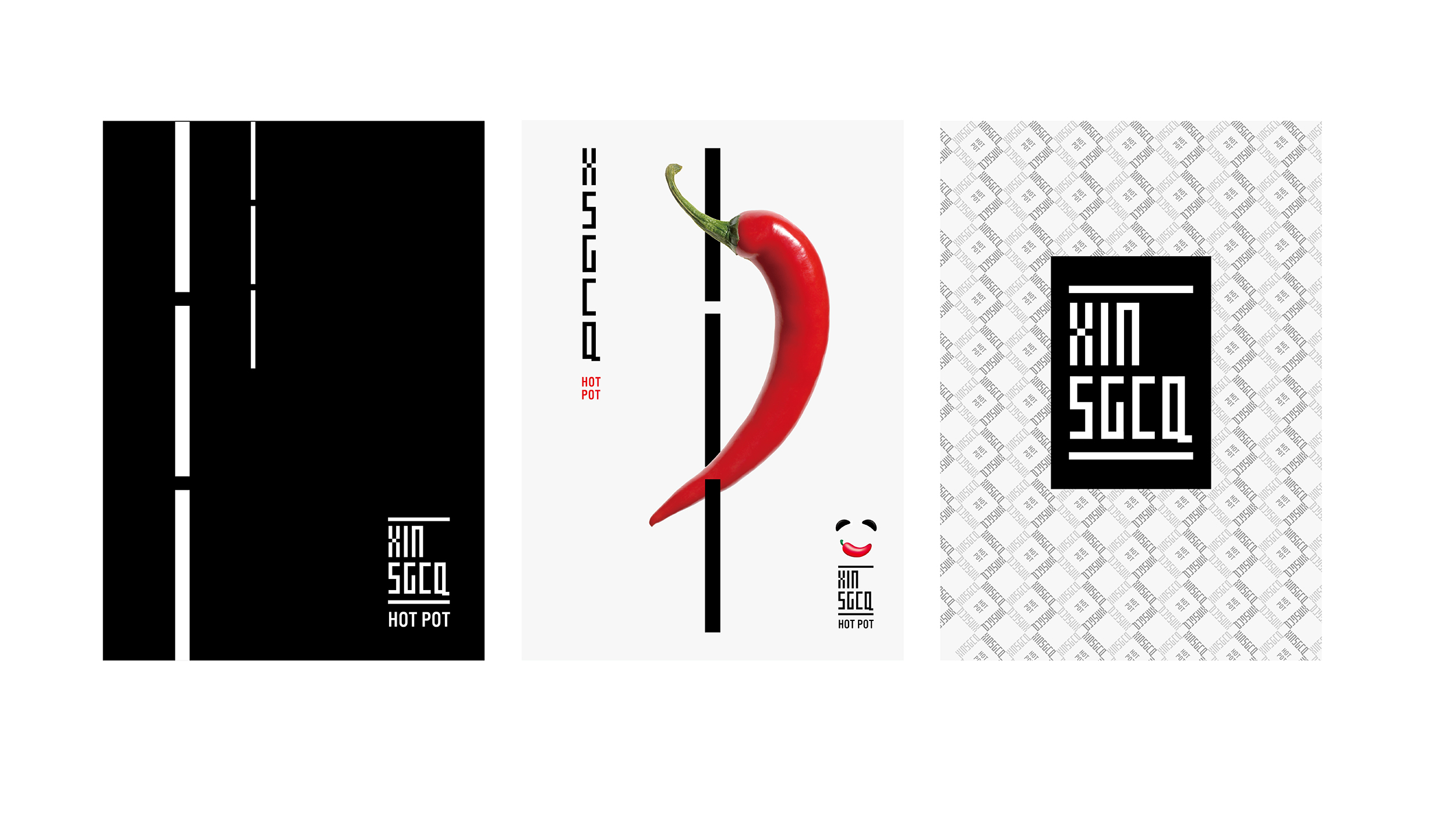
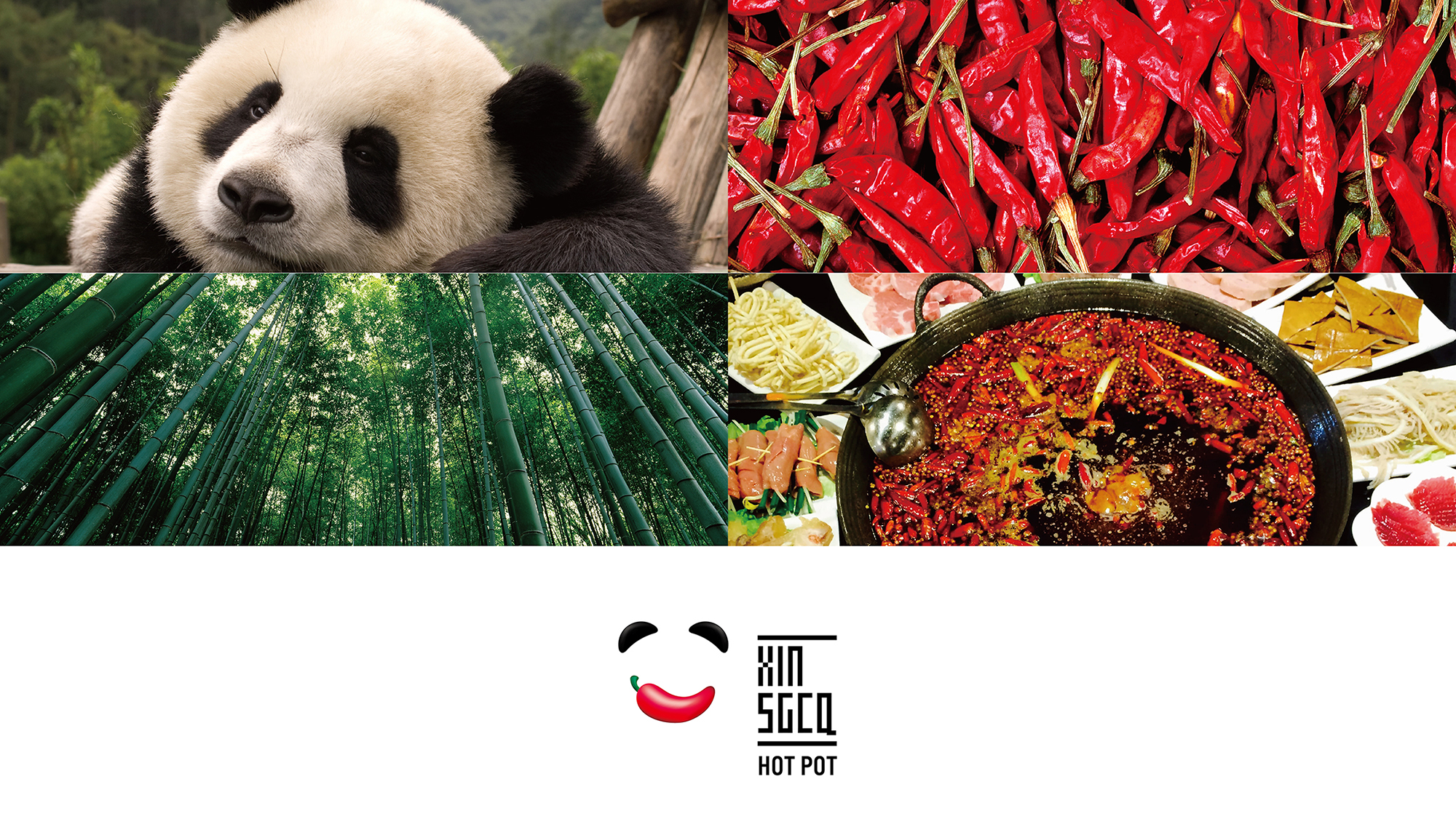
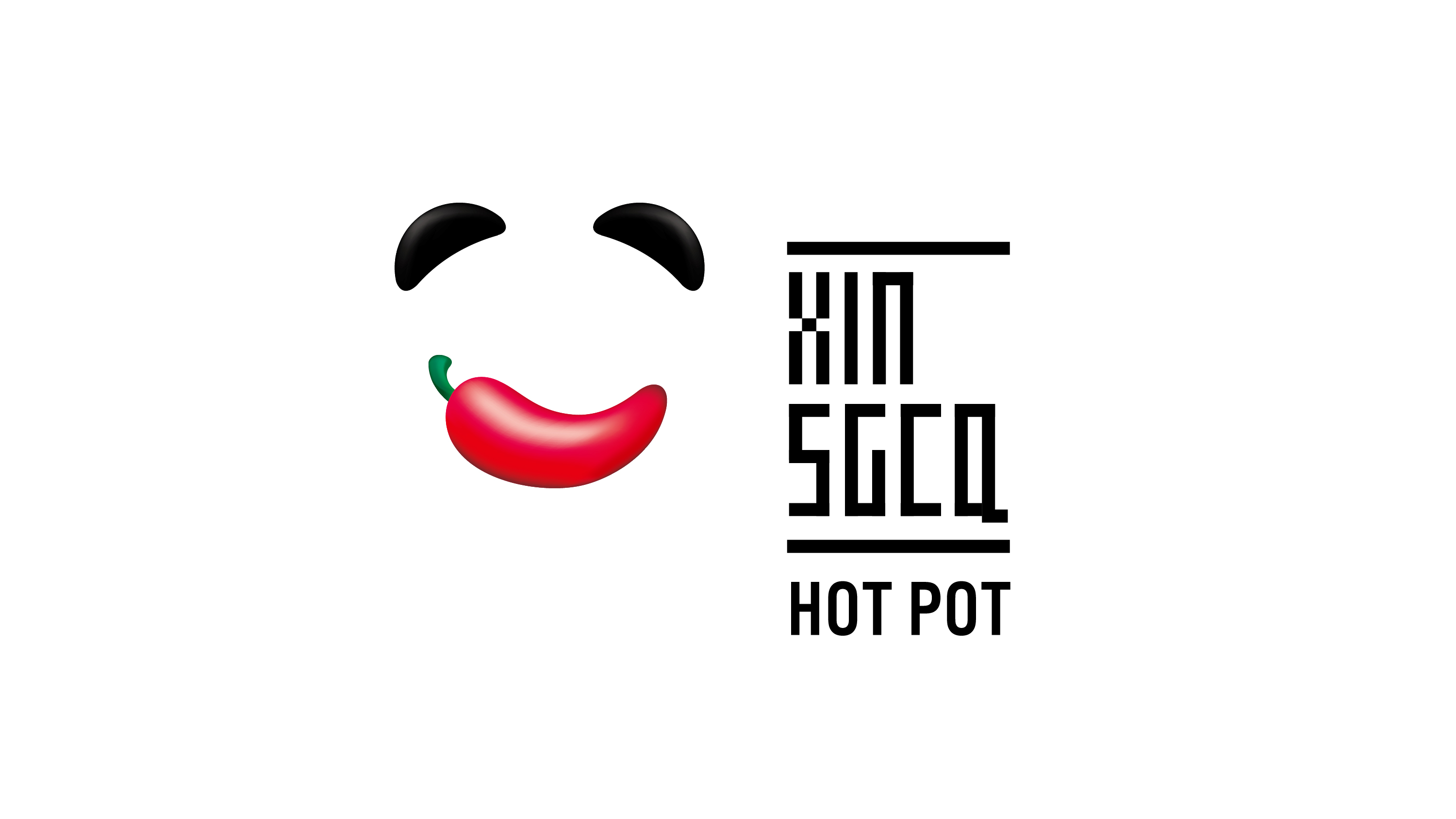
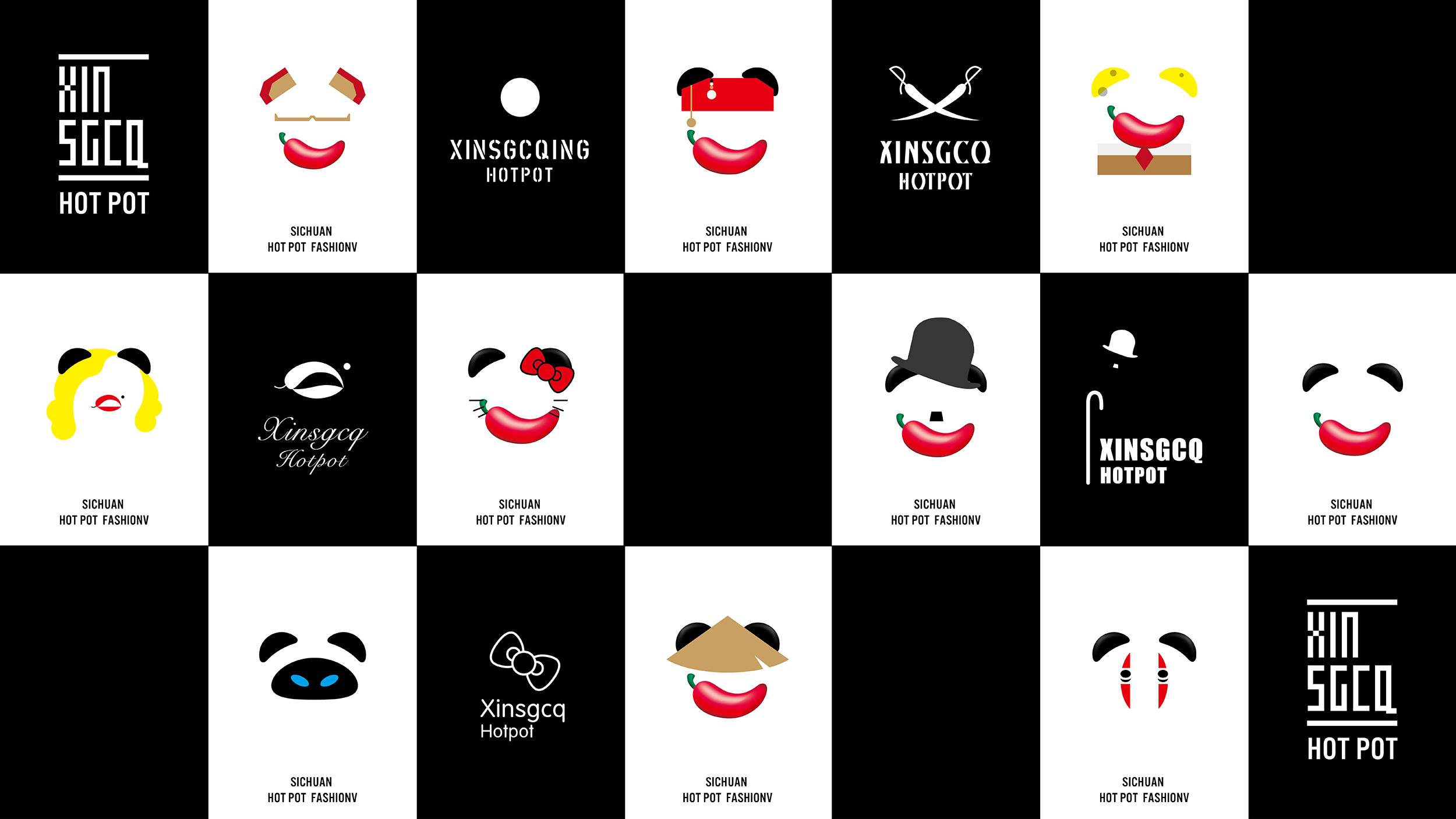
  • XIN SGCQ Hotpot is featured with Sichuan hotpot culture, which stresses spicy flavors. Besides, Sichuan is a famous place for pandas. Considering this, we created a panda face pattern (mainly adopting eyes and mouth as design elements) as a part of the logo, conveying a lovely and lively sense to attract more youngsters and women. Furthermore, the client wanted the new brand image to present not only a traditional food but also a catering fashion. Therefore, we combined a panda face pattern with spicy hotpot graphics to make XIN SGCQ a new symbol of food fashion.

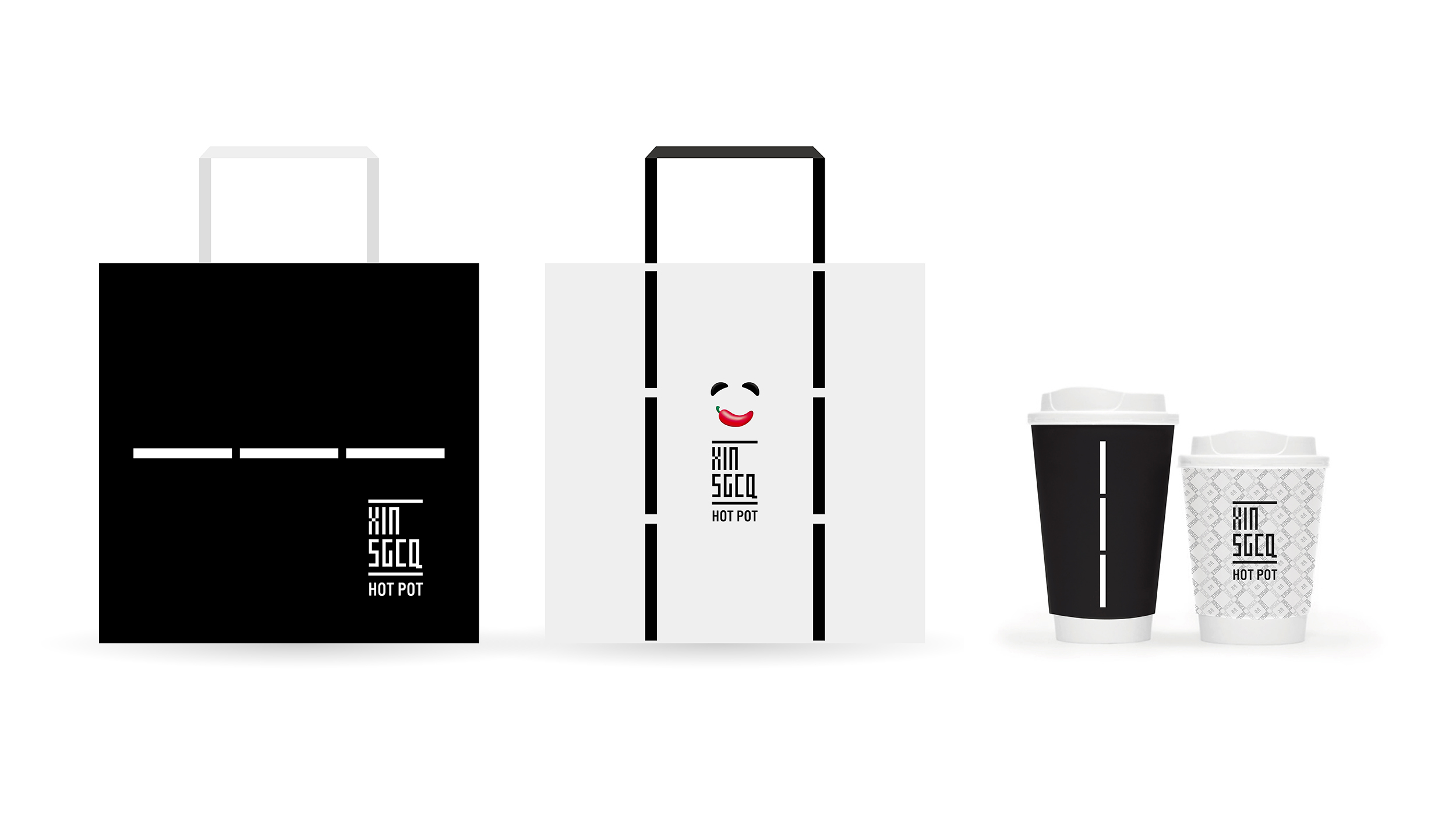
  • In our logo design, we adopted black, white and red to represent panda's skin color as well as the color of the red pepper. In the right part of the logo, we took bamboo as the auxiliary graphics to showcase regional features (Sichuan). The vertical auxiliary graphics symbolize bamboos; horizontal graphics represent chopsticks. This combination of patterns and auxiliary graphics represent the typical Chinese (especially Sichuan) hotpot characteristics.