The Push – Youth Music Organisation

good-design-award_winner_rgb_blk_logo
  • 2026

  • Digital
    Web Design and Development

Designed By:

Commissioned By:

The Push

Designed In:

Australia

The Push was turning 40 with a new brand, a new strategic direction, and an old website that was losing traffic year-on-year. Bone rebuilt it from the ground up with a headless platform purpose-built for four distinct audiences, designed to grow with the organisation.
view website

2.jpg
3.jpg
4.jpg
5.jpg
6.jpg
  • CHALLENGE
  • SOLUTION
  • IMPACT
  • MORE
  • Most websites are built for one audience. The Push needed one platform to serve four: young people discovering music, parents seeking safe spaces, educators accessing resources, and donors looking for impact. The old site made all of them start in the same place and figure it out. Traffic was declining. Navigation was built around internal logic, not user needs. The challenge was to completely restructure the experience around how real people think, while launching on a hard deadline tied to a 40th anniversary the organisation had spent years building toward.

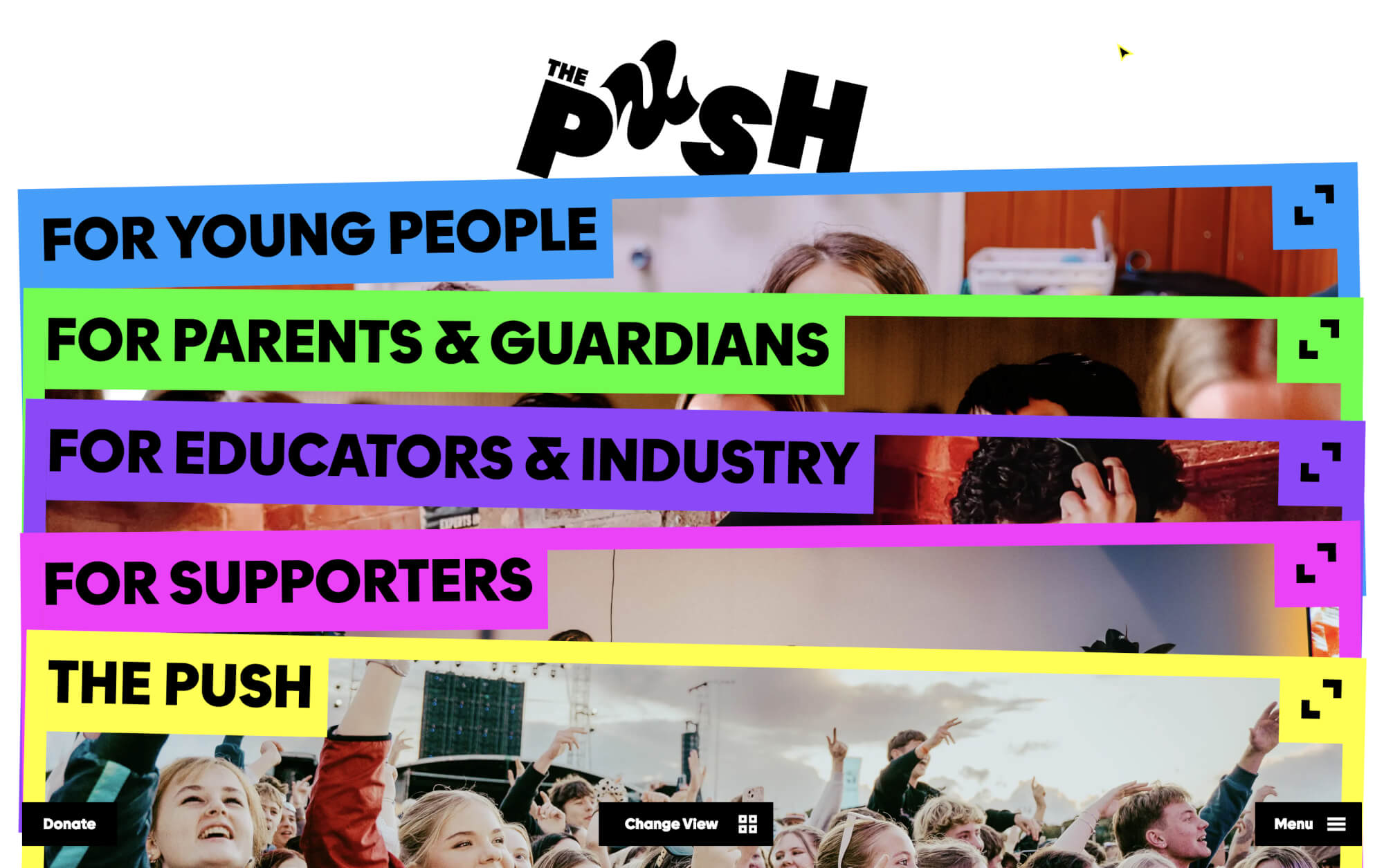
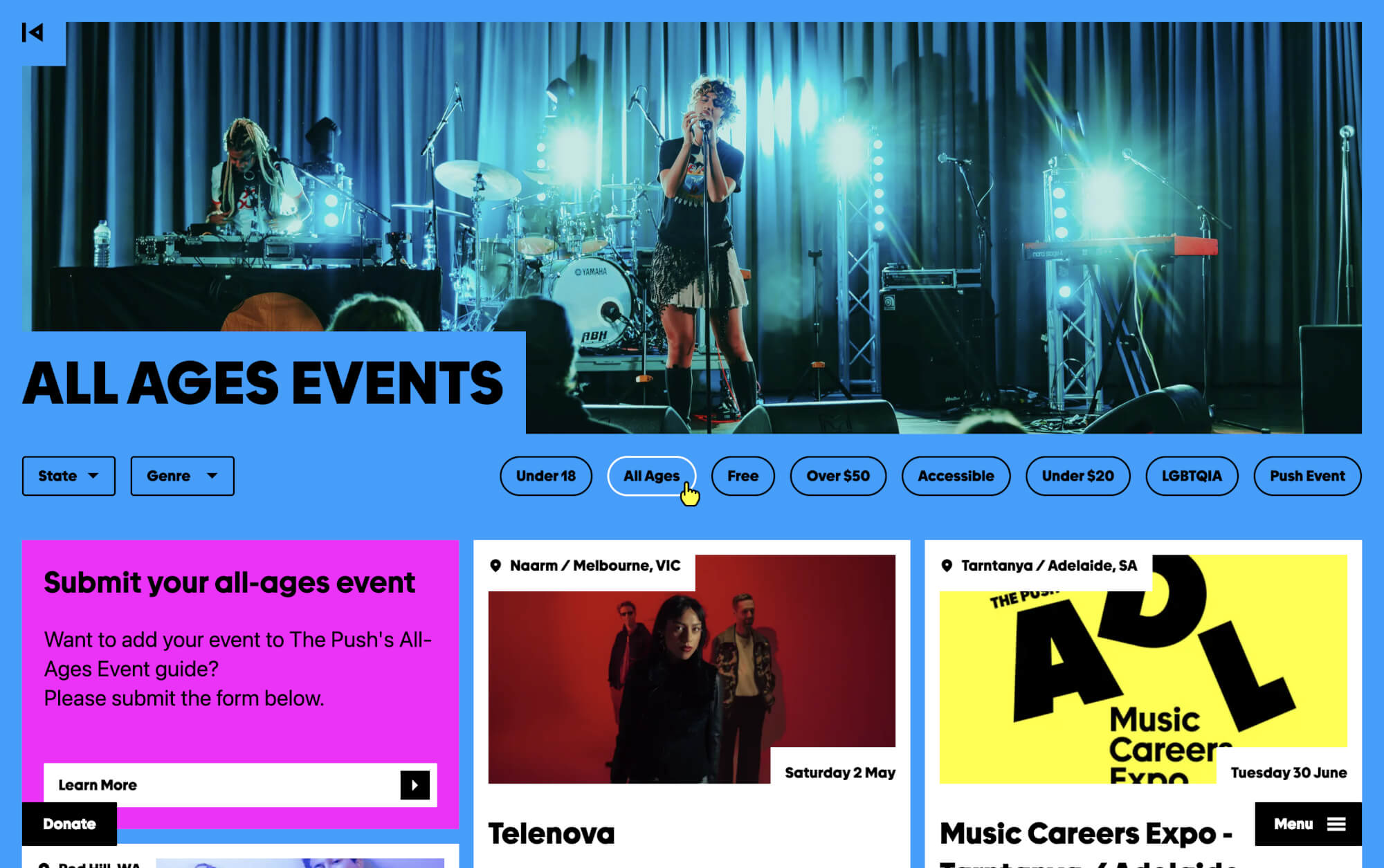
  • Three decisions defined the project. First: rebuild the information architecture around how users actually think, not how the organisation was structured. Second: make audience selection the first act of the site, four distinct worlds, colour-coded from homepage to inner page, so users always knew where they were. Third: choose a headless stack that a small, non-technical team could run. Storyblok meant the team loaded 99% of the content in two weeks. The homepage drew from record-crate culture. Panels that slide open on hover, discovery as navigation.

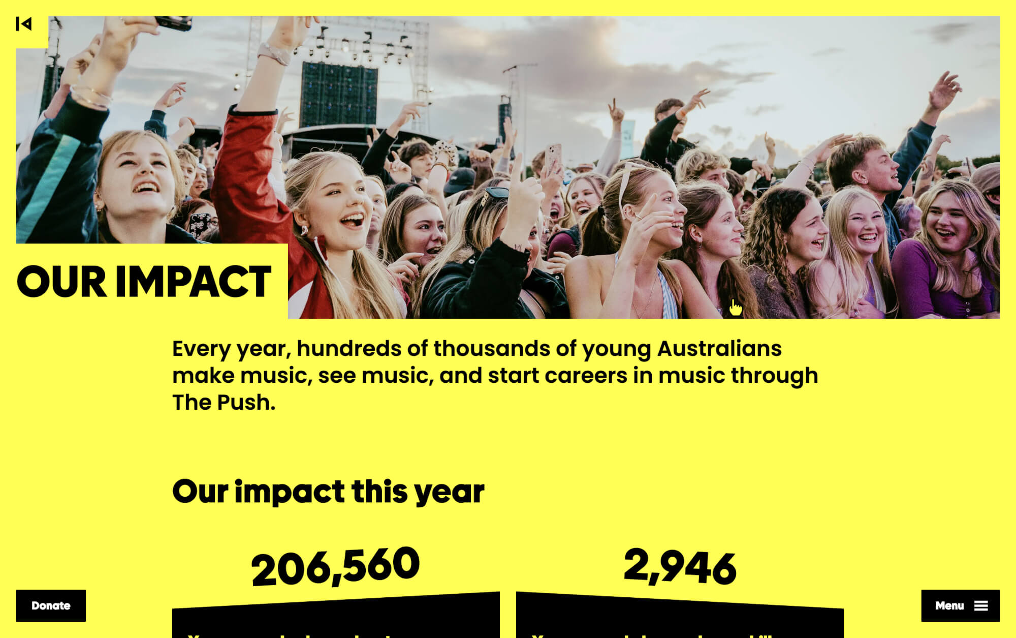
  • Launched against the backdrop of Australia's social media ban for under-16s, the new Push platform arrived at exactly the right moment: an independent, accessible digital home for young people when the algorithmic alternatives were closing. The impact was immediate: traffic quadrupled, a year-on-year decline reversed, and engagement depth increased dramatically. The operational impact was equally significant: a lean team gained a platform manageable without technical support. The societal impact is longer: a national youth music charity, properly equipped for the next forty years.

  • Audience-first architecture. Rather than a conventional homepage, the site opens with audience selection, four distinct worlds, each with its own bold colour system that carries as a wayfinding signal from entry point through every inner page. Users always know where they are without thinking about it.Record-crate navigation. Homepage panels stack like record sleeves and slide open on hover to reveal full-bleed photography beneath, drawing directly from music culture to make discovery the core mechanic.Animated identity. Each letter of the P-U-S-H wordmark animates independently on arrival, communicating brand attitude before a word is read.Enterprise flexibility for a lean team. A headless stack, Storyblok, Next.js, Vercel paired with a component system so considered that the team loaded 99% of site content in two weeks, independently.First-to-market commerce. Shopify Web Components deployed within a headless architecture, among the first production sites globally built on this approach, delivering full ecommerce capability without a separate storefront or redirects.