The Greens – Tax the 1%: Turning Australian Inequality into a Personal Story

good-design-award_gold-winner_rgb_blk_logo
  • 2026

  • Digital
    Web Design and Development

Designed By:

Commissioned By:

The Greens

Designed In:

Australia

Tax the 1% is a campaign microsite for the Australian Greens that turns abstract economic inequality into a personal experience. Through a real-time wealth clock and interactive salary comparison tool, the site helps everyday Australians understand the scale of wealth disparity and take action to address it.

view website
Buy online

2.jpg
3.jpg
4.jpg
Aretha Brown
5.jpg
6.jpg
7.jpg
  • CHALLENGE
  • SOLUTION
  • IMPACT
  • MORE
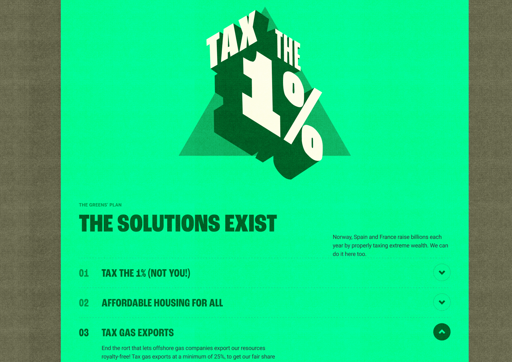
  • Wealth taxation sits at the intersection of fiscal policy, corporate regulation, housing affordability and political donations. The Greens needed a digital centrepiece for their “Tax the 1%” campaign that could make this complexity legible to everyday Australians, particularly younger audiences who are feeling the effects of inequality but have no frame of reference for its scale or mechanics.The brief came with real constraints: a four-day delivery window, from concept to launch. The site needed to translate dense policy into emotional, personal experience, and convert understanding into action.

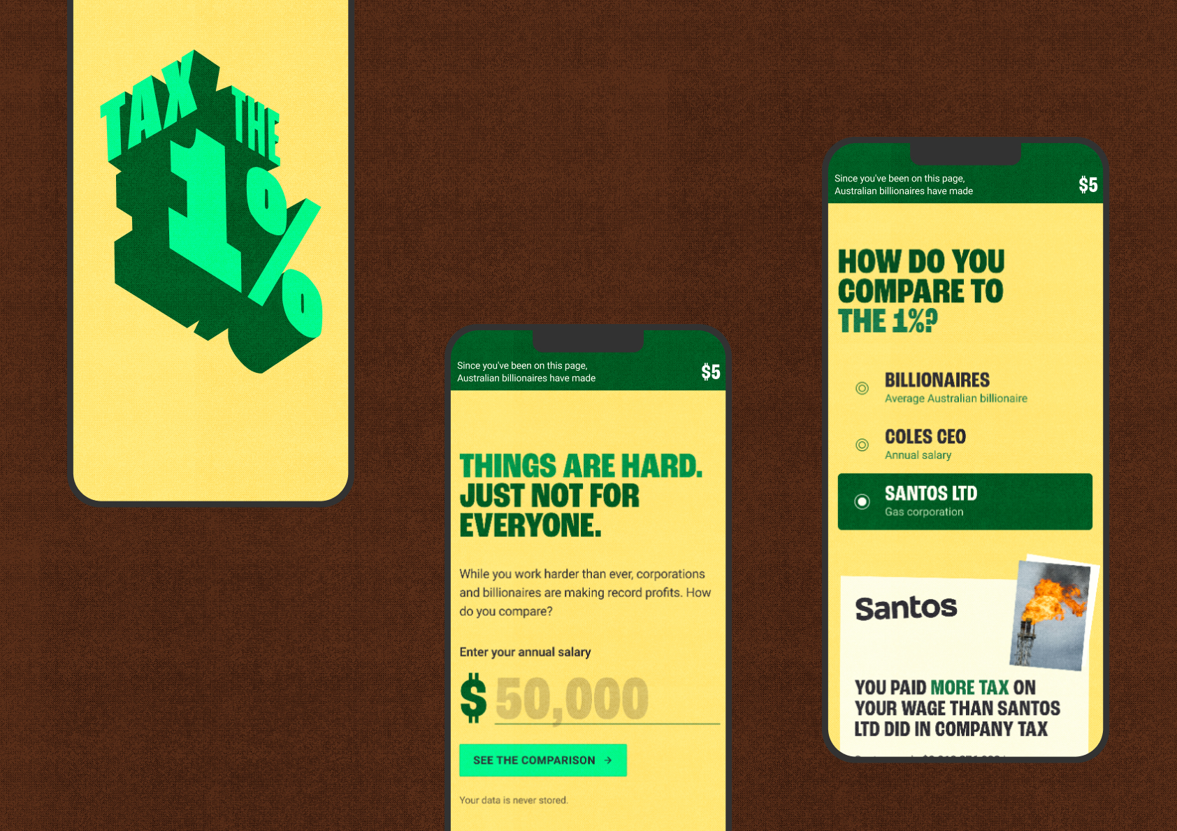
  • We designed a single-scroll narrative experience that translates a multi-layered policy platform into a personal story. Rather than explaining wealth taxation, the site shows it. Users enter their salary and are shown tailored comparisons: how quickly a billionaire earns their annual wage, how their tax compares to a gas corporation’s, and how CEO pay dwarfs their hourly rate.Each comparison uses real data and culturally specific references (Gina Rinehart’s yacht, Coles chip packets) to make abstract policy tangible. A persistent real-time wealth clock reinforces the accumulation happening as they read. The experience culminates in four distinct calls to action.

  • Launched in mid-April 2026, the site achieved 20,627 page views in its first two weeks, ranking second across all ten domains in the Greens’ digital network. It outperformed every state contact site, the federal MPs portal, and the membership and donations platform.More significantly, the average dwell time was 4 minutes 21 seconds, well above the 45-second to 2-minute industry benchmark for advocacy and campaign landing pages. Reach and depth together are notoriously difficult to achieve in digital advocacy. This site delivered both, converting attention into sign-ups, volunteer commitments and sticker pack requests.

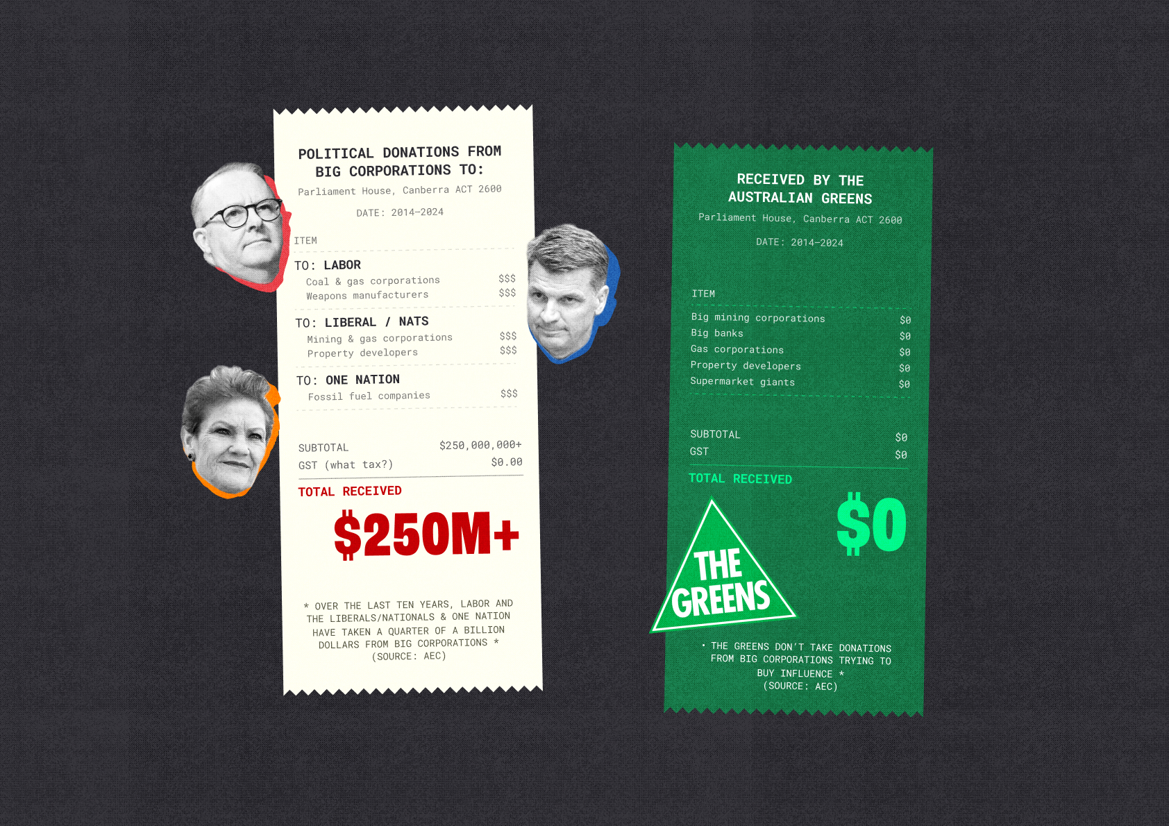
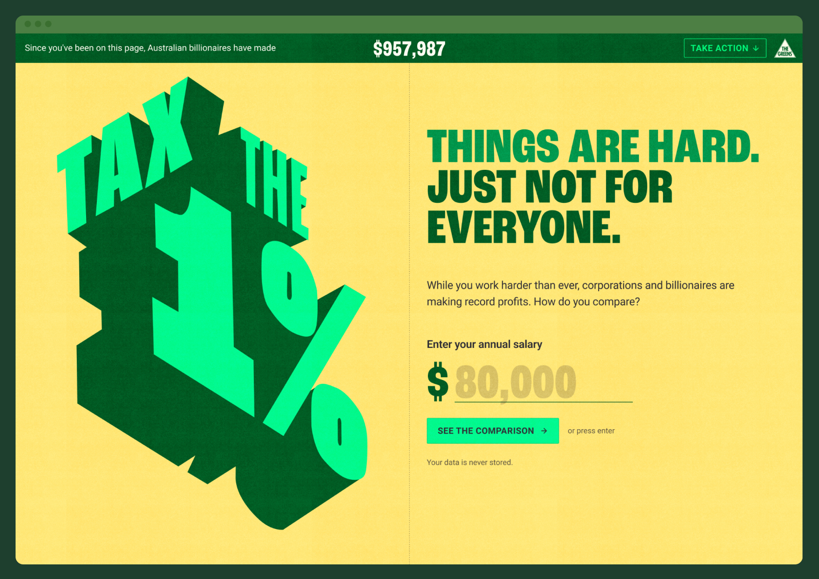
  • The site is structured as a single continuous narrative, but three features deserve specific attention.The 1% clock. A persistent real-time counter shows how much Australian billionaires have earned since the user opened the page. It runs from the moment the site loads, creating an ambient sense of accumulation that intensifies as the user scrolls through the content. It reframes wealth growth from a static statistic to something happening now.The salary comparison engine: Users input their annual salary and the site generates a personalised series of comparisons: how long it takes a billionaire to earn their yearly wage, what the Coles CEO makes per hour versus their rate, and how their personal tax contribution compares to Santos’s corporate tax bill. The comparisons are grounded in specific, recognisable Australian references that make abstract numbers concrete.The donations receipt: A visual device styled as a receipt reveals corporate political donations to major parties over the past decade, totalling over $250 million. The Greens’ $0 figure sits alongside it. The receipt format makes the information scannable, memorable and shareable, turning complex electoral commission data into a simple visual argument about influence.