Telegraph Hill Olive Oil Rebrand

good-design-award_winner_rgb_blk_logo
  • 2026

  • Communication
    Print and Packaging

Designed By:

Commissioned By:

Goodfood Group

Designed In:

New Zealand

Telegraph Hill had two decades of craft and a brand built for selling at the orchard. A change of ownership changed the ambition: national retail, full product range, one cohesive identity. The brief was to stretch without breaking, disruptive enough to compete, disciplined enough to stay itself recognisably.
view website

2.jpg
Photography - Yuki Sato
3.jpg
Photography - Yuki Sato
4.jpg
Photography - Yuki Sato
5.jpg
Photography - Yuki Sato
6.jpg
Photography - Yuki Sato
7.jpg
Photography - Yuki Sato
8.jpg
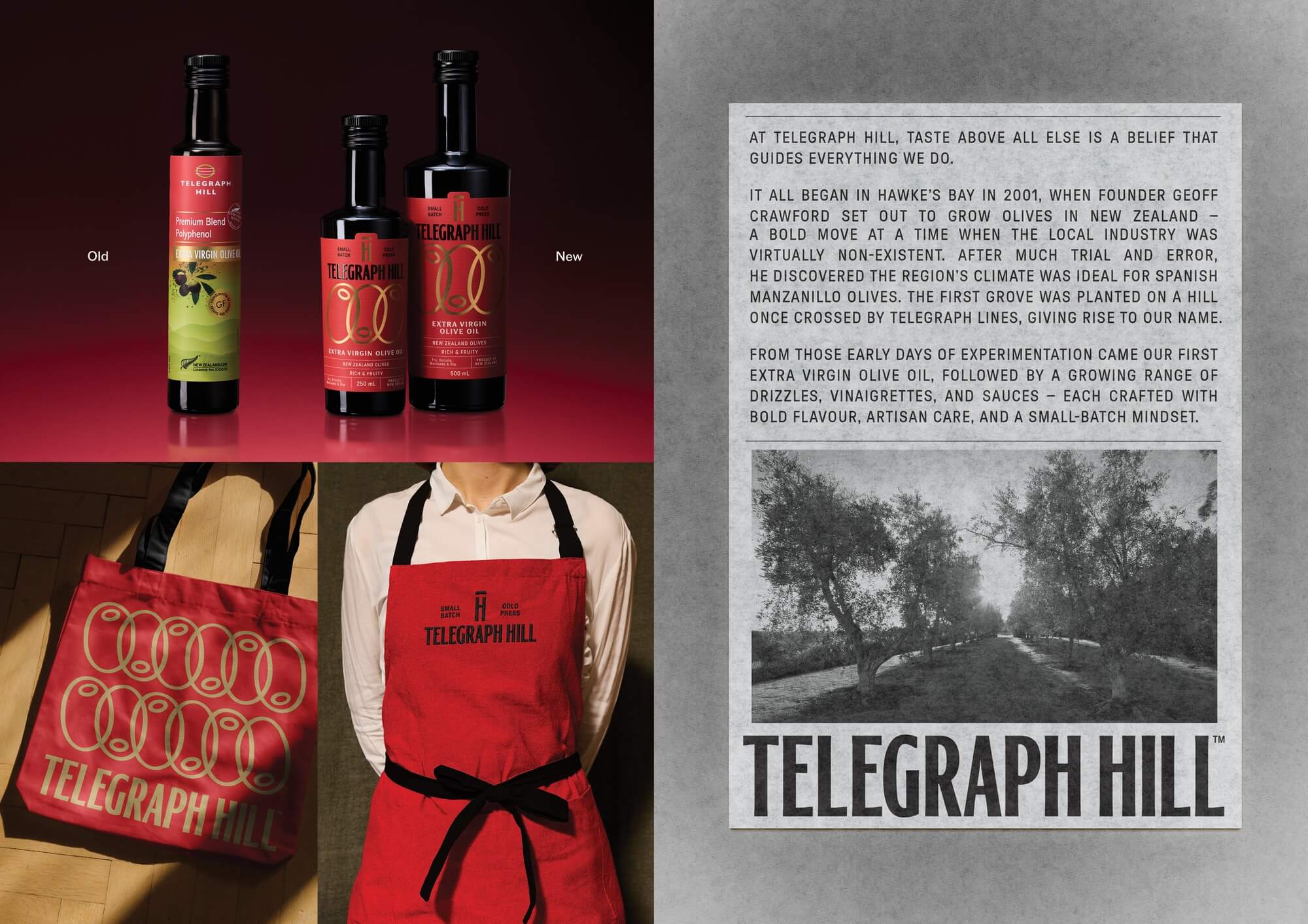
Before and After refresh and brand elements
  • CHALLENGE
  • SOLUTION
  • IMPACT
  • MORE
  • The existing brand had warmth but no architecture. It worked at the farmers market scale, where provenance does the selling, but fell apart under the demands of national retail and various categories, where a product has limited shelf time to make its case.The design challenge was structural: build a visual system flexible enough to span a full product range, bold enough to compete against established category players, and coherent enough to hold together as a masterbrand. All without erasing the twenty years of equity sitting in that highly distinctive red.

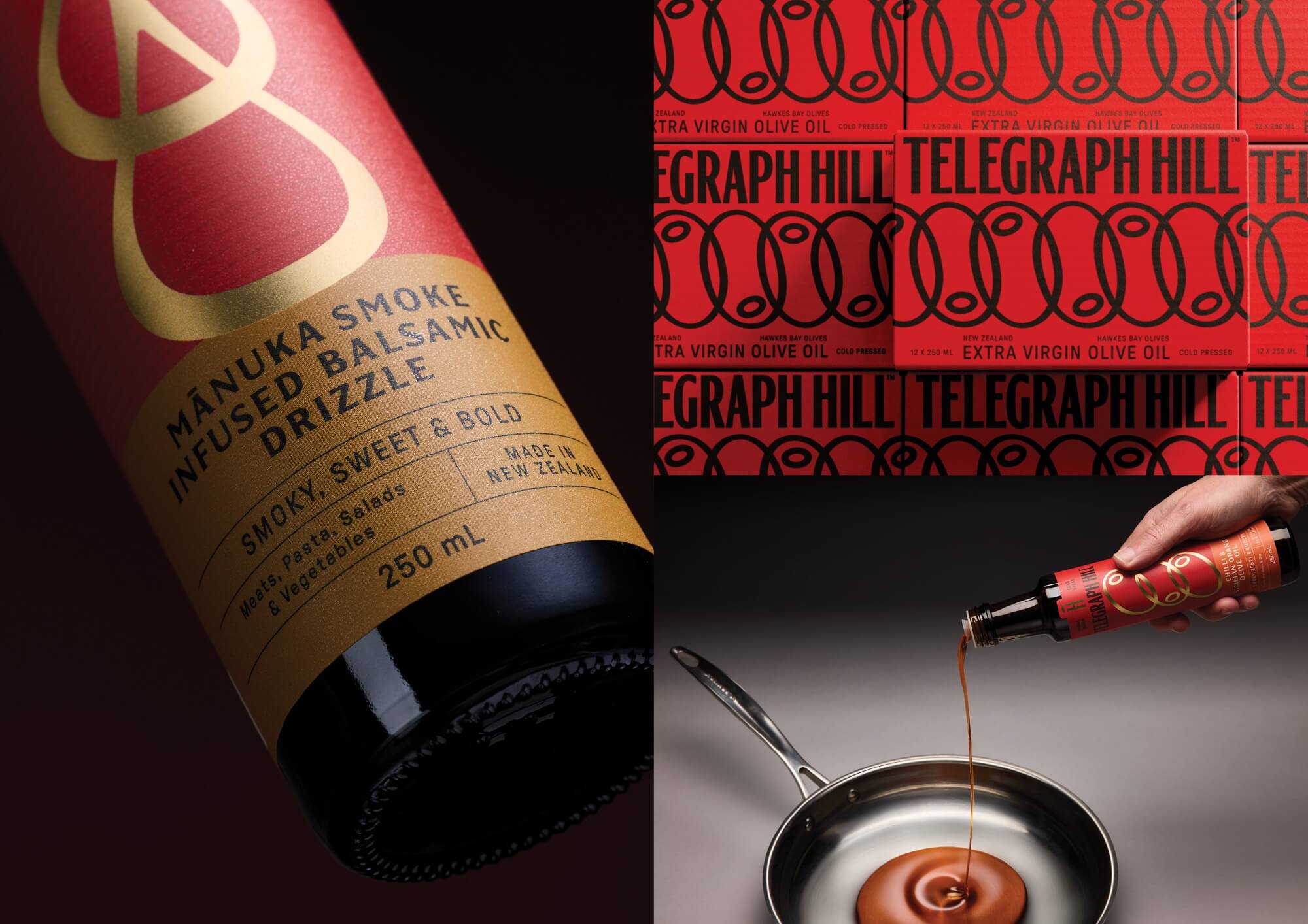
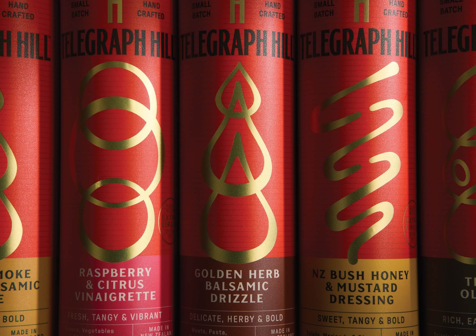
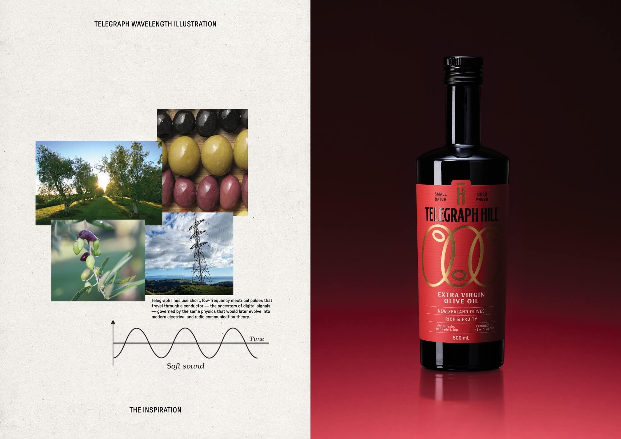
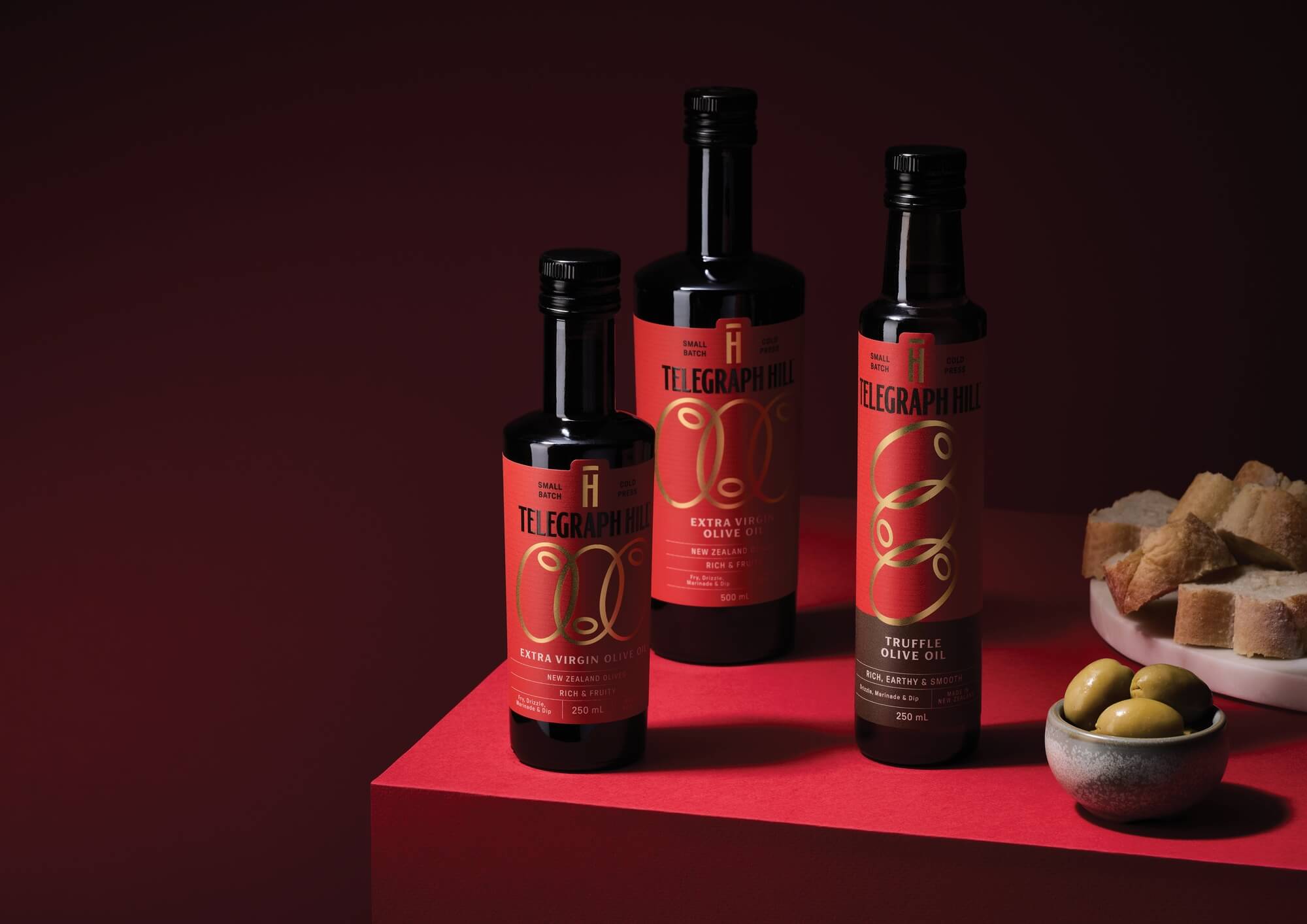
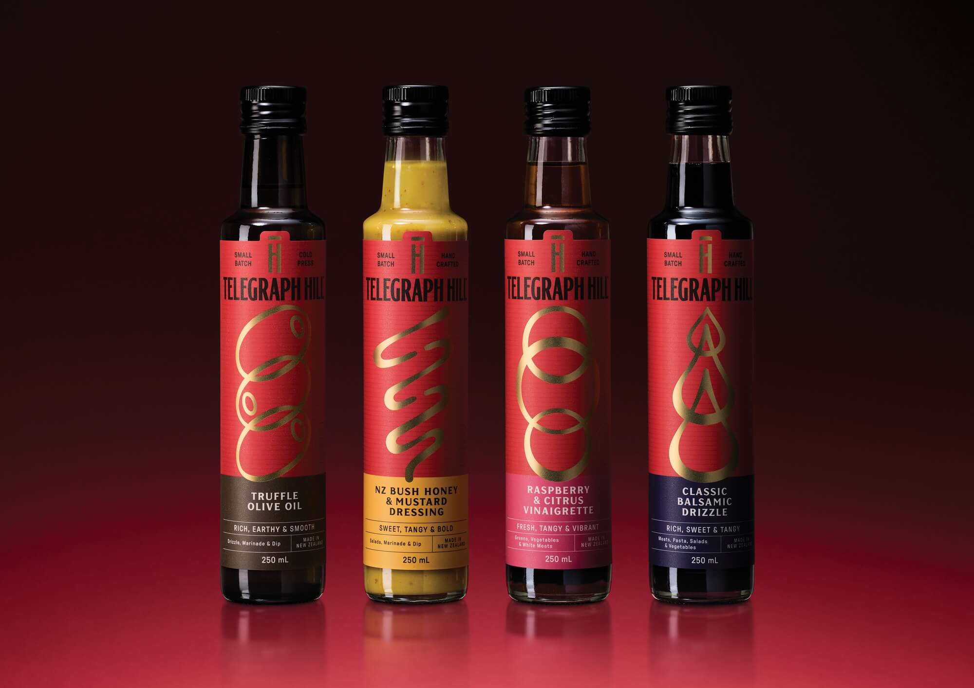
  • One idea held everything together: Taste above all else. The design solution made that tangible. The Telegraph Hill red was kept, elevated, and made stronger, not softened or complicated. A new illustration system used two brand truths: the oval of an olive and the telegraph's electrical wave signal. Printed in gold foil, it reads as both an ingredient mark and a unique visual signature. The wordmark was redrawn with the vertical geometry of telegraph towers. The result is a timeless, pragmatic system. The illustration flexes across oils and changes shapes, but not style, for flavoured oils, dressings and drizzles.

  • Commercial: National retail entry, the rebrand was the prerequisite for distribution beyond its Hawke's Bay roots and made it viable for mass retail chains. Premium-mainstream positioning targets a larger addressable market than artisan-only framing allowed. Environmental: Its commitment to mainstains its small-batch promise - single-origin NZ production is lower food-miles than imported European oils. Societal: Keeps a New Zealand-owned food brand competitive against multinational imports. "Taste above all else" as a philosophy pushes against ultra-processed food culture, olive oil as everyday cooking, not luxury occasion.

  • The red. Not changed, not compromised. Elevated. Telegraph Hill's signature colour was already doing brand recognition work, the solution was to let it own more space, more confidently. A full block of it reads as flavour before it reads as packaging.The illustration system. The central visual asset fuses two things specific to this brand and no other: the natural oval of an olive, and the radial signal waves of a telegraph transmission. The resulting pattern is geometric but warm, technical, and organic. Printed in gold foil, it moves between icon and texture depending on application — small as a stamp, large as a hero graphic. It cannot be mistaken for anything else on the shelf.The wordmark. Redrawn from the vertical geometry of telegraph towers — tall, considered letterforms that carry authority without coldness. Paired with the illustration system, it anchors without competing.Together, these three elements form a genuine system: modular, scalable, and range-agnostic. Oils, dressings, and condiments each carry the same visual logic without the range feeling manufactured. The uniqueness is in the specificity. Every asset traces back to something real about this brand, this place, this history.