Sydney New Year’s Eve Identity

good-design-award_winner_rgb_blk_logo
  • 2026

  • Communication
    Branding and Identity

Designed By:

Commissioned By:

Frost*collective

Designed In:

Australia

Sydney New Year’s Eve is Australia’s largest event, broadcast to 425 million people worldwide. The new identity by Frost* is unmistakably Sydney in any language and set a first as a moving part of the fireworks display, while promoting maximum legibility to safely move one million people around the Harbour.
view website

2.jpg
Joey Clark
3.jpg
Joey Clark
4.jpg
Joey Clark
5.jpg
6.jpg
7.jpg
8.jpg
Joey Clark
  • CHALLENGE
  • SOLUTION
  • IMPACT
  • MORE
  • Australia’s largest event, broadcast to over 425 million people and attracting more than 1 million people in person, New Year’s Eve is Sydney’s peak moment on the global stage. Driving a direct economic impact of $280 million, it’s key to attracting tourists for a ‘buck-list’ life moment. The challenge was complex: be unmistakably Sydney, capture the excitement of ‘cracker night’, skew younger, and maximise legibility for moving huge numbers of people safely, including many NESB visitors. With hundreds of touchpoints, the system had to be easy for roll out by an inhouse team and increase City of Sydney brand recognition.

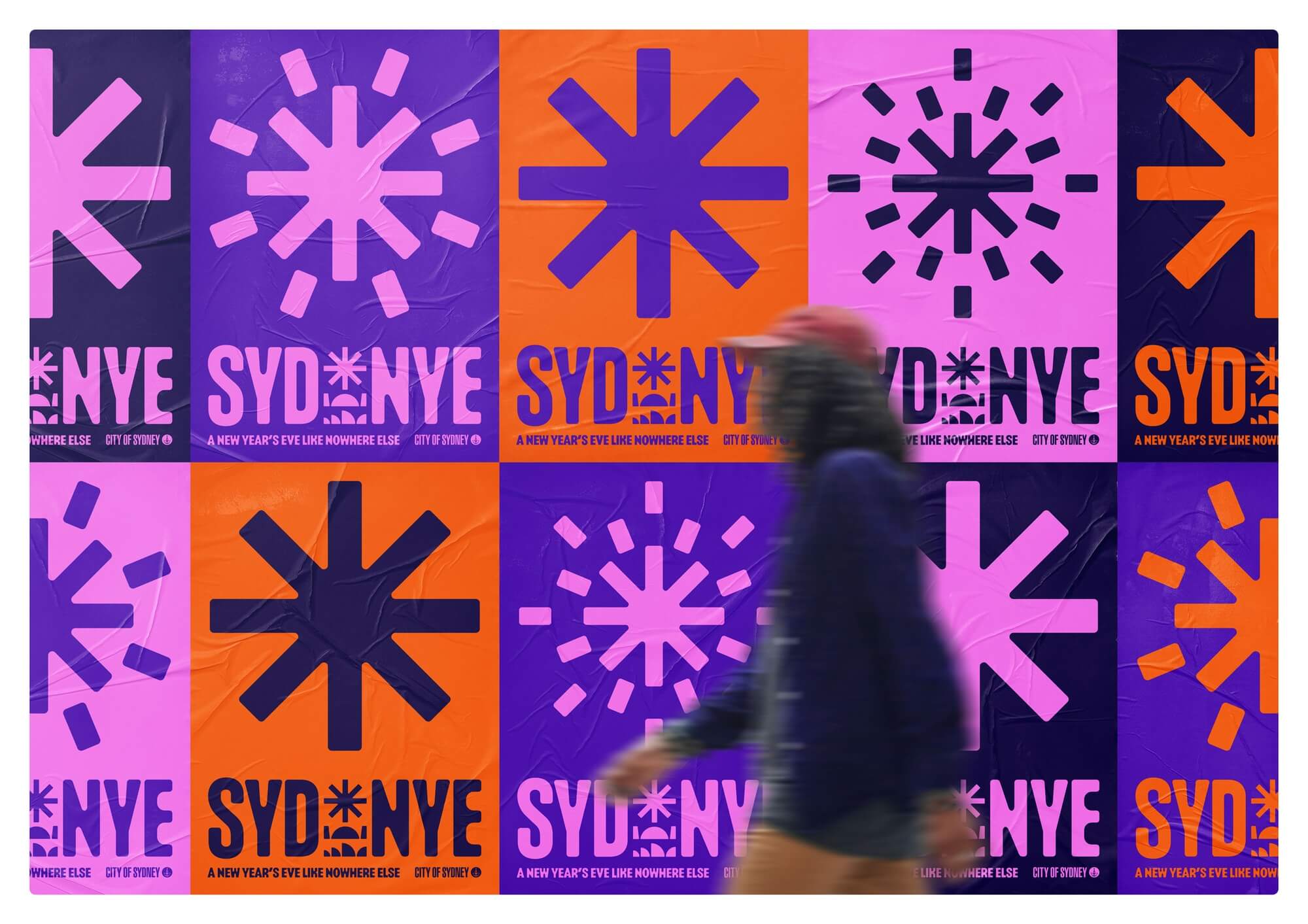
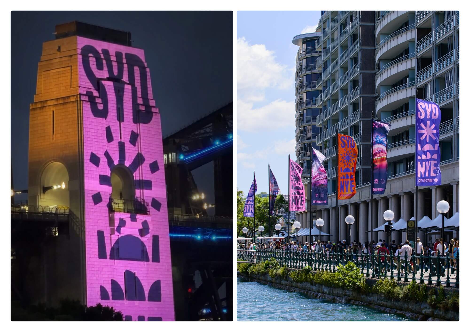
  • The new identity is literally iconic. By combining the Opera House, Harbour Bridge and fireworks into a typographic mark, it acts as a pictogram that means Sydney New Year's Eve in every language. The logo pairs seamlessly with the City of Sydney mark to drive better attribution. Designed to move, a suite of symbols and vibrant colours create a youthful, festival-like feeling while increasing legibility to help hordes of people navigate the event. We shifted guidelines online, with over 75 templates and downloadable assets empowering in-house teams to execute hundreds of touchpoints, often at rapid pace alongside live event operations.

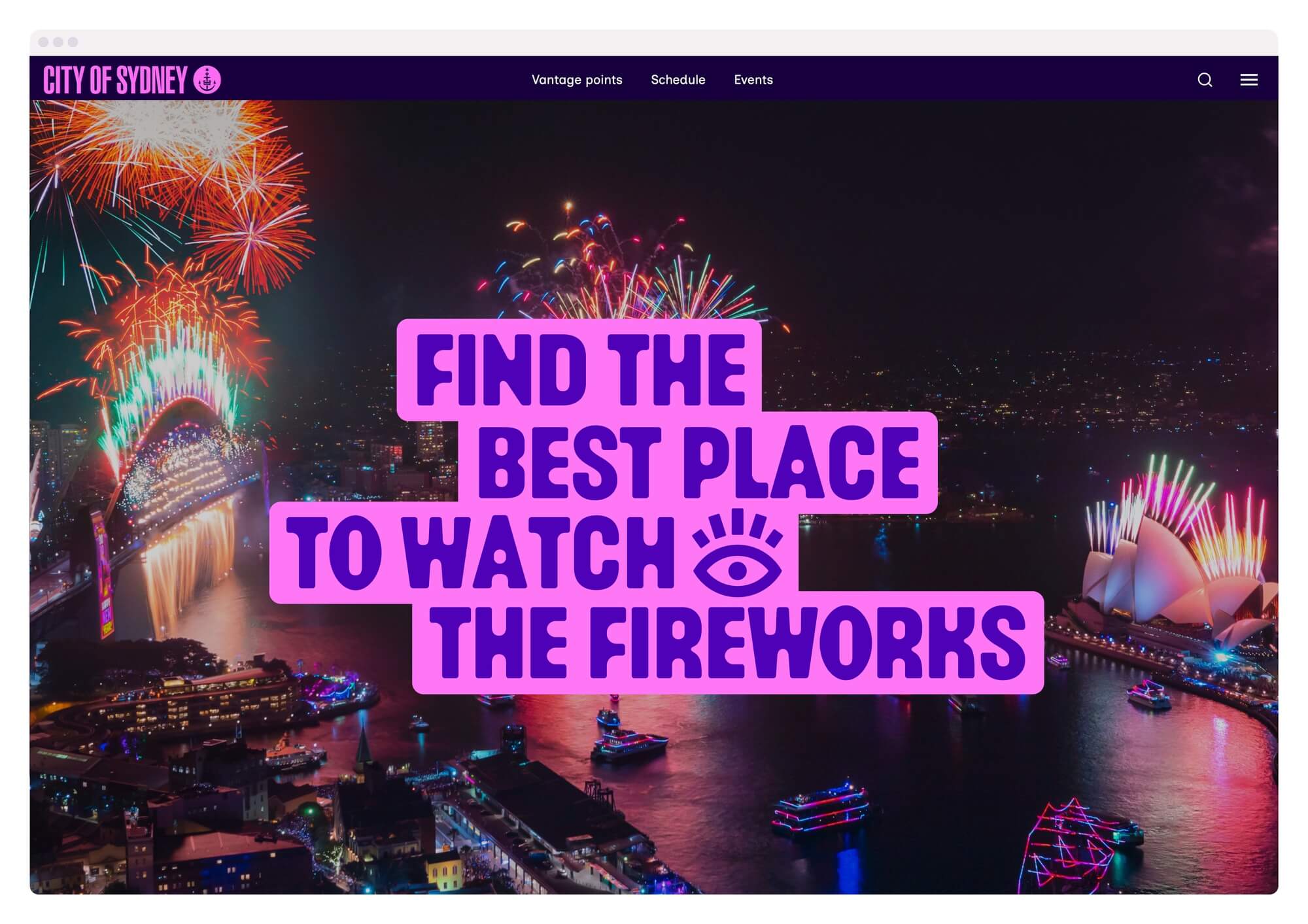
  • In an important first, the identity was designed to move as part of the fireworks display, boosting global brand recognition. The brand significantly improved audience engagement, more than doubling website views and delivering a 37% increase in sessions and 32% increase in engaged sessions. There was a 59% increase in scans from QMS ad panels, with over 13,000 people scanning codes onsite for maps and live updates. Designed to last three years, the identity promotes sustainability, while use of the City's photography archive cut costs and improved event recognition. The use of symbols maximised accessibility, increasing reach for NESB audiences.

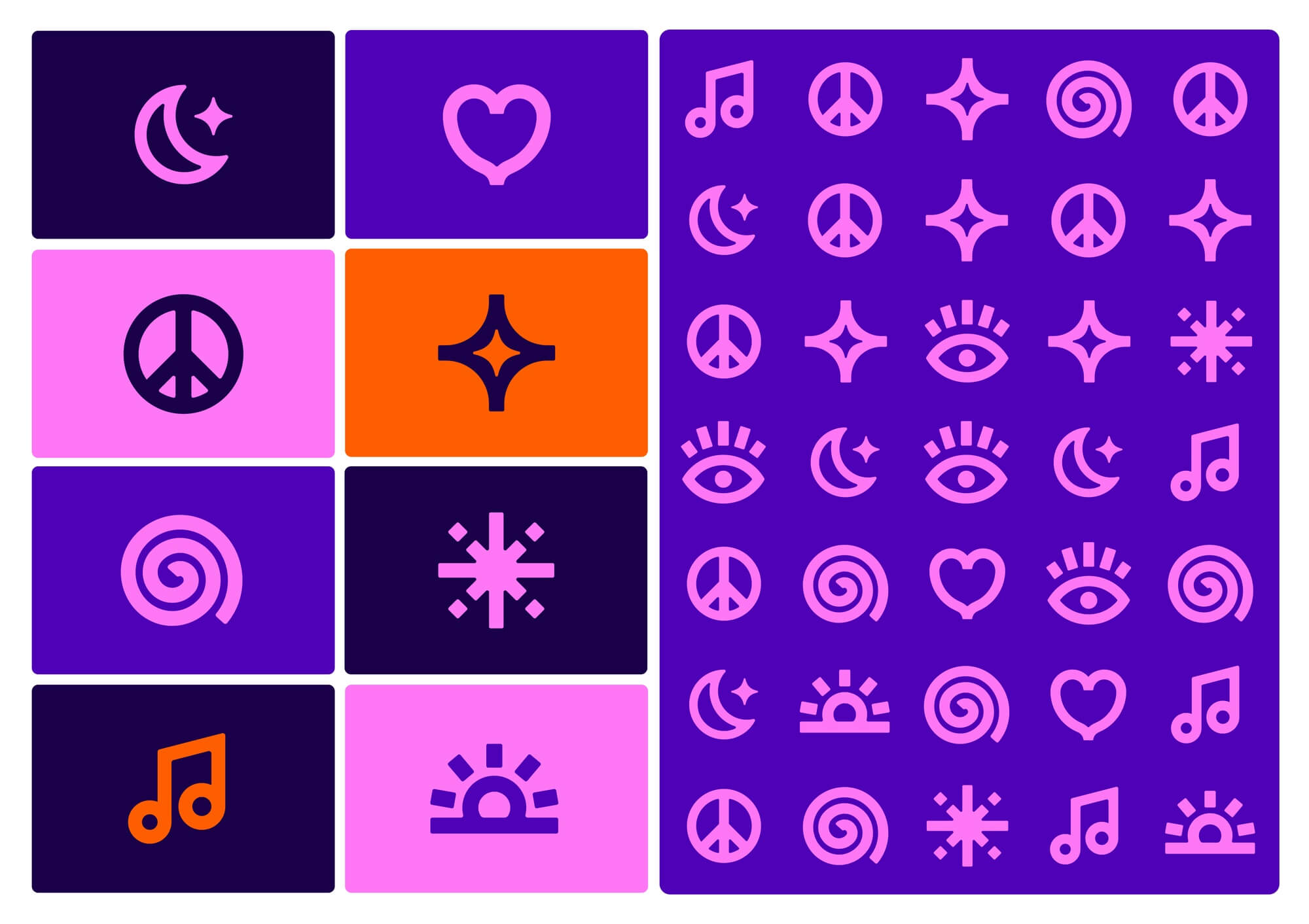
  • The Sydney New Year's Eve identity is both a highly effective piece of design and a rigorous, detailed system documenting a multitude of applications and branding scenarios. Requirements for NESB audiences and high-pressure crowd movement situations make functionality just as important as aesthetics – going well beyond the requirements of most branding exercises. The system is documented in a 120-page online brand guideline including: Logo design – portrait, horizontal and compact versions, placement rules, and lock-ups with the City of Sydney logo, sponsors and partners. Event symbols and pictograms: with over 30 unique symbols and a pattern system to increase accessibility across all channels. Colour palette: including colour pairing systems to ensure accessibility. Typography: hierarchy systems, combining type with images, and non-Latin language guidance. Photography: art direction rules, downloadable imagery, and framing and cropping devices. Motion design: logo reveal principles and downloadable motion files. Copywriting: principles for building the campaign from teasers through to event day and beyond. 70+ templates: including information booths, signage, maps, event guides, resident notifications, street banners, live update screens, posters, billboards, digital ads and website pages.