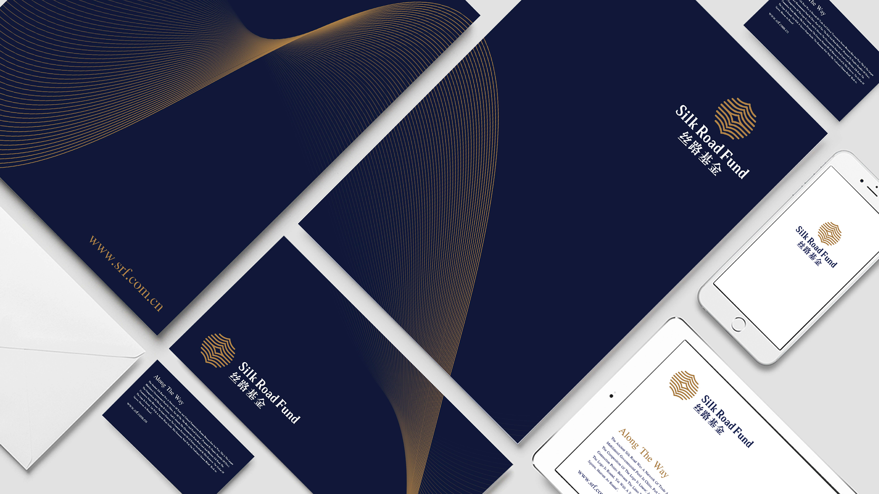
Silk Road Fund

  • 2016

  • Communication
    Branding and Identity

Commissioned By:

Silk Road Fund Co., Ltd.

Designed In:

China

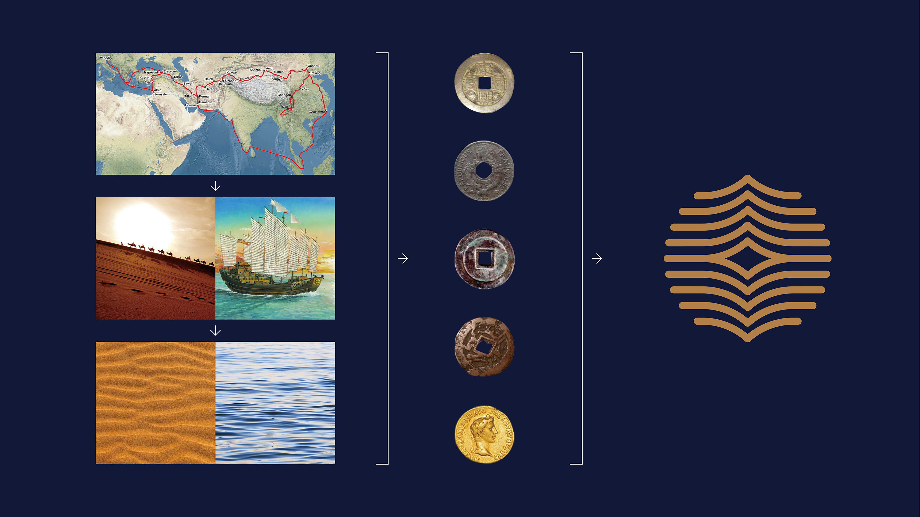
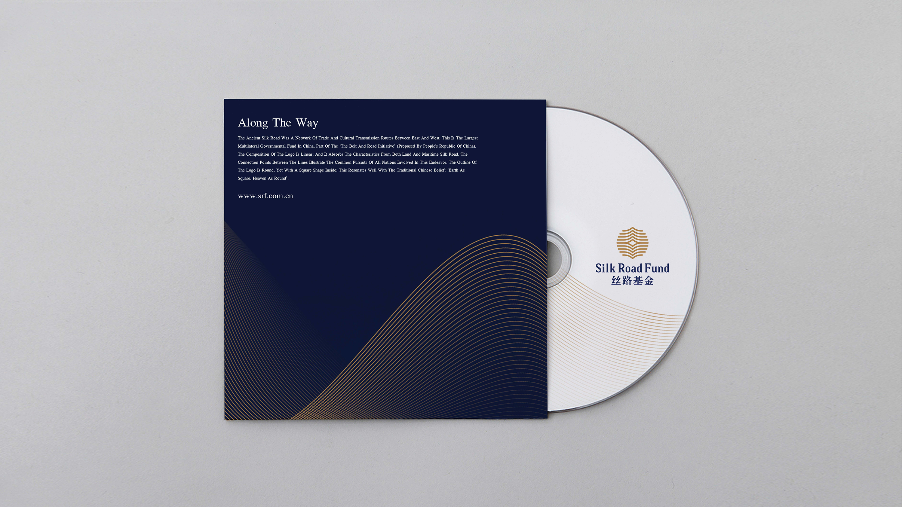
Silk Road Fund is part of the ‘The Belt and Road Initiative’ proposed by the People’s Republic of China. The outline of the logo is round, with a square shape inside: this resonates well with the traditional Chinese belief: ‘Earth as square, heaven as round’.


view website

  • CHALLENGE
  • SOLUTION
  • Following a philosophy of openness, inclusiveness and mutual benefit, the Silk Road Fund mainly provides funding and financing support for trade and economic cooperation and connectivity. By absorbing the characteristics from both land and maritime Silk Road, we adopted the visual symbols applicable to both desert and ocean. By connecting these symbols with undulating lines, we created the logo into a shape of an ancient coin to convey the financial features of the Fund. The interconnection among lines presents the concept of connectivity.

  • Inspired by silk (glossy, soft, ductile and with fine texture) composed of fine fibers, we designed such distinguishable and recognizable auxiliary graphics. The connection points between the lines illustrate the common pursuits of all nations involved in this endeavor. Properties of silk are presented throughout: the arrangements, movements, twisting and overlapping lines.