Kids Cancer Centre Rebrand

good-design-award_winner_rgb_blk_logo
  • 2022

  • Communication
    Branding and Identity

Designed By:

Commissioned By:

Kids Cancer Centre

Designed In:

Australia

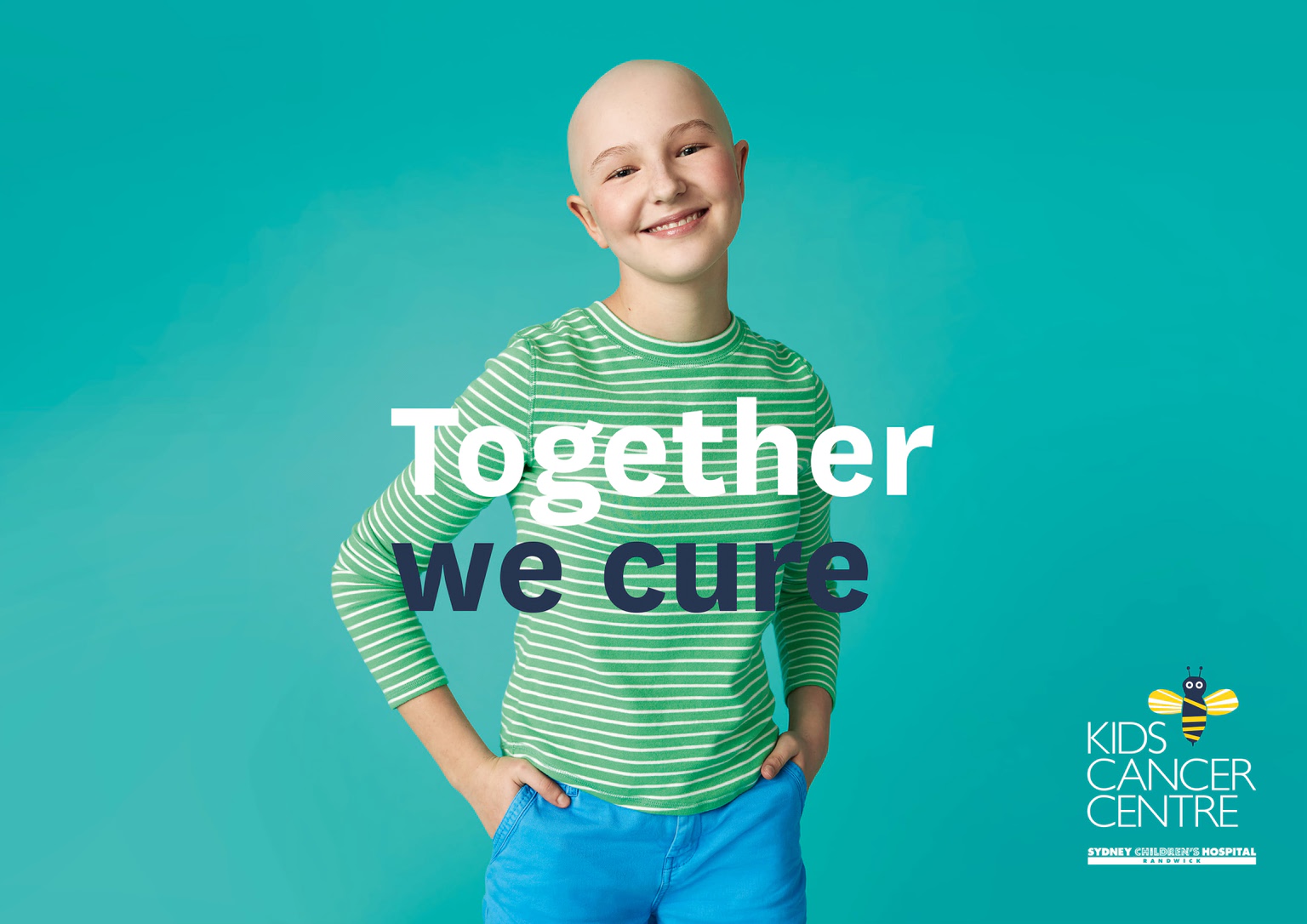
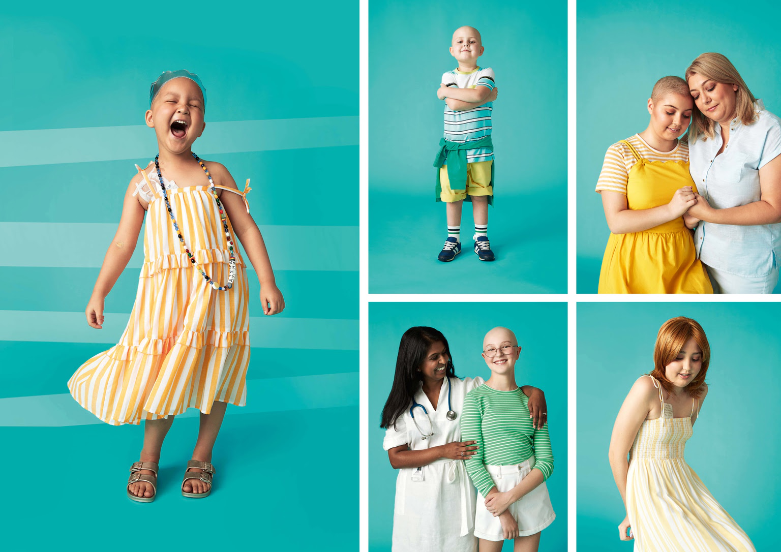
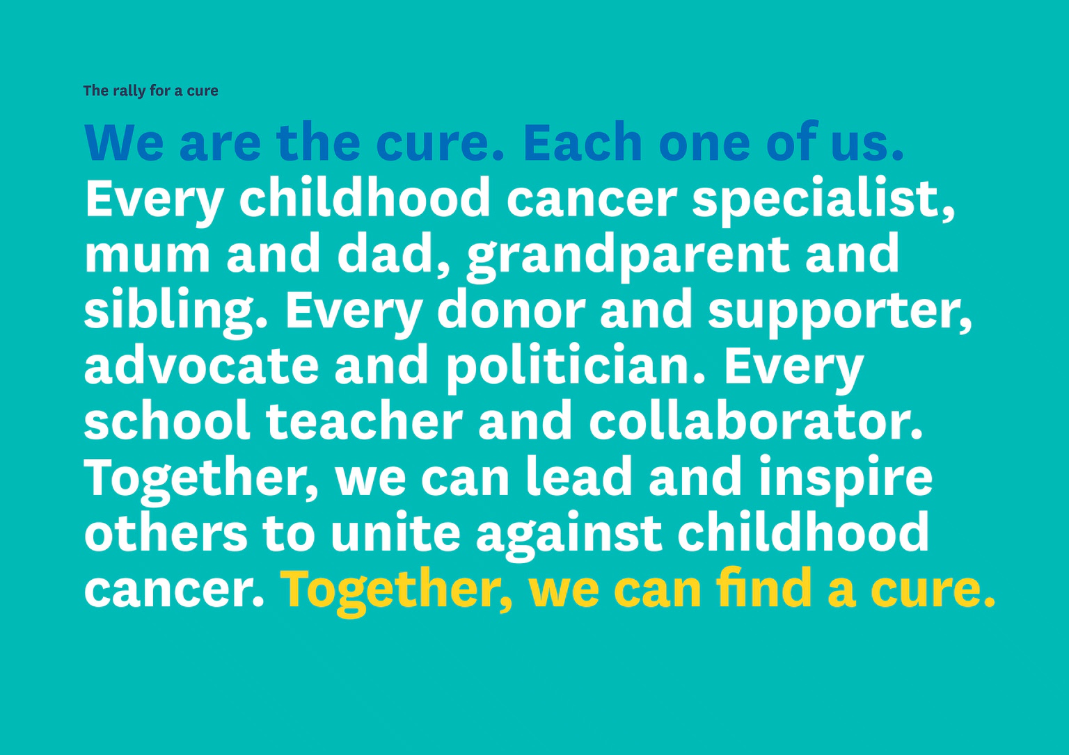
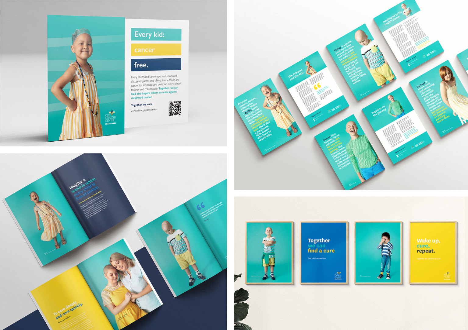
Kids Cancer Centre (KCC) wants a world where kids can just be kids, free from cancer. They are Australia’s largest children’s cancer centre that researches and treats kids’ cancer under one roof. Now, with SunnySideUp’s help, it’s rallying donors around that goal through a new, inspiring brand.


Image: Photographer: Alexandrena Parker
  • CHALLENGE
  • SOLUTION
  • IMPACT
  • MORE
  • KCC’s brand was outdated. It poorly communicated the cutting-edge work it was doing, impacting its ability to raise funds and support. KCC approached SunnySideUp with a fundraising brief, but we saw a greater opportunity: To rebrand the KCC and accurately present them as the extraordinary centre it is, with a team that puts the care and cure of children first. We saw a need to show that supporting KCC will create better outcomes for kids because it performs both research and treatment, enabling it to deliver care faster.

  • The new brand represents a revolution in thinking, style and presentation, resulting in greater engagement, mobilising support for KCC’s pursuit of a cure for kids’ cancer. KCC’s differentiator is its culture, approach and standard of excellence. To bring this to the fore, we created imagery showing children’s personalities, focusing on who they are, rather than their cancer. The logo with a bee, conveys KCC’s work style: united and fastidious. To highlight KCC’s mission we used poetry, statements and a manifesto culminating with the line, ‘Together we cure’.

  • The charity sector for kids with cancer is one of Australia’s most diverse. It’s also one of the most crowded and competitive. Through rigorous research and a robust strategy, SunnySideUp made sure KCC’s new brand cut through the noise and rose above the competition. Ultimately, this transformation has increased KCC’s brand awareness and strengthened its capabilities to seek funding and support.

  • Through interviews, research and analysis, we discovered a culture of innovation and excellence, collaboration across a wide variety of disciplines and working passionately towards a common goal: to put children first so they can focus on getting back to just being kids – not kids with cancer. By identifying this brand differentiator, we were able to make sure KCC’s new brand cuts through the noise and rises above the competition. We did this through the use of: •Mission statements, poetry and mantras to capture the attitude and ethos of KCC •Bold, powerful and inclusive copy that invites everyone to join in the search for a cure for kids’ cancers •A bright and polished execution that sets KCC in the right position in the market: positive and elite •Welcoming images that depict kids’ personalities first and foremost and show them wrapped in their families’ or healthcare staff’s care. Overall, the new brand represents a revolution in thinking, strategy, design and presentation, transforming the way KCC engages and attracts donors. Visually and verbally, it’s a game changing approach for the kids’ cancer space in Australia.