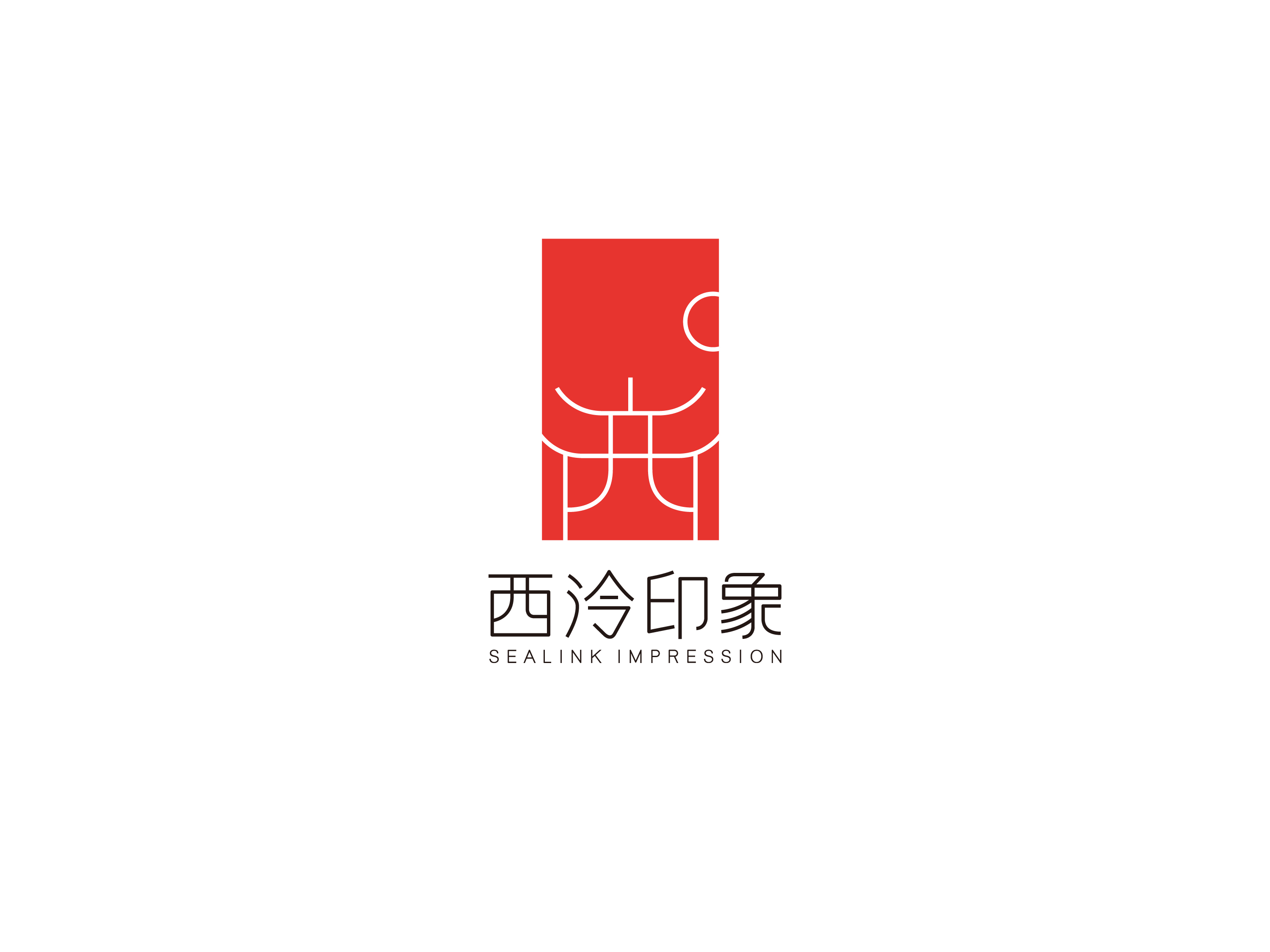
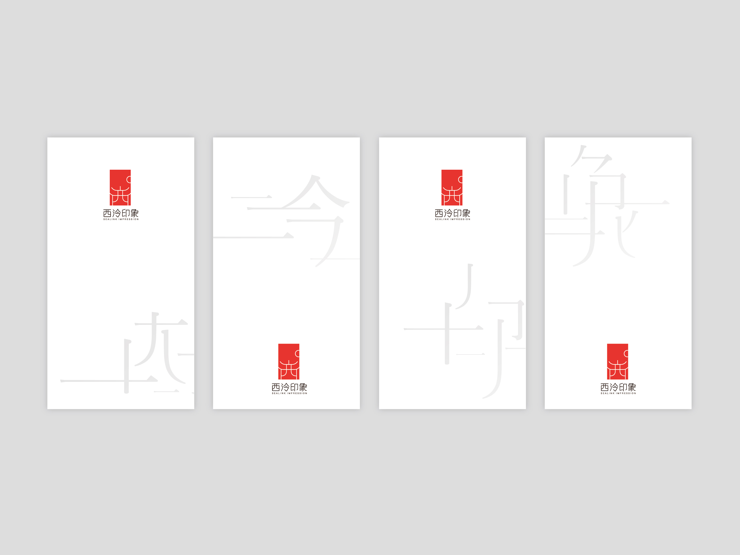
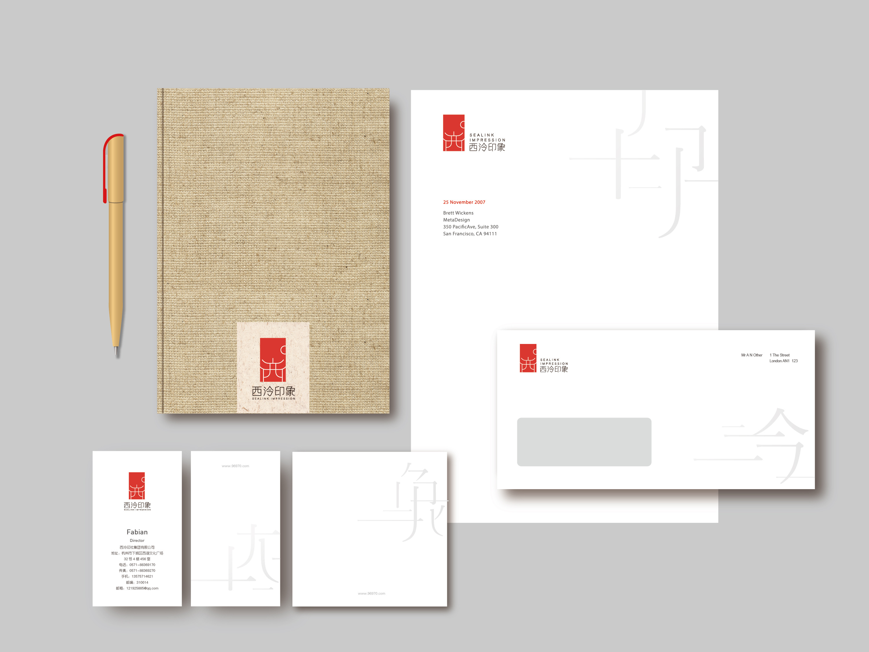
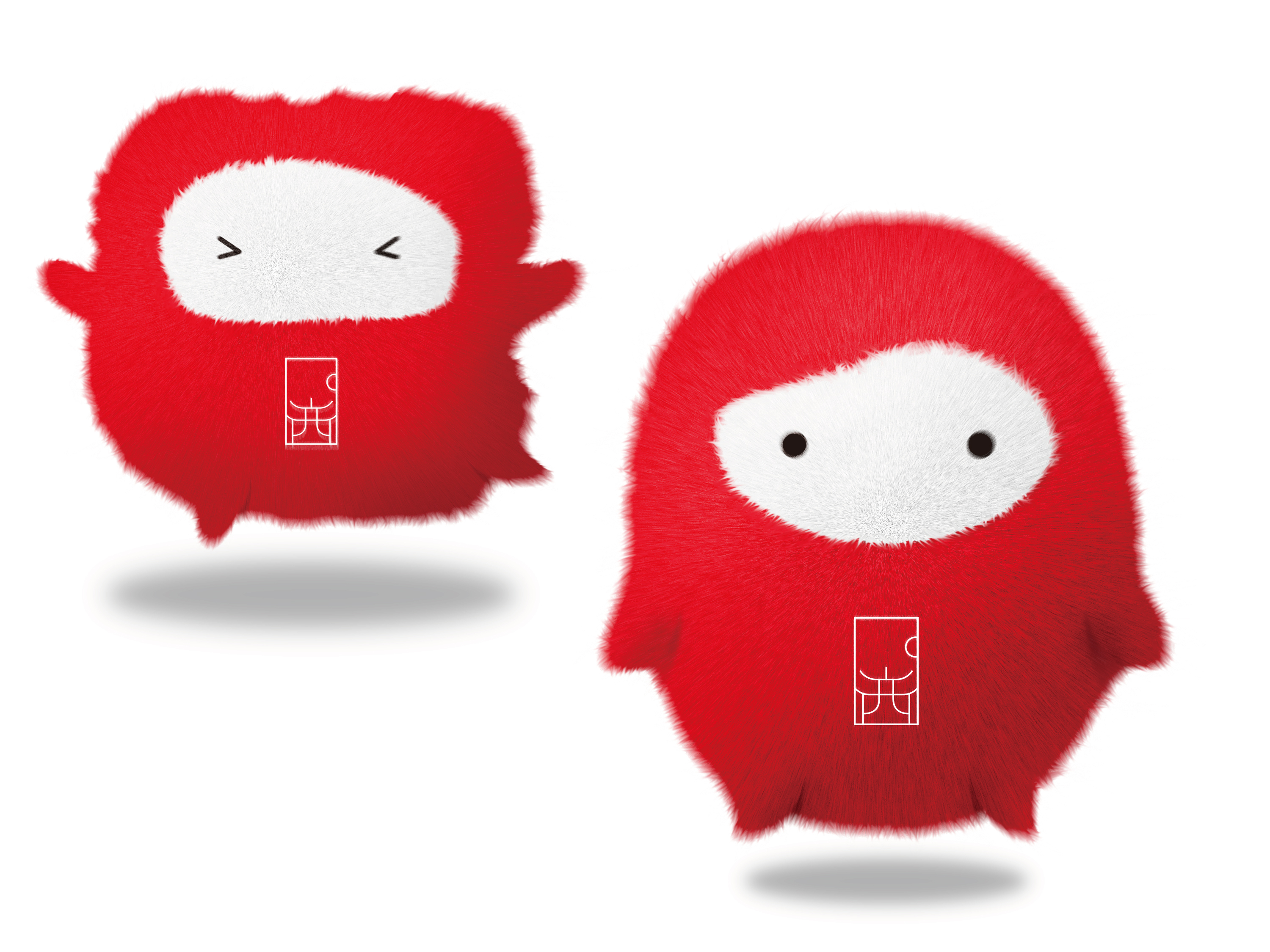
Sealink Impression

  • 2016

  • Communication
    Branding and Identity

Commissioned By:

Xilingyinshe Group Co., Ltd.

Designed In:

China

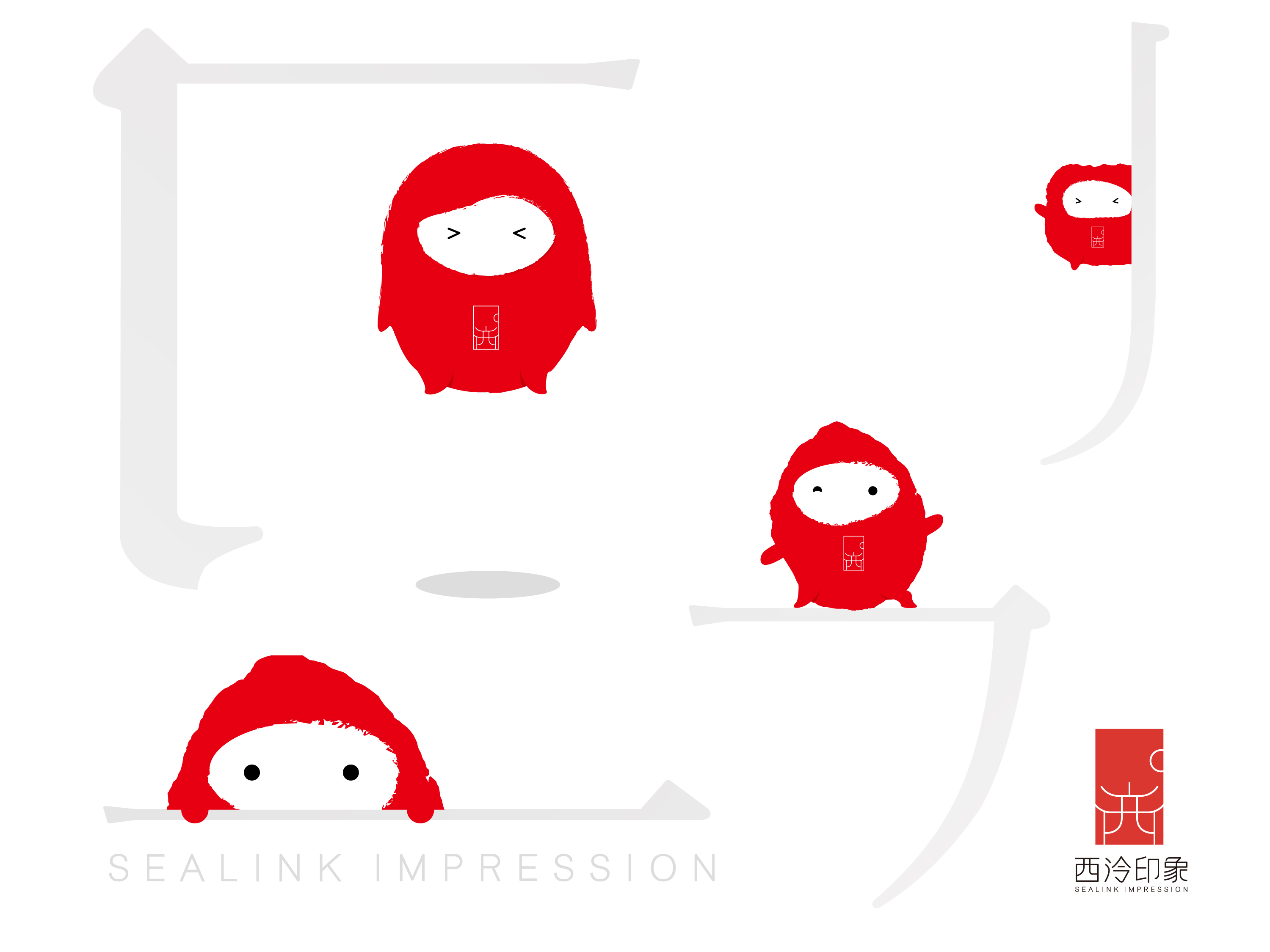
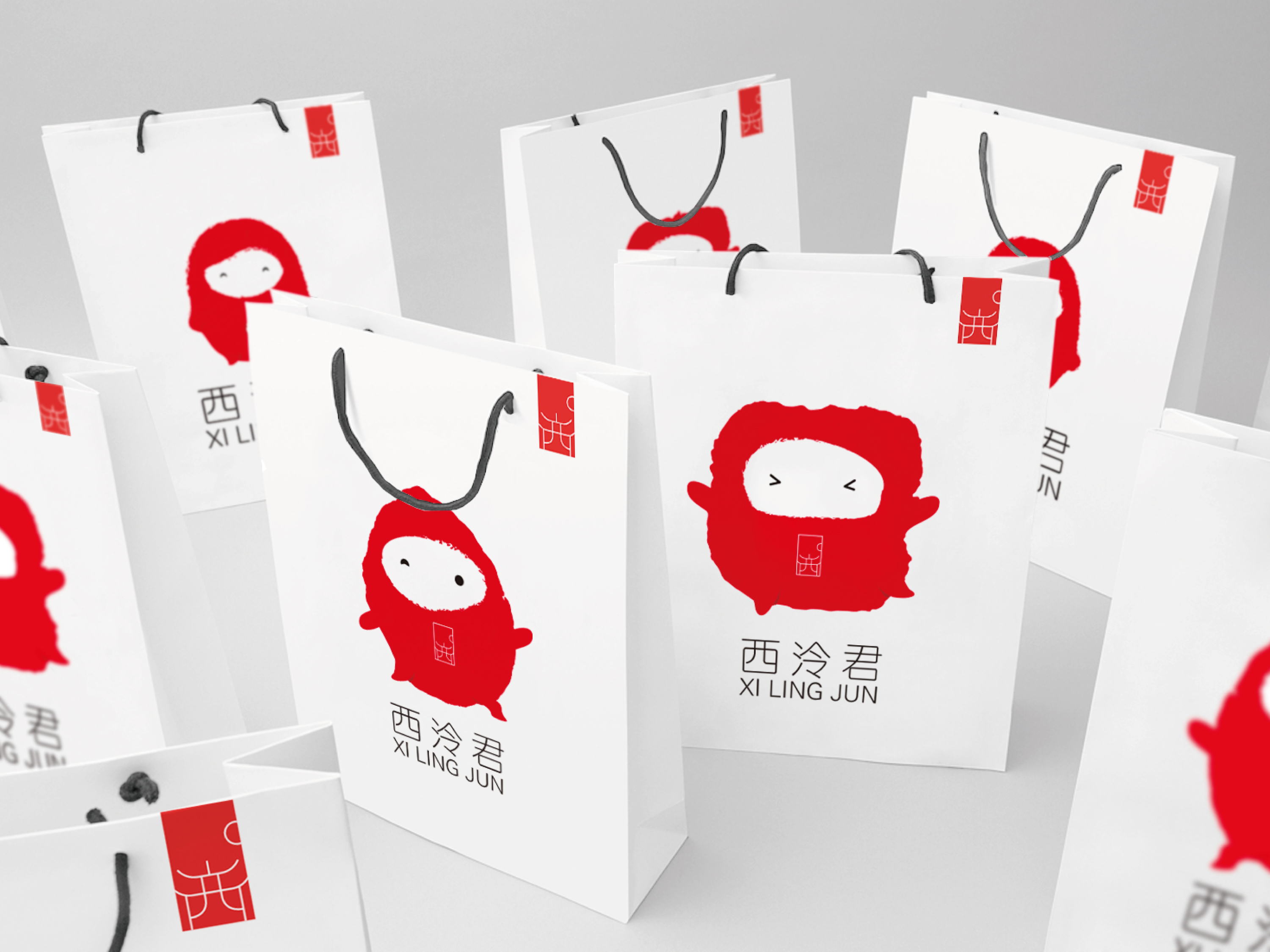
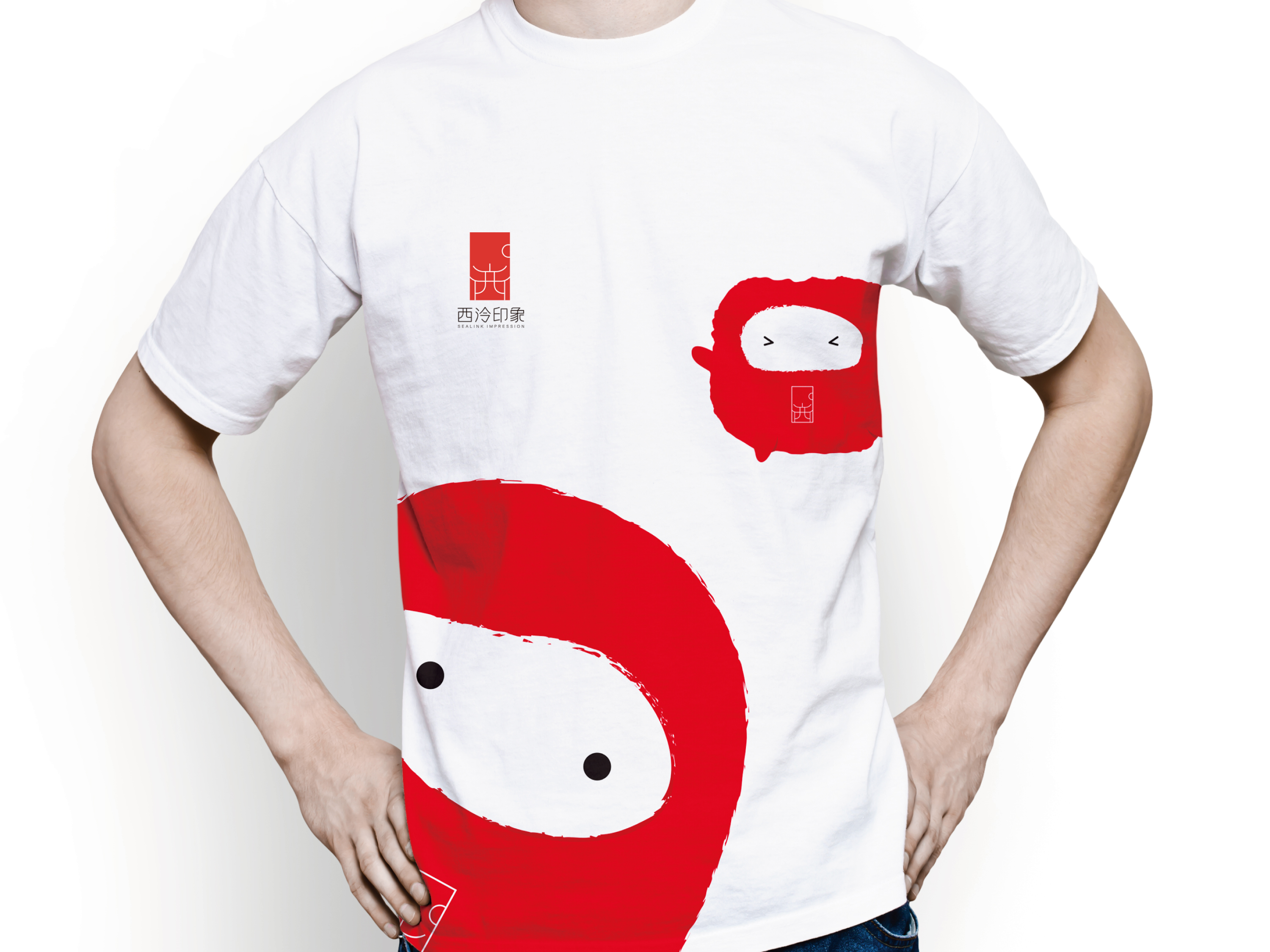
Sealink Impression originates from a civic seal cutting society, which intends to re-popularize this traditional practice and make it again a ‘gift culture’ in the city of Hangzhou. Inspired by Chinese seal and carving tradition, we presented a modern brand and succinct techniques of expression.


view website

  • CHALLENGE
  • SOLUTION
  • Our inspiration originates from the traditional art of seal cutting that was invented in China. Looking at the very characteristics of seal carving, we took the Chinese character 西, pronounced 'xi', and created a relevant pattern. The visuals reflect a harmonious combination of tradition and modernity. The image of sunrise embodies the unique mood of Chinese aesthetics. Generally speaking, a seal provides a conservative impression. However, we made it appear lively, yet tolerant.

  • For the mascot, we added limbs making it appear immensely vivid. The use of eyes are typical Eastern characteristic emphasizing the origin of culture. As such, we presented 西泠君 (xi lin jun), the humble, friendly and lovely mascot.