Redheads

good-design-award_winner_rgb_blk_logo
  • 2026

  • Communication
    Branding and Identity

Commissioned By:

Redheads Matches

Designed In:

Australia

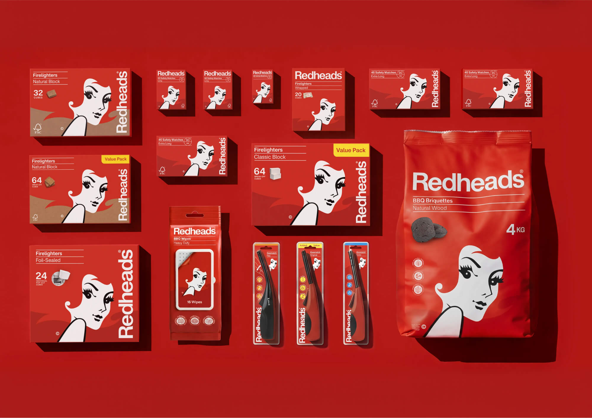
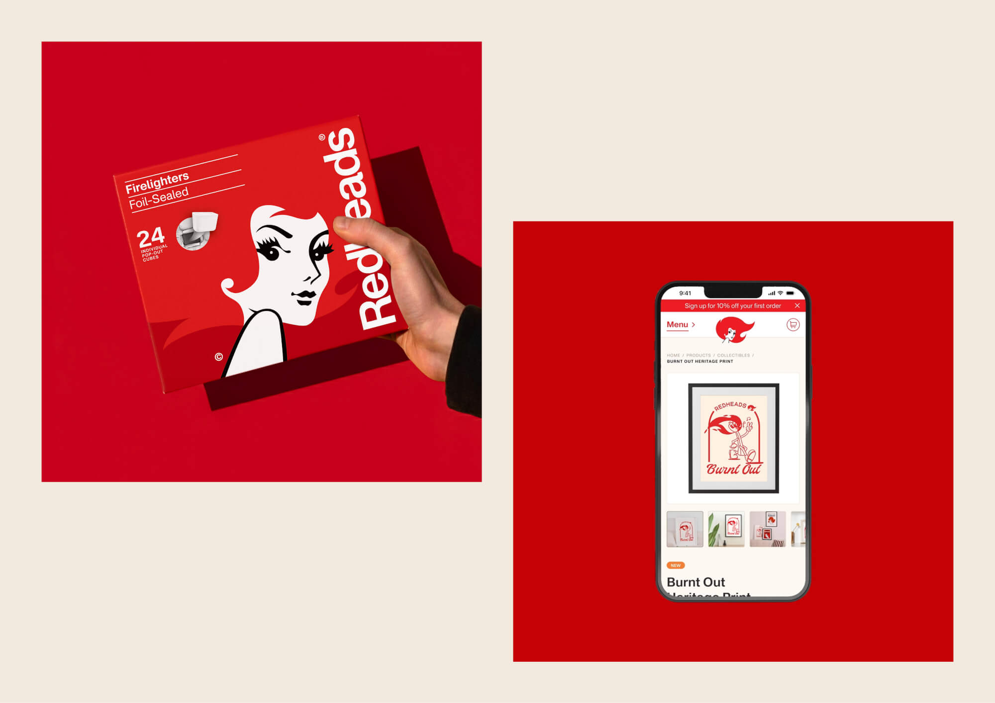
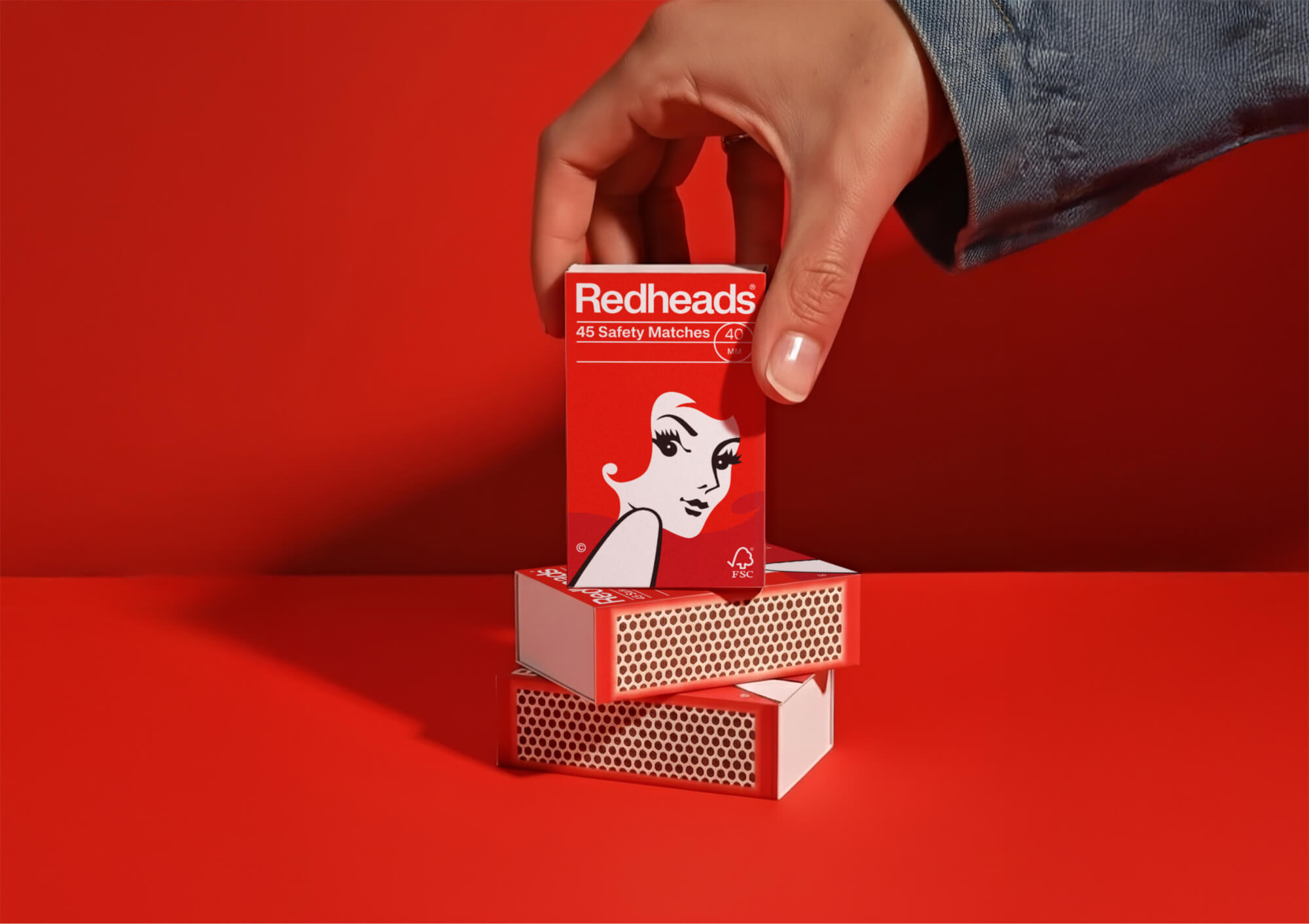
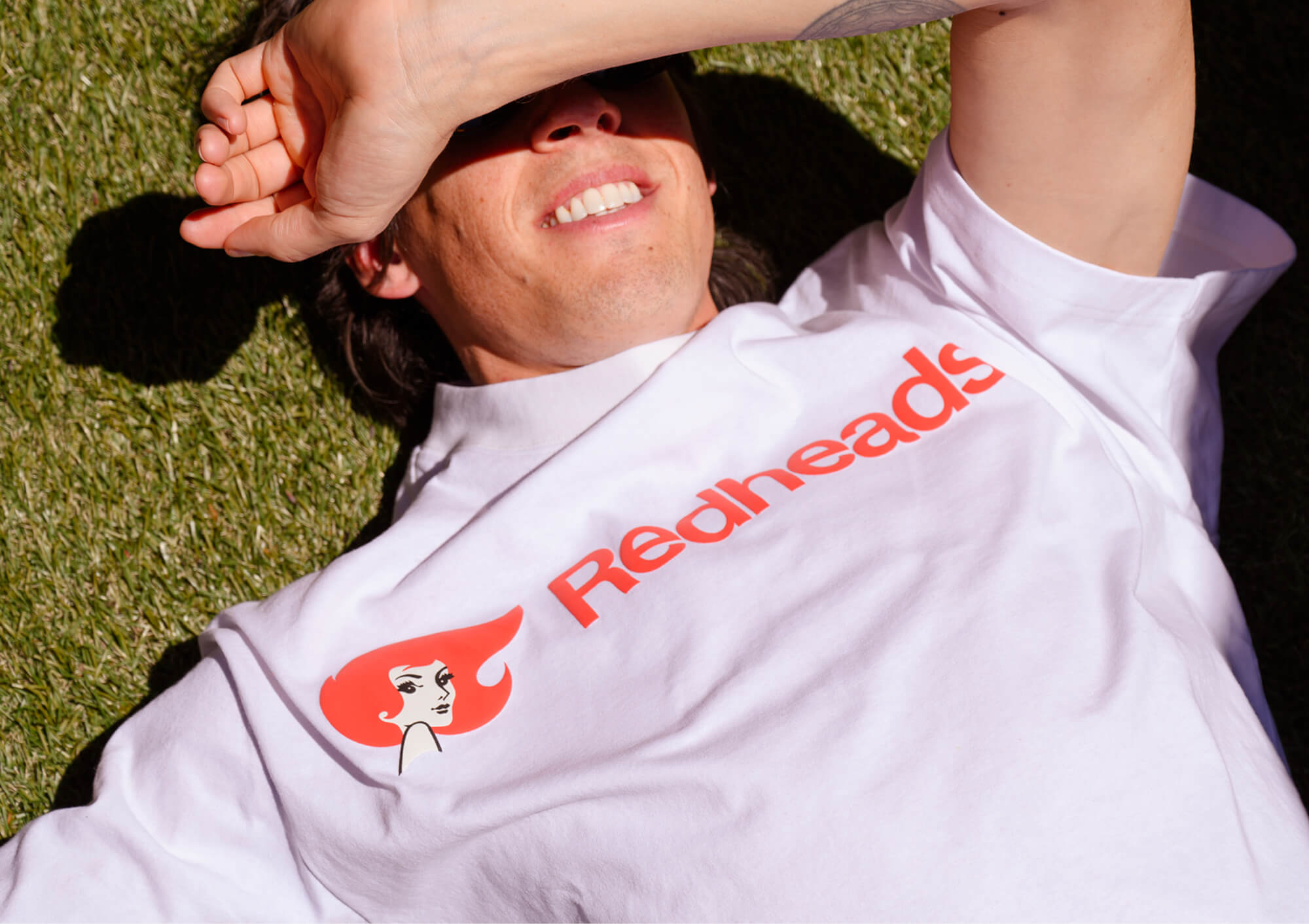
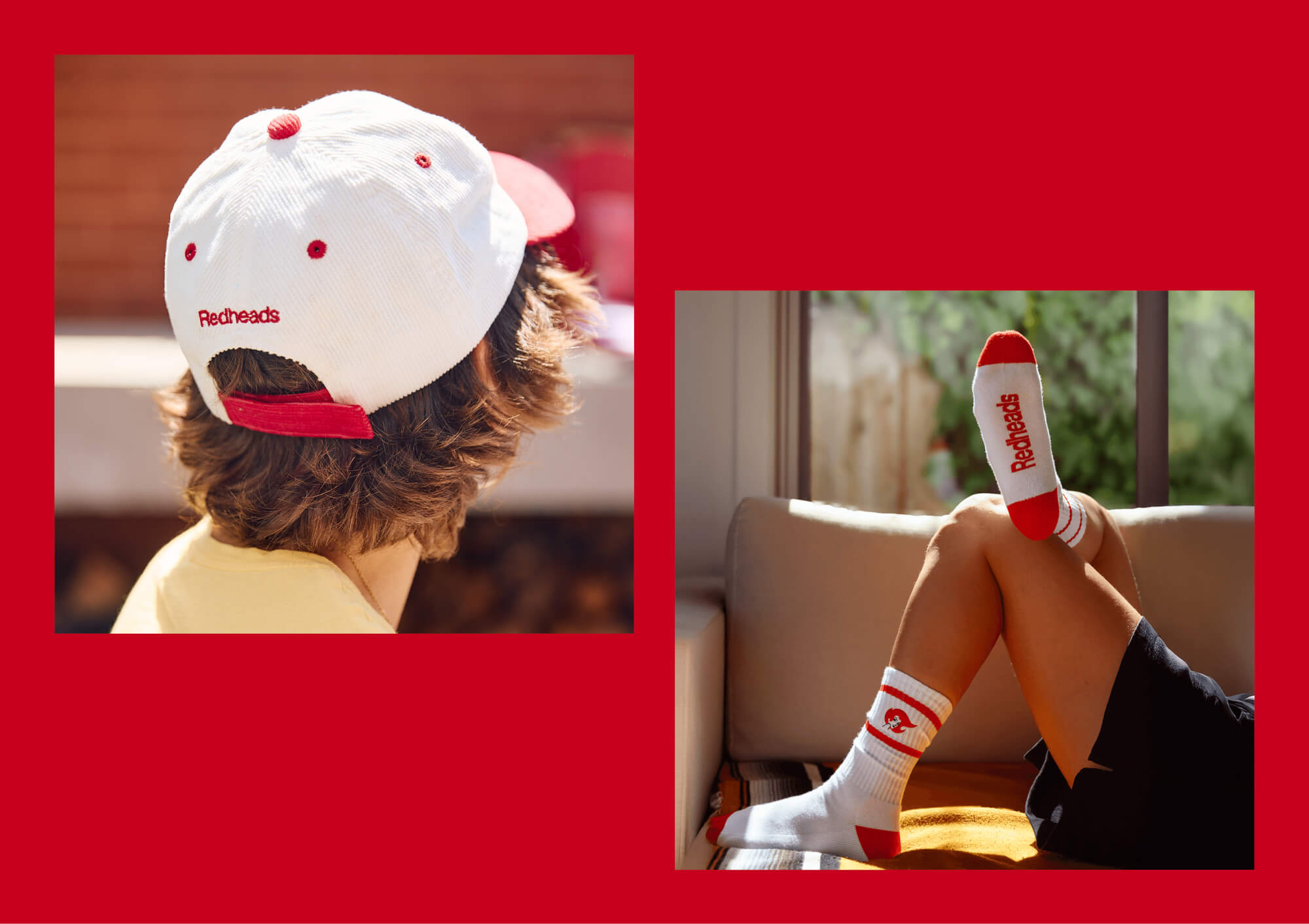
Redheads is one of Australia’s most enduring household brands. Oliver Grace was engaged to refresh the iconic identity – including its beloved mascot Ms Redheads – for a contemporary audience, delivering a new packaging system, updated brand language, and a direct-to-consumer digital experience that extends the brand’s reach beyond retail.
view website

2.jpg
3.jpg
4.jpg
5.jpg
6.jpg
7.jpg
8.jpg
  • CHALLENGE
  • SOLUTION
  • IMPACT
  • MORE
  • Redheads has been a fixture in Australian homes since 1946. That longevity is an asset and a constraint. The refreshed brand needed to feel current without alienating the generations who grew up with it. Ms Redheads – one of Australia's most recognisable brand icons – had to evolve without being replaced. At the same time, the brief extended beyond heritage stewardship: Redheads needed a packaging system flexible enough to span multiple formats, and a digital presence capable of supporting direct-to-consumer e-commerce. Oliver Grace had to honour eighty years of brand equity while making the identity feel genuinely alive for a new generation.

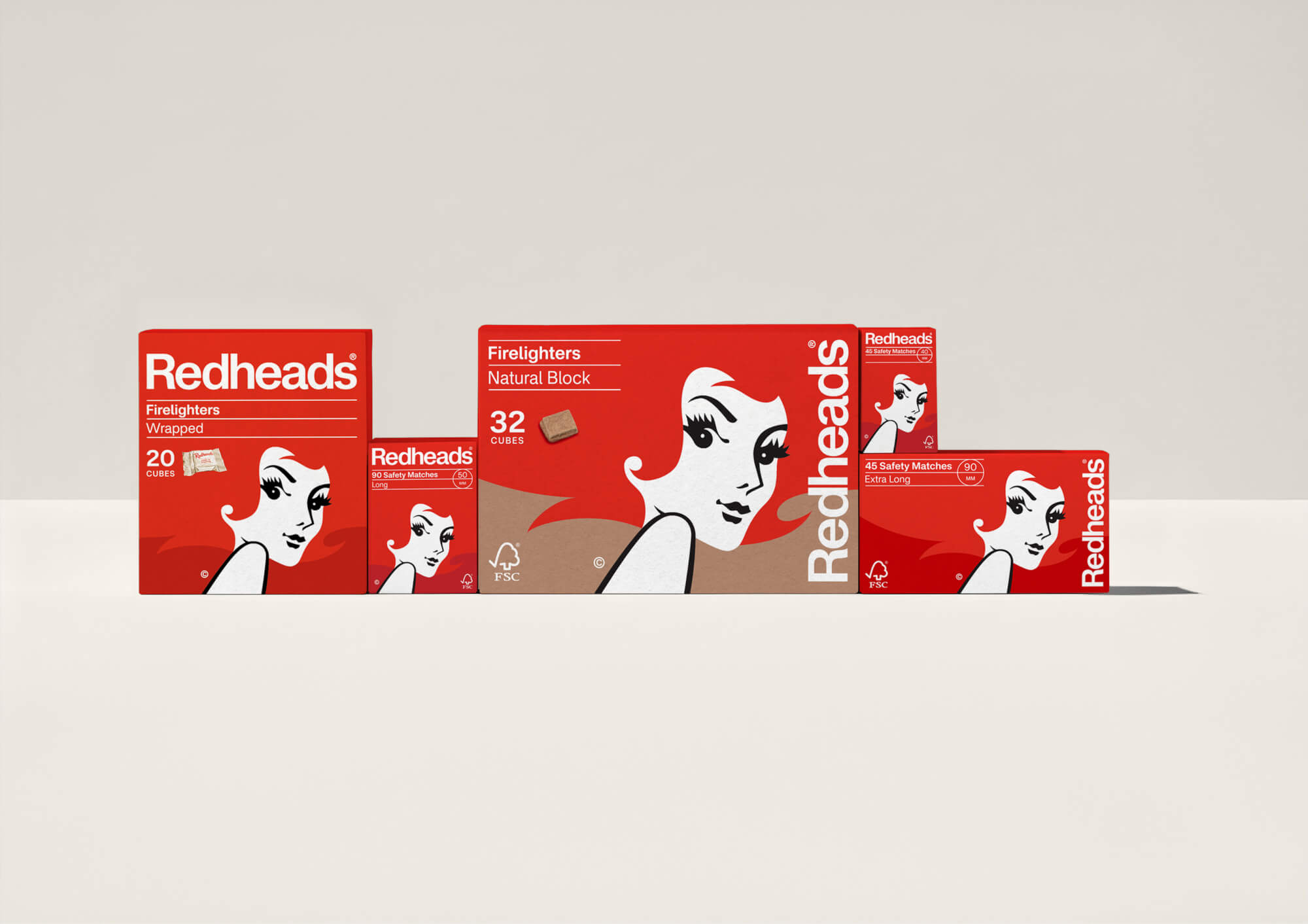
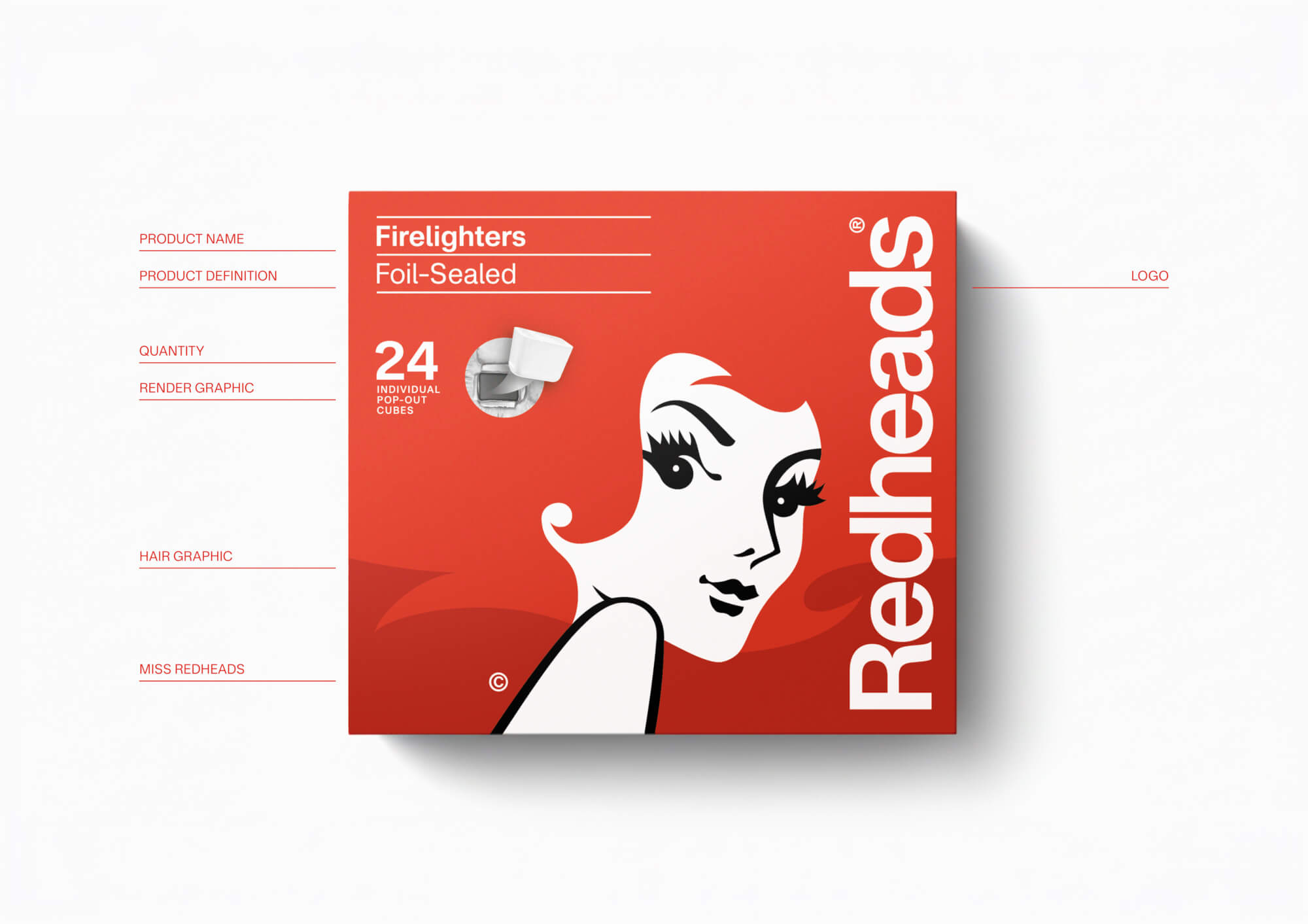
  • Oliver Grace began with the brand's own history, revisiting Redheads' heritage wordmarks and finding a Swiss Modernist influence from the 1970s that felt both historically grounded and contemporary. The resulting typographic refresh blends archival integrity with modern rigour. A flexible Swiss grid system was applied across all packaging formats, ensuring consistency and recognisability regardless of pack size or ratio. Ms Redheads was simplified rather than reimagined – her voluminous hair retained as the defining expression of personality, refined to be bolder and more stylish. The refreshed identity then extended into a dynamic e-commerce website that brings the brand to life digitally.

  • The Redheads refresh demonstrates that heritage brands can evolve without losing their magic or, on the flip side, feeling too trendy. The updated identity retains the fiery spirit and iconic imagery, while delivering the visual coherence and digital capability a modern brand requires. The new packaging system works cohesively across the full product range. The e-commerce platform opens a direct relationship between Redheads and its customers for the first time, expanding beyond traditional retail. As Redheads' Head of Brand noted, the refresh has given the brand "new energy while staying true to what people love about it."

  • 1) Heritage wordmark revival. Oliver Grace revisited Redheads' archival wordmarks, blending them with Swiss Modernist typography from the 1970s. The result feels timeless – rooted in the brand's own history rather than imposed from outside it.2) Flexible Swiss grid system. A structured grid was applied across all packaging formats, ensuring every element – logo, typography, colour, hierarchy – scales and adapts consistently regardless of pack size or ratio. The system provides coherence across a varied product range without sacrificing flexibility.3) Ms Redheads, evolved. Australia's most recognisable brand mascot was simplified rather than replaced. Drawing on her long visual history, Oliver Grace distilled her most iconic quality – her voluminous, expressive hair – into a bolder, cleaner mark with contemporary style and appeal.4) Direct-to-consumer digital experience. The new website was designed as a primary commercial channel, not a brand brochure. It promotes and sells both core Redheads products and a new range of nostalgia-inspired home items, with experience-focused interface elements that make the brand feel dynamic and engaging online.5) Cohesive brand ecosystem. Packaging, identity, and digital experience are designed as a unified whole – ensuring the Redheads refresh translates consistently across every surface and every customer touchpoint.