Purpose Driven Periods

good-design-award_winner_rgb_blk_logo
  • 2026

  • Communication
    Print and Packaging

Commissioned By:

Charlotte Stewart

Designed In:

Australia

How can we make periods empowering and not embarrassing? Why can’t we make them feel like a ritual instead of a hassle? Full of satisfaction and pride rather than guilt and worry? Some of the questions that sparked Half of Us – Purpose Built Periods.
view website
Buy online

2.jpg
3.jpg
4.jpg
5.jpg
6.jpg
7.jpg
8.jpg
  • CHALLENGE
  • SOLUTION
  • IMPACT
  • MORE
  • Period-care branding has for decades communicated one thing above all else: discretion. Blue liquid, clinical patronising packaging and euphemistic language have collectively reinforced the message that periods are something to be hidden. The Half of Us brand brief rejected this entirely. The challenge was to create an identity that could simultaneously compete on shelf, earn trust from health conscious consumers, resonate emotionally with women who had never felt seen by a period brand, and communicate a genuinely elevated value proposition - all while navigating a category still shaped by deep cultural taboo. The brief demanded both commercial viability and cultural courage.

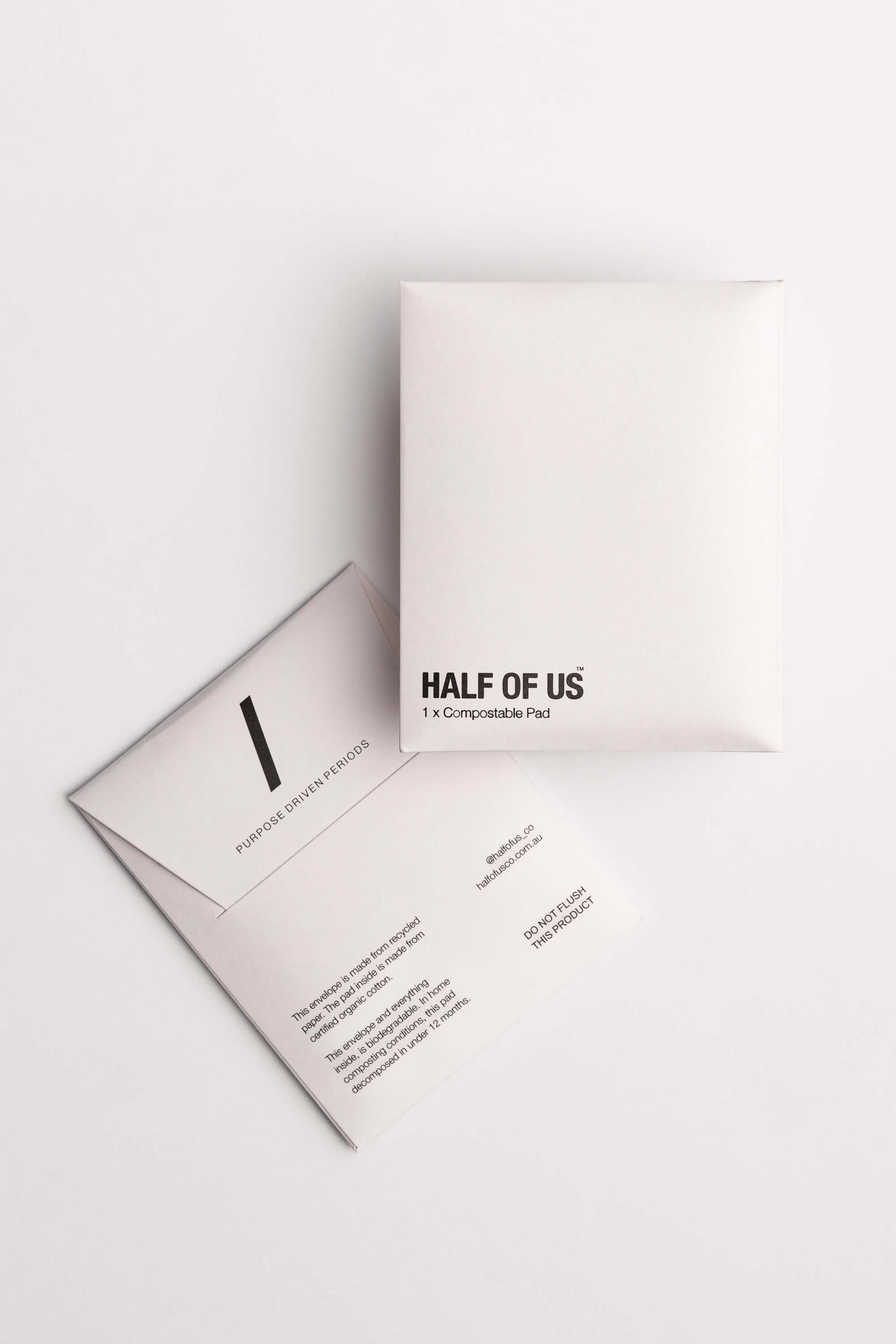
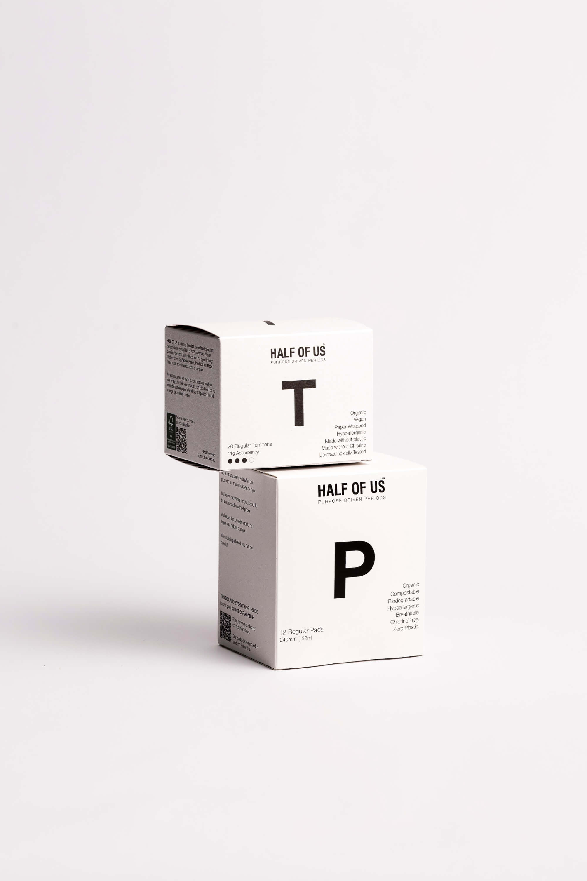
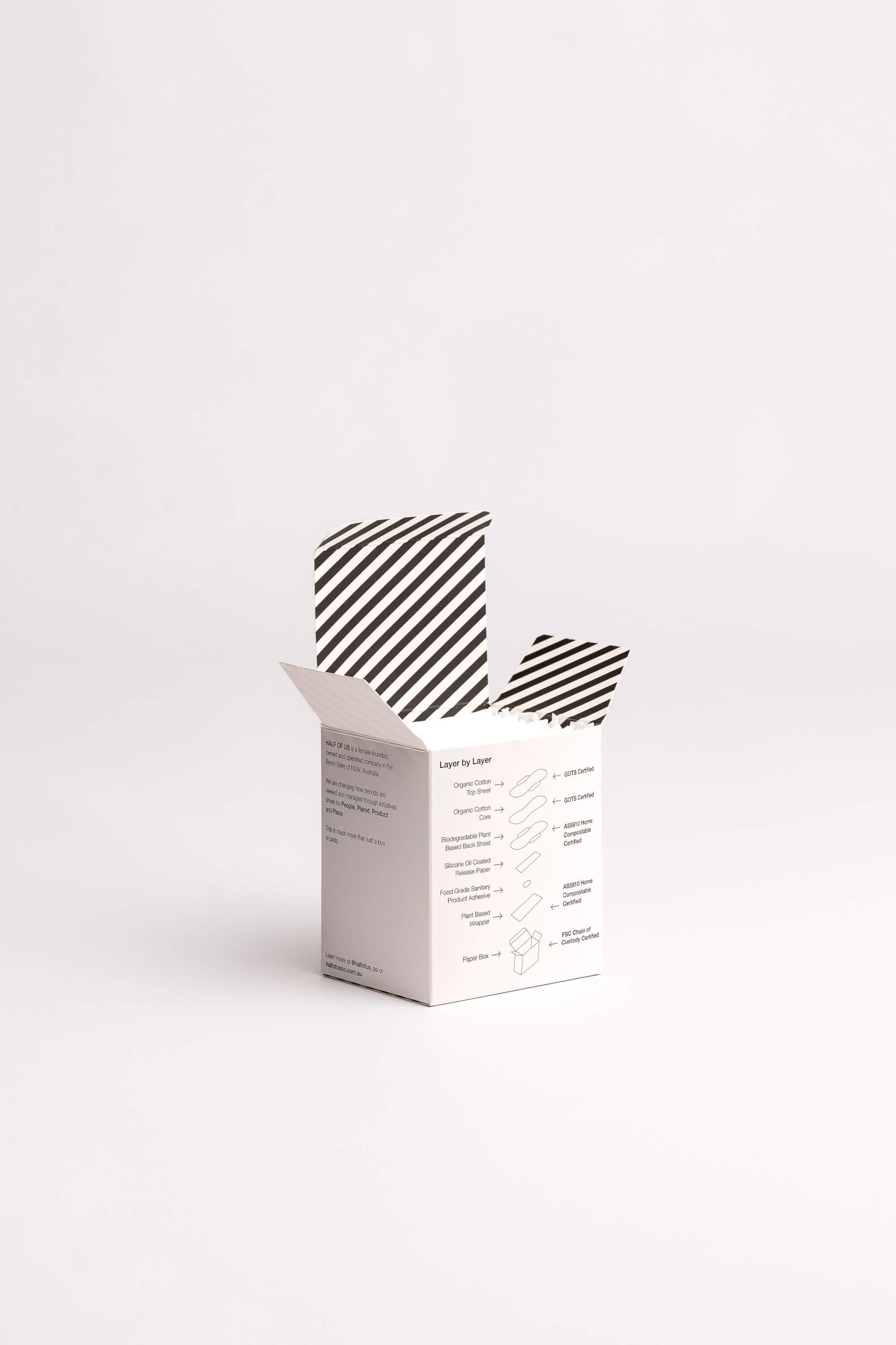
  • HOU was built from a single strategic conviction: periods deserve the same design care we apply to everything else we value. Good design is key to our well-being, inspiring and elevating us - periods are often when half of us feel our worst, which makes this an imperative time to feel uplifted. The visual identity is considered and unashamedly bold - a deliberate contrast to the pastel, female silhouette clichés of the category. Naming, typography, colour-palette and tone-of-voice were developed as a unified system. The result - an identity that feels closer to a wellness brand than a hygiene product - precisely the point.

  • The Half of Us brand identity is demonstrating measurable impact within its first year of trading. Customer feedback is fast and strongly driven by values alignment and reinforced by a product that outperforms. Wholesale interest from health and wellness retailers signals the brand's credibility beyond direct-to-consumer channels. Excitedly, corporate interest from offices, hotels and hospitality is strong, leading to a change in societal perspective, reducing social stigma. The brand carries a profit donation model, positioning focus on domestic violence survivor support and education, reinforcing brand interaction as an act of collective good through raising women up.

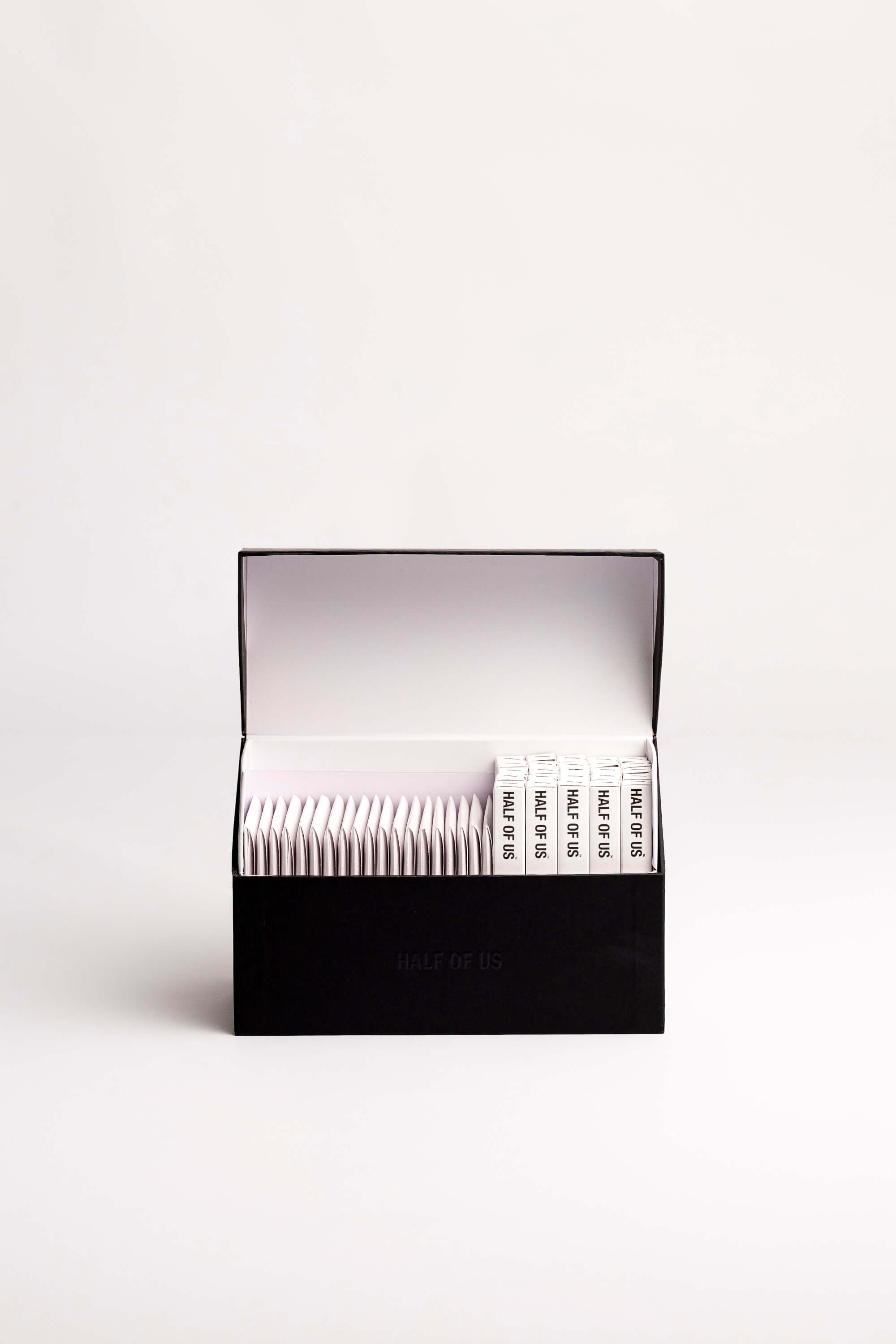
  • - Brand name and identity rooted in inclusivity - 'Half os Us' centres the experience of everyone who menstruates, framing the brand as a collective rather than a product. - Tone of voice designed to actively de-stigmatise; direct, warm, and shame-free across all touch points - packing, website, social media. - Visual identity deliberately positioned at the intersection of wellness and self-care, breaking category conventions of clinical white, garish pink and euphemistic messaging. - Packing is designed for visibility, not concealment - intended to sit on a bathroom shelf as an object of print and beauty rather than be hidden away. - 50% profit donation to domestic violence survivors is woven into the brand storytelling, not treated as a footnote - giving every customer a meaningful reason to engage beyond the product. - Australian-owned, female-founded brand story authentically across identity, providing genuine differentiation in a category dominated by offshore corporations. - Brand language and visual systems designed for scalability across product packaging, digital, wholesale, and corporate contexts without losing warmth or coherence. - Customer feedback 10th May 2026: "Just wanted to comment on your ingenuity when it came to making your products. They genuinely solve a real problem and are incredibly affordable. Thank you for everything." Sarah Taylor, WA