ohGiGi®️ Oral Care Packaging System

good-design-award_winner_rgb_blk_logo
  • 2026

  • Communication
    Print and Packaging

Commissioned By:

ohGiGi®

Designed In:

Australia

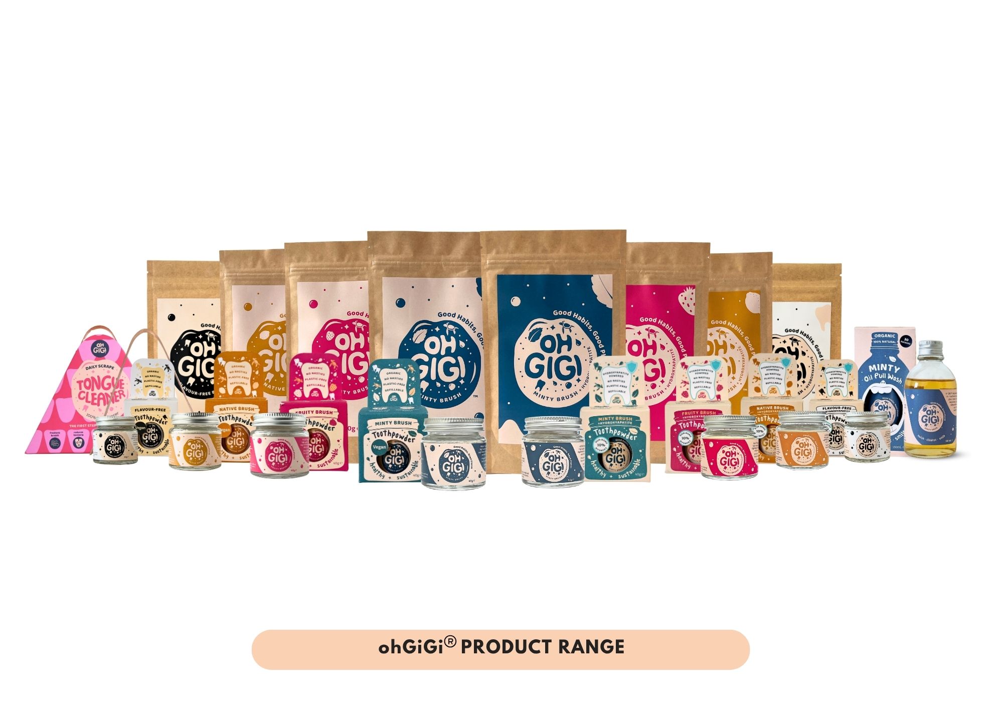
ohGiGi® Oral Care Packaging System reimagines everyday oral care rituals through bold structural forms, educational storytelling and emotionally engaging design. Designed for conscious consumers, the system spans Toothpowders, Oil Pulls and Tongue Cleaners, balancing shelf impact, functionality and material-conscious packaging while challenging conventional oral care packaging language.
view website
Buy online

2.jpg
3.jpg
4.jpg
5.jpg
6.jpg
7.jpg
8.jpg
9.jpg
  • CHALLENGE
  • SOLUTION
  • IMPACT
  • MORE
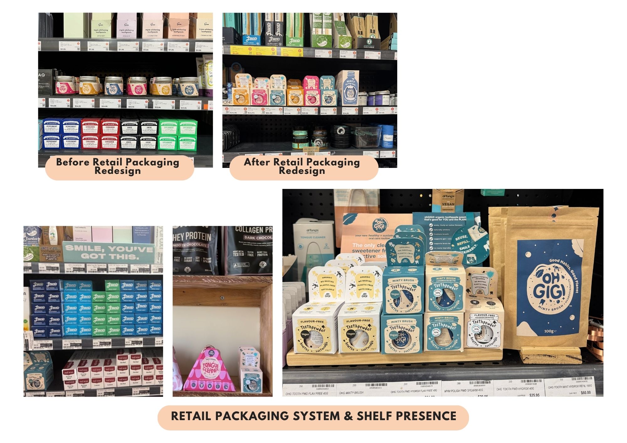
  • The project set out to challenge conventional oral care packaging, which often conceals the product, through distinctive forms and intuitive communication that make unfamiliar oral care products feel more approachable and visible. The small, refillable Toothpowder glass jar risked being overlooked beside vertically oriented toothpaste cartons dominating shelf height. The packaging therefore needed stronger visibility within the category. The Oil Pull product, a lesser-known oral care product required clear visual communication while the Tongue Cleaner presented an irregular form often packaged in generic cartons or plastic formats. Across the range, the system created a cohesive alternative to standard packaging conventions.

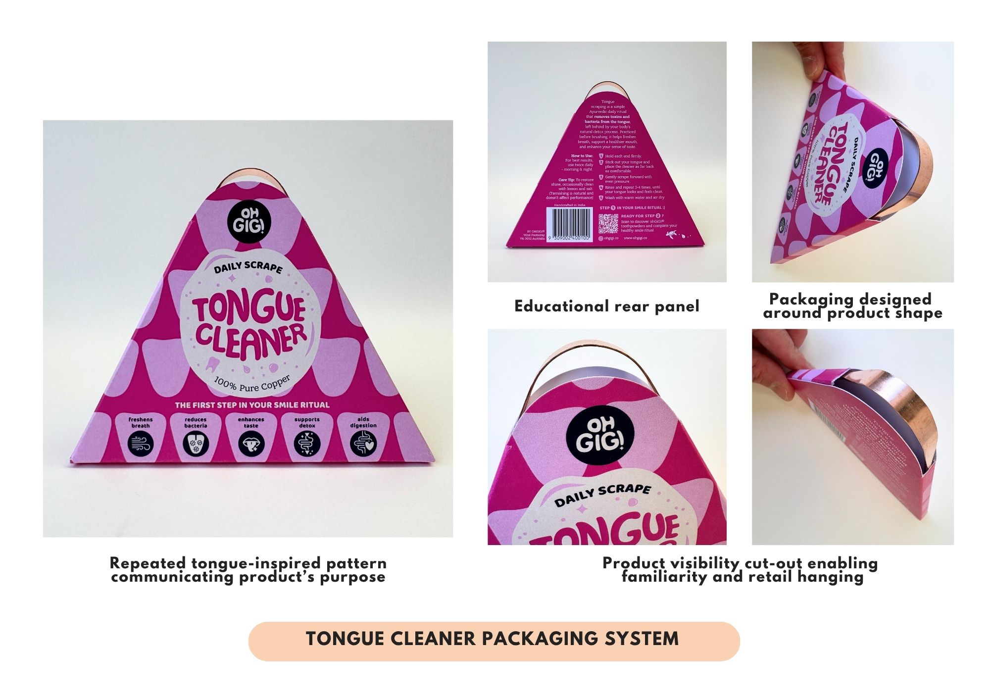
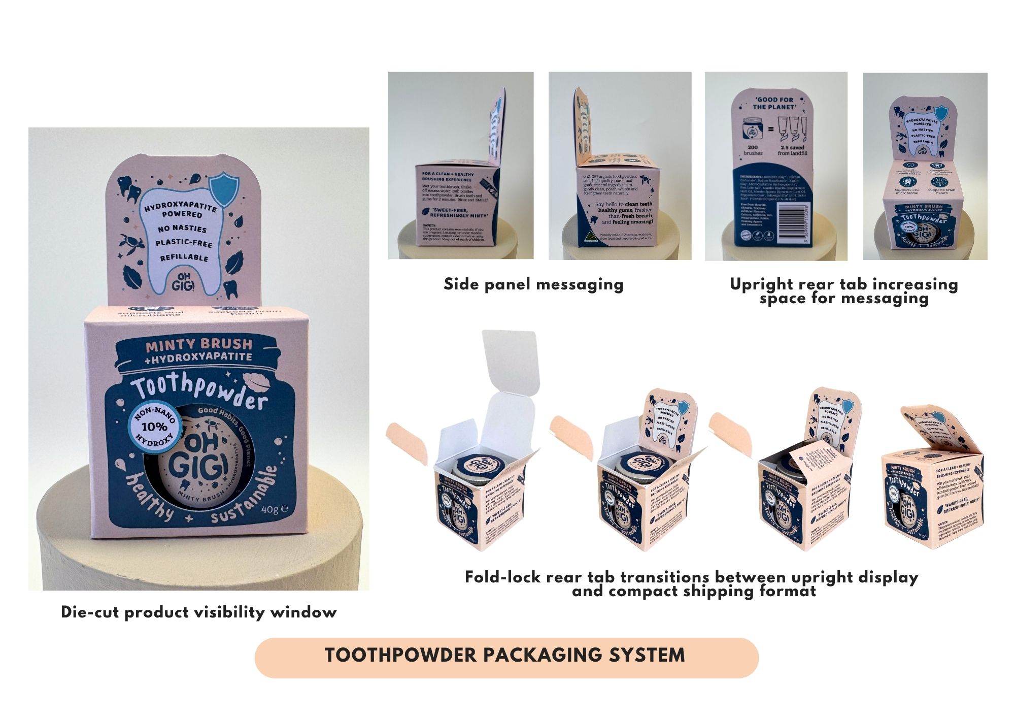
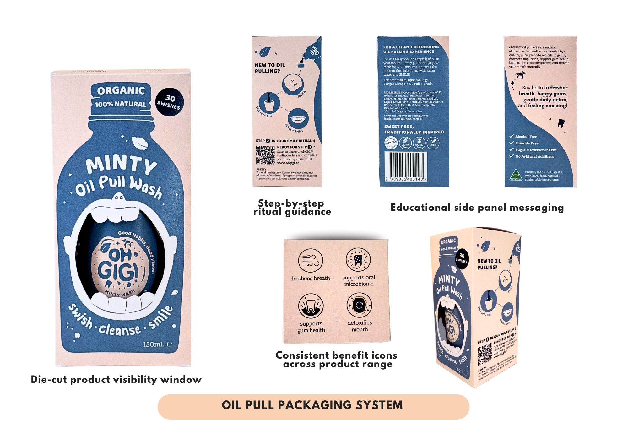
  • The packaging system uses structural design and cut-out forms as communication tools to improve product visibility, comprehension and shelf recognition across the range. For the Toothpowder, an upright rear tab increases vertical shelf presence while creating space for education and storytelling without increasing the primary footprint. The Oil Pull packaging introduces a mouth-shaped cut-out window that visually references the oral care ritual while establishing consistency across the product family. For the Tongue Cleaner, a custom structural format responds directly to the object’s shape, reducing unnecessary material use and improving product visibility. Together, the system balances functionality, sustainability and consumer engagement.

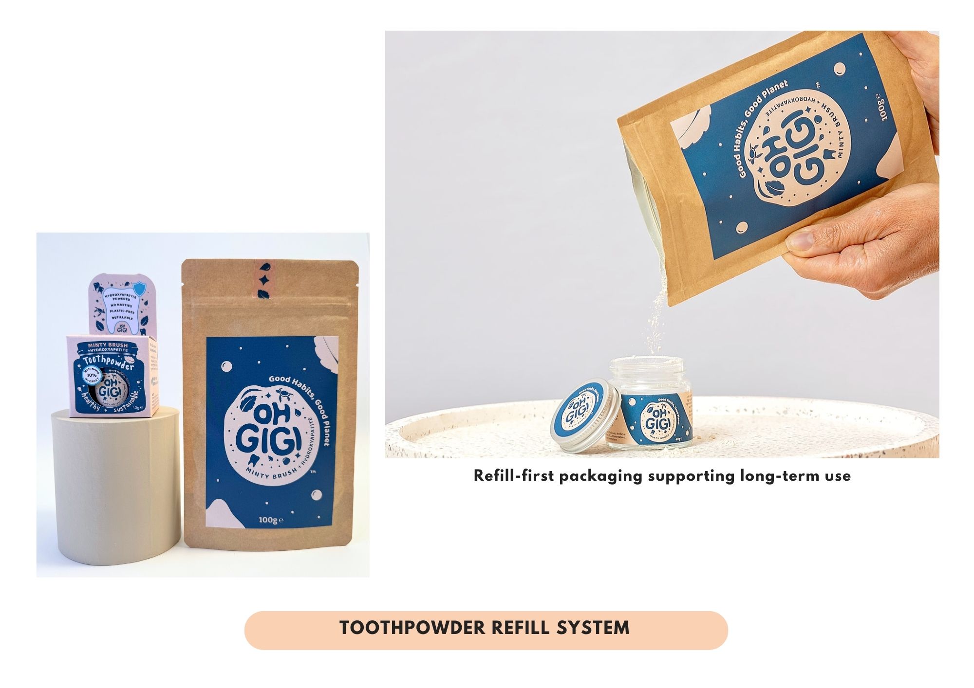
  • The packaging system repositions oral care as a more thoughtful and design-conscious daily ritual. Commercially, the structural forms create strong shelf recognition and differentiation within a crowded oral care market. Environmentally, the range prioritises recyclable materials including glass, paper labels, and cardstock packaging while avoiding unnecessary plastic and excess packaging volume. Societally, the packaging encourages consumers to engage more intentionally with everyday oral health routines and healthy habits through tactile, refillable and visually approachable products. The project demonstrates how packaging and communication design can support sustainability goals, educational storytelling and elevated consumer experience while challenging conventional oral care packaging norms.

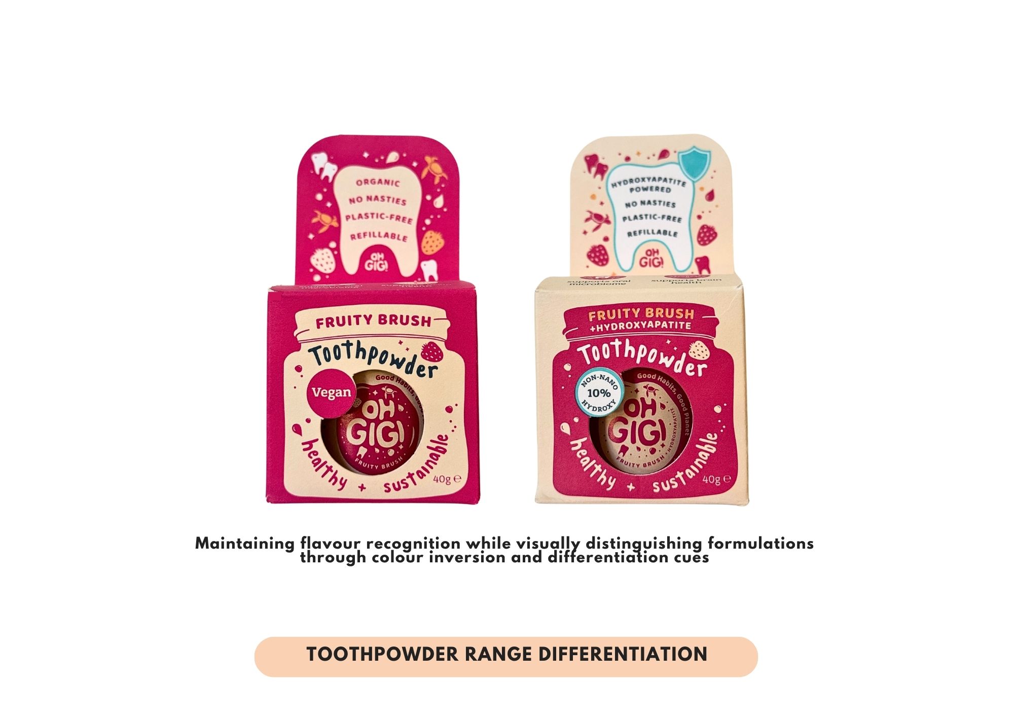
  • The packaging system combines structural innovation, bold colour palettes, playful forms and educational communication to create a cohesive oral care experience across multiple product formats. Across the range, cut-out forms, object-responsive structures and expressive illustrations create a more emotionally engaging consumer experience, establishing a recurring recognisable visual language across the ohGiGi®️ packaging system to improve product visibility, consumer understanding and shelf recognition.The Toothpowder box features a distinctive fold-lock rear tab designed to increase shelf presence for the small refillable glass jar while transitioning between upright retail display and compact shipping configurations. The structural extension creates additional communication space and increases the product’s visibility beside taller conventional toothpaste cartons. The Oil Pull packaging incorporates a mouth-shaped die-cut window that visually references the oral care ritual while helping consumers quickly understand the product category. The Tongue Cleaner packaging is designed around the object itself rather than a generic rectangular carton, reducing unnecessary material usage. A repeated tongue-inspired pattern subtly communicates the product’s purpose, while the open upper section partially reveals the product to improve familiarity and customer understanding, while also functioning as a hanging retail display.Refillable sachets, recyclable glass, paper labels and cardstock materials support the brand’s low-impact packaging approach.