NextSense

good-design-award_winner_rgb_blk_logo
  • 2022

  • Communication
    Branding and Identity

Designed By:

Commissioned By:

RIDBC

Designed In:

Australia

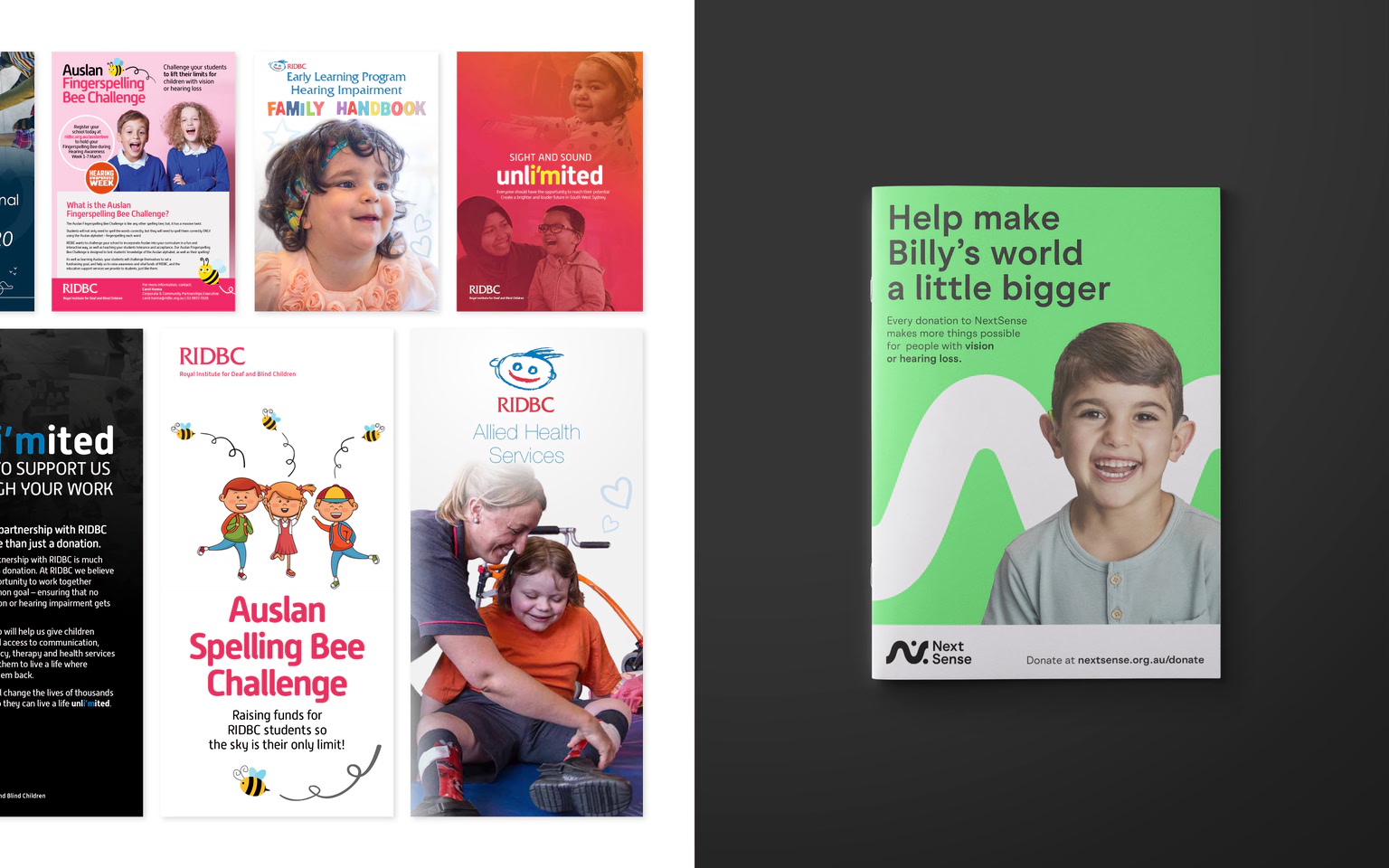
Since 1860, the Royal Institute for Deaf and Blind Children (RIDBC) has been providing not-for-profit services for people with vision or hearing loss. But the existing brand wasn’t speaking to those who needed it most. So we created one that puts people first, designed for the next 160 years.

view website
view facebook
view twitter

  • CHALLENGE
  • SOLUTION
  • IMPACT
  • MORE
  • In Australia, one in six people will experience hearing loss. And four in every 10,000 children are born with severe vision loss. How can we make the world a more inclusive place for them? The Royal Institute for Deaf and Blind Children had been providing services for people with vision or hearing loss—including its specialist schools, the Sydney Cochlear Implant Centre, and their higher education institute The Renwick Centre—for over 160 years. In order to unite its services under a new Masterbrand it needed an identity that could speak directly to the people who needed it most.

  • NextSense is a brand that speaks the language of the senses. With a name that’s more inclusive. A logo you can see, hear, touch and sign. Dots and waves to represent braille and sound. And Next Sans, their custom-made typeface designed for the best possible legibility. The entire brand was built from the ground up around inclusive design principles that were chosen to make the brand as accessible as possible. NextSense is a brand that’s made for everyone in the organisation, from children to adults, researchers, professionals, post-graduates and volunteers—all around Australia.

  • NextSense represents a unifying of RIDBC, the Sydney Cochlear Implant Centre, and the Renwick Centre (for research, innovation, and higher education). It's now easier for those diverse audiences to get what they need, right across Australia. And by shifting from a collection of disparate services to an innovative, united organisation under a single brand, NextSense can solidify its position as a category leader. It’s not only equipped to better advocate for issues around hearing and vision loss, but also retain and attract the best minds in their fields.

  • The NextSense brand speaks the language of the senses. There are a few extra features that help the brand express itself in different ways, for different audiences. The new name brings together two words to tell an inclusive story. ‘Next’ is for innovation, breaking down barriers and helping people achieve whatever’s next. ‘Sense’ includes both vision and hearing, while capturing the empathy and understanding the NFP shows every day. The logo represents hearing with a soundwave and vision with dots inspired by braille—both coming together to form an abstract ‘N’. The deliberately simple mark was designed to be printed into an embossed, tactile version for the blind community. And it was translated into its very own unique gesture in Australian Sign Language. We partnered with the font foundry Family Type, who already had a highly accessible font which we then worked with them to further enhance and refine to create —literally down to how we dot our i's and cross our t’s. Backed by research into what makes a font accessible and legible, it’s more easily read by people who have vision loss. And importantly, it’s still friendly and approachable.