The Prince Akatoki

good-design-award_gold-winner_rgb_blk_logo
  • 2021

  • Communication
    Branding and Identity

Designed By:

Designed In:

Australia

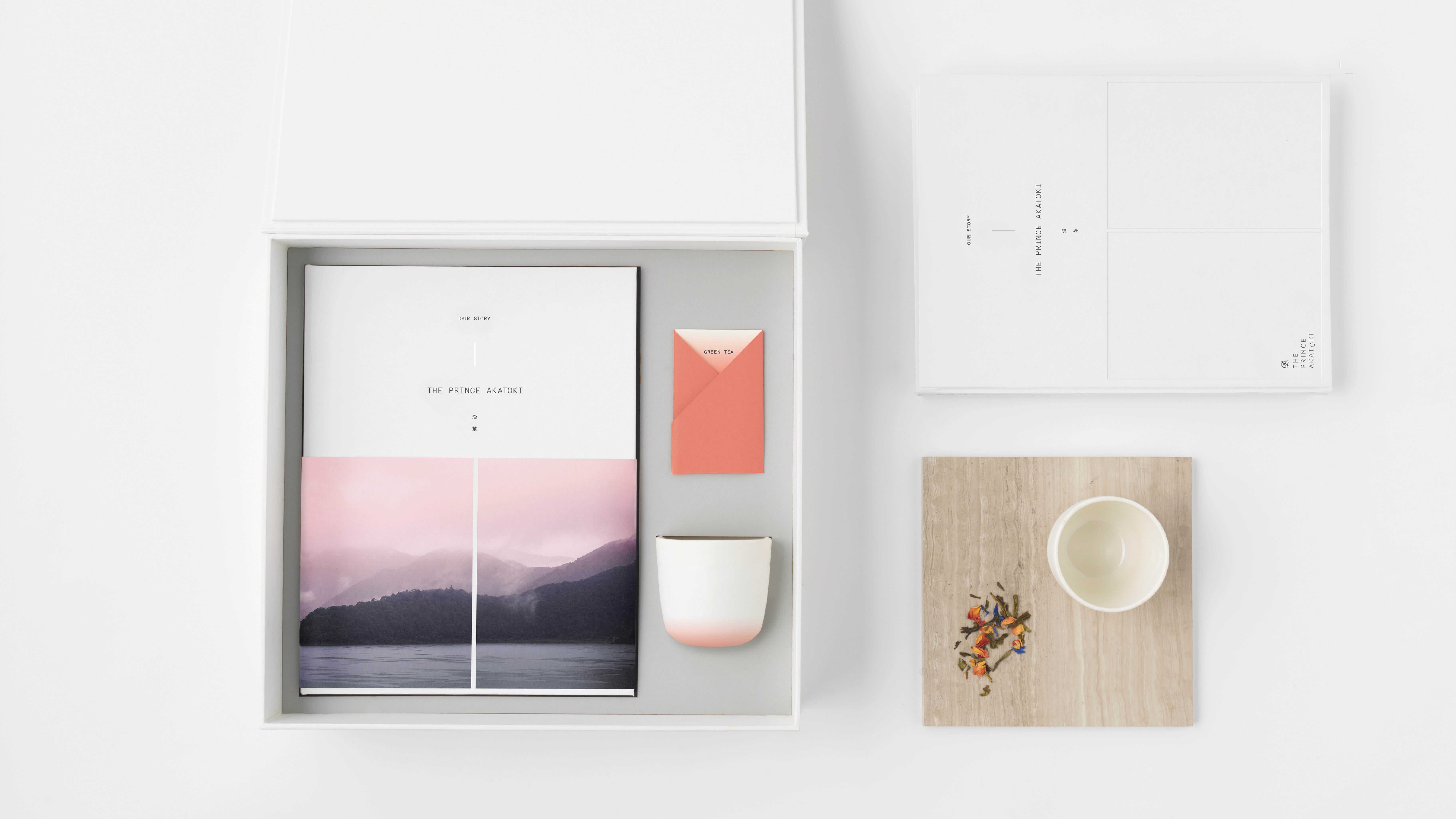
Japan’s Prince Hotel Group in partnership with Staywell Group wanted to take their unique style of hospitality beyond Japan. It needed a new brand, taking the best of Japan—service, sophistication, mindfulness—and making it truly international.

Introducing The Prince Akatoki, a 5-star luxury hotel experience that embodies Poetry at Dawn.

view website
view facebook
view twitter

Image: Illustration — Matt Murphy
Image: Illustration — Jeremy Lord
Image: Illustration — Matt Murphy
Image: Photography — Nick Bowers; Illustration — Jeremy Lord
Image: Photography — Nick Bowers
  • CHALLENGE
  • SOLUTION
  • IMPACT
  • MORE
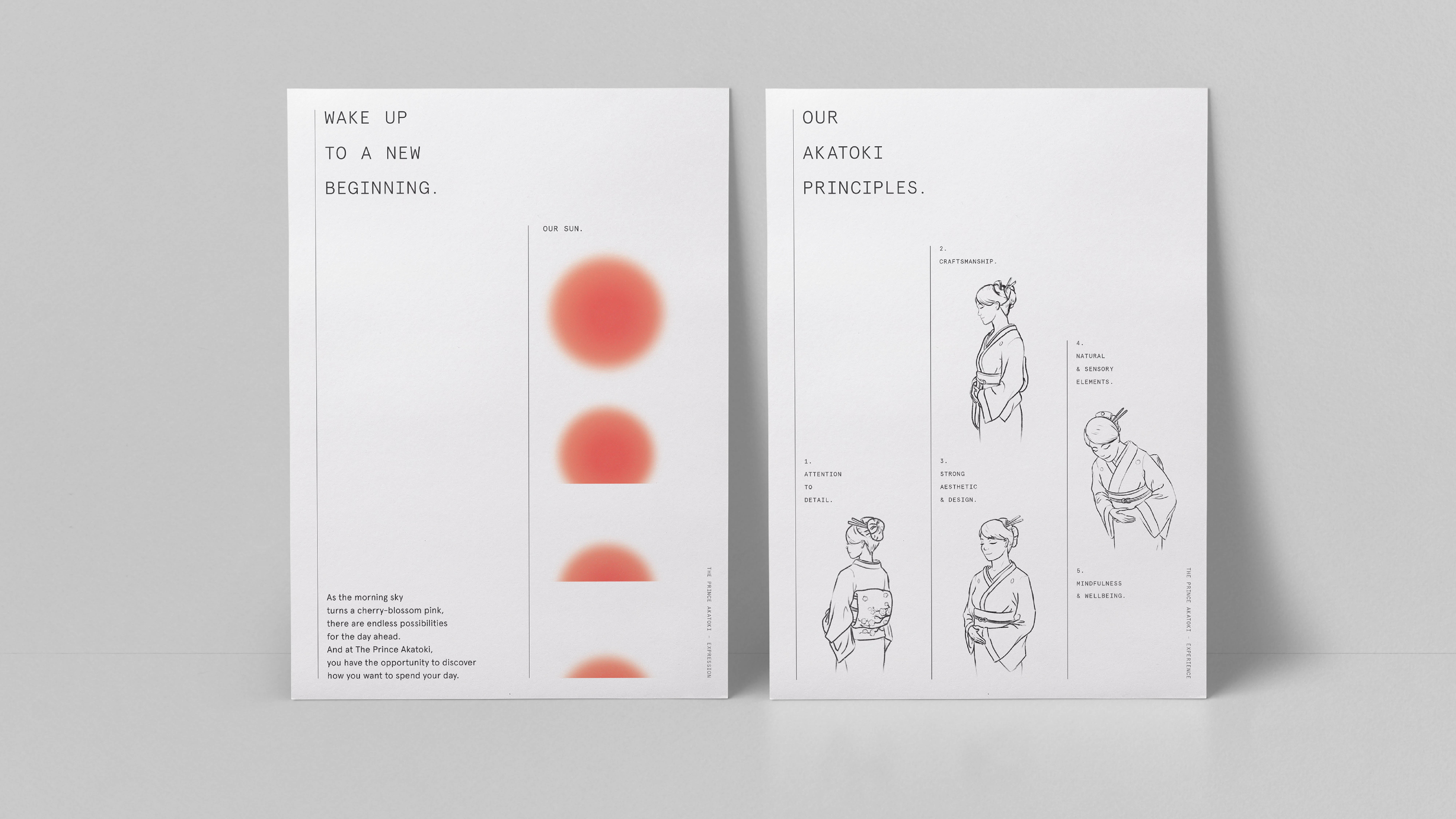
  • The Prince Hotel Group are experts in luxury Japanese hospitality. But when they partnered with Staywell Group to create a brand that took a uniquely Japanese experience and make it feel at home anywhere in the world, they came to us. Aimed at high-end travellers looking to escape the chaos of modern life, the Prince Akatoki is where every touchpoint leaves guests feeling enriched and reinvigorated. We had to build the brand from the ground up. So, we started at the beginning. And the beginning of every day-and the mindfulness, tranquillity and poetry that dawn inspires-was our guiding idea.

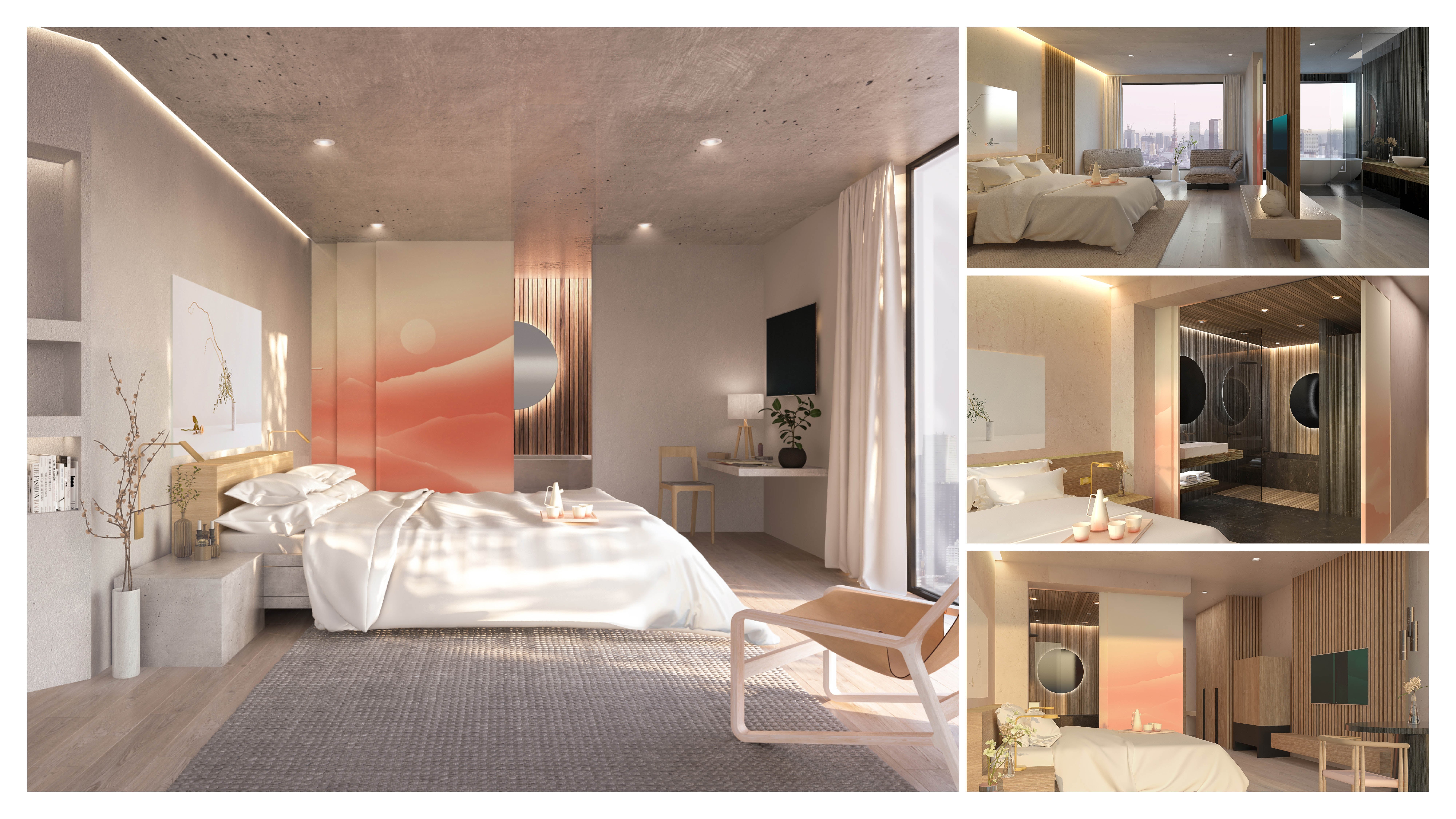
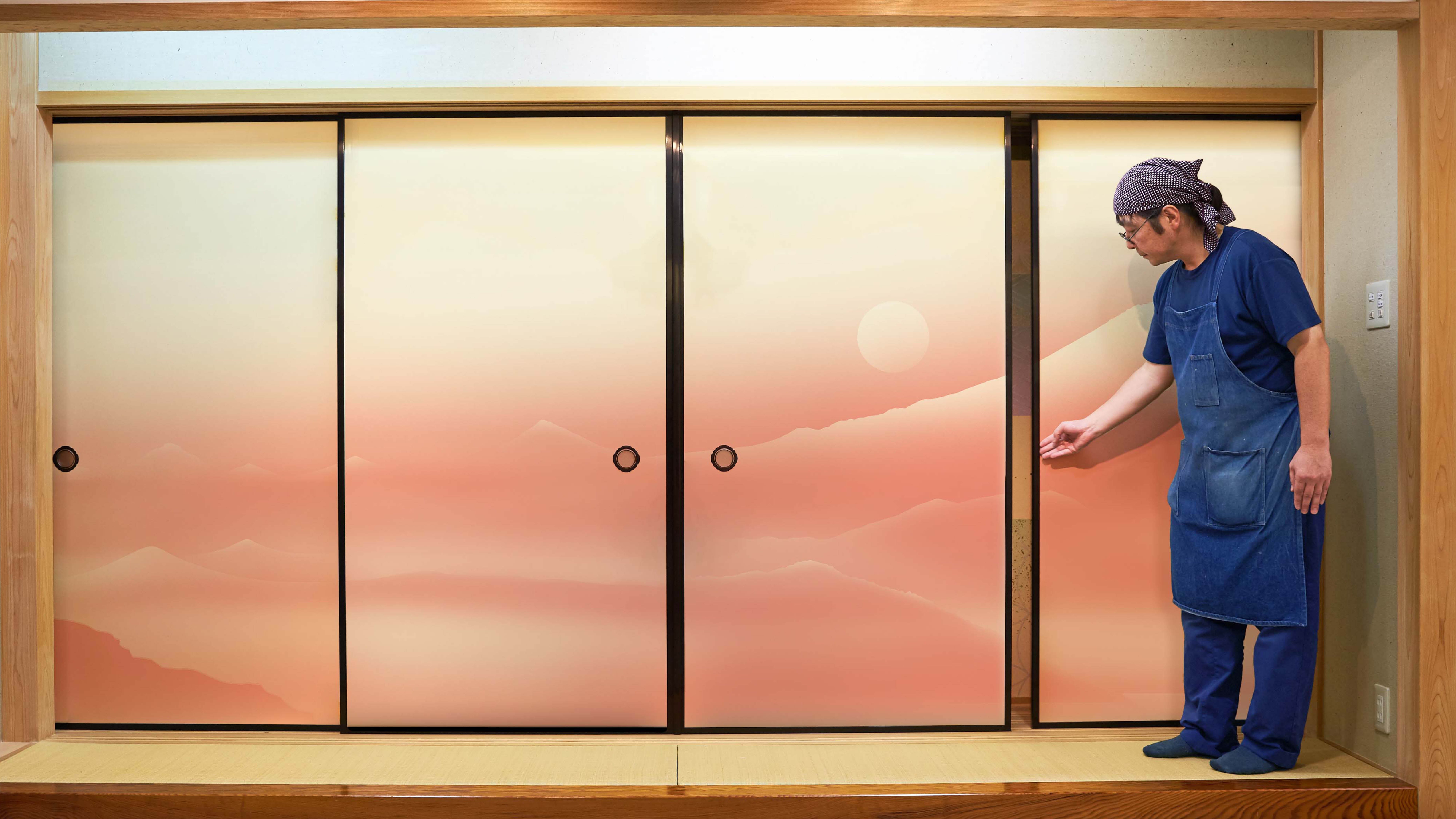
  • Poetry at dawn. It captures the colours and language that bring the experience to life; the sights and smells that intrigue our senses, and the moments that leave us calm, tranquil and enriched. The brand embodies the feeling of optimism, vitality and possibility that come with the start of a new day, perfect for the high-end traveller to immerse themselves in Japanese luxury. The name Akatoki means dawn. The logo evokes a rising sun. The fusuma panel design system-based on traditional, beautifully decorated sliding doors-open up to transform a space and invite you to discover something new.

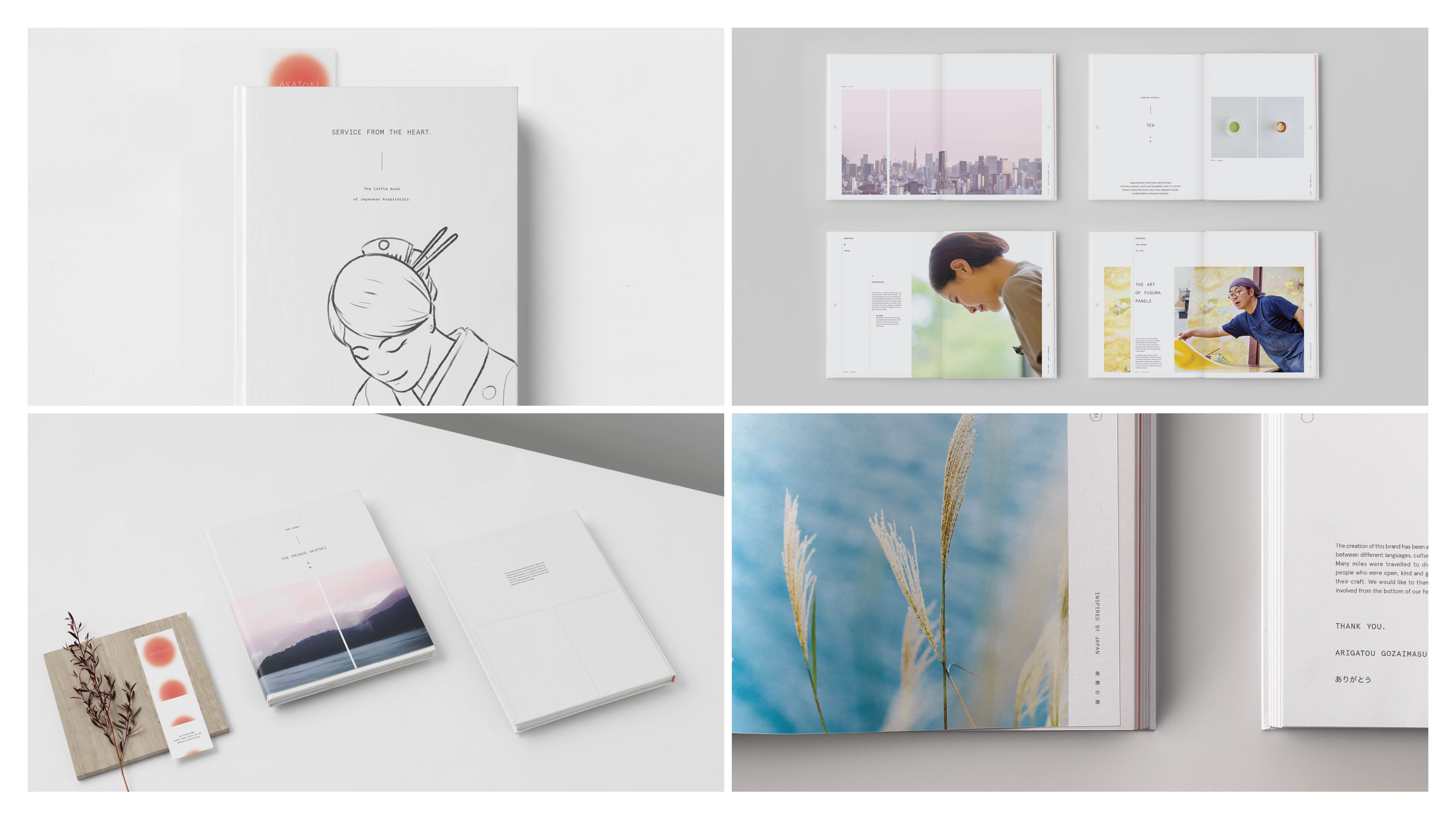
  • The target audience for The Prince Akatoki is affluent international travellers. We created a brand book and other marketing materials to helped create targeted potential investors. Considering the luxuriousness of the hotels, as well as the level of investment required, all collateral was of the highest quality. The 100-page brand books, for instance, each cost upwards of $AU4,000. There are currently two Prince Akatoki hotels: one in London's upmarket Marylebone district and another on Guangzhou International Biotech Island. Future plans are to build 25 new hotels with at least 300 rooms in major gateway cities-Sydney, Paris, and New York.

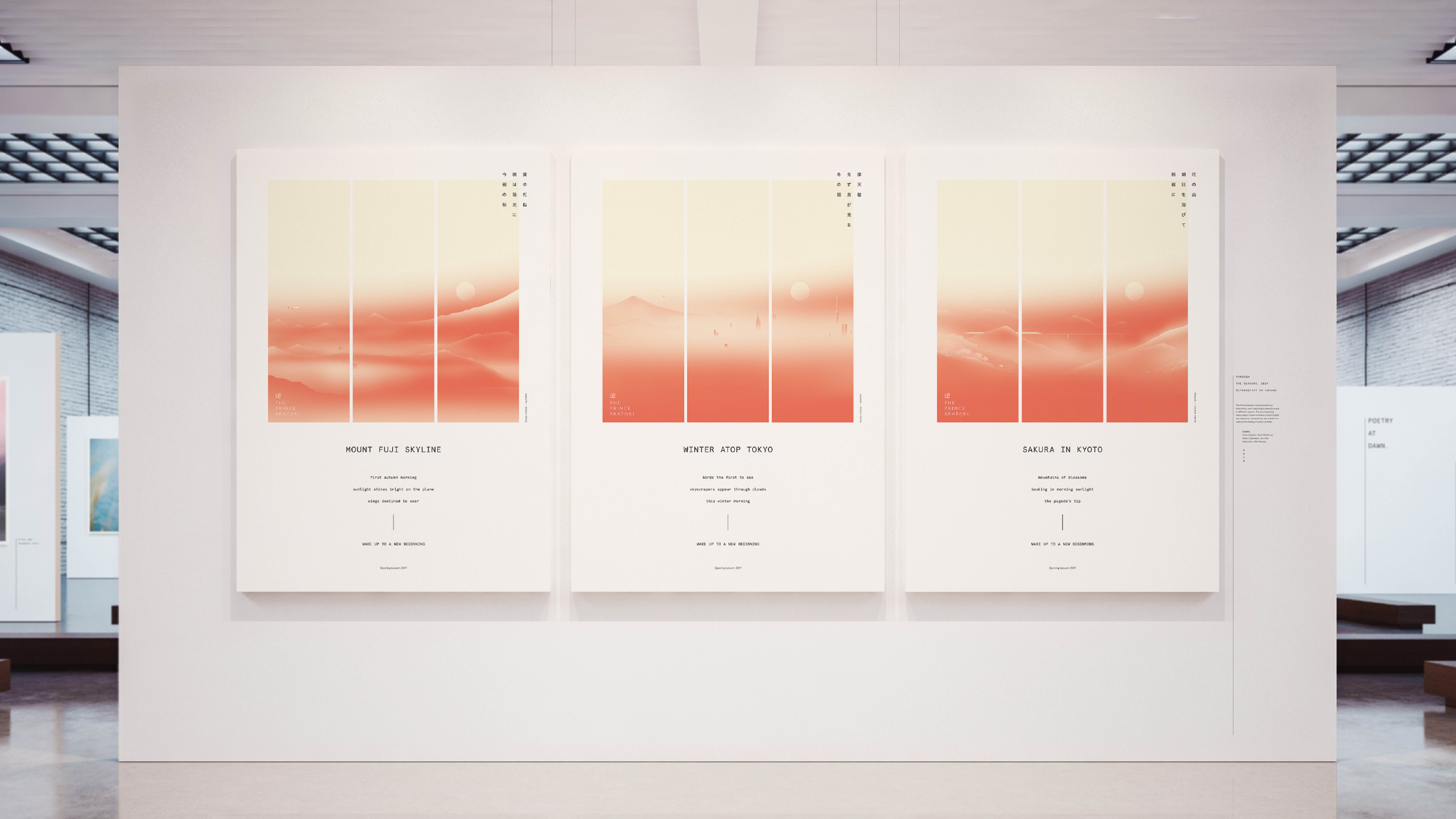
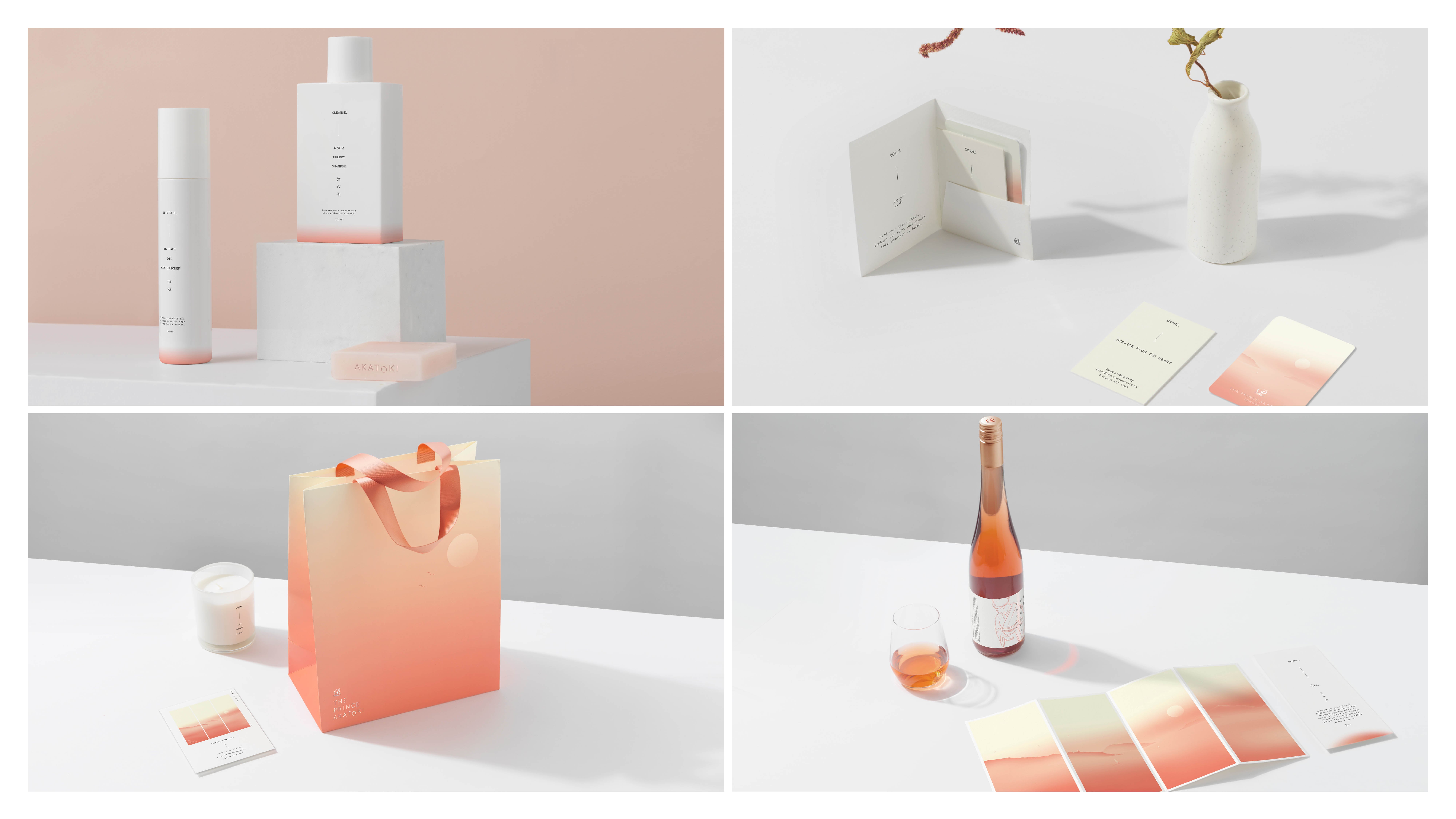
  • Naming: 'Akatoki' is an ancient Japanese word for dawn. It also describes the pink hues of sunrise-the colours at the brand's heart. Logo: Akatoki's logo evokes a rising sun that has long been the symbol for Japan. The horizon line alludes to possibilities ahead. And its minimal aesthetic uses a uniquely Japanese style of sophistication. Illustrations: The brand's illustrations were inspired by the Japanese art of fusuma panels. A modern take on an ancient practice, tranquil landscapes are depicted in a soft, gradient hue, evoking each of the seasons at the break of day. Haikus: Accompanying each illustration is a haiku. Composed in both English and Japanese, they were written in collaboration with two master poets, each working in their respective languages. Photo series: We also created a photo series that highlight the craftsmanship and care of Japanese design, each with an East-meets-West juxtaposition-coffee meets matcha, California sushi rolls and English roses arranged in a Japanese ikebana style. Service from the heart: Known as 'omotenashi', service from the heart anticipates guests' needs before they even know it themselves. Touchpoints were designed to bring this famous Japanese experience to the heart of the hotel.