Magic Bubble Brand Identity
-
2015
-
Communication
Branding and Identity
Designed By:
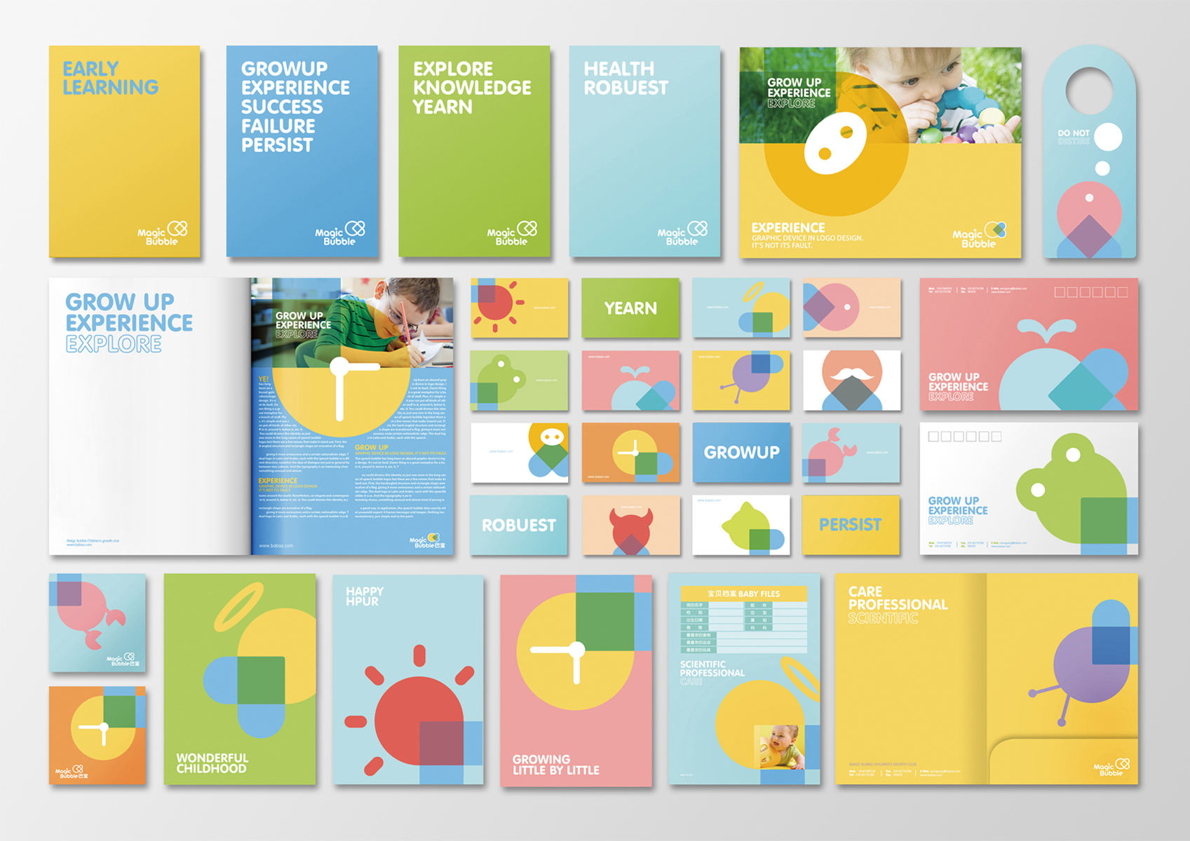
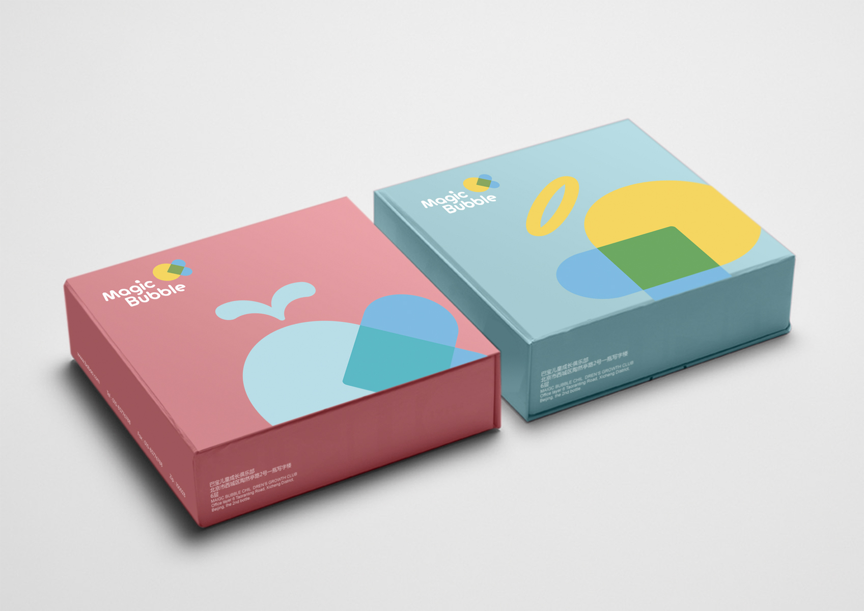
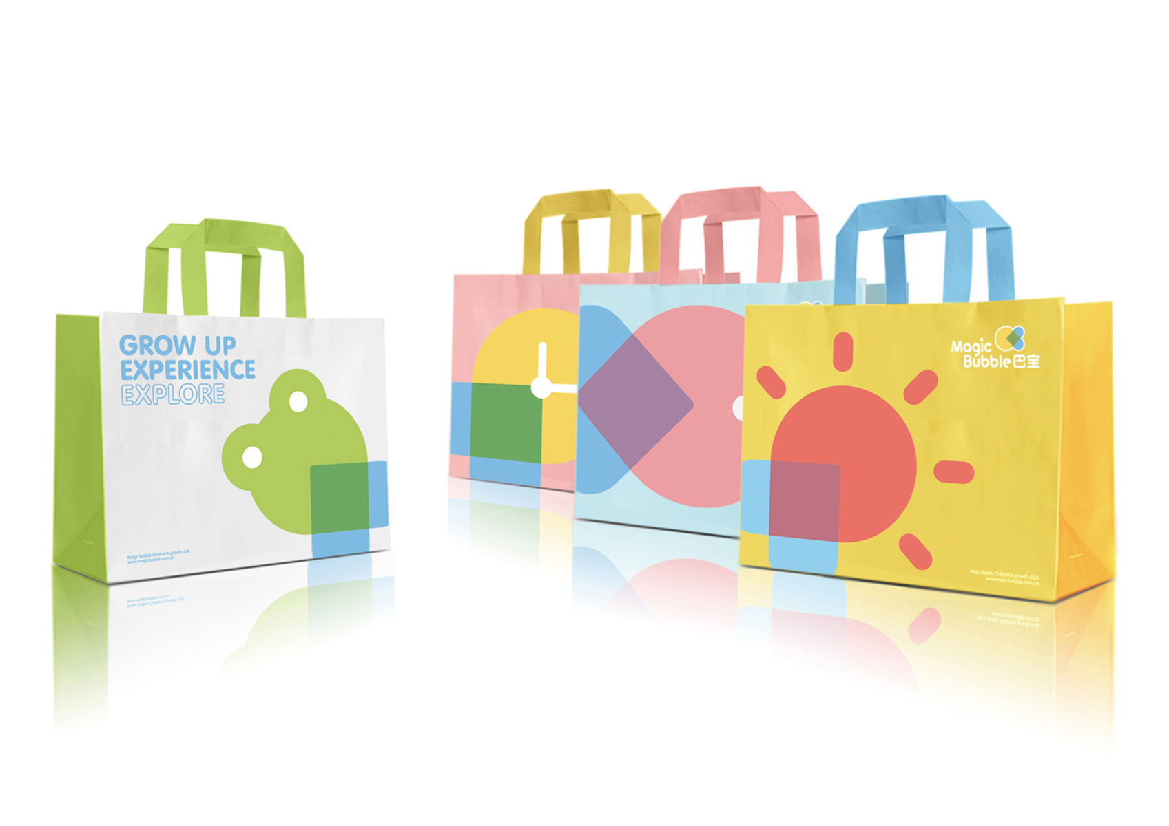
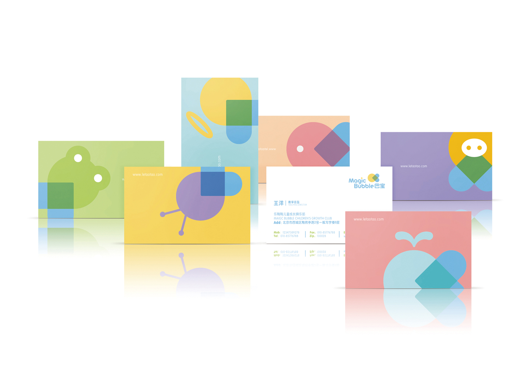
Our inspiration comes from the English name, as bubbles are associated with inspiration and wonder. Based on the core brand concept – ‘limitless imagination’ – we used the shape of a bubble and a simple heart to create the logo. Bubbles stand for inspiration, imagination and wonderful things; besides being enchanting, magical, charming, and beautiful. The heart stands for children’s curiosity, for the unknown, and for parents caring. Yellow and blue are children-favored colors. Overall, the logo reflects the brand concept, and looks fresh, modern, and imaginative.