Land Lab Brand Identity

good-design-award_winner_rgb_blk_logo
  • 2026

  • Communication
    Branding and Identity

Designed By:

Commissioned By:

Land Lab

Designed In:

Australia

Land Lab is a profit-for-purpose, evidence-based supplement brand powered by Native Australian plants. It merges 65,000 years of Indigenous knowledge with clinical science to create high-performance formulations, while pioneering an ethical, First Nations-led supply chain and improving access to prenatal nutrition for underserved Australian women.
view website

2.jpg
3.jpg
4.jpg
5.jpg
6.jpg
7.jpg
8.jpg
  • CHALLENGE
  • SOLUTION
  • IMPACT
  • MORE
  • Land Lab set out to build a brand that honours Country and Indigenous cultural knowledge while establishing a new global standard for efficacy and ethics. The challenge was to balance deep respect with commercial scalability; creating something clinically credible, culturally sensitive, and visually magnetic. It needed to avoid appropriation or tokenism, while elevating native Australian ingredients into a premium, globally competitive space. At the same time, the brand had to resonate with a modern, design-literate audience; positioning Land Lab not just as a supplement, but as a culturally defining new category of wellness.

  • We created a category-defining brand system that unites land and lab: visually, verbally, and strategically. The identity balances rich, earth-derived textures with structured, grid-based typography to reflect both nature and scientific precision. The narrative positions Land Lab as “symbiosis in supplement form,” embedding its ethical supply chain, clinical validation, and profit-for-purpose model into every touchpoint. From its brand language design right through to its packaging, the system builds trust, communicates efficacy, and elevates native ingredients into a premium, credible wellness offering; redefining expectations of both performance and responsibility in the supplement space.

  • Land Lab establishes a new benchmark for the category, proving that clinical efficacy, cultural respect, and commercial viability can coexist. The brand elevates native Australian ingredients into a globally competitive space while embedding ethical sourcing through a First Nations-led supply chain and profit-for-purpose model. It drives both consumer trust and cultural accountability, challenging industry norms around transparency and efficacy. Beyond product, Land Lab expands health access through its charity, providing free prenatals to underserved Australian women. Land Lab is a brand that delivers impact across commercial, cultural, and societal dimensions, setting a new standard for what responsible design can achieve.

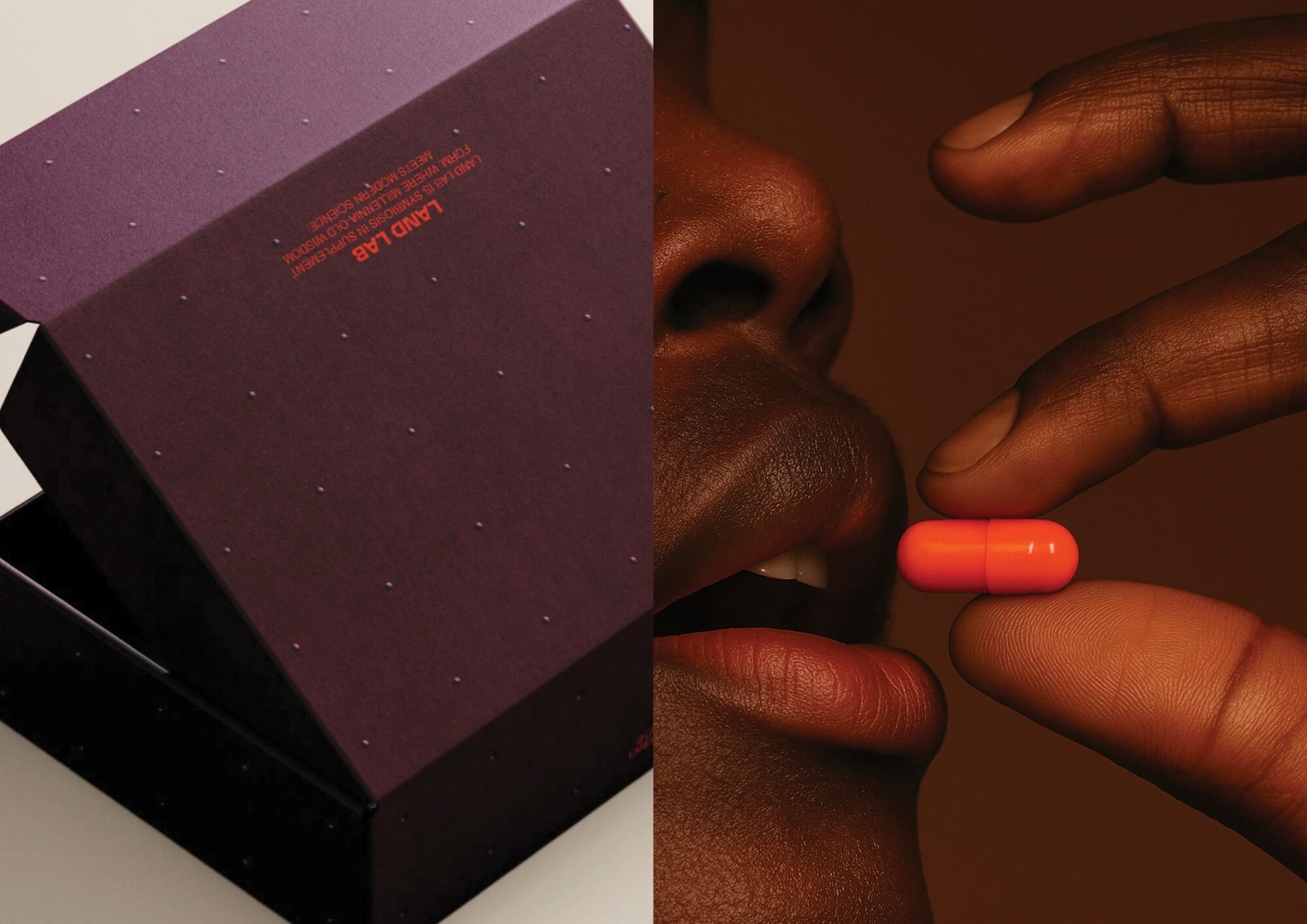
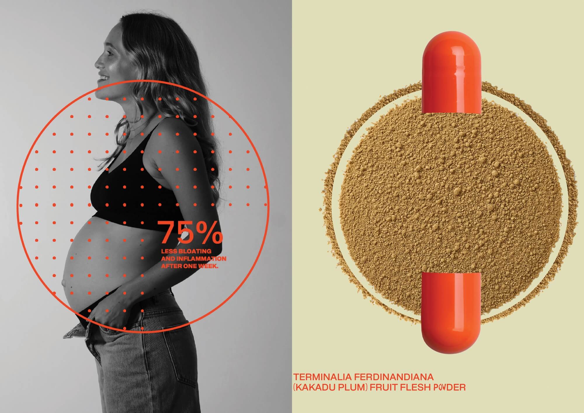
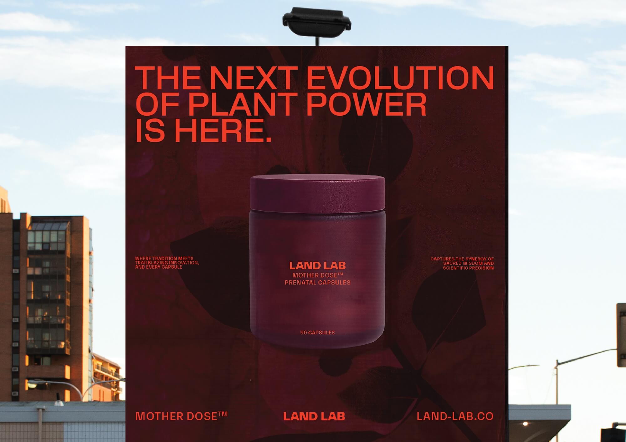
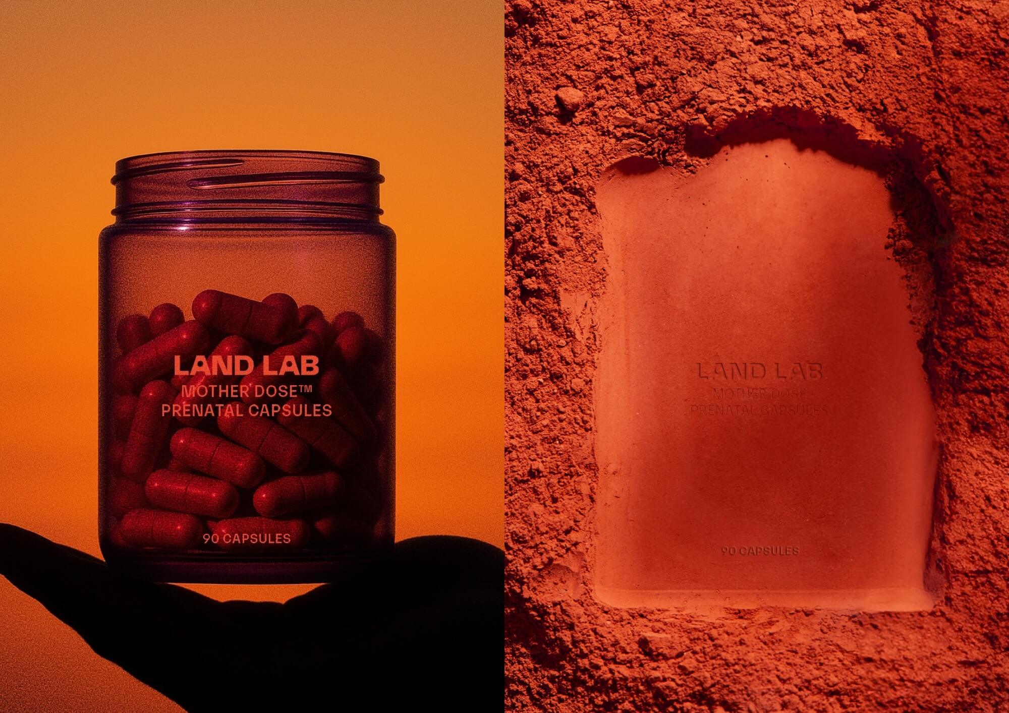
  • Land Lab’s design system is built on the concept of “land meets lab,” expressed through a deliberate tension between organic and structured elements. Rich, earth-derived textures and tones reference Country, while grid-based typography and precise layouts communicate scientific rigour.The brand world extends beyond identity into a fully realised ecosystem, with name, strategy, identity, packaging, website, campaign, socials and a myriad of other assets, all founded by Smack Bang. Brand language is intentionally calm, clinical, and progressive, rejecting wellness clichés in favour of clarity and credibility. A palette of rich, earthy tones are inspired by the land from which its ingredients are sourced. These tones, filled with texture and depth, permeate the brand to honour the land and convey its story. The logo features custom counters within the letter ‘A’s, forming circles that symbolise Land Lab’s holistic values, connecting Indigenous and scientific symbols. These counters also form a grid pattern, used as a primary brand asset. Circular motifs throughout the brand reinforce the idea of connection, between Country and research, tradition and innovation.Typography is carefully structured within grids, emphasising clean lines and reinforcing the brand’s foundation of strong scientific research.