IKU

good-design-award_winner_rgb_blk_logo
  • 2022

  • Communication
    Branding and Identity

Designed By:

Commissioned By:

IKU

Designed In:

Australia

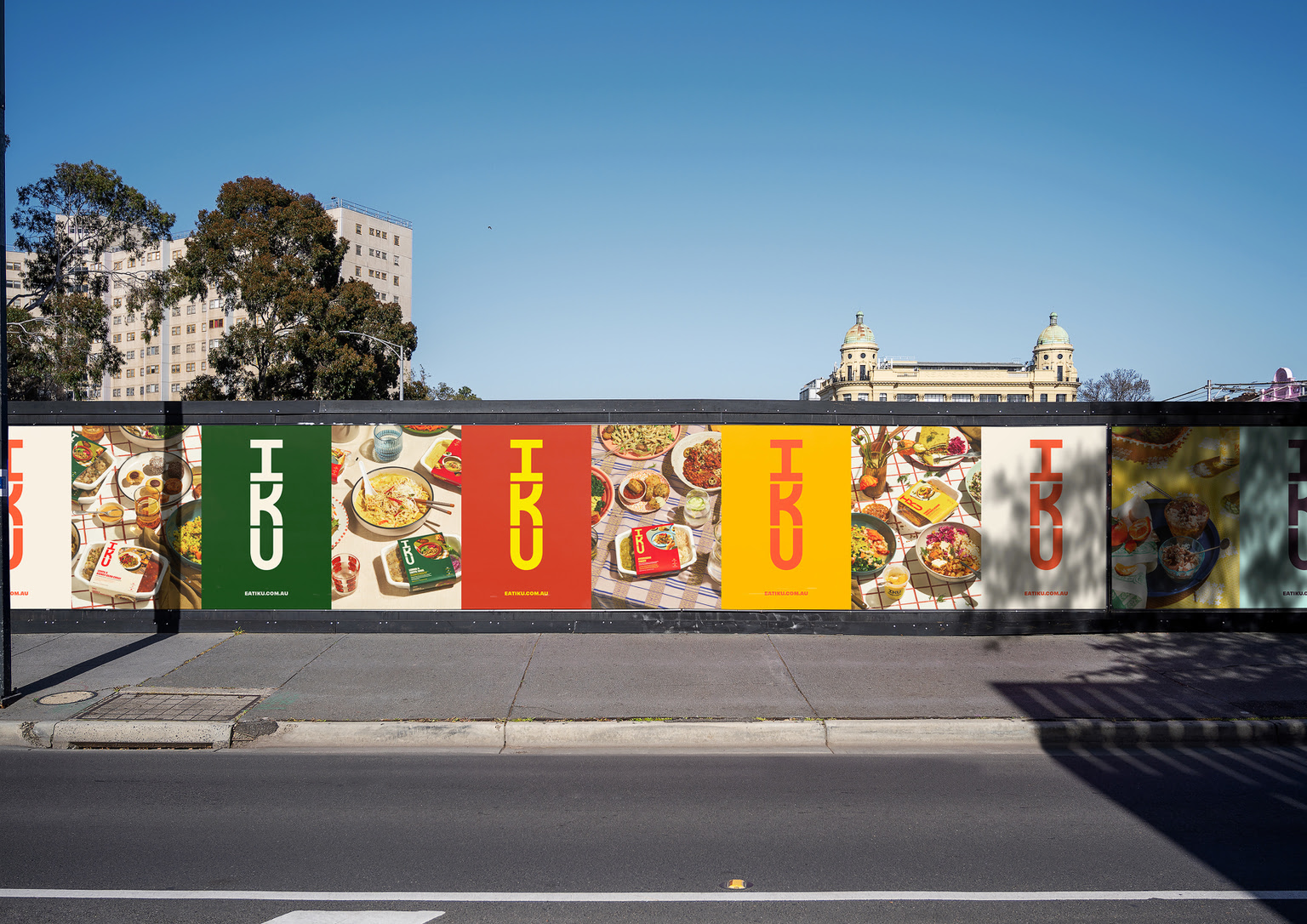
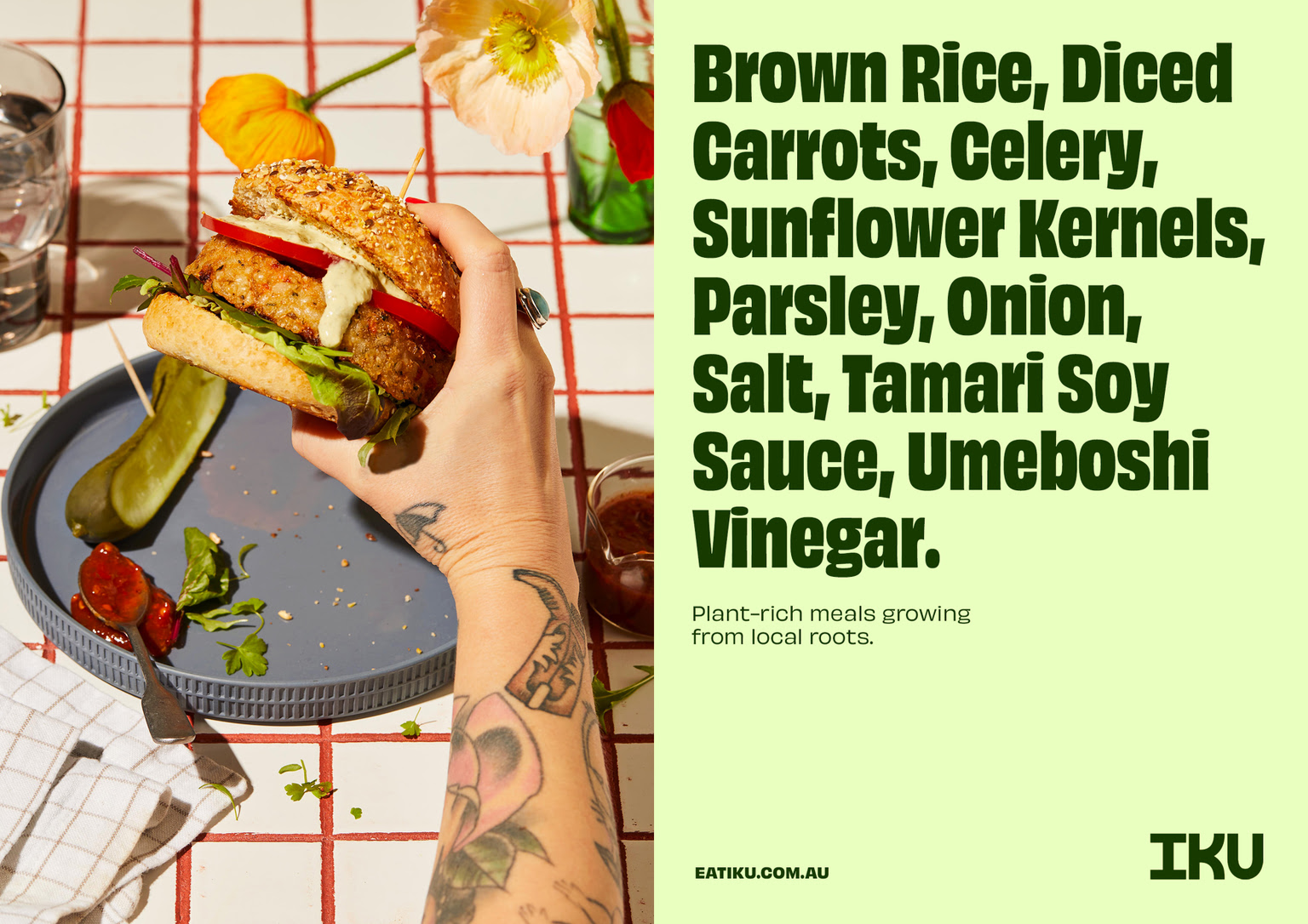
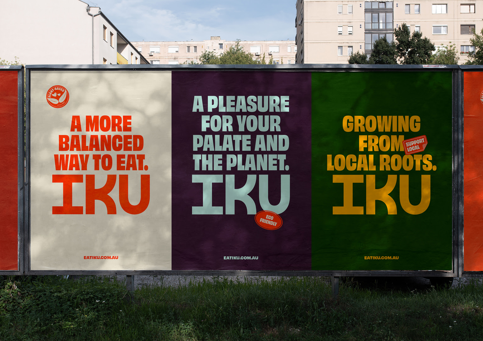
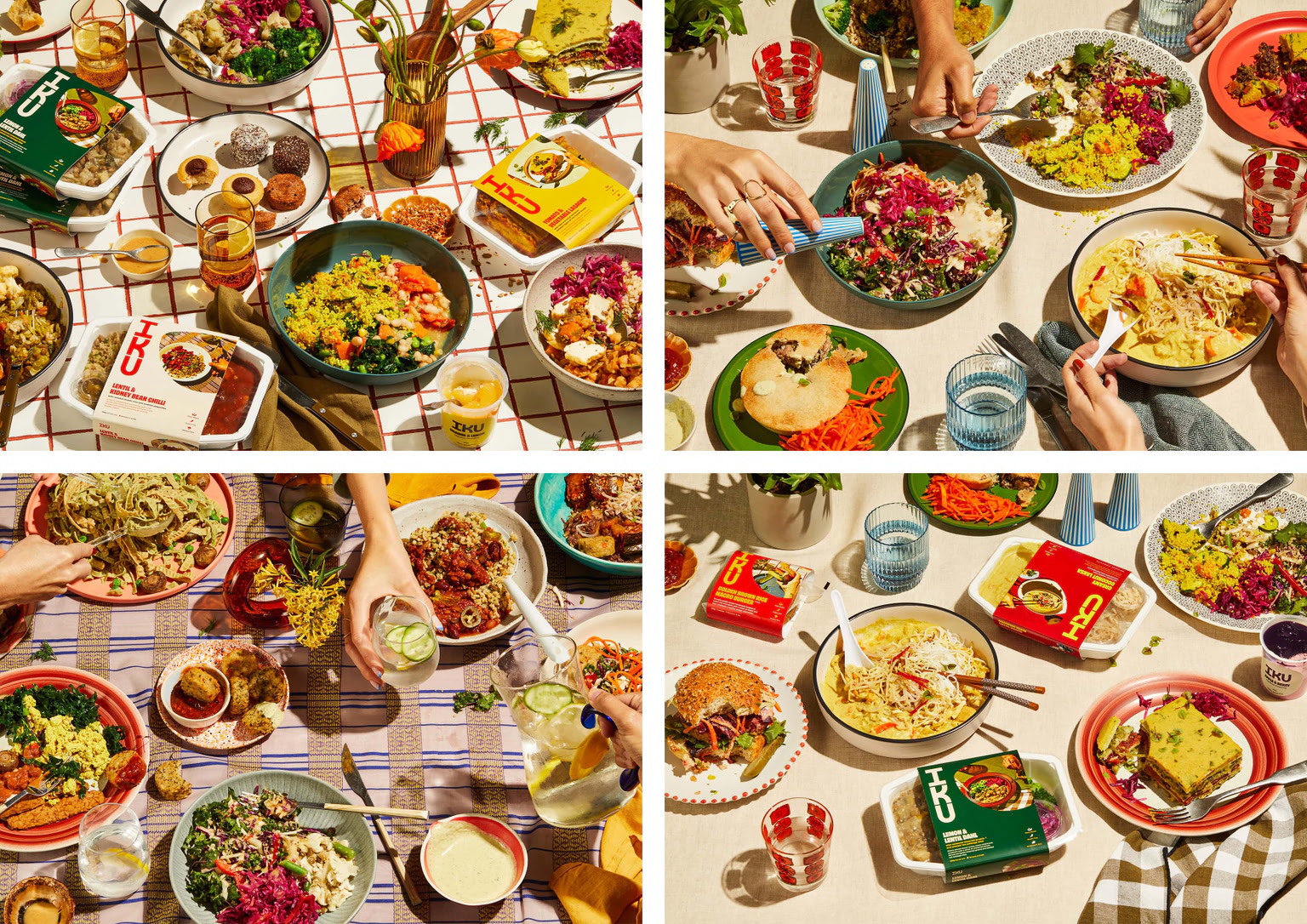
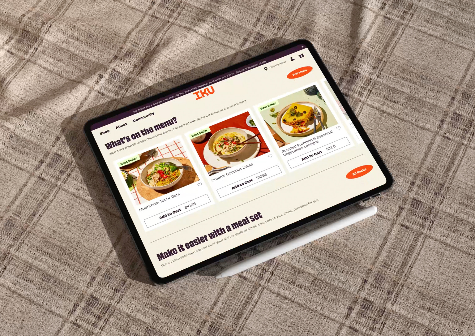
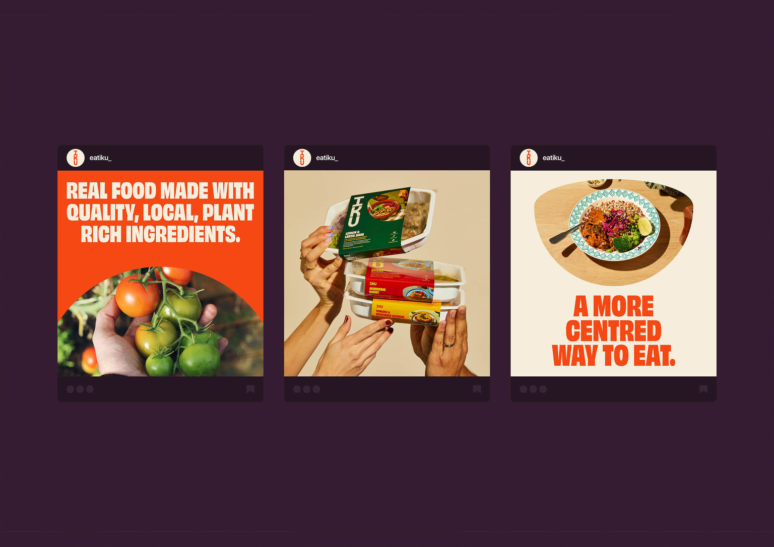
When it comes to plant-based meal delivery, there’s a monotonous swathe of earthy tones and lentils sitting in lettuce leaves. Not IKU though. The purpose of the rebrand was to create a brand identity that would set IKU apart in the DTC space while still staying true to its heritage.


view website
view facebook

  • CHALLENGE
  • SOLUTION
  • IMPACT
  • MORE
  • IKU was in need of a full rebrand that would set them apart in the direct-to-consumer space while still staying true to the roots they put down in their Sydney storefront almost 40 years ago. They wanted to be relevant to a younger audience including Millennials and Gen Z who care about their health and the environment. The rebrand needed to shift the paradigm around plant-based food. It needed to leverage the friendly, feel-good essence of the IKU brand to make healthy, plant-based ready-meals so desirable that people would go out of their way to buy them.

  • IKU’s brand identity is now as vibrant and enticing as the food they create. It’s a beautiful and inviting celebration of all the ways in which plant-based food can change our world. By channelling the past and remembering the foundations IKU was built on, we were able to create a brand for both the future of their business and the planet. The brand identity and all the key customer touchpoints - eg. the website and packaging - were developed based on the brand essence that was brought to light during the initial brand strategy phase, which is ‘Eat your world better’.

  • Research shows that switching to a plant-based diet is the single most powerful thing people can do for their health and the planet; and by avoiding the category’s obsession with easy health we were able to own the emotional high ground of how a mouthwatering meal can change the world. IKU is participating in a shift of paradigm by changing the perception around plant-based food. Since they rebranded, they have generated a lot of interest and excitement. This is a rare case scenario where the growth of a business serves the business as well as the community and the planet.

  • The visual identity speaks to something inherent to the way IKU operates - keeping things in balance. Each letter of the wordmark is perfectly balanced and sits vertically as a nod to their Japanese name. The stacked bowls reference the nutritionally-balanced meals they create, while also giving the brand a flexible visual element to be used as a graphic or image container. The colour palette and photography direction is a deliberate divergence from the muted, “natural” and green tones the audience has come to expect of plant-based brands. It feels delicious and celebrates the colours of some of IKU’s favourite ingredients. Packaging was an opportunity to use the extended colour palette to visually categorise IKU’s extensive menu, making it easy for the customer to distinguish between curries, savoury snacks, desserts etc. Ensuring the IKU story and belief in balance isn’t lost when it comes to their products, the back of each pack gives an insight into their history, while the mailer box stacks to mimic the logo.