Doritos Rainbow Limited Edition

good-design-award_winner_rgb_blk_logo
  • 2023

  • Communication
    Packaging

Commissioned By:

PepsiCo Design & Innovation

Designed In:

Mexico

Doritos Rainbow has become an annual staple of celebrating Pride. Doritos Rainbow reaffirms the commitment against any type of discrimination and promotes respect for diversity. Standing in support, the message of Doritos Rainbow also speaks against prejudice of any kind not only during the Pride Festival, but every day.
  • CHALLENGE
  • SOLUTION
  • IMPACT
  • MORE
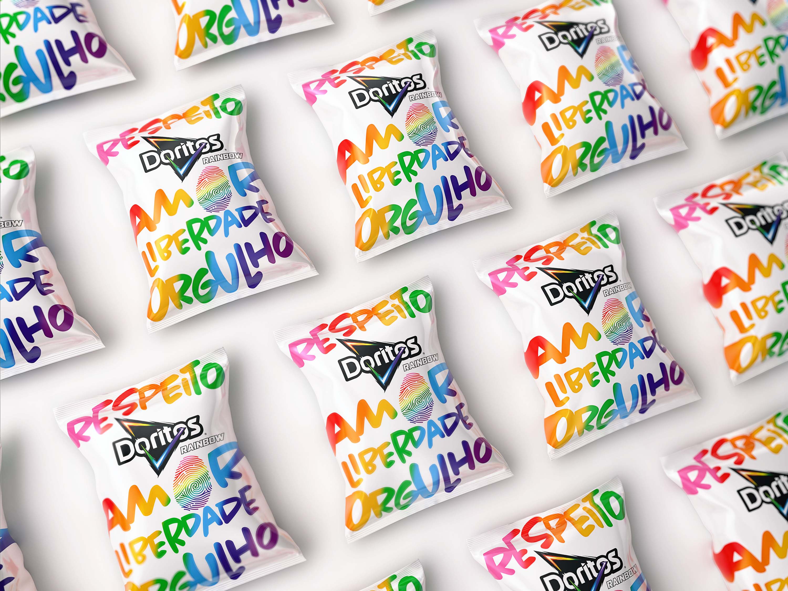
  • The Design Team was tasked with developing a fresh design for the limited-edition Doritos Rainbow 2022 to be released during Pride month and at the Pride festival in Brazil. This year, we wanted our design to not only incorporate the classic colors of the LGBTQ+ flag, but also establish a clear statement of support for diversity.

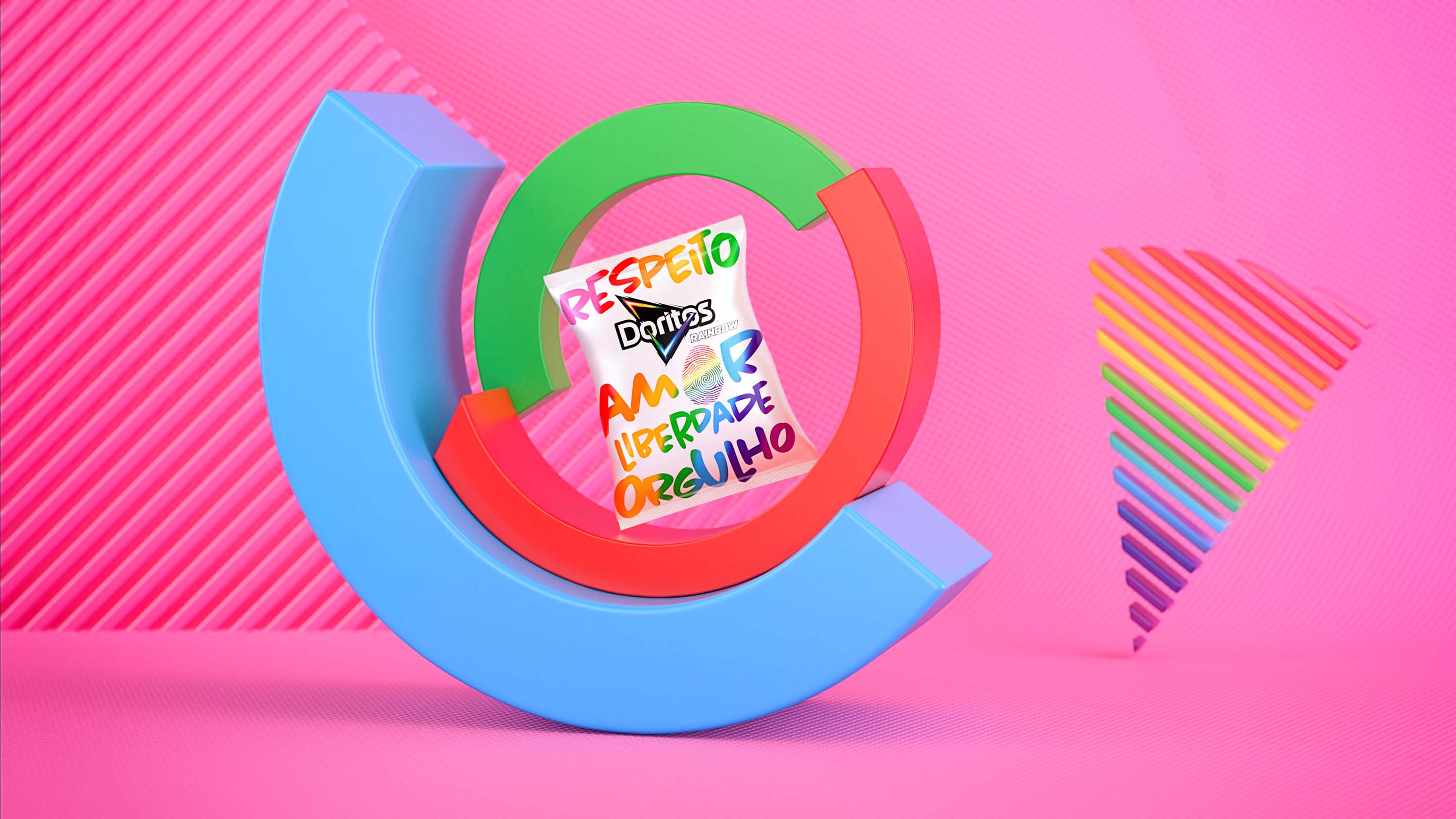
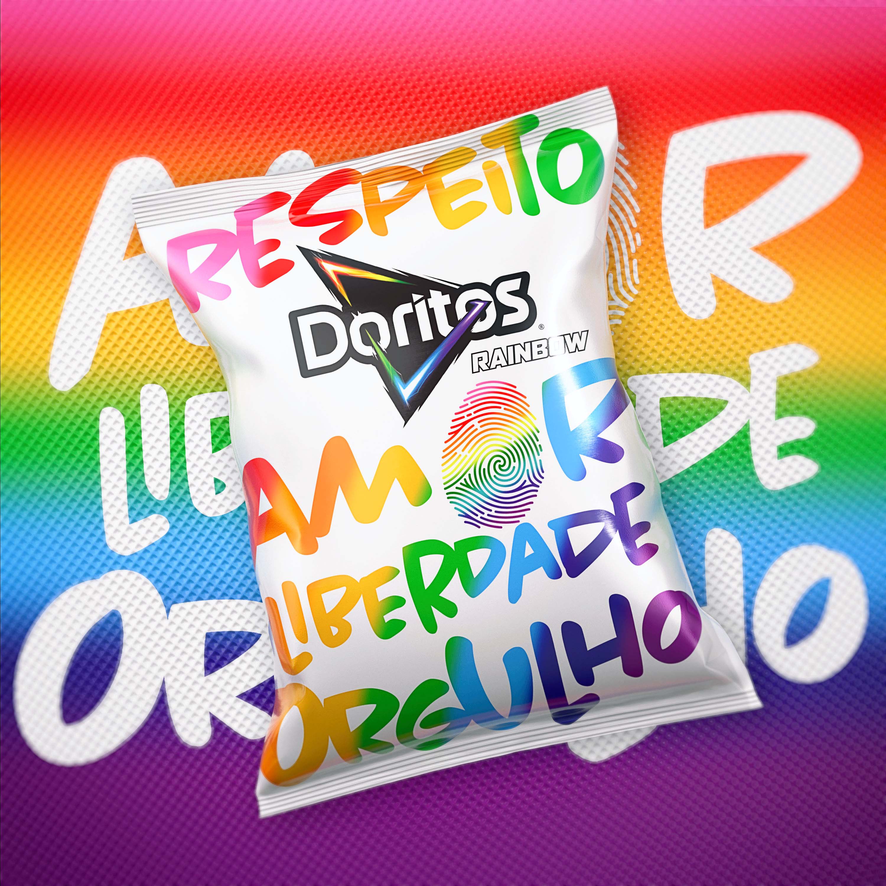
  • We stayed true to the Visual Identity of Doritos Rainbow with a clean white substrate, stylized rainbow, and colors of the LGBTQ+ flag. We wanted the design to be bolder than ever to make a statement for the respect of diversity, so we included the strong words, “RESPECT, LOVE, FREEDOM, PRIDE” in a hand-drawn, freestyle typographic font. We also added a stylized fingerprint as part of the design, linking it to the Brazilian product campaign in which Doritos communicated the importance of recognizing LGBTQ+ people and voiced their support for the Trans community and respect of all people’s identities.

  • This year’s edition of Doritos Rainbow achieved its goal of highlighting the brand’s core values and establishing a meaningful supportive statement for support of the LGBTQ+ in Brazil.

  • To further spread the message of diversity, equity and inclusion, we created a limited edition satin white bomber jacket with bright rainbow-inspired lines on the cuffs and at the waist. The messaging “RESPECT, LOVE, FREEDOM, PRIDE” appears in the same colorful artistic typeface on the back of the jacket, with the word “RAINBOW” outlined atop the four words as signature of brand ownership. We also incorporated a larger-than-life stylistic fingerprint on the shoulder, so it is sure to be seen from all viewpoints when worn. Every detail of the jacket was thoughtfully designed to translate and unify the core graphic essence across touchpoints.