Black Rabbit Wines

good-design-award_winner_rgb_blk_logo
  • 2026

  • Communication
    Print and Packaging

Designed In:

Australia

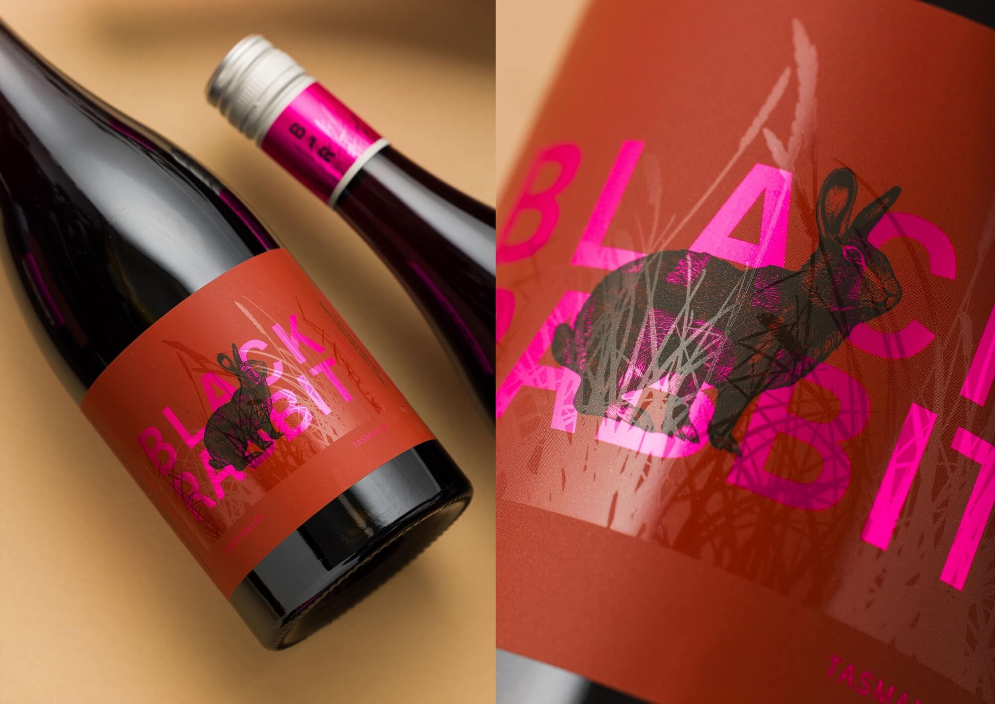
On Tasmania’s Tamar River, Black Rabbit Wines takes its name from an unexpected visitor. As a single-varietal vineyard with eight pinot noir vintages, it posed a rare design challenge; to give each vintage a distinct identity while building an ongoing story, full of charm, energy, and sense of place.
view website

2.jpg
Jesse Hunniford
3.jpg
Jesse Hunniford
4.jpg
Jesse Hunniford
5.jpg
Jesse Hunniford
6.jpg
Jesse Hunniford
7.jpg
Jesse Hunniford
8.jpg
Jesse Hunniford
9.jpg
Jesse Hunniford
  • CHALLENGE
  • SOLUTION
  • IMPACT
  • MORE
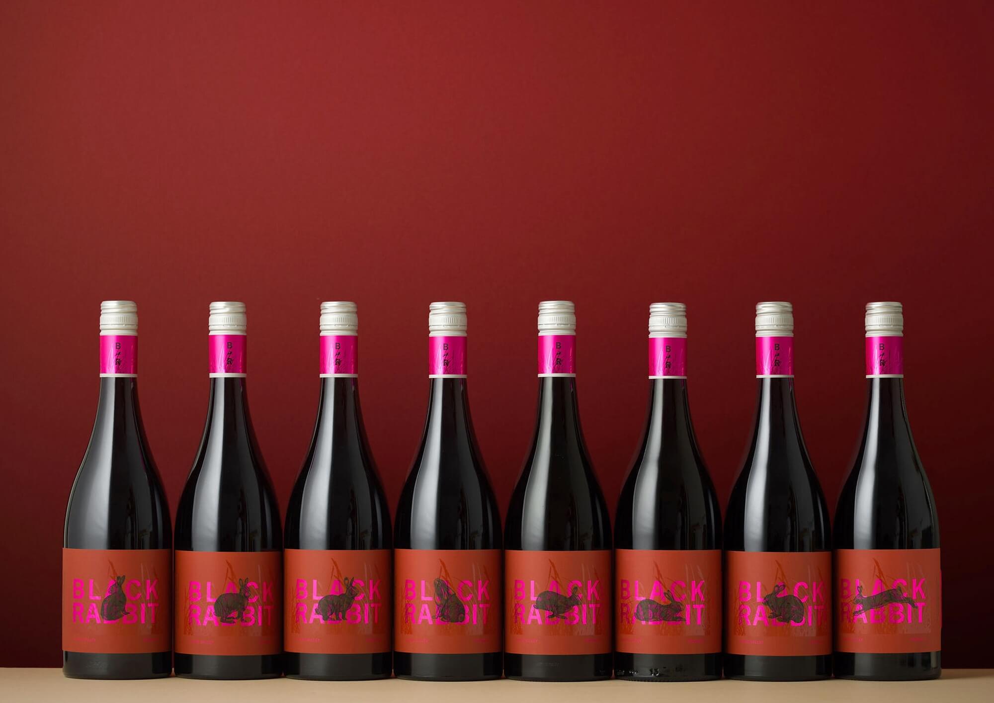
  • The challenge was to give each of the eight vintages its own clear identity within a single-varietal vineyard. As all eight pinot noir vintages would be released at the same time, the need for distinction was practical as well as creative. Each label had to help people recognise the vintage at a glance while still feeling part of the same Black Rabbit story. This created an opportunity to build a connected series, where every bottle could stand alone, yet also contribute to a larger sense of character, place, and continuity.

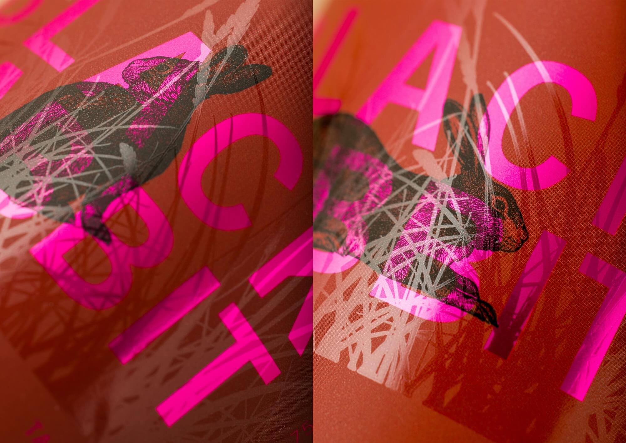
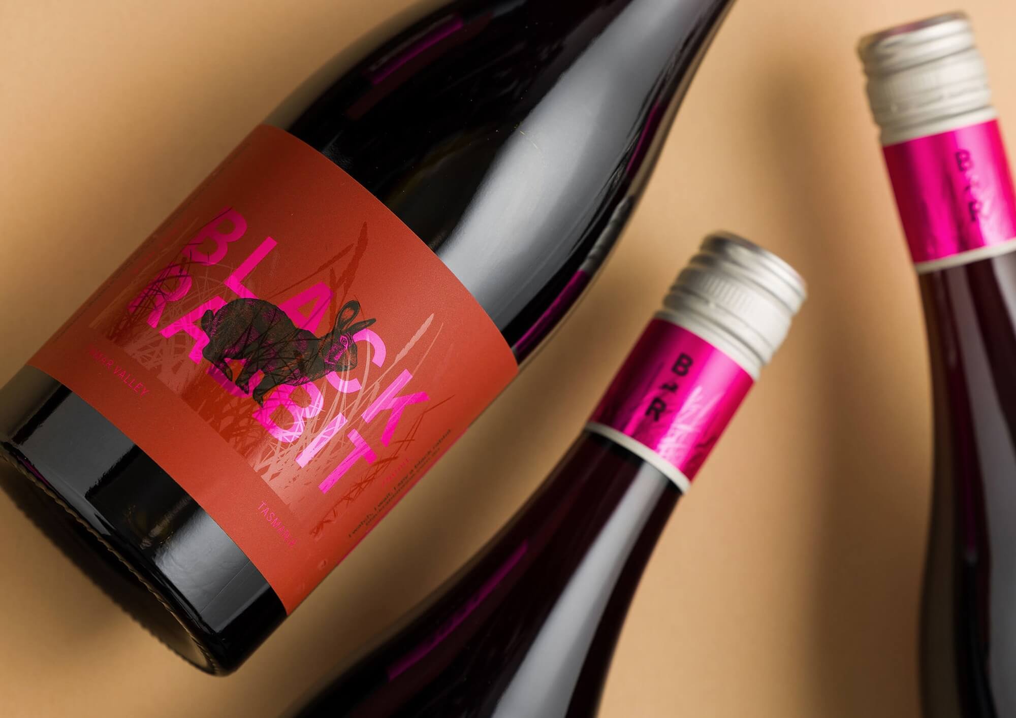
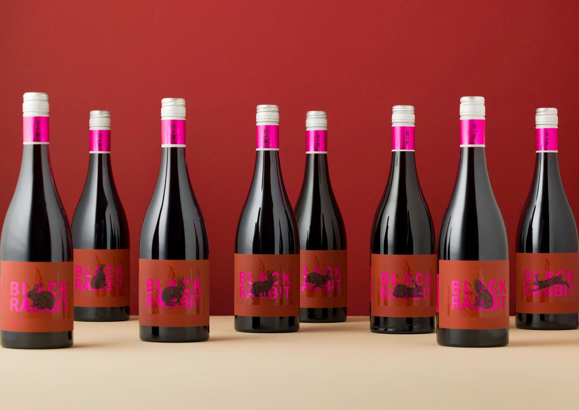
  • The design solution uses a series of bespoke rabbit illustrations to give each vintage its own identity while keeping the range clearly connected. The same rabbit appears across all eight labels, but its posture and movement change from bottle to bottle, creating distinction without breaking the continuity of the single-varietal vineyard. The pared-back composition reflects the purity of the pinot noir, while animated embellishments add rhythm, light, and movement. A vivid hot pink introduces personality and confidence, with a clear nod to the client’s lively character.

  • The label system gives each vintage instant recognition while turning the full range into a connected story. Instead of treating eight pinot noirs as a repetition problem, the design makes their similarity part of the charm. The shifting rabbit creates curiosity, collectability, and shelf presence, inviting people to notice the differences between bottles. The balance of elegance, play, and vivid colour gives Black Rabbit Wines a distinctive identity that feels refined without becoming too serious, capturing the energy of the vineyard and the personality behind the brand.

  • The project centres on a flexible label system that gives eight pinot noir vintages their own identity while keeping production simple and cost-effective. As a low-budget production, it was important to limit changes across the label suite without sacrificing impact. The design uses a consistent structure with small but meaningful shifts. The bespoke rabbit illustrations create distinction between vintages without requiring a complete redesign for each bottle. Subtle embellishments add movement and character, while the hot pink brings confidence and personality. The result is a practical, cohesive system with charm, shelf impact, and a clear sense of place.