Australian National Maritime Museum – muSEAum

good-design-award_winner_rgb_blk_logo
  • 2020

  • Communication
    Branding and Identity

Designed In:

Australia

MuSEAum is the culmination of a three-year partnership to completely reposition the Australian National Maritime Museum, extending its audience appeal and supporting its financial future. This project turned around the brand (one of Australia’s most treasured museums) – shifting it from old world maritime clichés into a dynamic brand for today.
view website
view facebook
view twitter

  • CHALLENGE
  • SOLUTION
  • IMPACT
  • MORE
  • The Australian National Maritime Museum needed to win new audiences and increase its presence at a time when nearby Darling Harbour was being completely transformed. The brand was facing a number of issues – its identity was seen as masculine, cold and cliched, drawing on nautical references that were not appealing to many target audiences, who often didn’t even understand the meaning of the word “Maritime”. The problems with the parent brand had led to a plethora of sub-brands that were distracting from the destination and diluting its equity, causing major issues with the consistency of its communications.

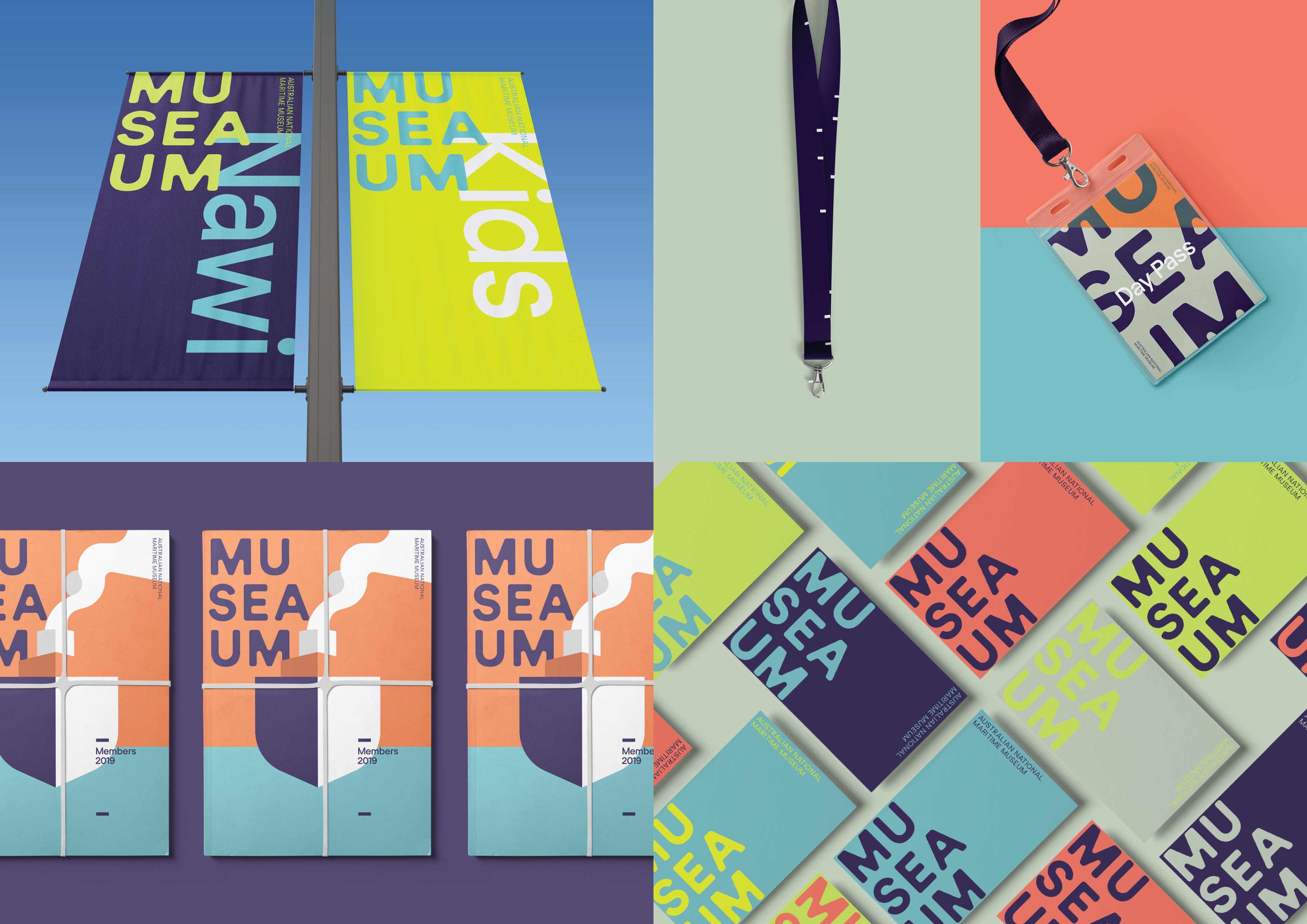
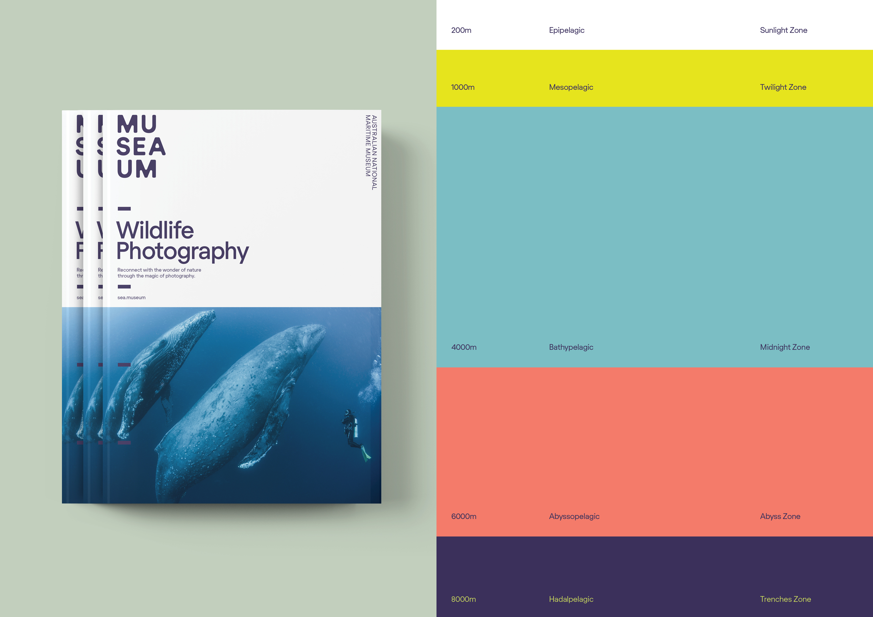
  • Our process involved company-wide workshops and reviews of consumer research to deeply understand the Museum’s vision and markets. We discovered visitors wanted more immersive, hands-on experiences and more emphasis on its floating fleet of vessels. Our brand idea was to unlock the ‘spirit of adventure’ associated with the sea. The name “Mu-SEA-um” is a perfect response to this strategy. Not only does it overcome the barriers in the Museum’s name, its clever and playful character immediately communicates a modern museum experience. Traditional navy and static photography were replaced with vibrant colours, dynamic photography and illustration to radically transform its image.

  • Since its rebranding MuSEAum has seen record breaking visitation up over 85% from its January 2018 figures. Research also shows 22% of those who said they were unlikely to visit the Maritime Museum in the next 12 months would be more likely to visit after seeing the creative. This increased to 65% among those who already expected to visit the museum. Importantly the new brand, with its emphasis on delivering adventure and experiences, has helped to focus the approach to exhibitions and programming, increasing the success of numerous temporary and permanent exhibitions and helping to increase customer satisfaction.

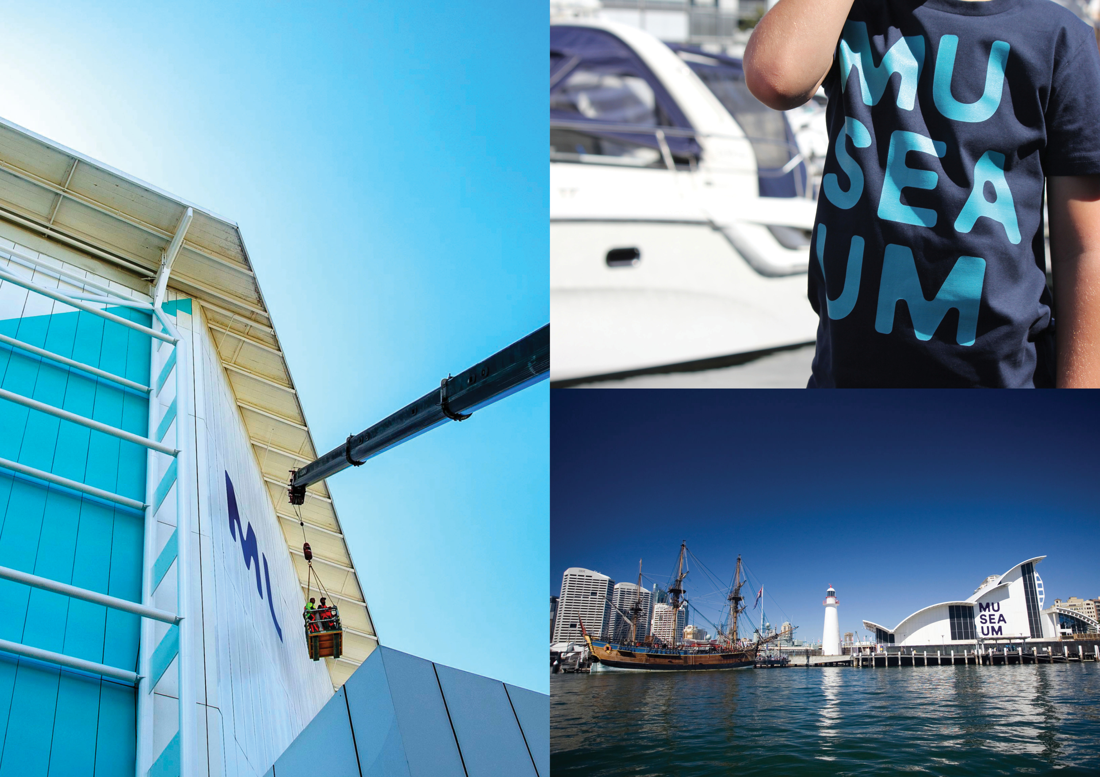
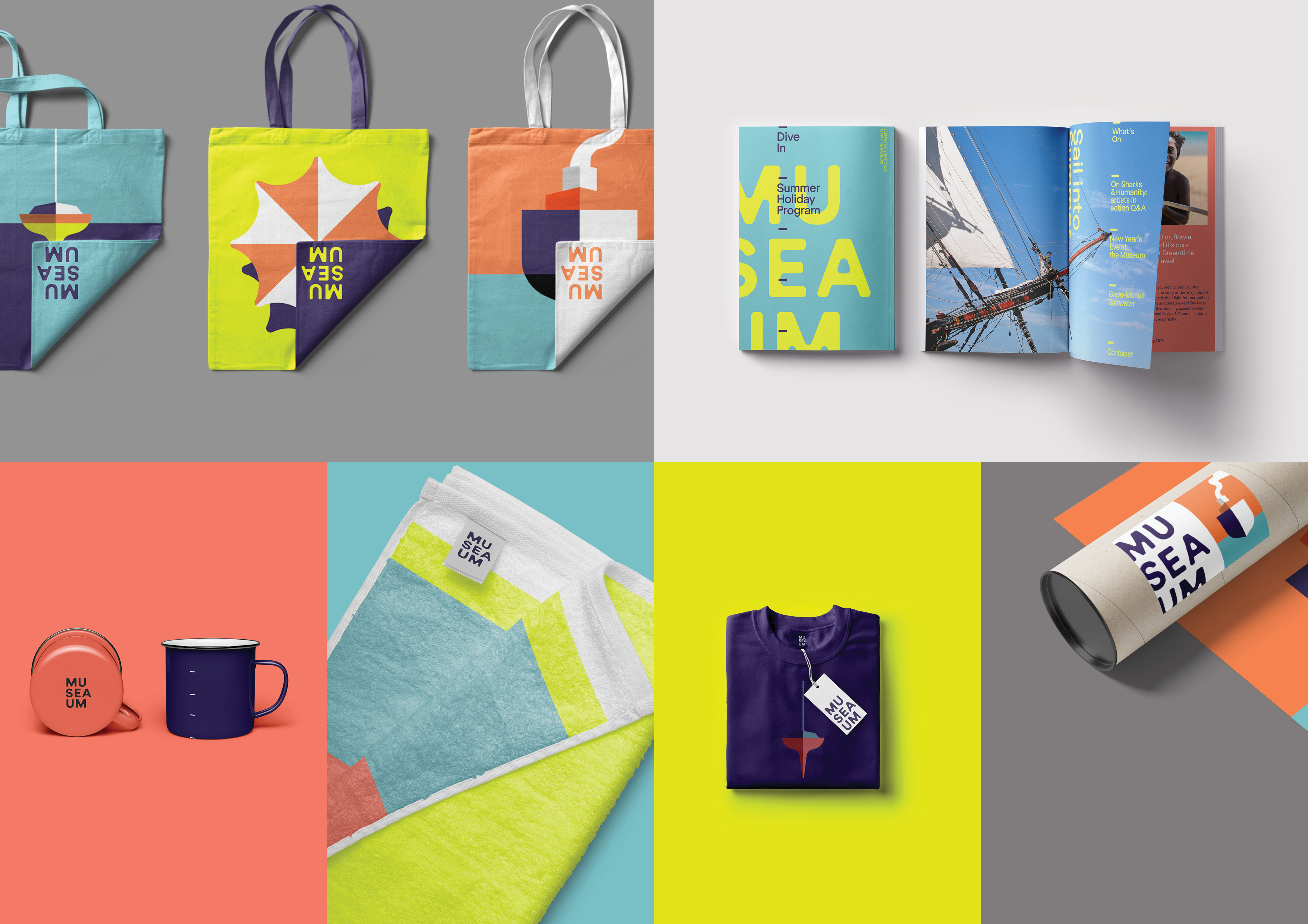
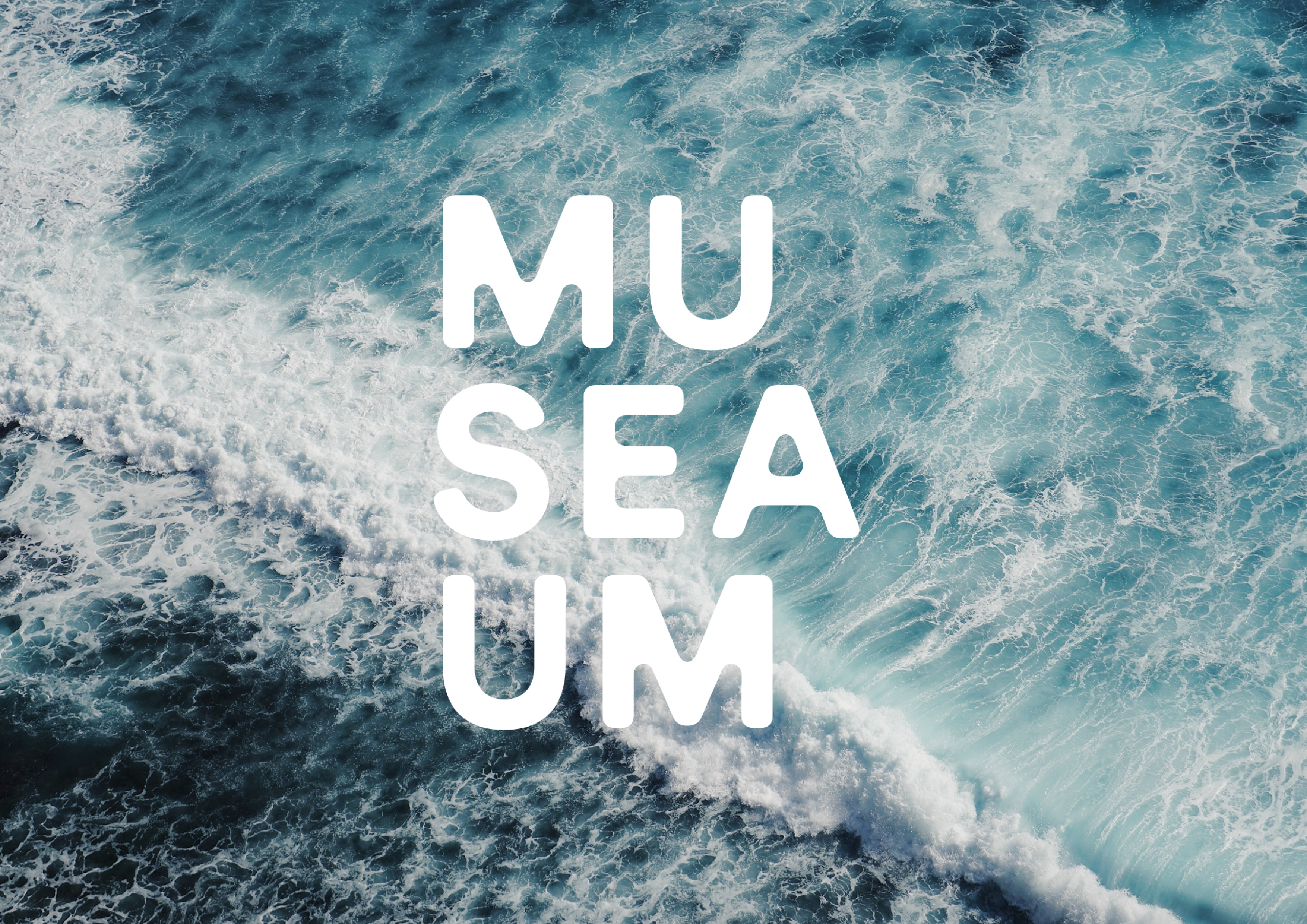
  • Many of the MuSEAum’s visitors come from people walking around Darling Harbour, so it was critical to create a lot of impact for the new brand on the harbour itself. The new brand has been applied at massive scale on the building so that it can be seen not only when nearby but also across the water, asserting its place as a leading Sydney cultural venue. The logo itself is a custom-crafted piece of typography that was designed to resemble the fluid qualities of water. The brand is highly merchandisable, so that sales of t-shirts, bags and other items bearing the brand design contribute to its financial success. A major part of the project was radically rationalising its brand architecture so that the destination itself could shine – we did this by creating systematic ways of presenting exhibitions and programming within the parent brand that also allows enough latitude for each to tell its own story.