Koa Kids

good-design-award_best-in-class_rgb_blk_logo
  • 2026

  • Communication
    Print and Packaging

Commissioned By:

KOA Kids

Designed In:

Australia

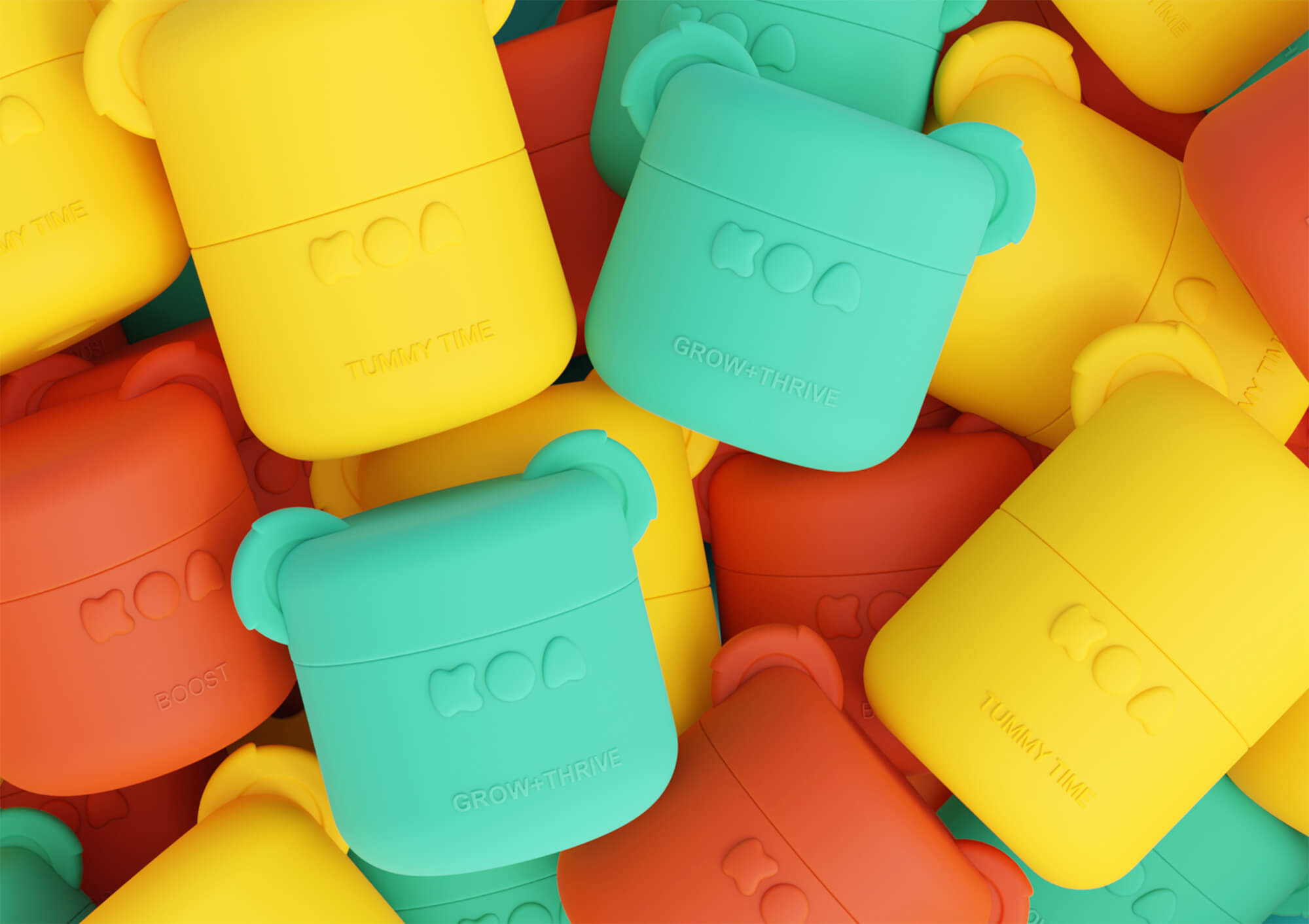
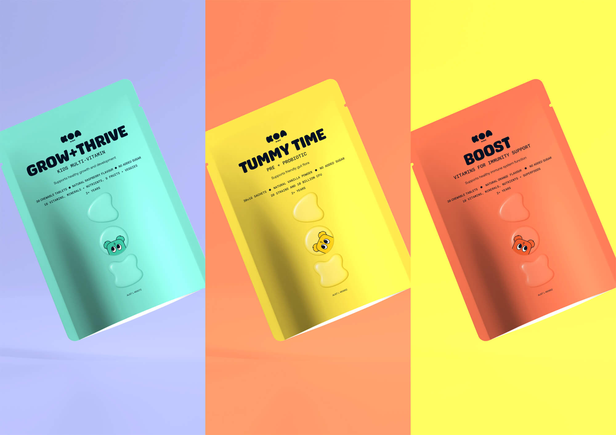
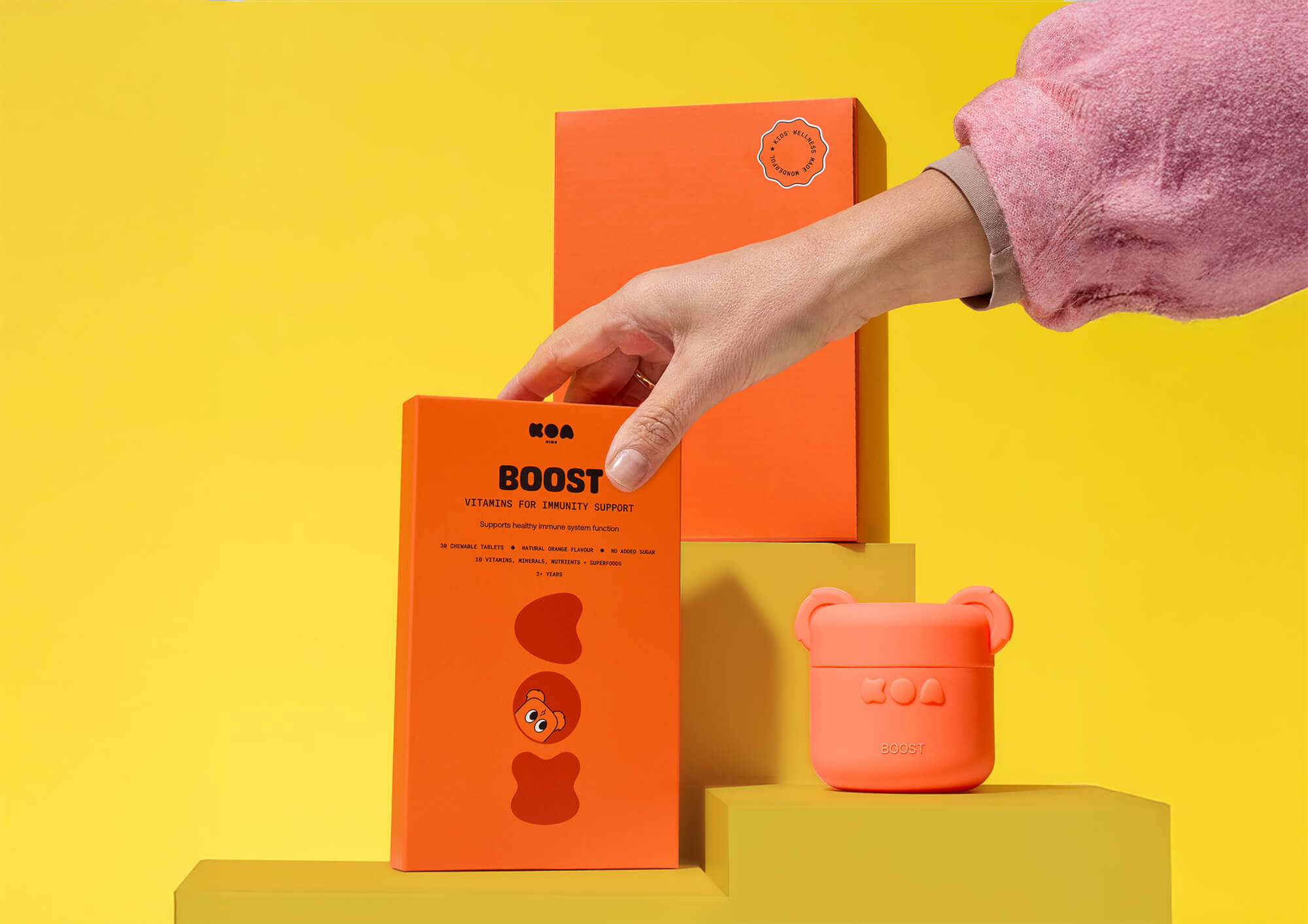
KOA Kids is a TGA-listed children’s vitamin brand designed by Oliver Grace for an Australian e-commerce startup. The packaging system – comprising a refillable koala-shaped jar, colour-coded refill pouches, and subscription delivery boxes – transforms a daily health routine into a joyful ritual that earns trust from parents and delight from children.
view website
Buy online

2.jpg
3.jpg
4.jpg
5.jpg
6.jpg
7.jpg
8.jpg
  • CHALLENGE
  • SOLUTION
  • IMPACT
  • MORE
  • Australia's vitamin market is crowded. Parents face aisles upon aisles of choice and are increasingly sceptical of marketing claims. Children, meanwhile, resist taking vitamins unless they taste like lollies. KOA Kids entered as a challenger brand with a genuinely differentiated product – sugar-free, science-backed, free of artificial flavours – built for subscription e-commerce. Oliver Grace was tasked with designing a packaging system that could earn parental confidence, excite children without relying on sugar or gimmicks, reduce single-use plastic waste, and stand out against heritage giants and fast-moving competitors.

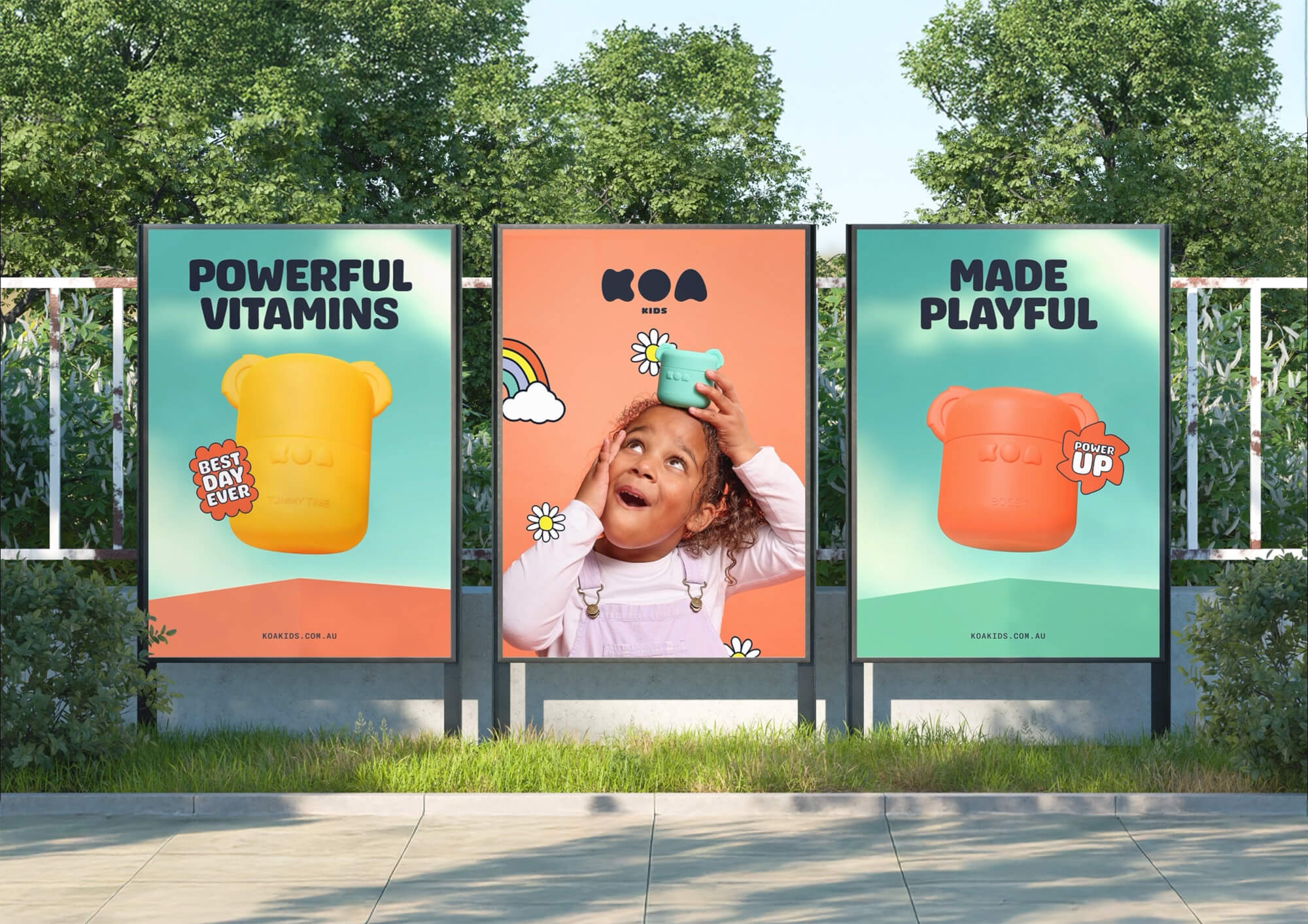
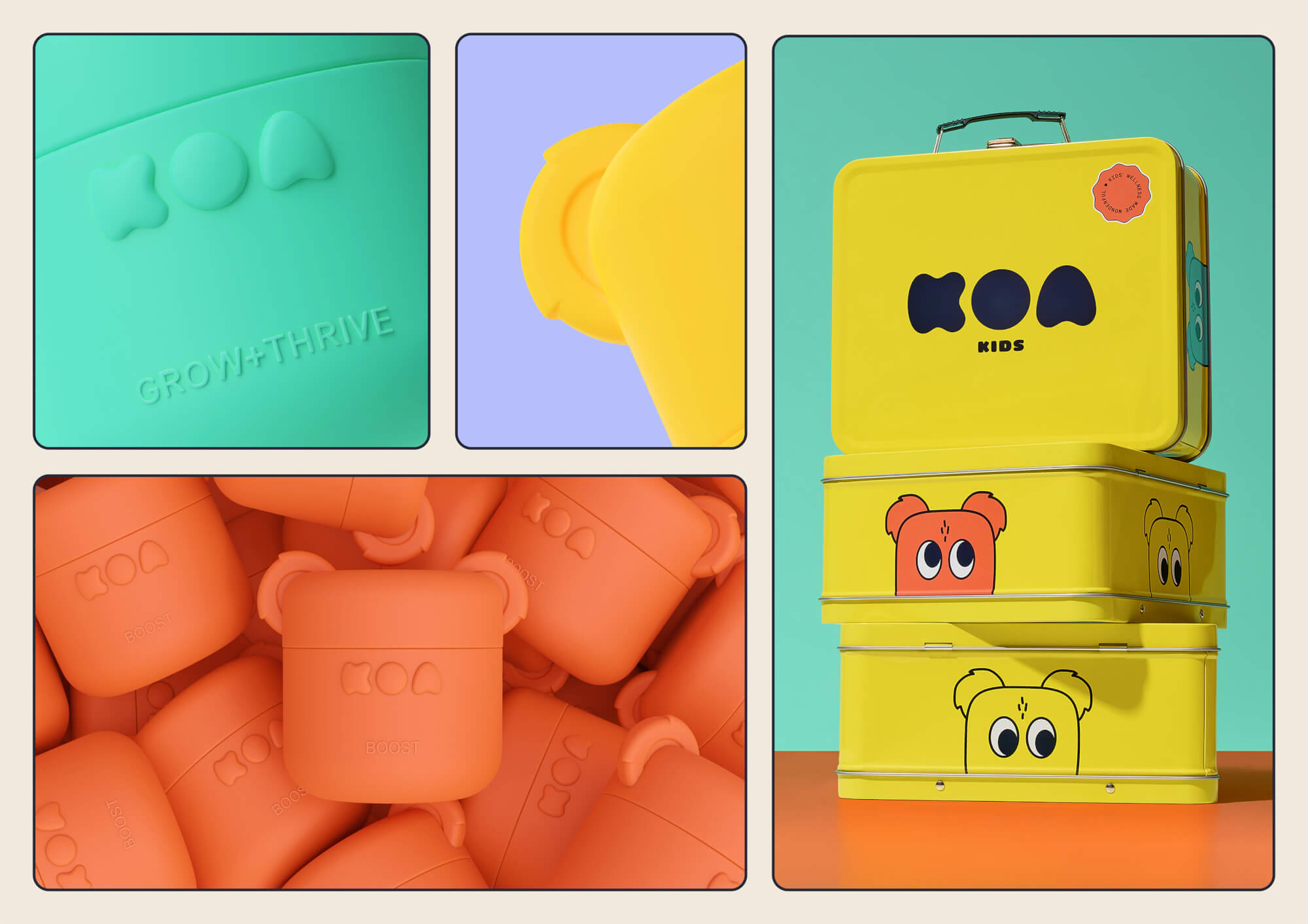
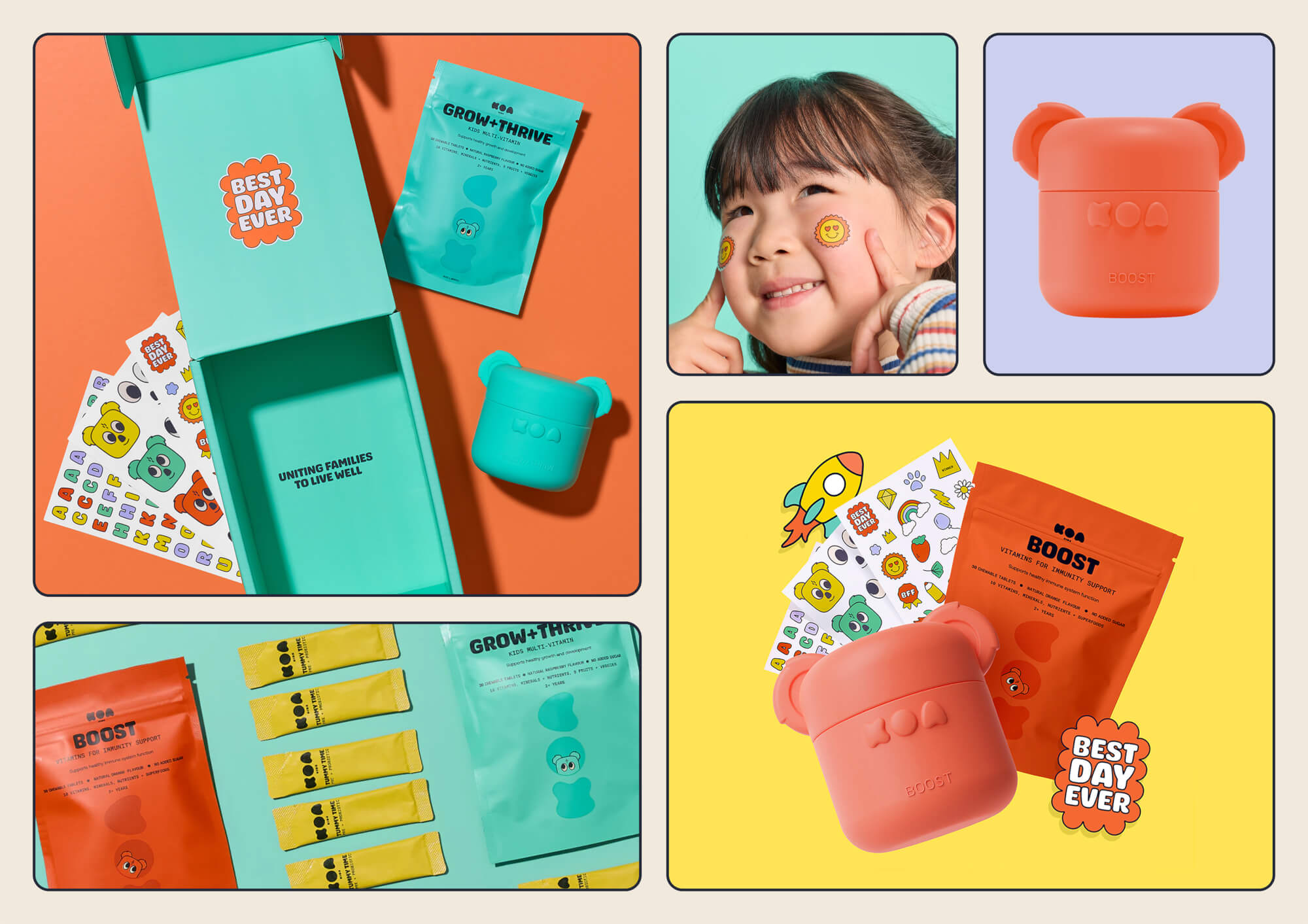
  • Oliver Grace anchored the project in a single purpose: "Unite families around the joy of living well." Every design decision was filtered through this lens. The hero vessel – a koala-shaped jar in durable silicone and glass – was designed to be refillable, displayable, and decorated with stickers by children. Colour-coded refill pouches with expressive illustrated faces made formula identification easy for parents and engaging for kids. Subscription delivery boxes were designed to feel like an event, not a transaction. The result is a fully integrated packaging ecosystem where function and delight reinforce each other at every touchpoint.

  • KOA Kids launched as a cohesive brand ecosystem – packaging, product, digital presence, and messaging in full alignment. The design produced a marked behavioural shift: children began requesting their vitamins rather than resisting them. The refillable jar and flat-pack pouch system meaningfully reduced reliance on single-use plastic, positioning sustainability as a core feature rather than a footnote. By setting a new standard for health-focused consumer packaging – one that balances scientific credibility, environmental responsibility, and genuine playfulness – KOA Kids established a differentiated and defensible position in a crowded category.

  • 1) Refillable koala-shaped vessel. The hero jar is made from durable silicone and glass – built to last, designed to be loved. Its tactile, character-driven form invites children to personalise it with stickers, creating a sense of ownership over their daily health ritual. For parents, it is premium enough to display proudly rather than hide in a cupboard.2) Colour-coded refill pouch system. Flat-pack pouches replace the single-use plastic bottles that dominate the category. Each formula is assigned a distinct colour and expressive illustrated face, making selection intuitive for parents and visually engaging for children. The system significantly reduces packaging waste per dose compared to conventional vitamin bottles.3) Subscription delivery experience. Every delivery box is treated as a brand moment: designed to be unpacked with anticipation, and stamped with purposeful copy that reinforces the KOA Kids ethos.4) Two-audience design language. The visual system speaks simultaneously to a parent's need for clarity, trust, and premium cues, and a child's appetite for colour, character, and play.5) Integrated brand ecosystem. Packaging, product, digital, and delivery are designed as a unified whole, ensuring the physical experience and the brand narrative are always in step.