Oh! for OzHarvest

good-design-award_winner_rgb_blk_logo
  • 2026

  • Communication
    Print and Packaging

Designed By:

Commissioned By:

OzHarvest Ventures

Designed In:

Australia

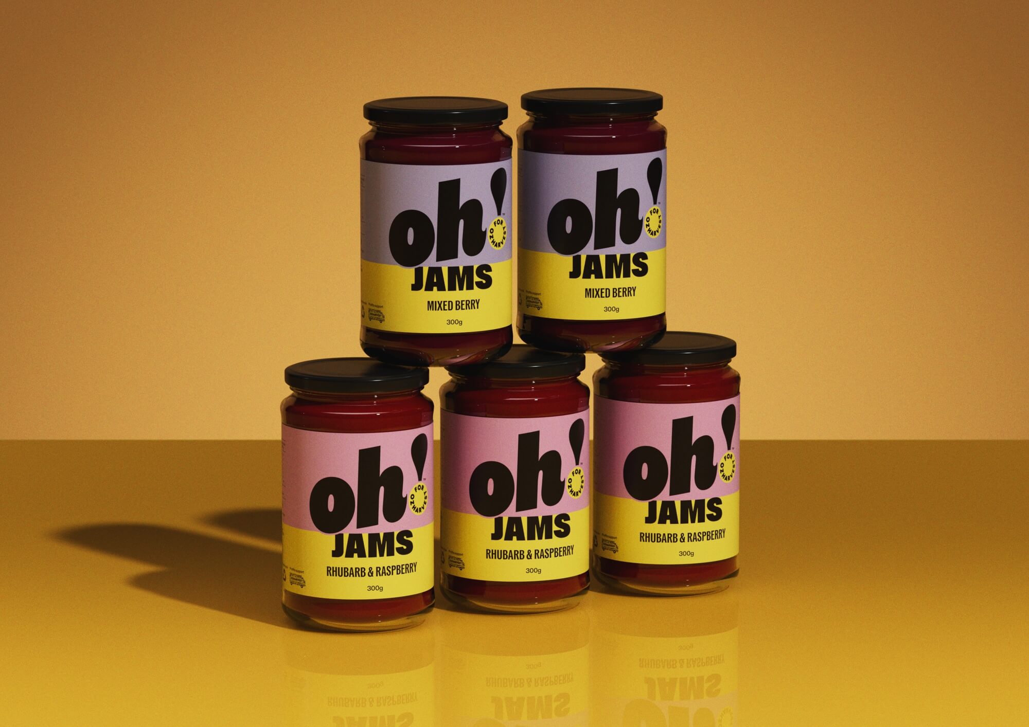
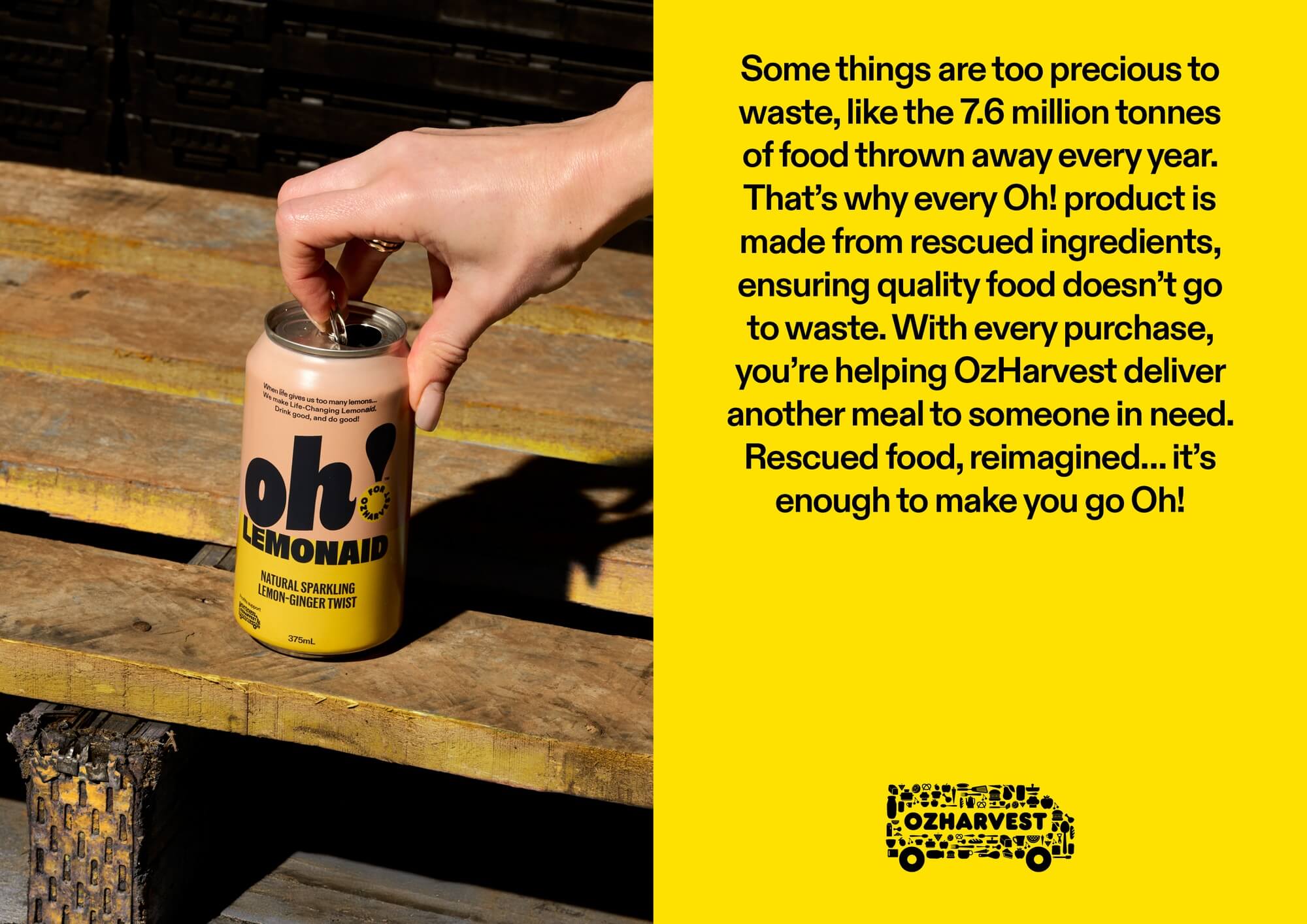
What if fighting food waste felt less like something you ‘should do’ and more like something you wanted to do? Oh! is a purpose-driven brand created for OzHarvest Ventures, transforming rescued ingredients into consumer products. Designed by Weave, the packaging reframes surplus food as something fun, optimistic and genuinely shelf-worthy.
view website
Buy online

2.jpg
3.jpg
4.jpg
5.jpg
6.jpg
7.jpg
8.jpg
  • CHALLENGE
  • SOLUTION
  • IMPACT
  • MORE
  • For 20 years, OzHarvest has led the fight against food waste and food insecurity as Australia’s foremost food rescue charity. In a country where 7.6 million tonnes of food is wasted each year, much of it still edible, while millions of households struggle to put food on the table. OzHarvest Ventures is Oz Harvest’s Social Enterprise arm, created to transform food waste into “business for good” products that raise sustainable revenue for OzHarvest.Weave’s challenge was to create a consumer-facing brand and design system that could inspire conscious consumption without guilt, while flexing across multiple product categories.

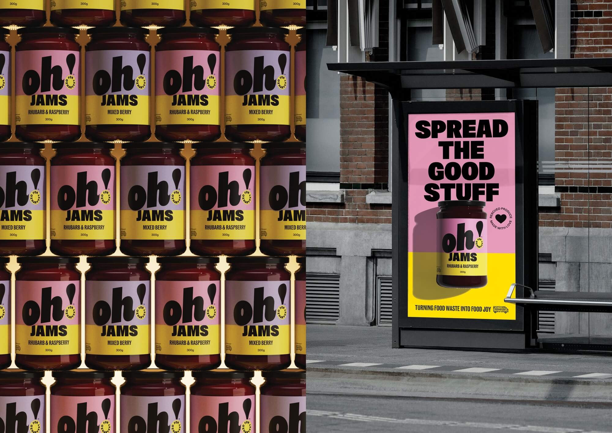
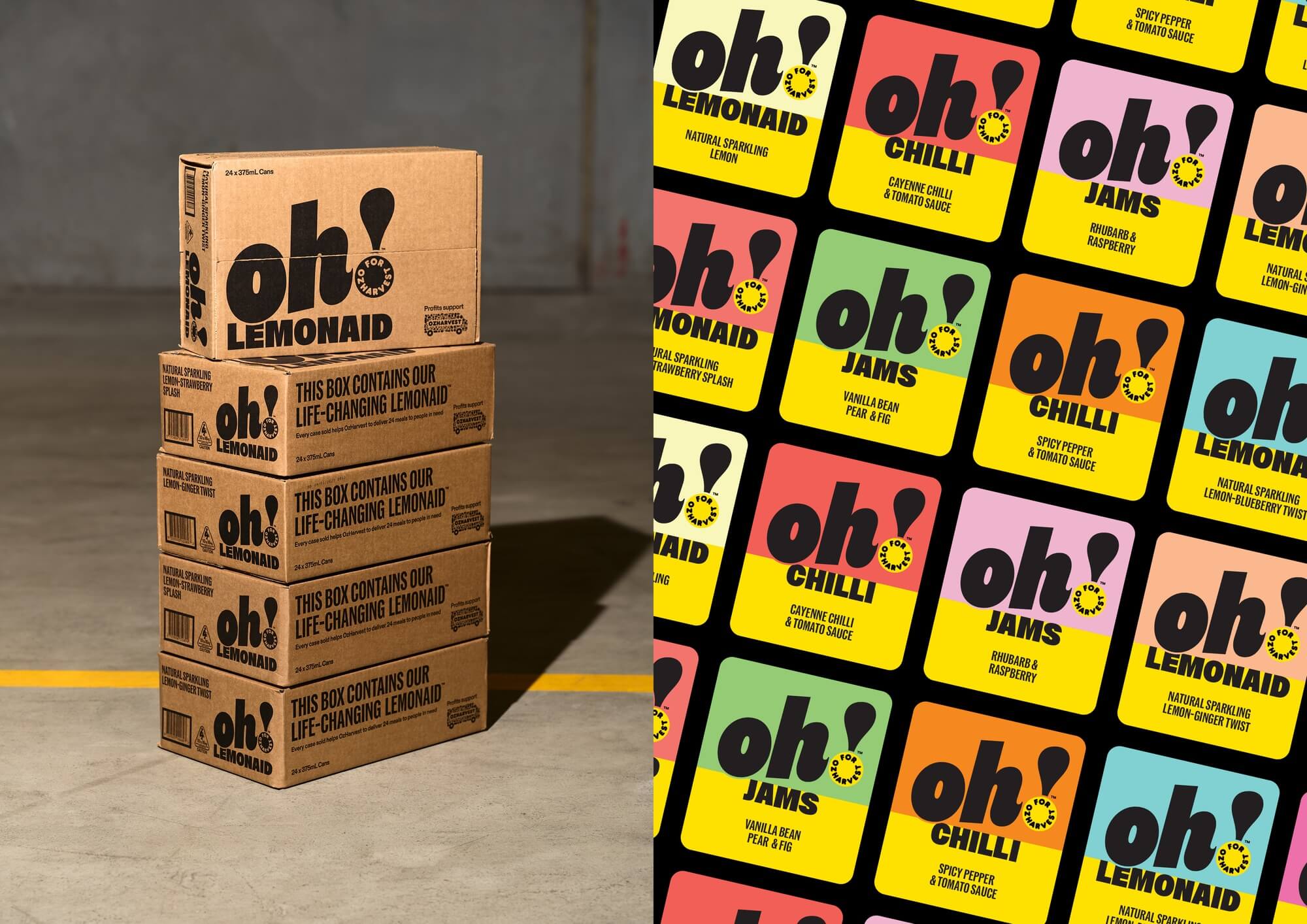
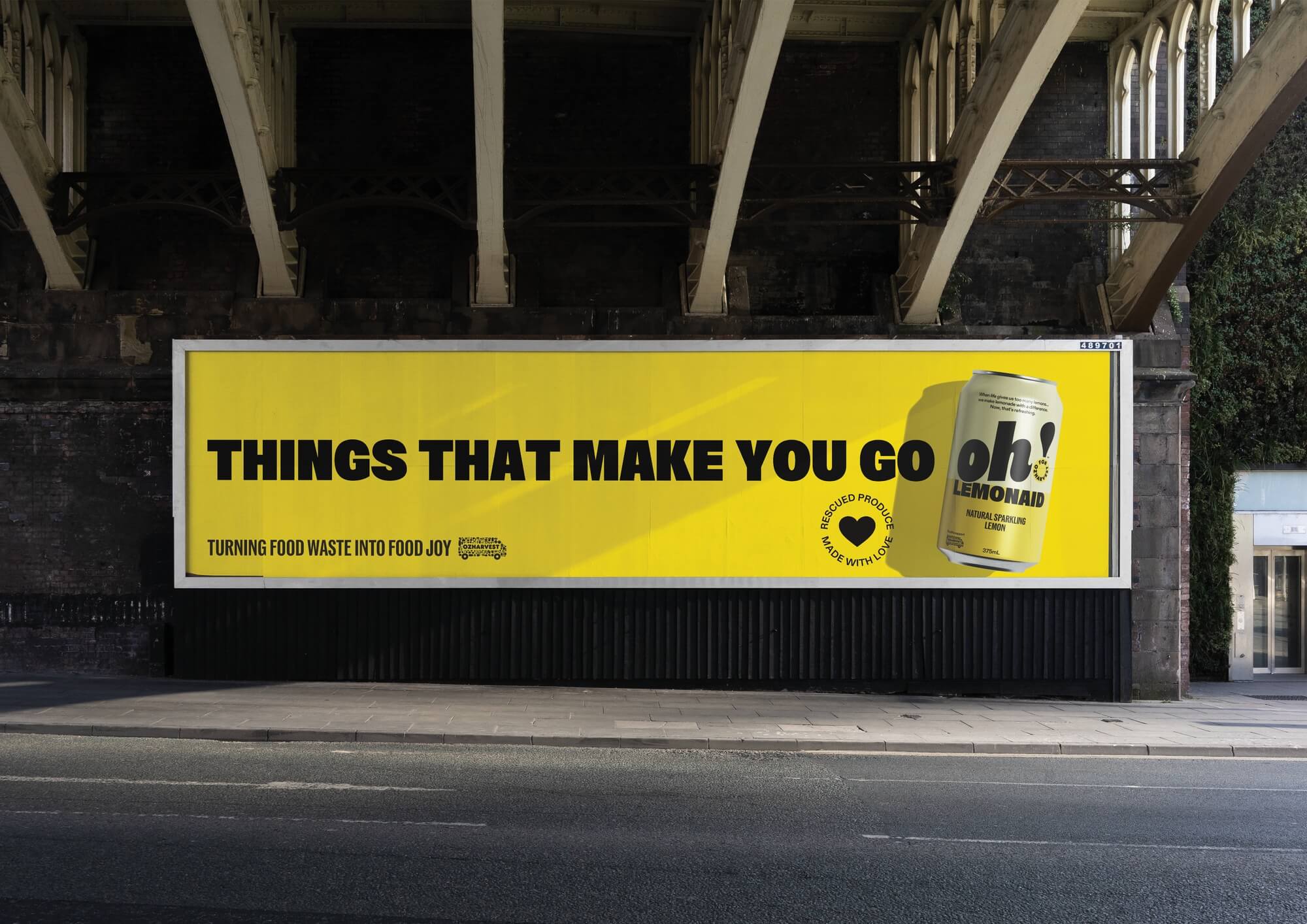
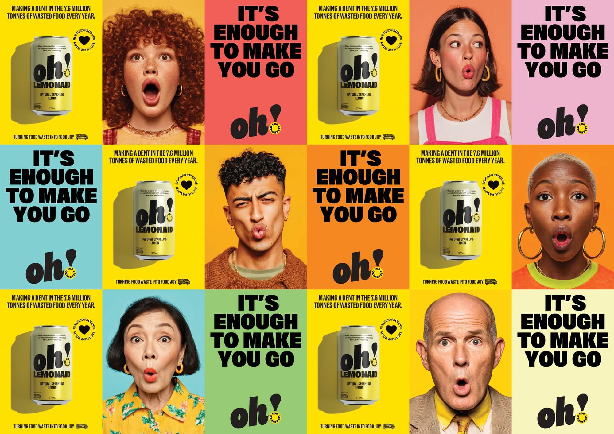
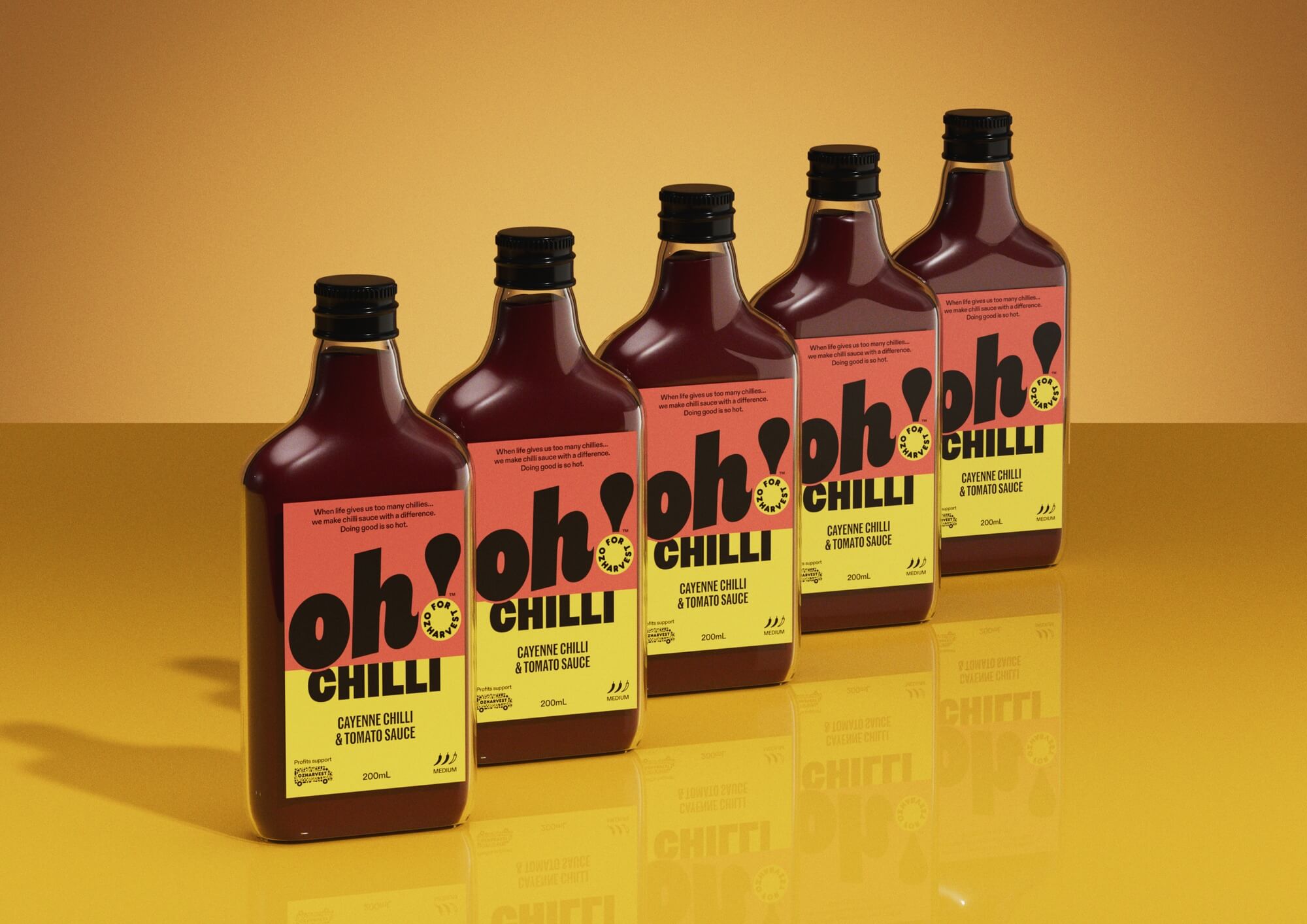
  • Introducing Oh!, a joyful brand built around the universal expression of surprise.The name cleverly nods to OzHarvest itself (OH) while capturing the moment consumers realise rescued ingredients can be both impactful and delicious.Visually, Oh! rejects the muted eco-aesthetic of sustainability brands. Instead, vibrant colour, bold typography and an expressive exclamation mark create immediate shelf impact.The packaging system was designed as a scalable framework rather than a single product identity. Bold colour blocking, playful language and confident hierarchy allow the brand to flex across categories, while remaining instantly recognisable.

  • Oh! enables OzHarvest Ventures to support the mission of OzHarvest by transforming surplus food into products that generate revenue and awareness.Commercially, the brand provides a scalable platform for future product innovation. Environmentally, it encourages consumers to rethink food waste by demonstrating the value of rescued ingredients while also supporting Australian farmers with a fair return for produce that might otherwise go to waste.Socially, the design reframes surplus food from something that’s at best ignored and at worst, avoided… into something desirable and inviting everyday consumers to participate in positive change, simply through what they choose to buy.

  • Oh! is built around a design system that prioritises clarity and scalability.The brand name itself becomes the central storytelling device. “Oh!” functions simultaneously as an emotional reaction, a mnemonic for OzHarvest, and a brand signature that captures the moment of discovery.The expressive exclamation mark, featuring OzHarvest’s signature yellow, anchors the identity, acts as punctuation, symbol and purpose marker that links the products directly to OzHarvest’s mission.The packaging architecture relies on bold colour blocking and oversized typography to create strong shelf presence while maintaining clarity across formats. Each product range uses colour to create distinction while remaining clearly part of the Oh! family.Playful copywriting transforms sustainability messaging into moments of curiosity and delight, allowing consumers to discover the purpose behind the products organically. Subtle secondary icons and storytelling details communicate how rescued ingredients are transformed into new products, reinforcing the brand’s mission without overwhelming the design.Together, these elements form a flexible system capable of scaling across categories while maintaining a confident and recognisable brand presence.