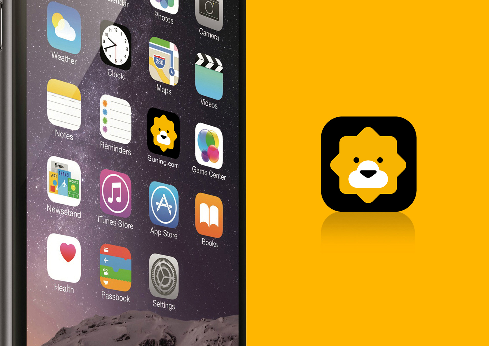
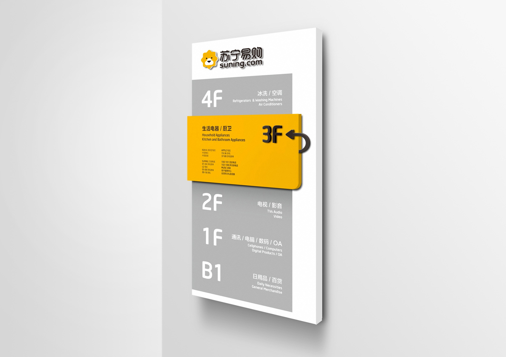
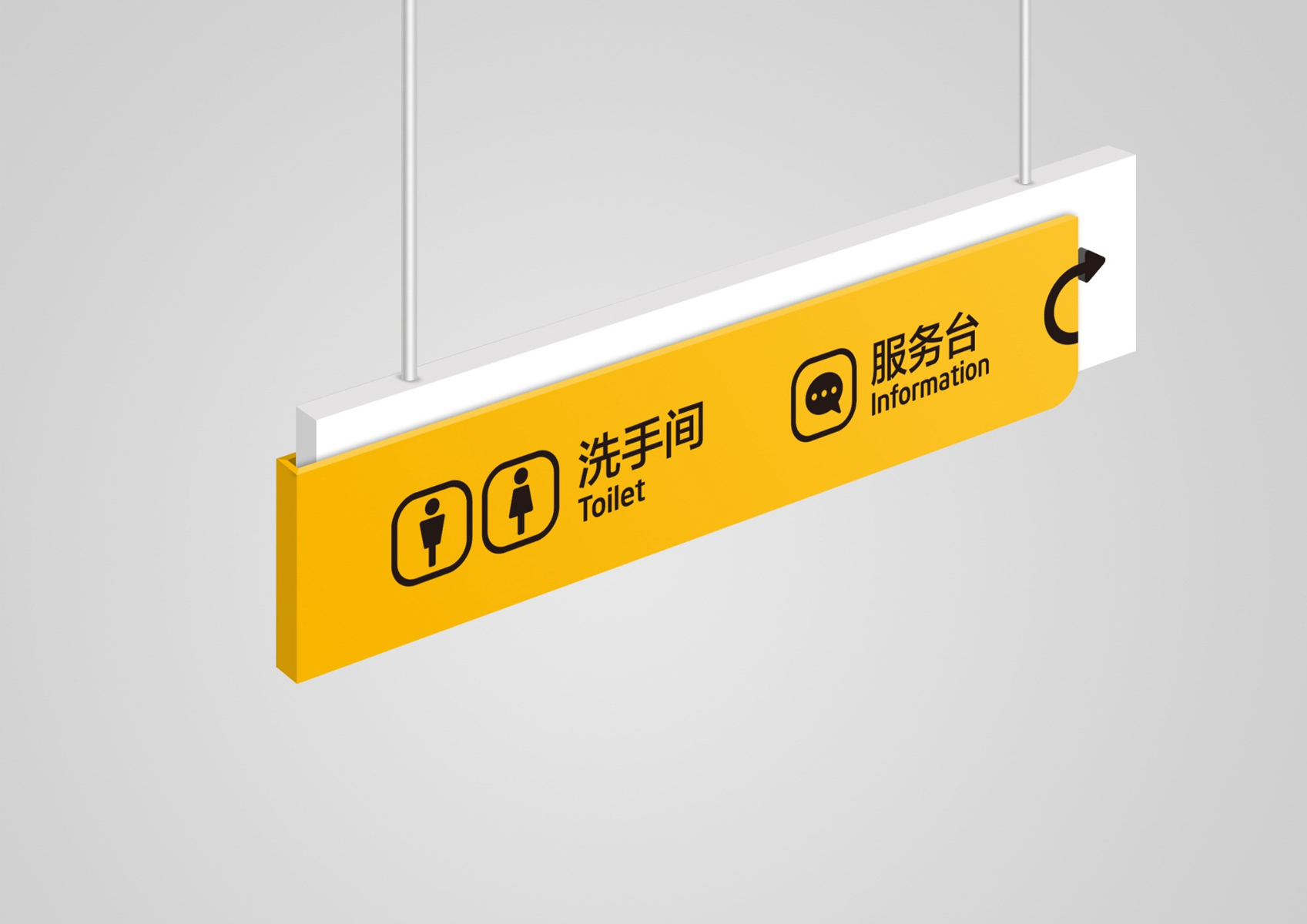
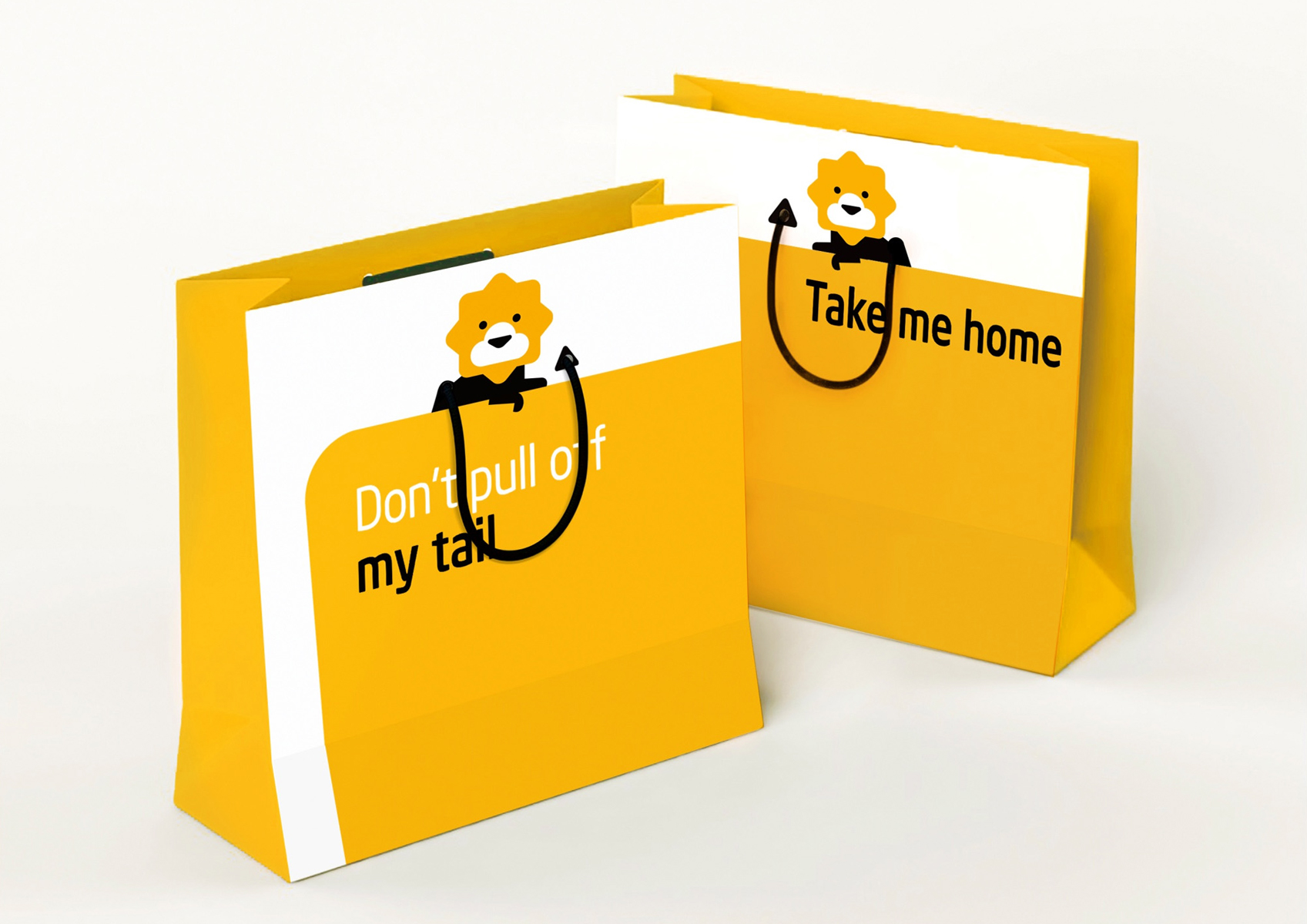
Suning.com

good-design-award_winner_rgb_blk_logo
  • 2016

  • Communication
    Branding and Identity

Designed In:

China

Suning.com is originally a B2C online shopping platform subordinated to Suning Group and ranks among the top three in the Chinese B2C market. In 2015, Suning Group combined Suning.com with Suning appliance retail store to integrate online-to-offline services and construct a one-stop service platform for customers.


view website
Buy online

  • CHALLENGE
  • SOLUTION
  • Considering that Suning Group is a competitive e-commerce entity, we adopted the king of all animals - “the lion” - in our design to highlight the position and the potential of Suning. In the pattern, we utilized clouds to depict lionet mouth, conveying a lovely visual effect. By combining all relevant elements in the pattern, the logo shows a brand new model of integrated online-to-offline service. Through the image variation, we intended to attract more young and personalized consumers to construct an integrative consumption experience.

  • The brand-new logo we designed for Sunign.com adopts the combination of black, white and yellow to substitute the former combination of yellow and blue. Besides that, the image of a lionet is added, thus making the new logo appear much more modern, fashionable, friendly and approachable. Compared with the original logo, the new logo completely breaks through the former limits.