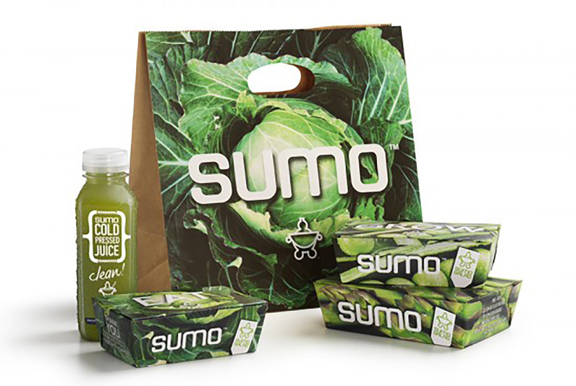
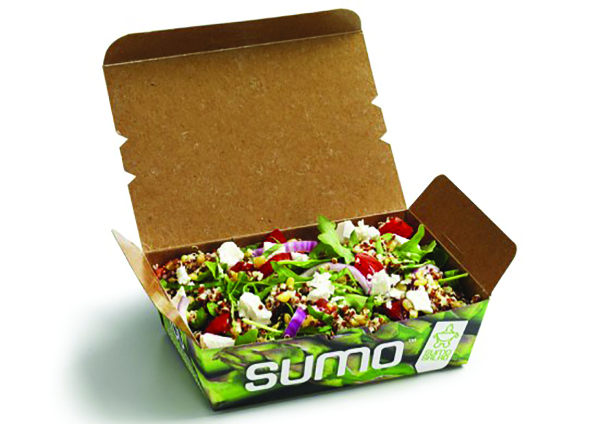
SumoSalad Box

  • 2016

  • Communication
    Print

Designed By:

Commissioned By:

Detpak

Designed In:

Australia

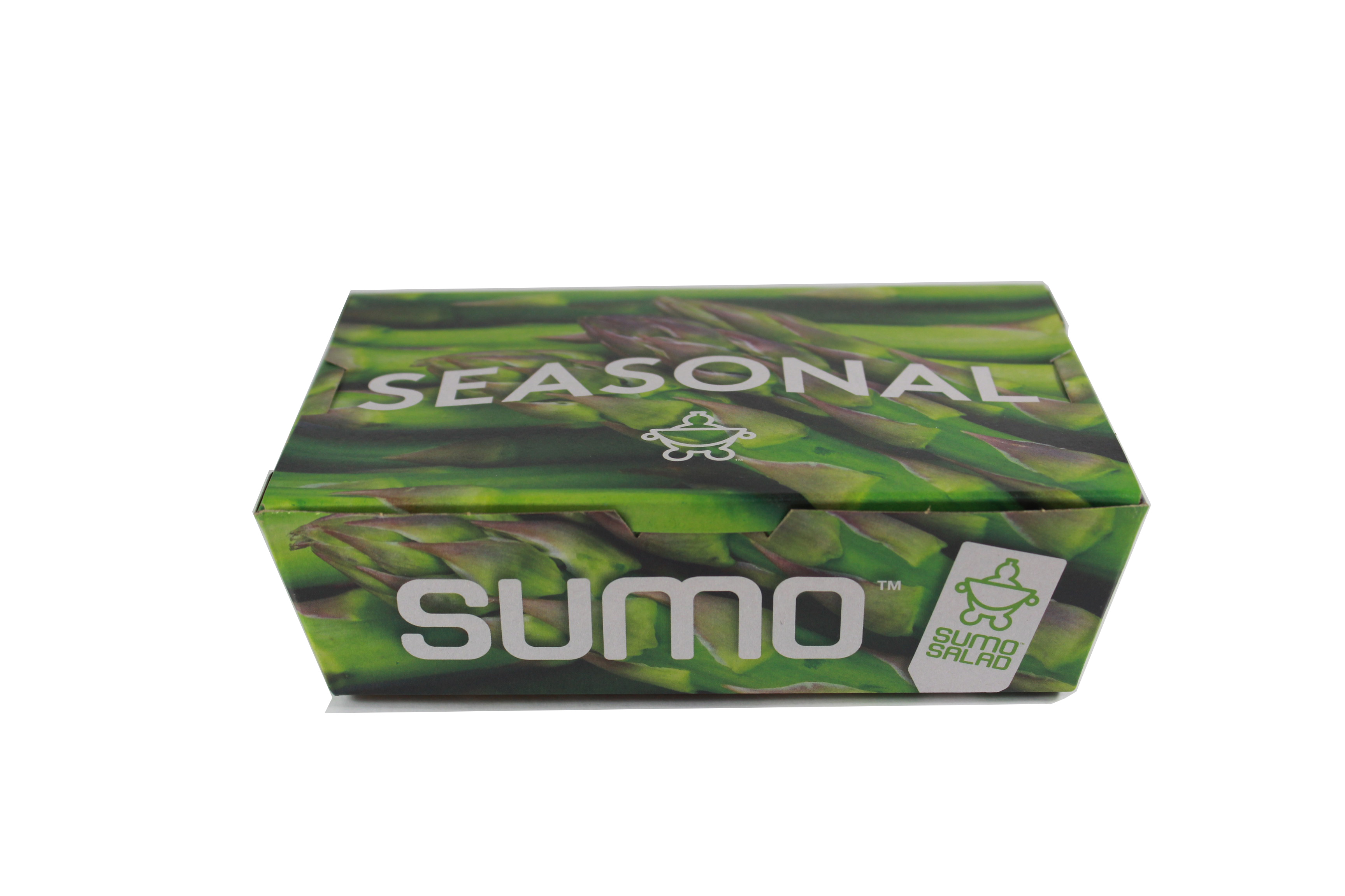
Detmold has achieved an outstanding vibrant photographic print quality on recycled brown kraft.

We have leveraged the high skill level of our print technicians, run multiple trials & innovated our print processes to produce this outcome.
view website
view facebook
view twitter

  • CHALLENGE
  • SOLUTION
  • IMPACT
  • MORE
  • The 4 colour process image with 100% ink coverage on the packaging enhances the brand & product presentation. The result is a vibrant photographic display that reinforces the customers' brand position to deliver great tasting healthy food. A hydrophobic coating not only maintains the natural feel of the material, it also eliminates contamination of oil & moisture on the outside of the box. The simple box design is modern & functional for both servers & consumers, providing a large opening & attached lid for easy filling & consumer use. Displaying graphics of seasonal produce, they can be updated with seasonal changes again reinforcing the brand positioning.

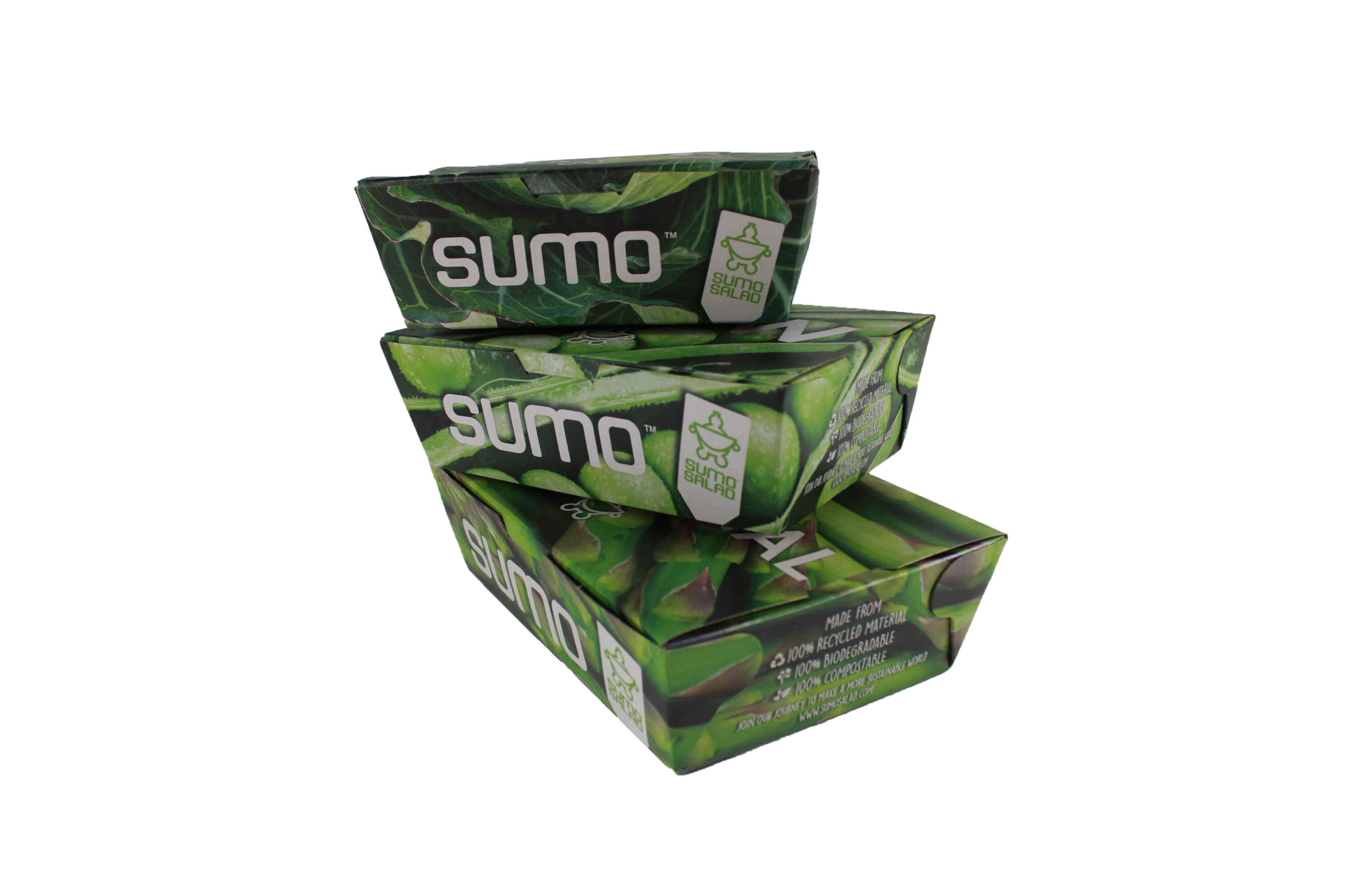
  • The box is recognisable as a lunchbox & the photographic quality of the artwork is a cue that the user is about to eat something that is fresh & of high quality. Design of the corner folds & placement of graphics, enables the corner folds to be hidden resulting in continuous artwork flow. The in-built hinged lid is easy to open & offer vast improvement on usability of the previous packaging that had two pieces-a base & lid. The 3 sizes contain the same volume as previous packaging, however the transition to lower rectangular shape addresses the customer's request for salads to be placed side by side rather than on top of each other. The sustainability of this product works to engage the user & enhance.

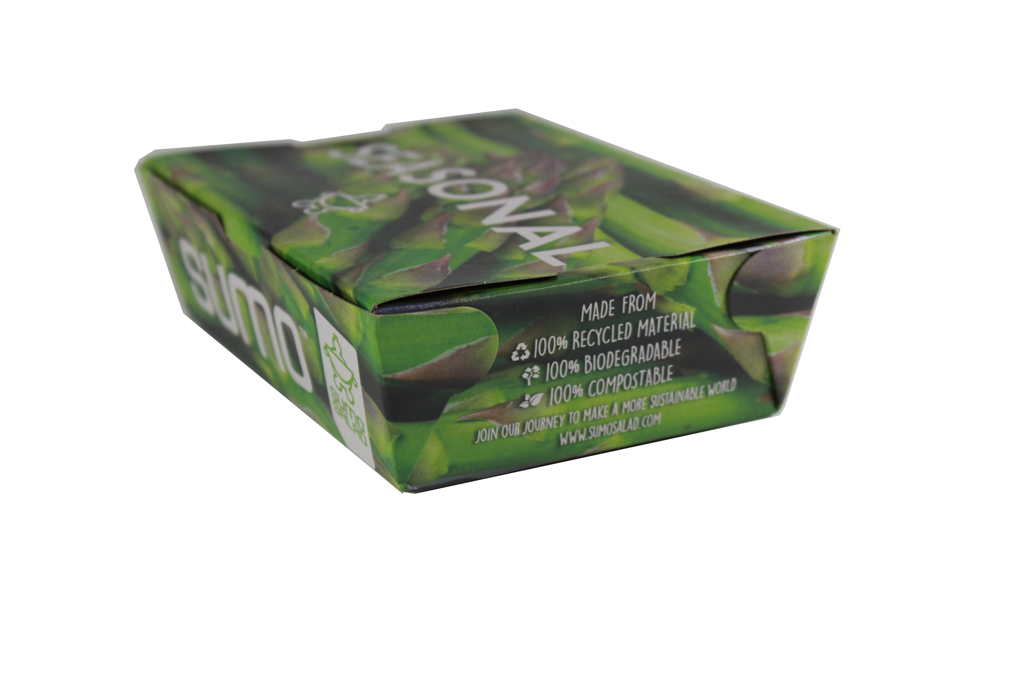
  • Utilising an existing design we made key changes to functionality, material & aesthetics to create a unique & original product. Design of the corner folds & placement of graphics enables the corner folds to be hidden resulting in continuous flow of artwork. Corrugated brown kraft liner board with PLA lining has been used, making this product one of the most sustainable branded items in the foodservice market. A hydrophobic coating on the exterior results in a matte finish reinforcing the rustic & eco brand positioning. This also eliminates the possibility of oily & wet contamination on the outside of the box. This is an improvement on previous packaging which couldn't be printed & showed marks easily.

  • The box has been printed & manufactured to the highest quality in our BRC and ISO9001 accredited facility. The exterior print is a 179 line screen using digital plate technology & colour management systems to achieve clear & bright final print on brown kraft. This involved multiple trials leveraging high technical capability of our print technicians & innovation in our print processes. The hydrophobic coating on the exterior of the packaging is to ensure carton integrity & avoid unsightly contamination through product handling. The matte finish reinforces the environmental positioning. The environmental statement is easy for the end users to understand, supporting the customer's environmental goals.

    The customer's previous packaging was moulded pulp packaging with embossed unprinted branding. The transition to a completely covered high graphic print has increased brand visibility due to bright & recognisable graphics, unique in both design & print in the market place. This new design creates the perception of quality & value amongst the user base, thereby making it a valuable investment. The box design represents the customer's sustainability principles - reinforcing its brand proposition & value.