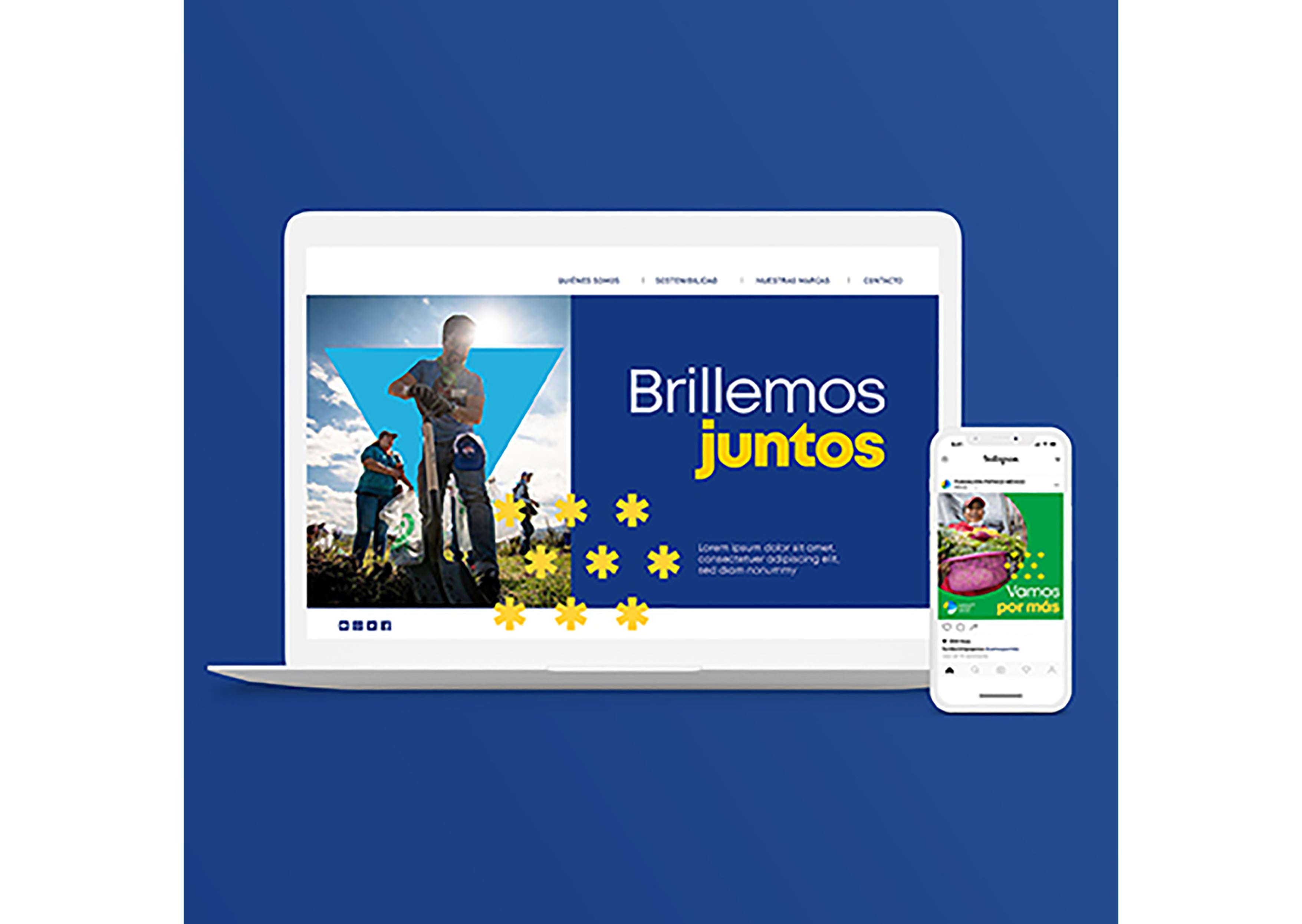
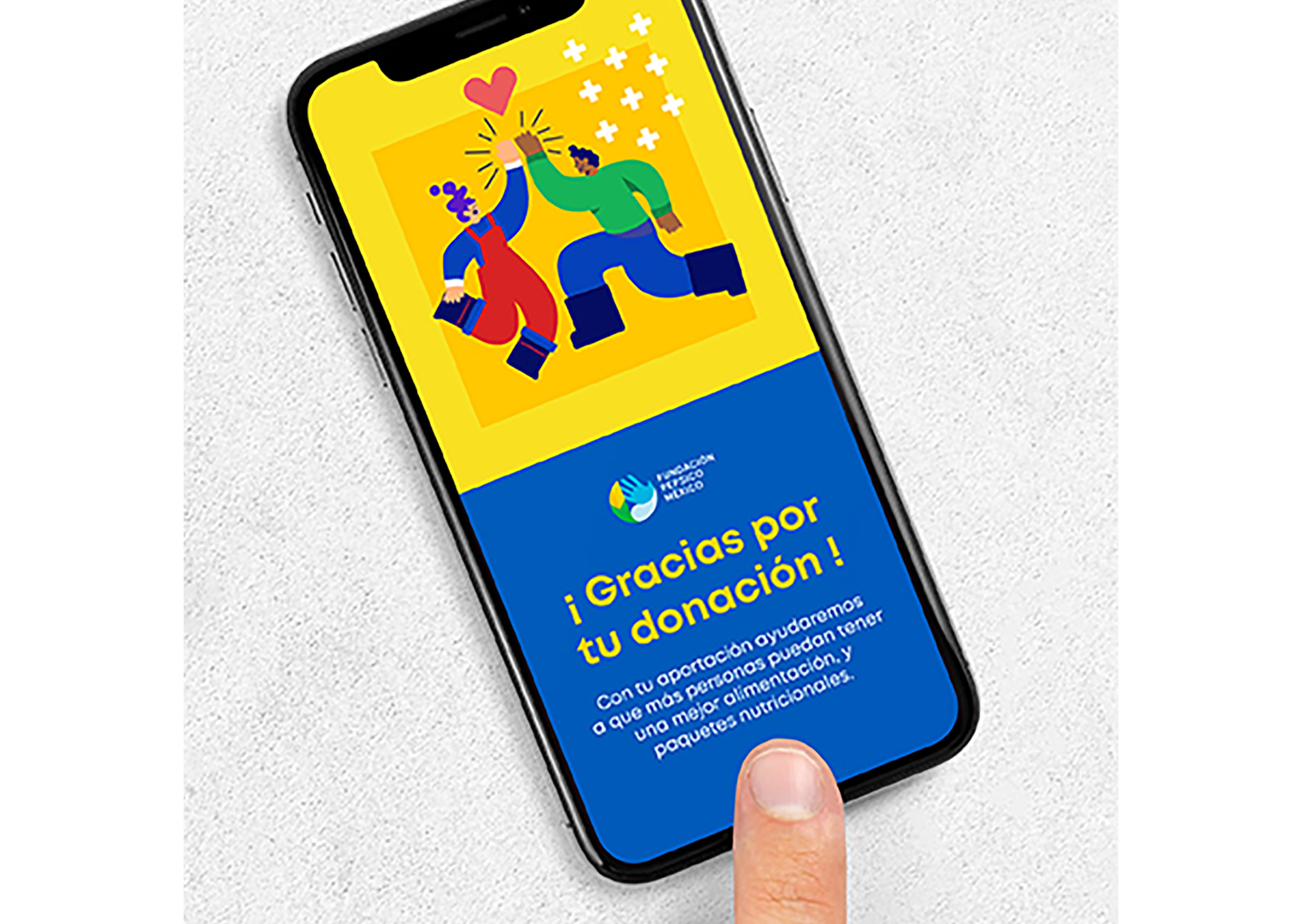
PepsiCo Foundation – Mexico

good-design-award_winner_rgb_blk_logo
  • 2021

  • Communication
    Branding and Identity

Commissioned By:

PepsiCo

Designed In:

Mexico

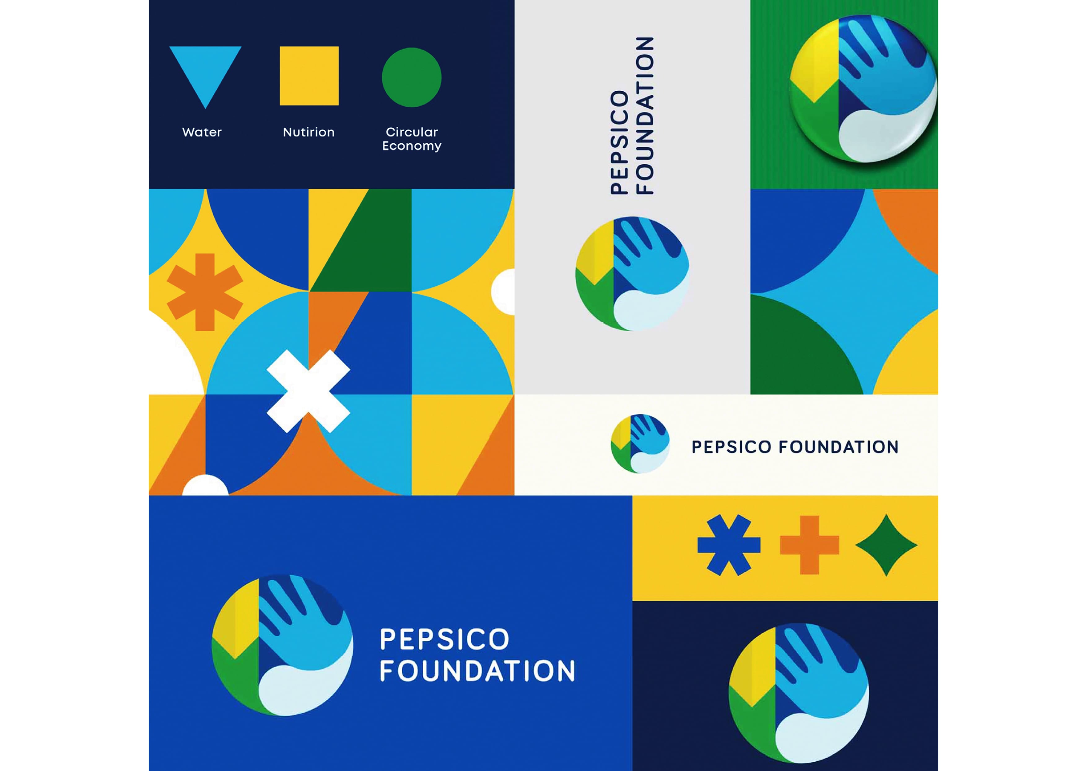
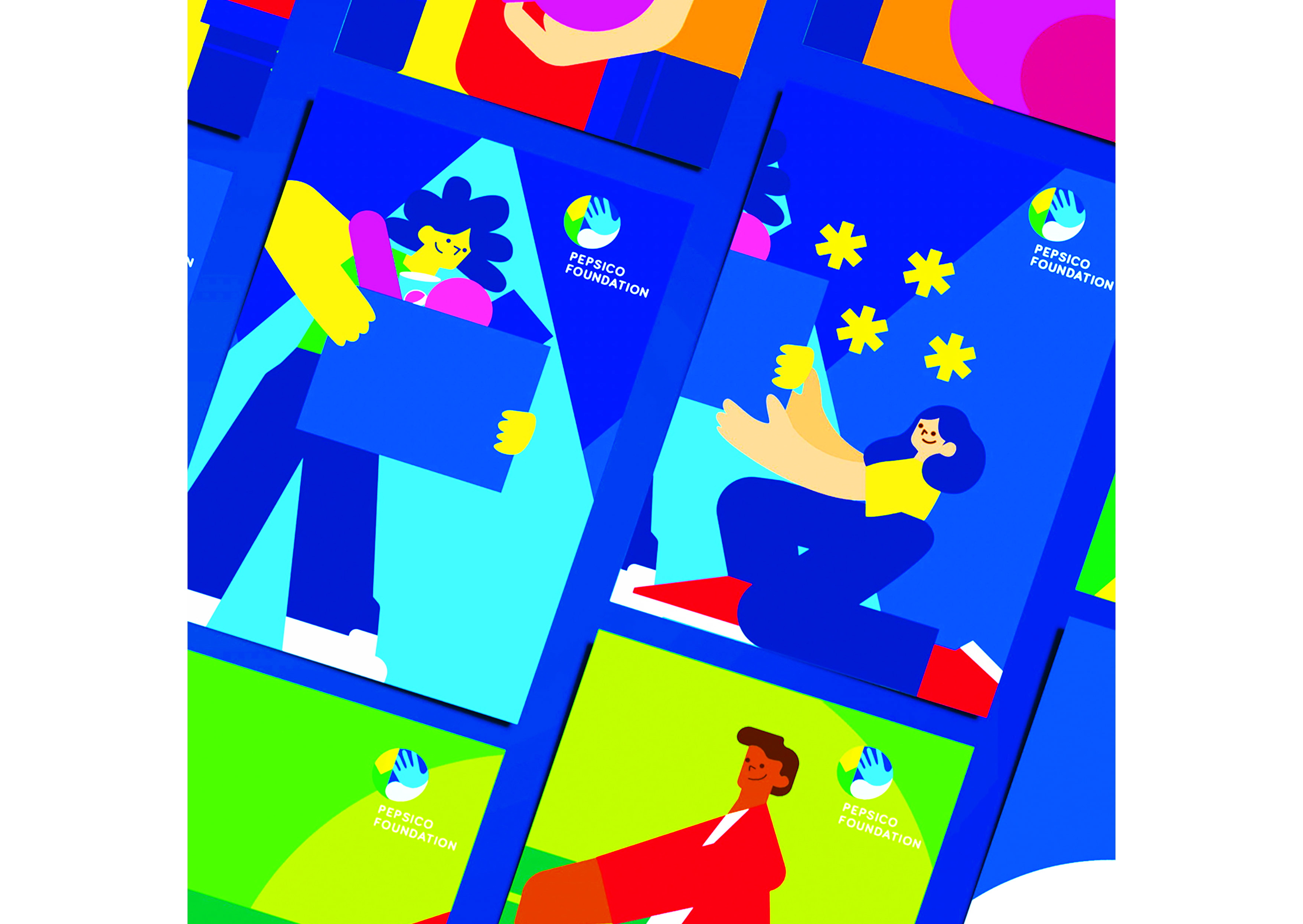
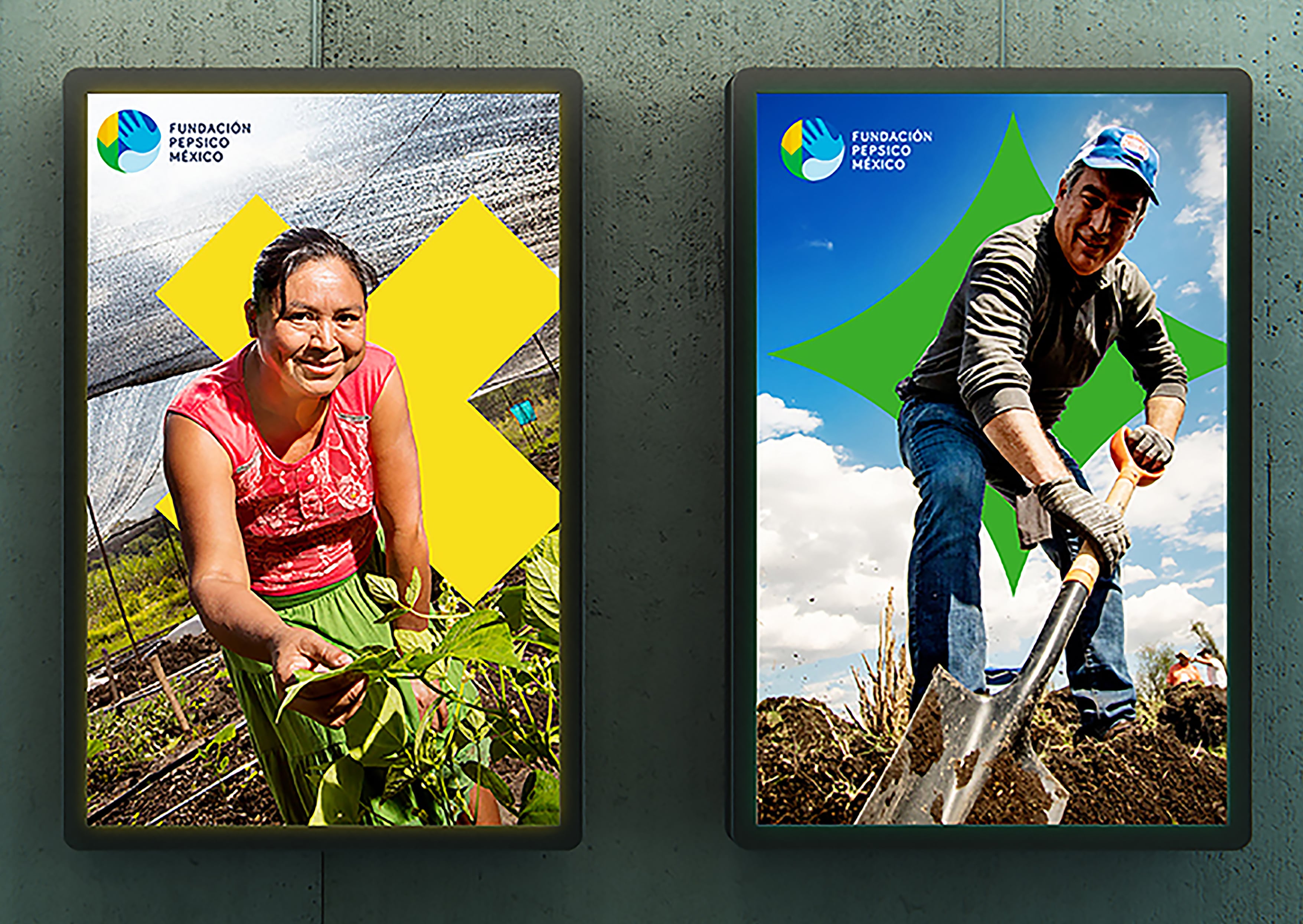
In Latin America, the PepsiCo Foundation is a nonprofit focused on investing in communities to help them thrive. Their mission is focused on empathy and equity. It’s human. However, the previous identity for the foundation was strongly influenced by the PepsiCo corporate visual language.


Image: PepsiCo Design & Innovation
  • CHALLENGE
  • SOLUTION
  • IMPACT
  • MORE
  • We redesigned the identity from the ground up with human centered design principles as our guiding light. We developed a regional identity for the foundation that expresses the pillars of their work through universal icons infused with emotion, empathy and humanity. We developed a clear geometric typeface and a vibrant color palette. We chose a photography style that highlights both the power of individuals and communities. At the end of the day all these add up to a unique, consistent and coherent system.

  • Our solution was simple. It's all about action. Putting things into motion. Think of it in an elemental way. When simple things come together and activate, they are the building blocks of bigger, more powerful movements. Our concept was anchored in the idea of Simple Great Help. Then came the visual translation. Archetypal shapes were chosen to identify the three main pillars of the foundation. In this modular system these building blocks multiply and interact to form the greater whole. The shapes can be mixed and matched for different communication needs and audiences.

  • Internally, the new identity was so well received that its scope of implementation increased dramatically. This started out as a regional identity for Mexico. Then it expanded to LatAm. The PepsiCo Foundation saw an increase in volunteer donations which translated into programs that had a positive impact for half a million people throughout Latin America. And that's just since the new identity launched in 2020.

  • Corporate foundations often follow their company's identity. And that makes it difficult for folks to differentiate the nonprofit and for-profit ventures. Yet, at the same time you can't stray too far from the founding logo. So, one of our constraints was to find a unique yet similar solution. The visual identity also had to be relevant for the complex audience matrix of people interacting with the org. Our last consideration was that the system needed to be fluid and flexible so the Foundation can get deep in niche topics while also communicating on a broad integrated level. Fourteen Million food portions were distributed all over Mexico. Employee contribution was multiplied by 14% for water and food security to different communities. All this while fostering gender equity which became a core value running across all programs. Which just makes sense since two thirds of their programming benefits women.