Pacific Fair Place Icons

  • 2016

  • Communication
    Branding and Identity

Commissioned By:

AMP Capital Shopping Centres

Designed In:

Australia

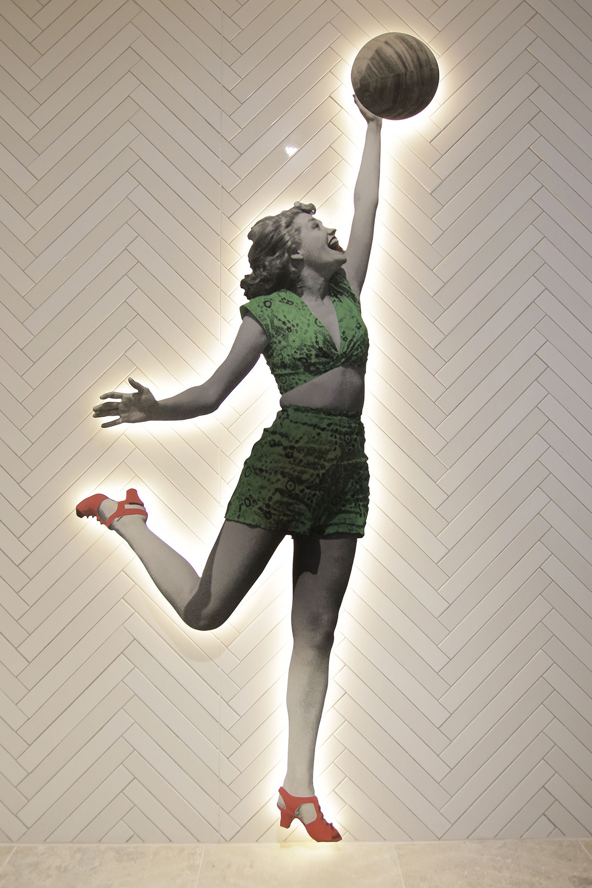
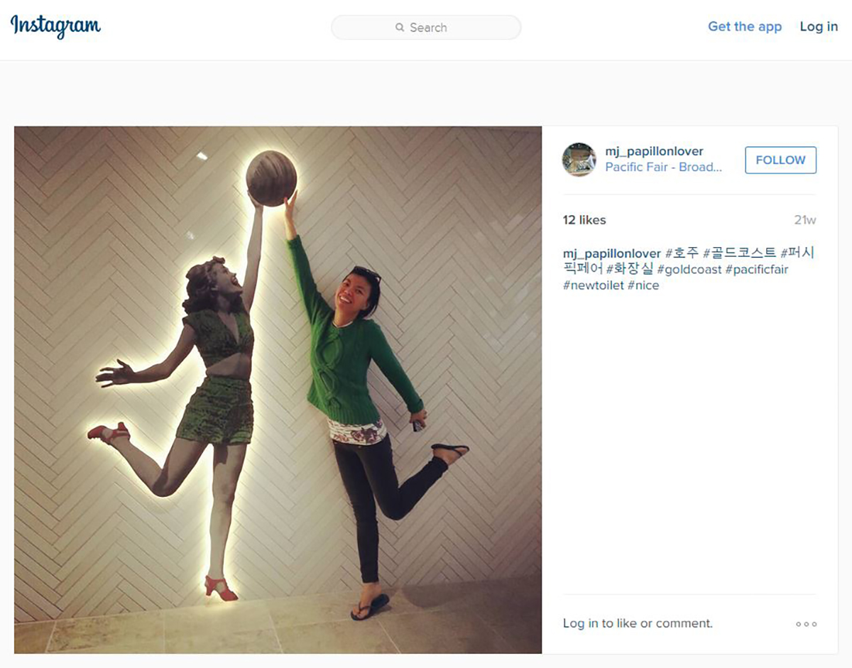
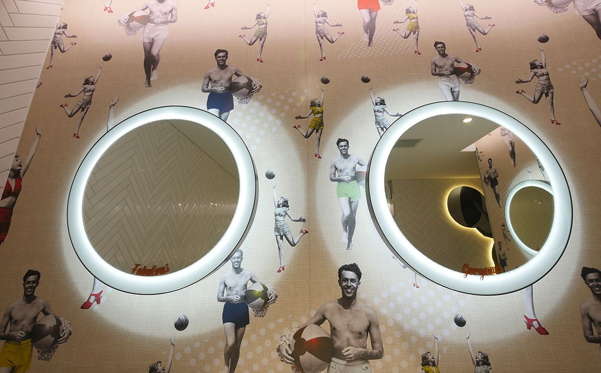
Pacific Fair has transformed traditional shopping trips into stimulating experiences, enticing visitors with quality, locally-resonant brand experiences, reflecting the character of the Gold Coast.

This holistic brand experience extends to identifying and theming for customer amenities. Vibrant beach-towel tiling leads customers to a quirky collection of ‘icons’ originating from the Gold Coast.


view website
view facebook

  • CHALLENGE
  • SOLUTION
  • IMPACT
  • MORE
  • This iconic centre holds a special place in lives of locals and tourists.The centre must deliver on the expectations of a highly diverse audience, from locals dropping in for a quick shop, family daytrippers, through to interstate and international travellers looking for an authentic international-standard Gold Coast experience. The visitor experience is carefully curated across all customer touchpoints through the activation themes of Oceania, Botanica and Urbania, seen in the architecture, interior design, signage and communications. The themes are essential tools in the repositioning of the development as a 5 star destination embedded in the Gold Coast culture and community.

  • All of the designs are originals, referencing images and iconography from Gold Coast history and lifestyle, including surfer boys/girls of the 1950s, and the legendary “Pink Poodle Motel” highway sign, bringing a unique blend of fun, place identity and functionality to visitor.The activation themes are subtly incorporated through images of beach and ocean play, underwater sea life and a retro-inspired urban coastal skyline. An extensive image selection process was undertaken to ensure the images connected emotionally and evoked a personality and a character inherent to the Gold Coast. Each set of amenities has its own specially created “couple” that corresponds to the energy and audience of their precinct. The final artwork was then developed in collaboration with Karma Creative.

  • No two locations' icons are the same, each selected to suit their context—'50s beach fashion for the sophisticated cafe precinct; lively, active outdoor fun for fresh food, and retro urban vibes for the luxury precinct. The icons function as playful and easily interpreted wayfinding devices—in masculine and feminine pairs with non-gender specific imagery in children's zones, such as parent rooms. Not only do these characters aid in wayfinding, they are designed to make you smile! Each of the characters have been given era-evoking names to bring them to life: Ethel, Frank, Sam, Peggy, Kath, Bruce, Beryl and Burt all welcome customers to the centre. Our favourite couples feature in bespoke powder room wallpaper.

  • The desired Pacific Fair brand experience is articulated as 'unmistakably the new Gold Coast' and the place icons are created to contribute to and reinforce this brand experience. In addition to reinforcing the place brand themes, the designs are deliberatively quirky, playful and encourage interaction. From the day they were installed, the designs have proven their appeal and talkability, featuring in local and international shoppers' Instagram feeds as they share the experience of their visit.

    The design values of individual icon applications correspond to the pricepoint and audience of the retailers in each precinct. In fresh food and general mall, characters are digitally printed onto metal composite panels, pinned off and halo-lit to give the feeling that they are jumping off the wall. In the luxury brands precinct, brass metallic accents are integrated to ensure a higher end look and feel that corresponds to the luxury brand environment. Figures are multi-layered, with extra care to detailing and finish selection with real brass inserts sandwiched between layers of digitally printed clear acrylic. The brass glimmers in the light to become a focal point for luxury brand customers.