NAB Evolution

good-design-award_winner_rgb_blk_logo
  • 2023

  • Communication
    Branding and Identity

Designed By:

Commissioned By:

NAB

Designed In:

Australia

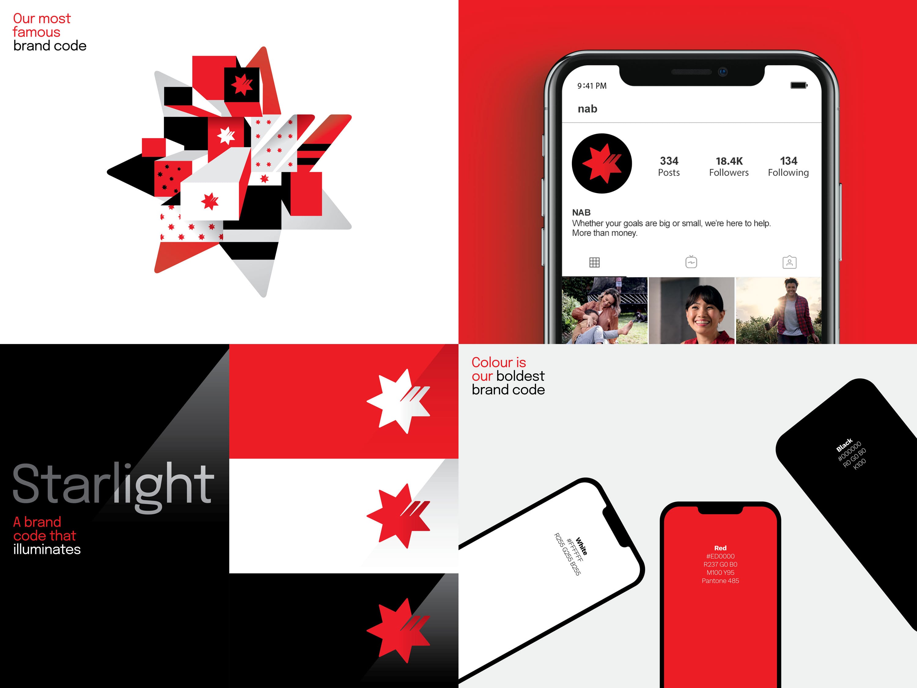
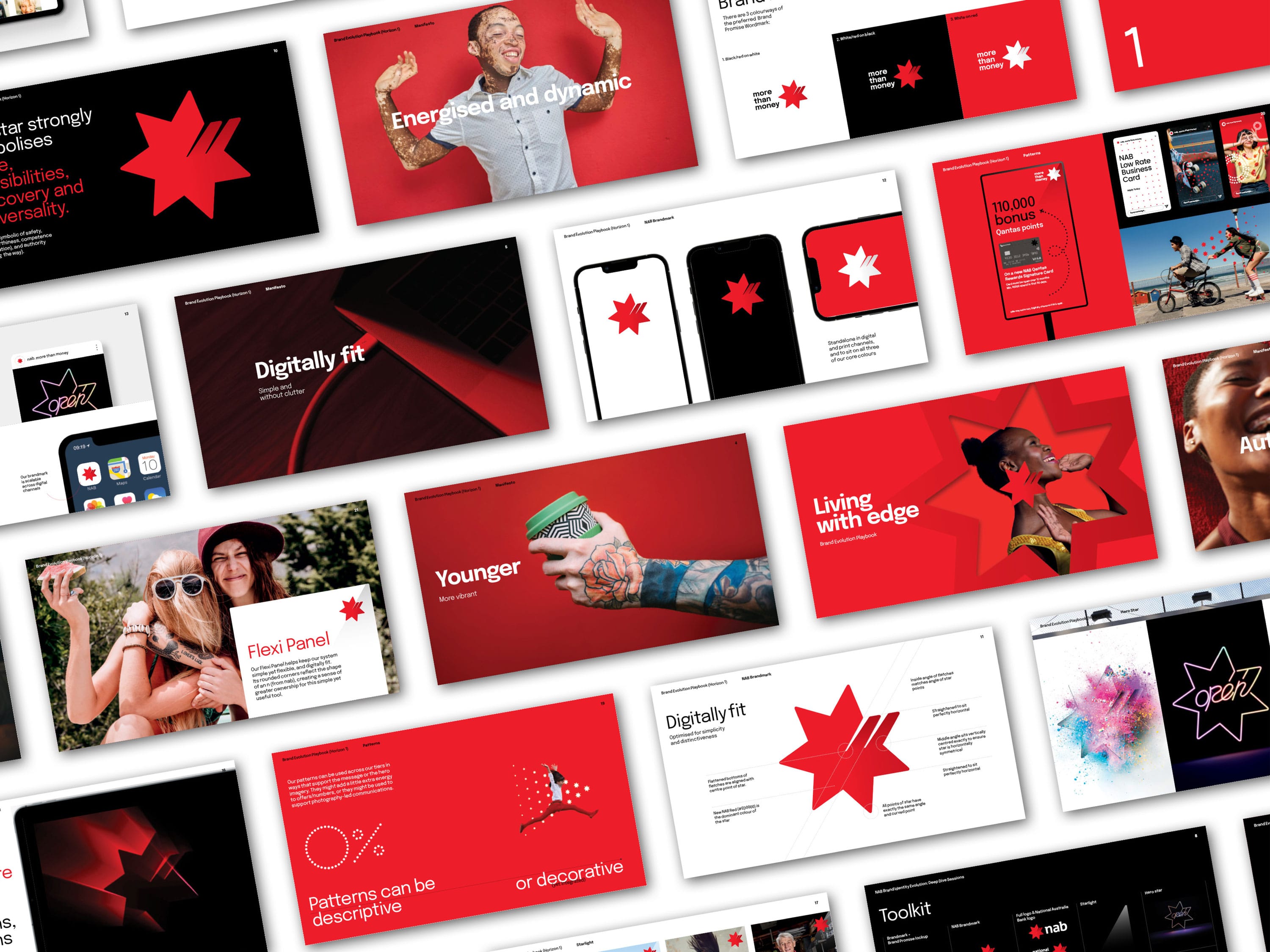
In late 2022, NAB evolved its brand identity to strengthen its positioning as the experts in money – and the bank that really gets Australians. Our approach represents contemporary best practice in evidence-based brand identity design. This project was the 3rd time that Principals has evolved the NAB brand over our 18-year partnership.
view website

  • CHALLENGE
  • SOLUTION
  • IMPACT
  • MORE
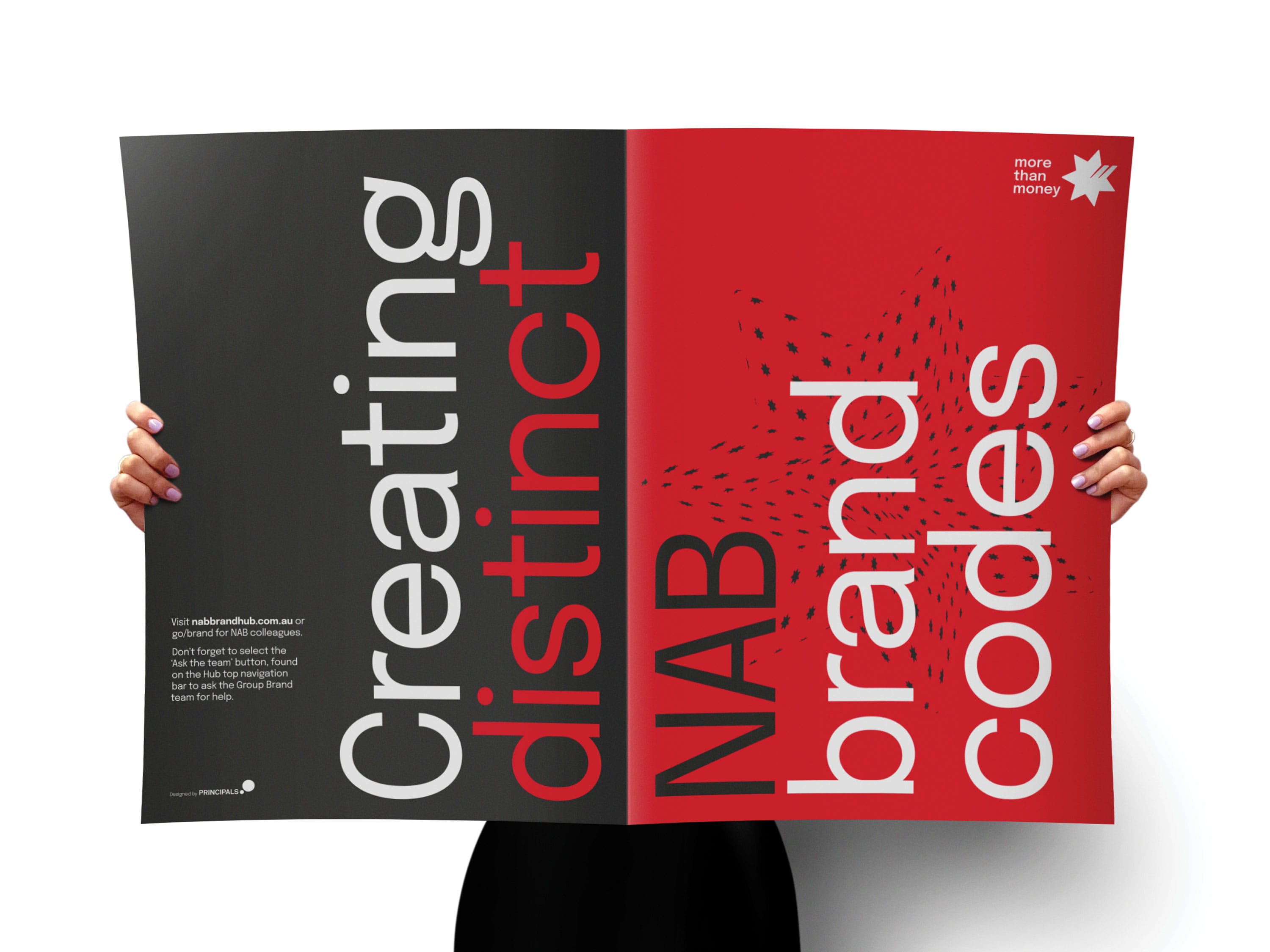
  • Big banks are complex to brand. The overall mission was to modernise and energise, with specific challenges to: •create an evidence base to build the internal case for change •meaningfully assess the relative significance of different identity elements to define the scope •bring new energy, dynamism, and flexibility to NAB’s brand identity system – allowing for a seamless customer experience across all audiences and contexts, in particular digital channels •develop simple self-service tools for the whole organisation to unify communications under the evolved Masterbrand – increasing brand attribution by research-qualified, unique, and distinctive brand codes.

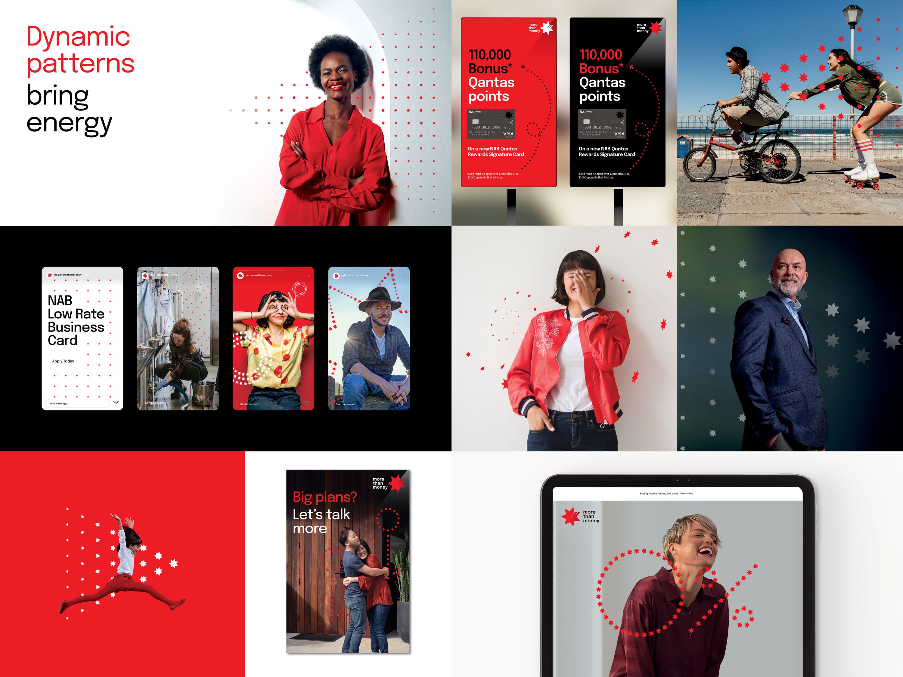
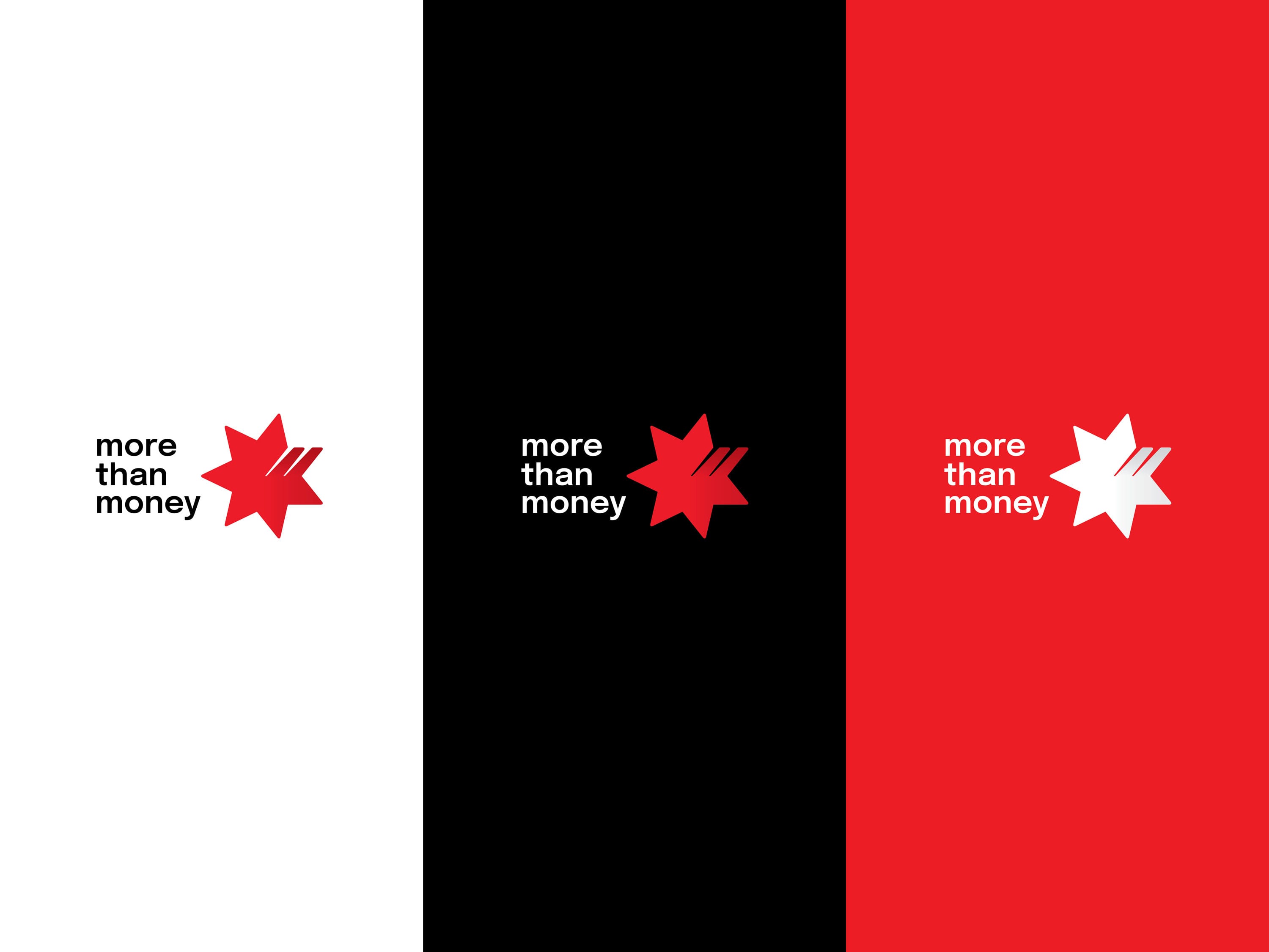
  • Driven by research (semiotic, qualitative and quantitative), design thinking, strategy validation, competitor analysis and system auditing, we leveraged our best assets and created new elements that hero NAB’s unique, ownable star – allowing for more freedom and impact. We simplified the identity system with flexible tools that can dial up and down, while also expanding on ideas of illumination, hope, and pathfinding. We found opportunities to amplify distinctive edge and effectiveness across all touchpoints. And aligned the refreshed strategy with more nuance around human character, expertise and emerging trends.

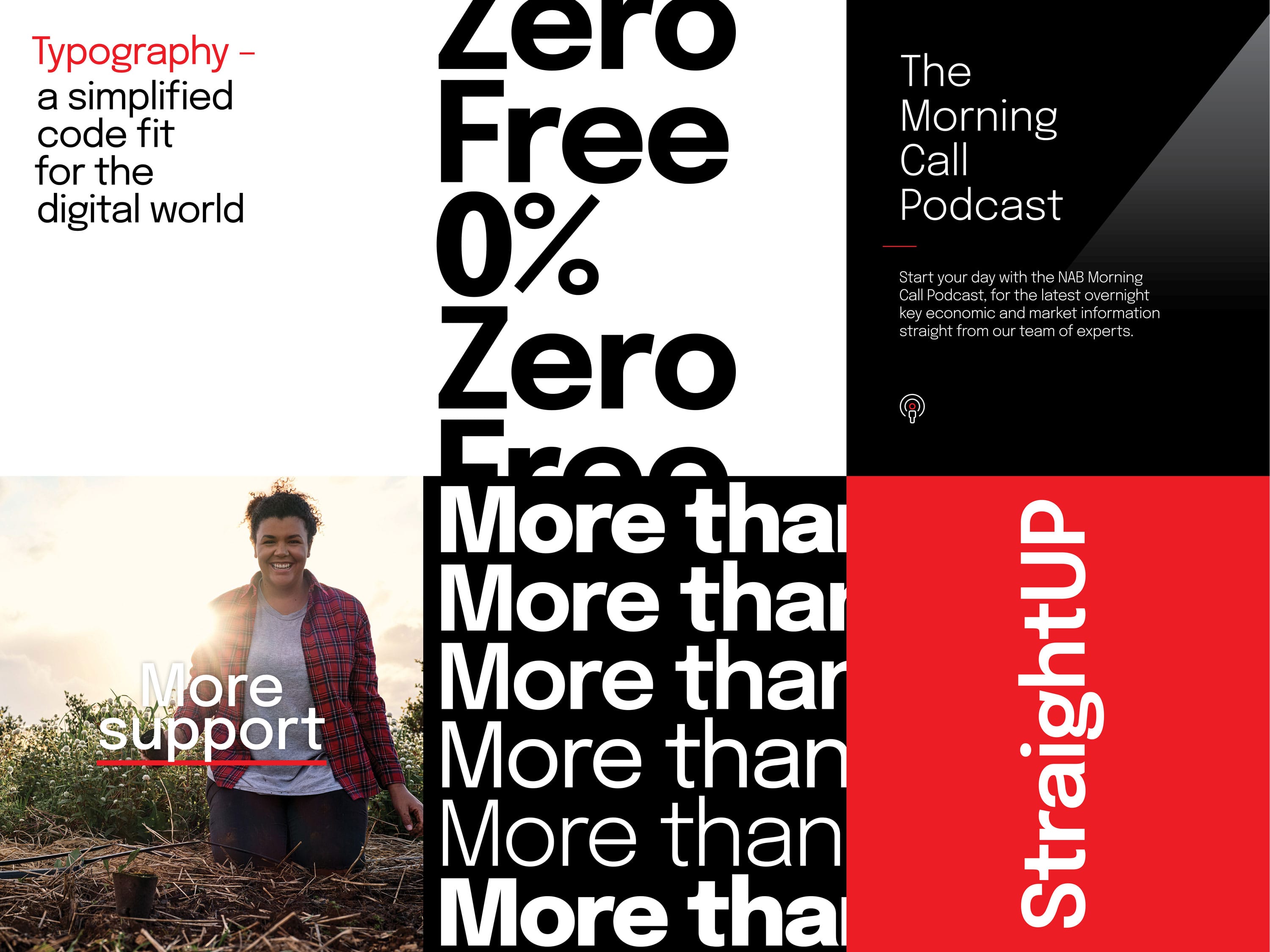
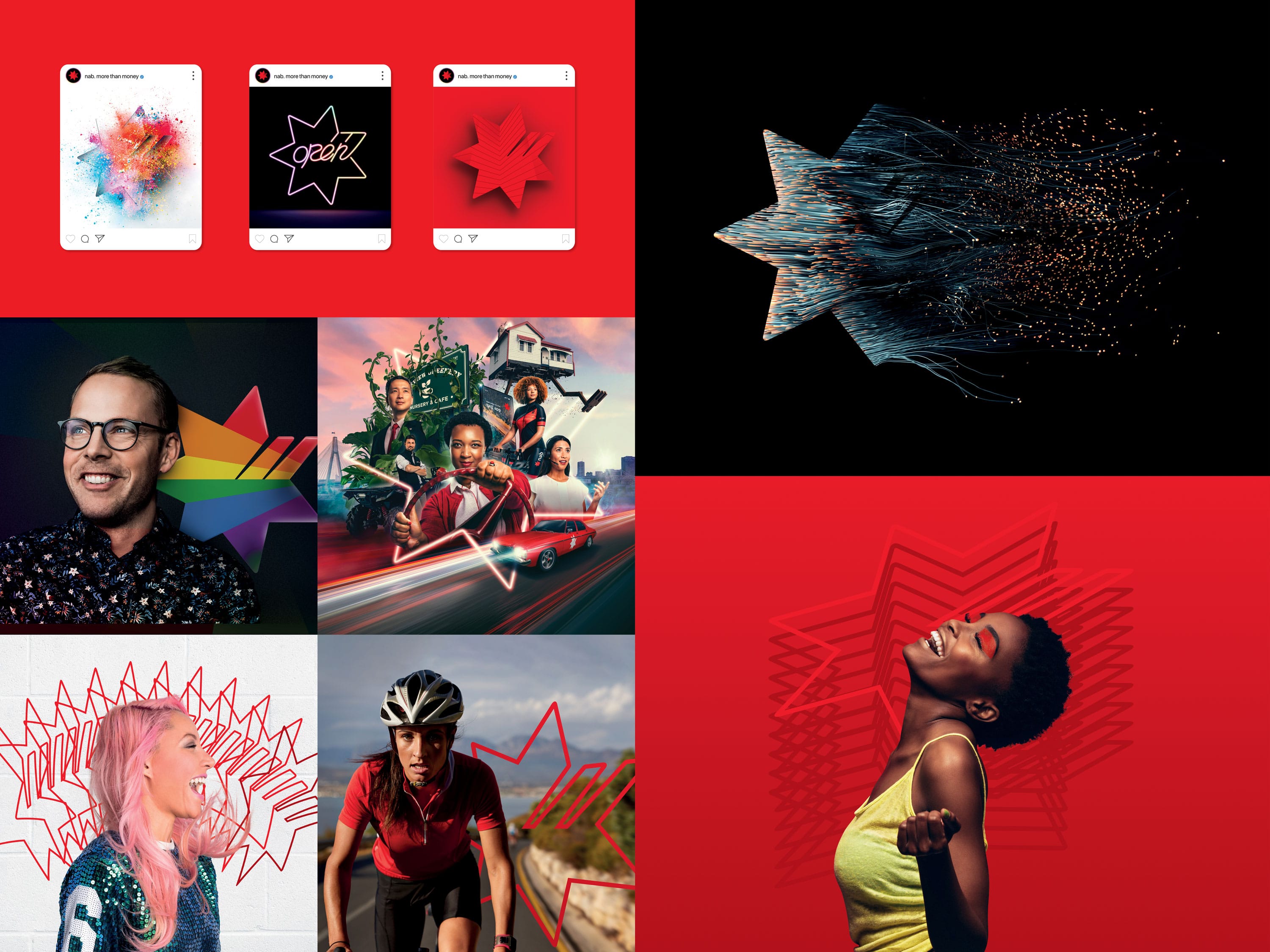
  • NAB’s new identity launched in April 2022 and early data shows that we’ve improved its distinctiveness across all our brand codes. Based on the research, we’ve boosted brand recognition by ‘freeing the star’ and evolved the brandmark, colour palette, typography, photography, illustration, and patterns. Our evidence-driven evolution has brought more energy and youthfulness to the brand, without compromising on NAB’s diverse range and style of communications.

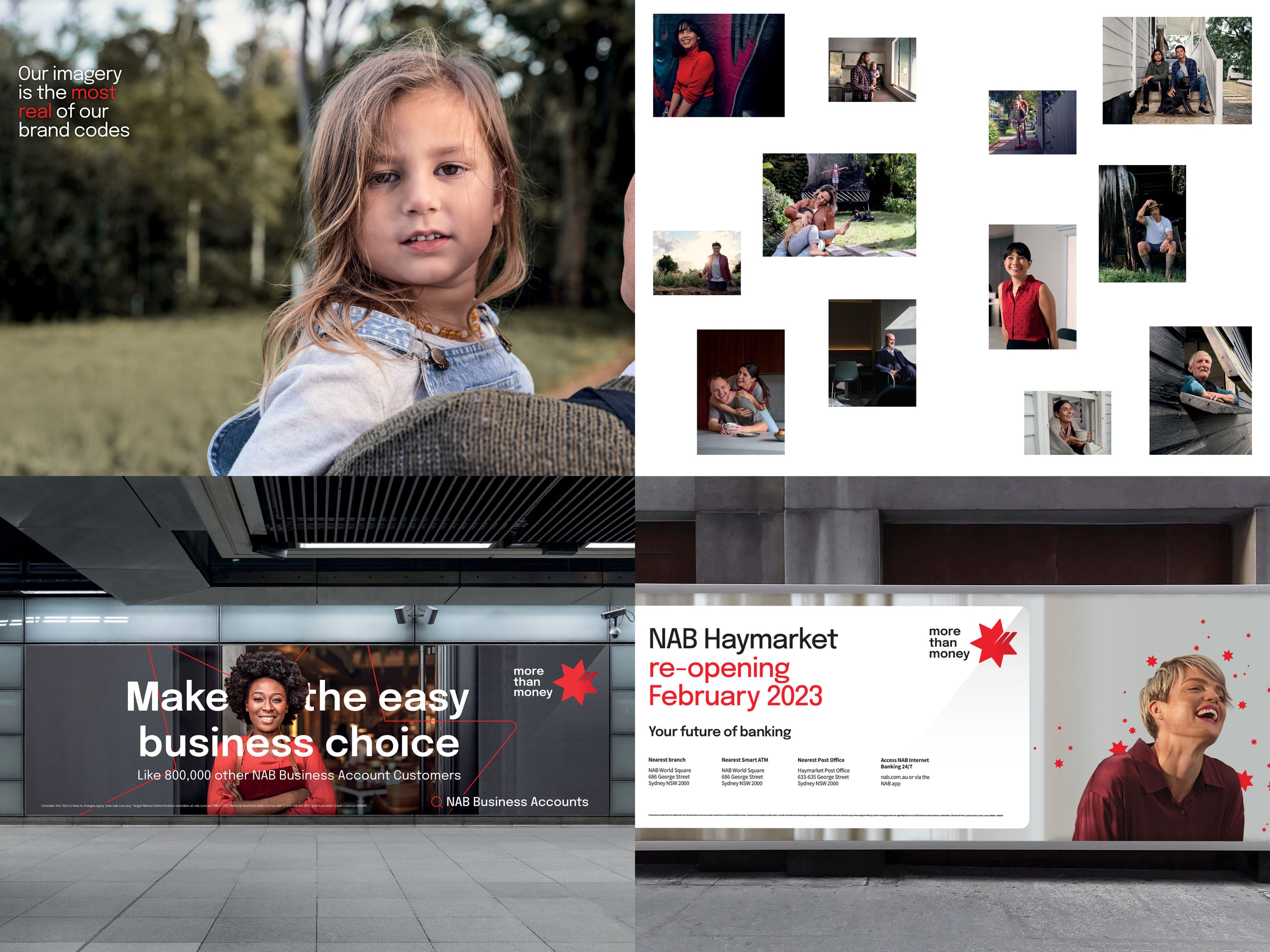
  • The most distinctive aspect of this project was the integration of research into the brand design process – specifically: •quant research to assess individual brand identity elements using the distinctive asset grid based on marketing science best practice •qual to explore ideal bank brand identities •semiotics to explore the intrinsic cultural meaning of the Star as a symbol. Central to our intent for the brand evolution, and the identity challenge at hand, we focused not just on what and why – but how. Our ongoing ambition is to democratise the brand evolution process. And build emotional and intellectual commitment to the refreshed system by featuring real people in real and often more intimate scenarios. We’re creating a platform encouraging colleagues as a start, to contribute to and build on our image library. This will help us create a platform for participation, so that who we are is a true reflection – a mirror image – of who we all are within the organisation. We see it as inclusiveness redefined, which allows us to push an already human and authentic photography style into the future. Moving away from category norm polished, stylised, and vibrant imagery and towards a more honest, raw, and immediate style.