MitoQ

good-design-award_winner_rgb_blk_logo
  • 2023

  • Digital
    Web Design and Development

Designed By:

Commissioned By:

MitoQ

Designed In:

New Zealand

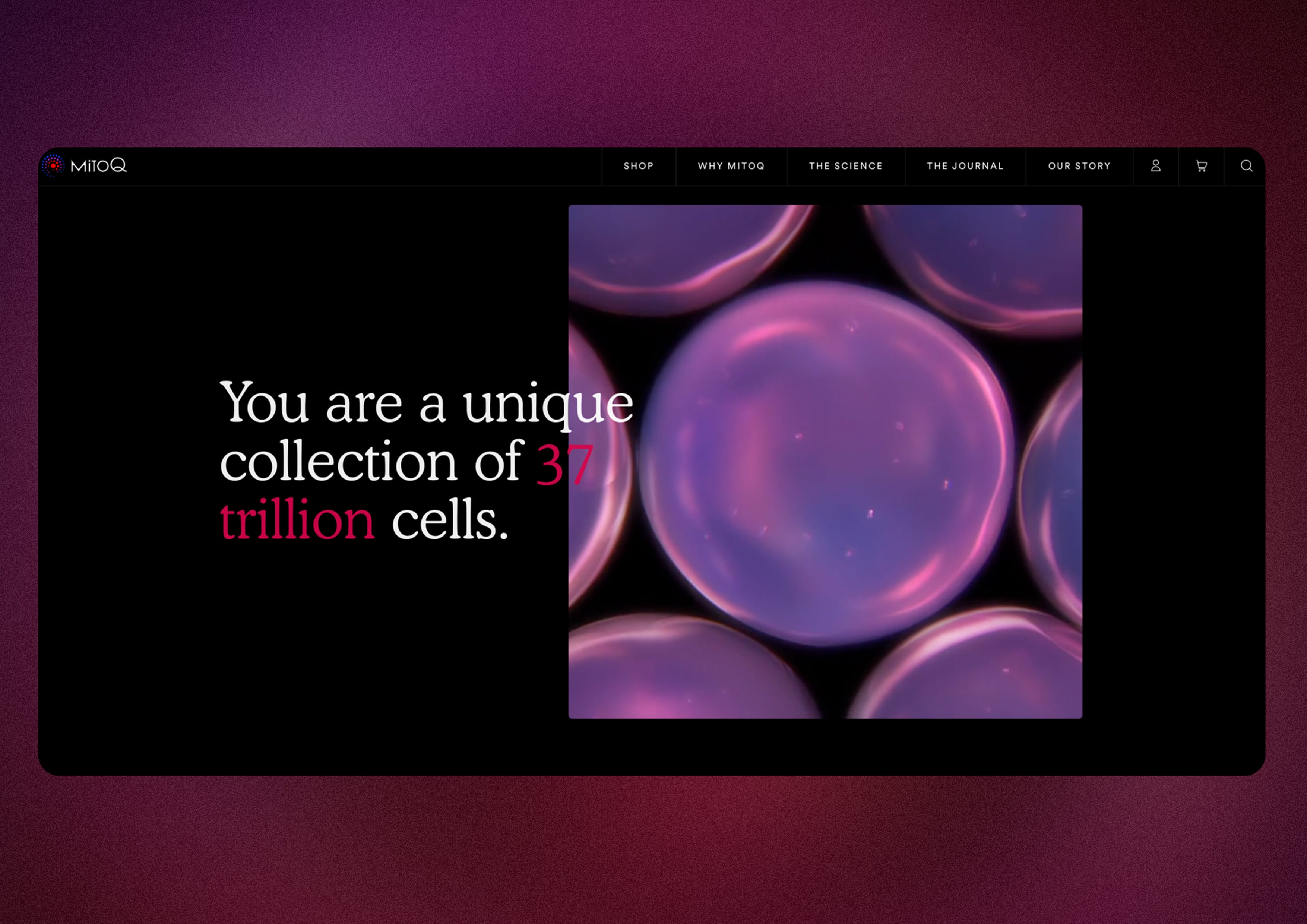
We collaborated with MitoQ to reimagine their digital experience from the ground up. They wanted to go beyond a health supplement, ecommerce website to create a storytelling-based experience which draws customers deeper into a positive, lifestyle-based brand.
view website

  • CHALLENGE
  • SOLUTION
  • IMPACT
  • MORE
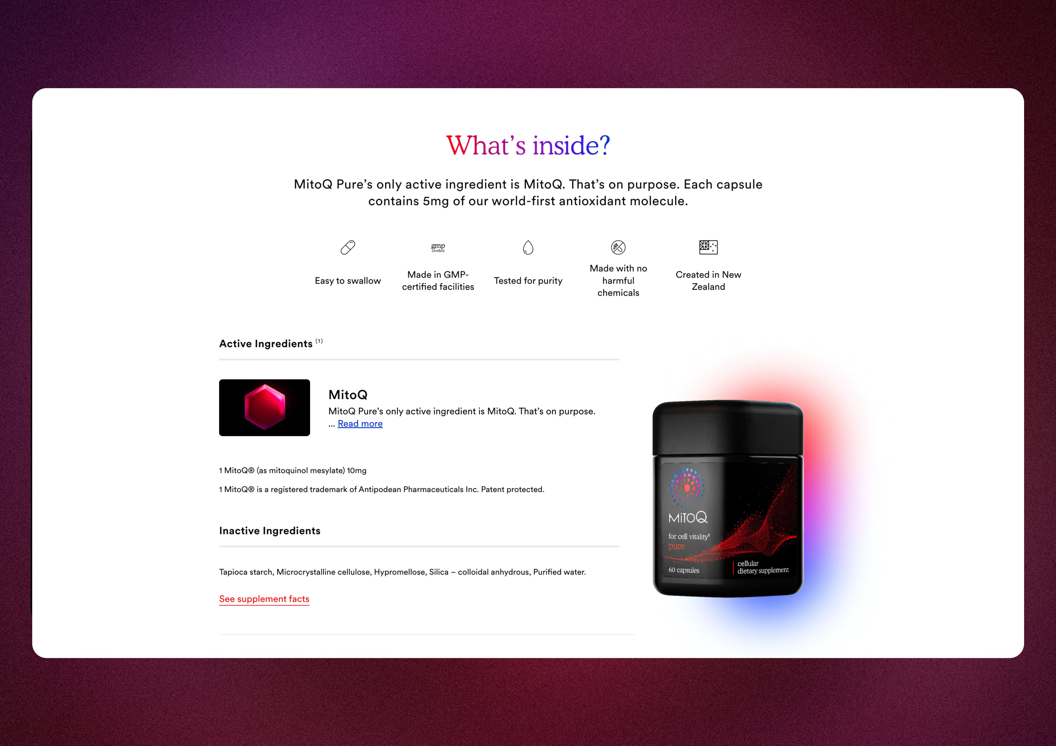
  • MitoQ wanted to forge an entirely new wellness category of “Cellular Health”, where consumers empower their own health on the deepest foundations - their cells. It was an opportunity to imagine how storytelling could play a pivotal role in ecommerce by putting the story of life and vitality at the heart of the site. We needed to convey the pragmatic qualities and benefits of the product, along with the aspirational feelings of the brand. We also had to tell the story of the science behind MitoQ without it feeling complex or overwhelming.

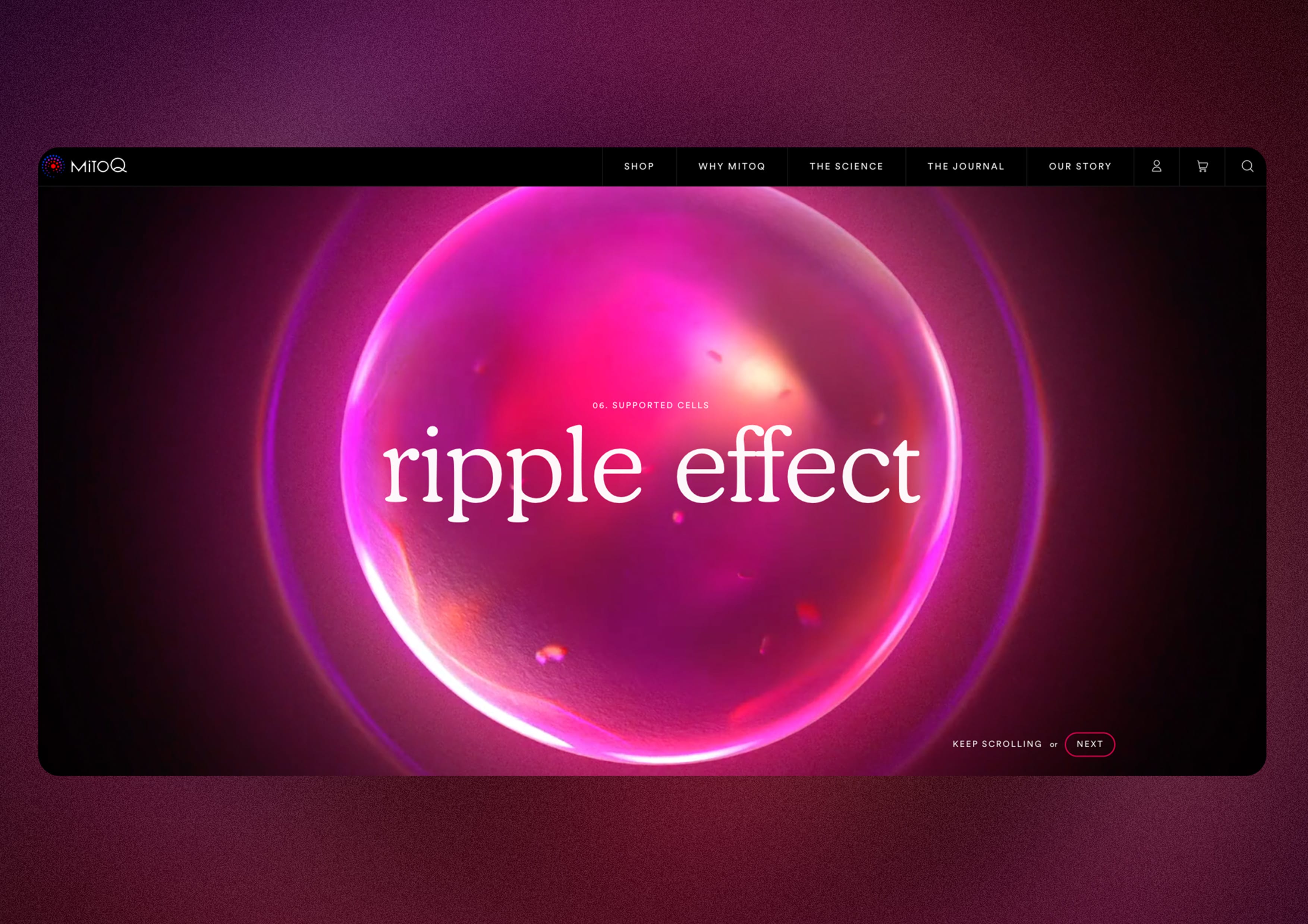
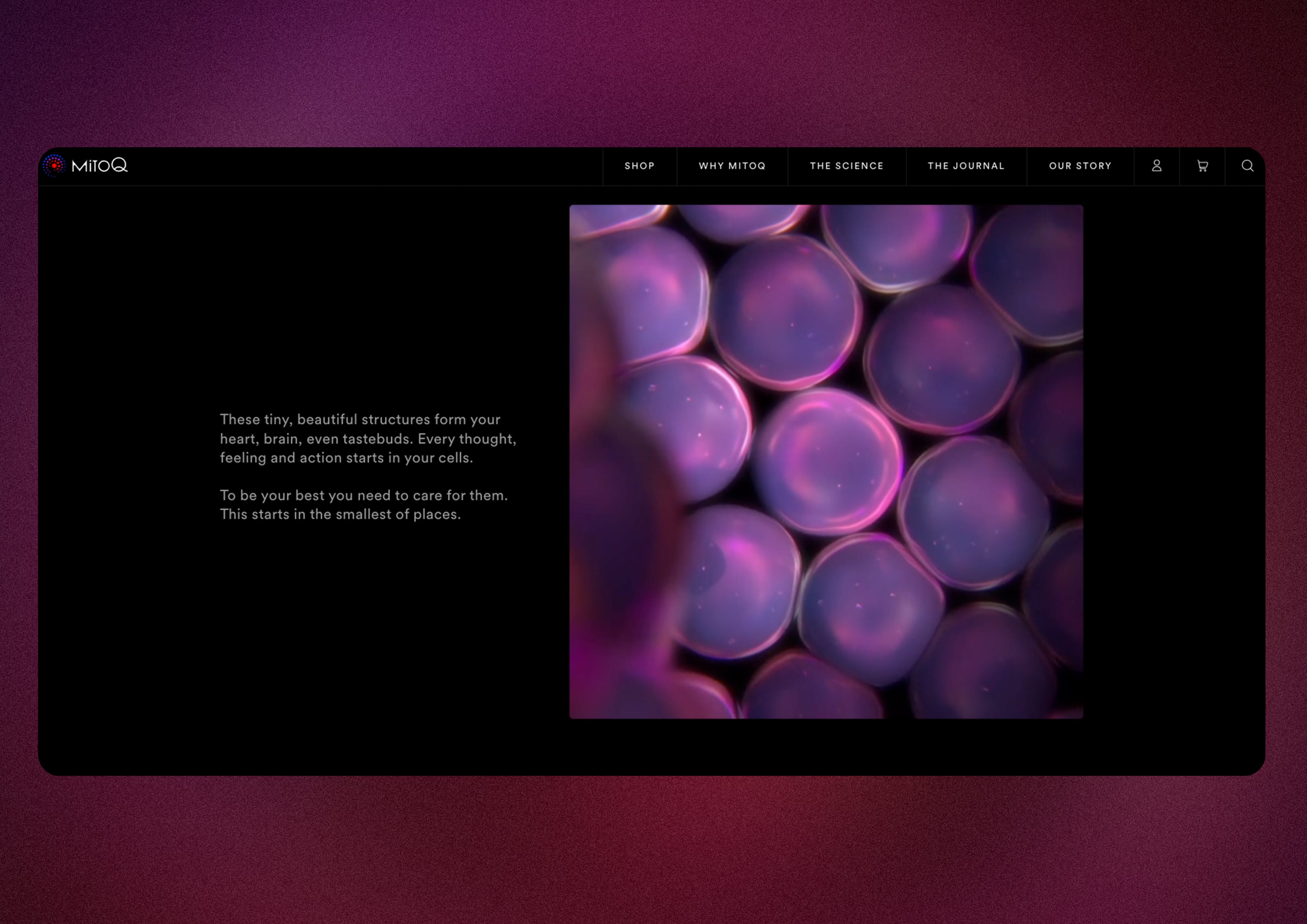
  • MitoQ’s new branding work was sleek and premium, we wanted to balance this with a feeling of lightness. We wanted to show how their product is woven into everyday moments, with photography conveying positive impact for real people. MitoQ wanted to demonstrate the science of the product working to enhance cellular health. They wanted to bring to life the energy of cellular production… those epically tiny moments that life is based on. We created a scrollytelling experience for The Science which begins deep inside a cell then shows the positive ripple effects as it moves throughout the body.

  • The new site has seen a significant uptick in onsite engagement, conversion and retention. We continue to work closely with the MitoQ team to finesse the UX/UI and content of the site in response to usage data and user feedback. The modular design system we established in the website’s design has been rolled out across several other touch points in the company. And the site has proved an ongoing source of inspiration and pride for their global team.

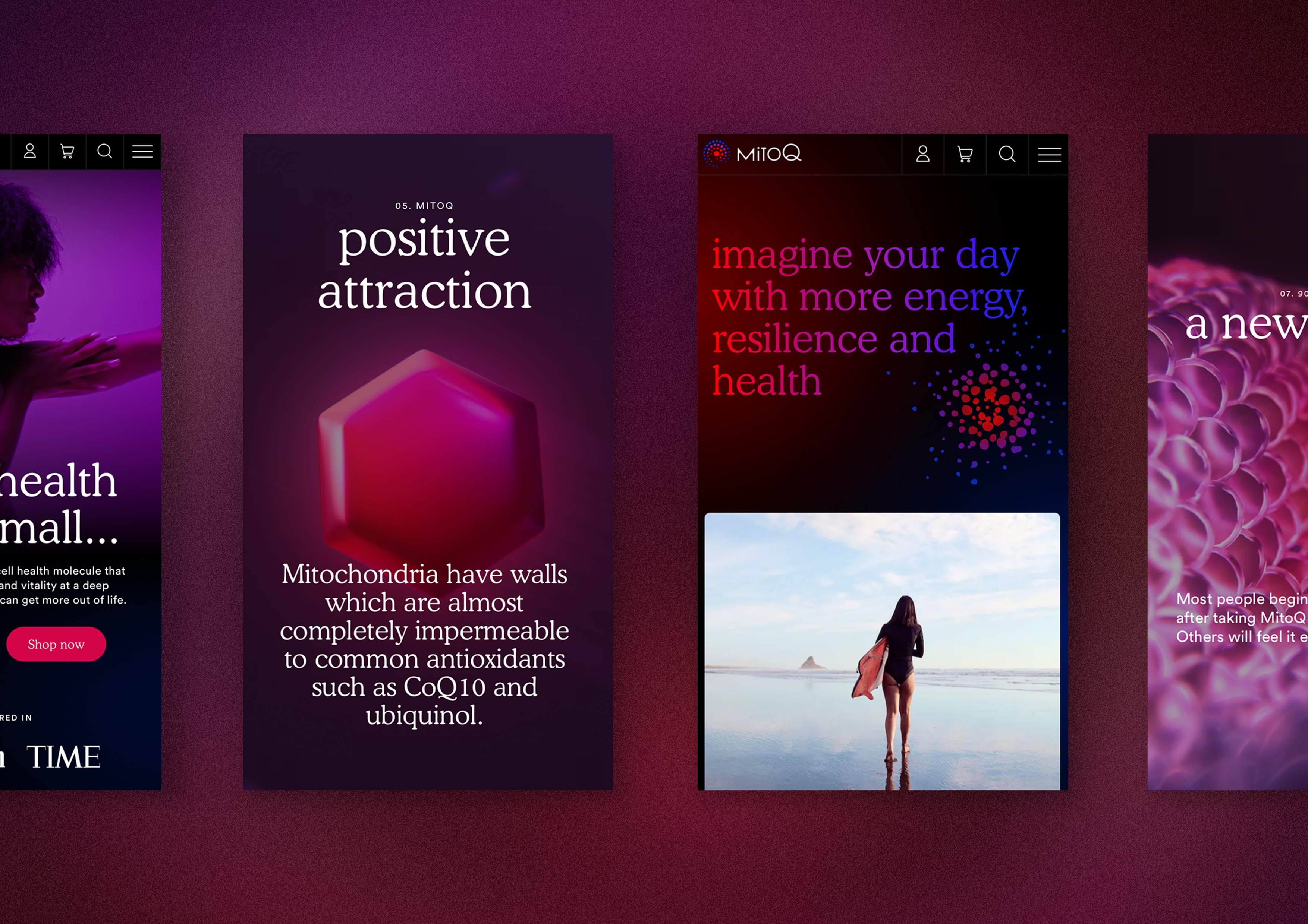
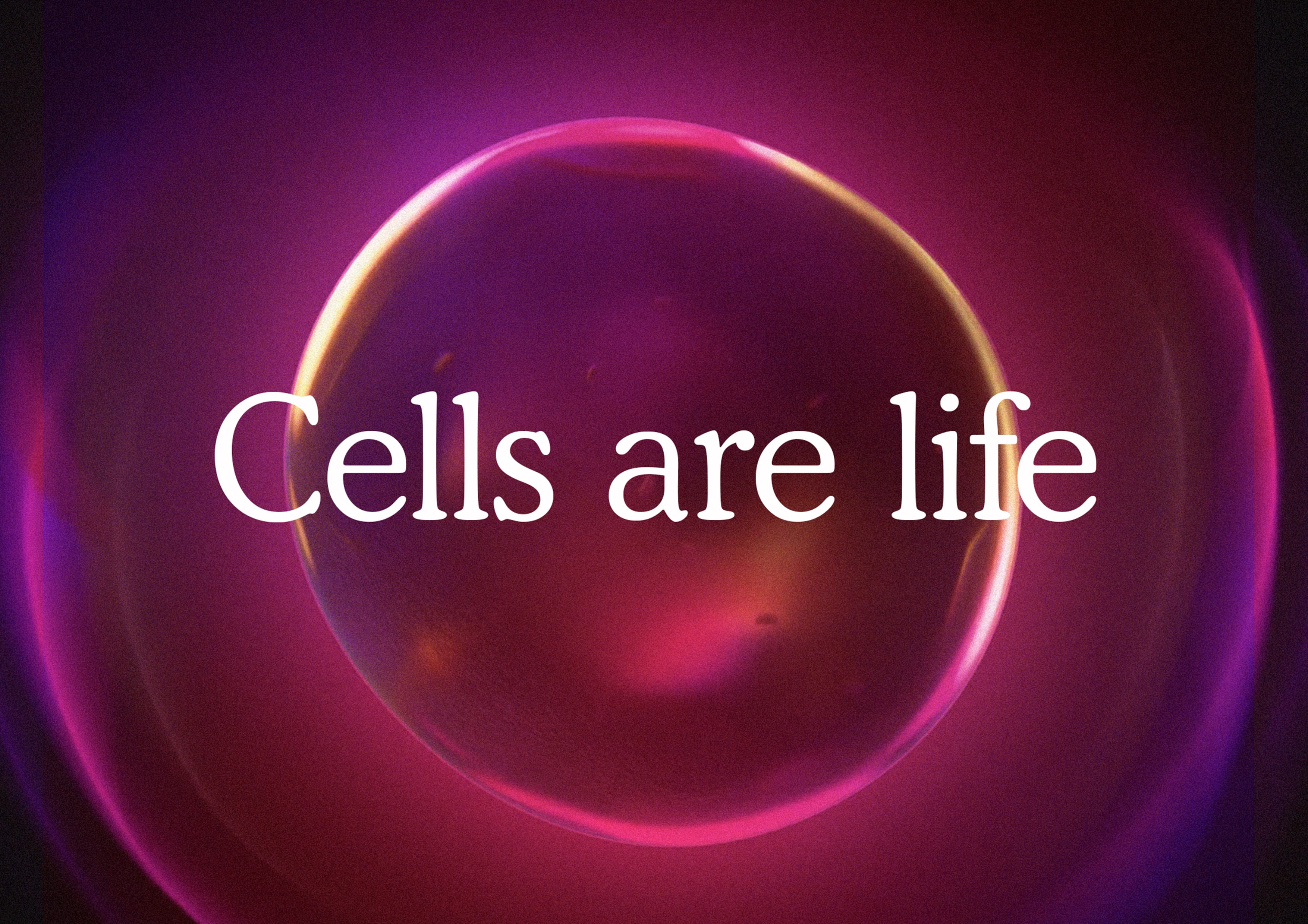
  • The brand work established a language of blues and reds - where blue was the base state of a body’s cells, red was the excitement of the MitoQ molecule, and purple is the energy cascading from one to the other. We expressed this story in multiple moments throughout the site, from backgrounds of key pages, where red and blue slowly swirl into each other, to the CTA button rollovers, where colours radiate outwards as you hover your mouse. In the site’s design direction we balanced premium cues of black interspersed with “pops” of colour and gradients, and sections of clean white for an easy reading experience and breathing space for the eye. Communicating MitoQ’s brand story of energy and positivity radiating outwards in a ripple effect from the individual to the wider community was a core aim for us, we wanted the entire site to have this feeling both in the way it looks and its interactivity.