Lugano Region Territorial Branding

good-design-award_winner_rgb_blk_logo
  • 2019

  • Communication
    Branding and Identity

Commissioned By:

Ente Turistico del Luganese

Designed In:

Switzerland

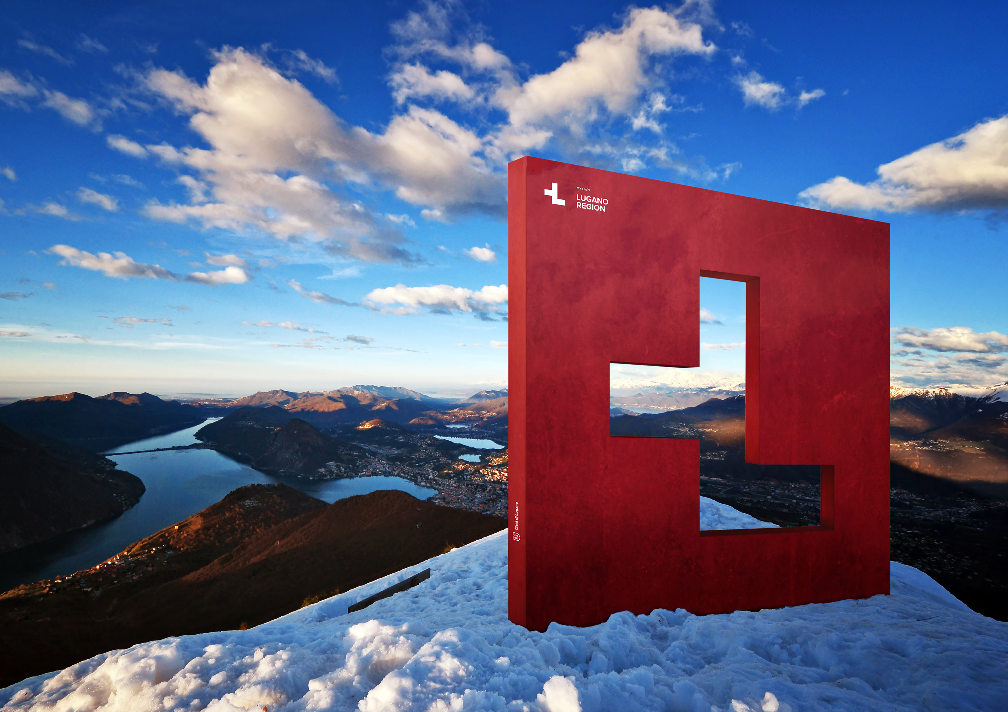
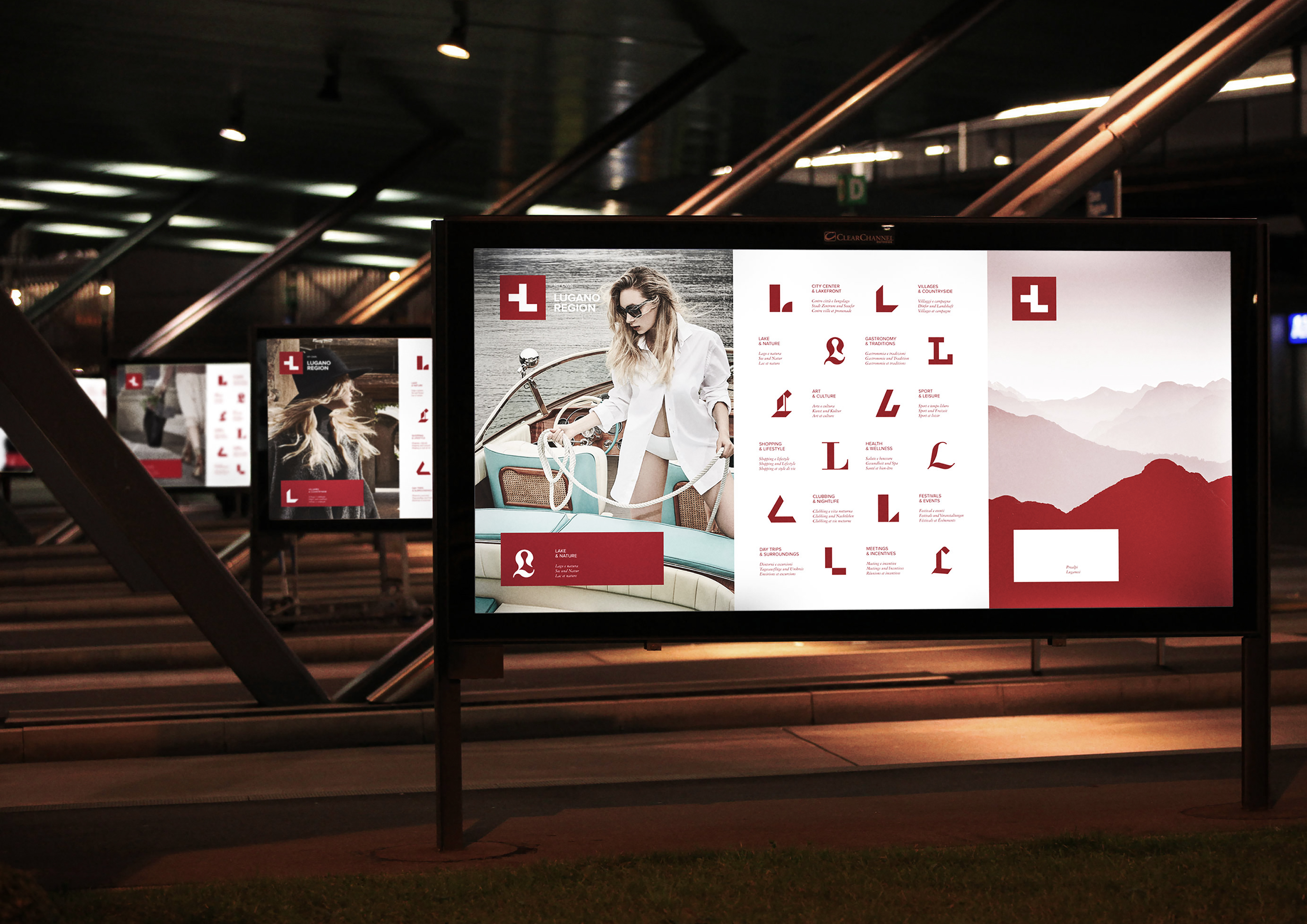
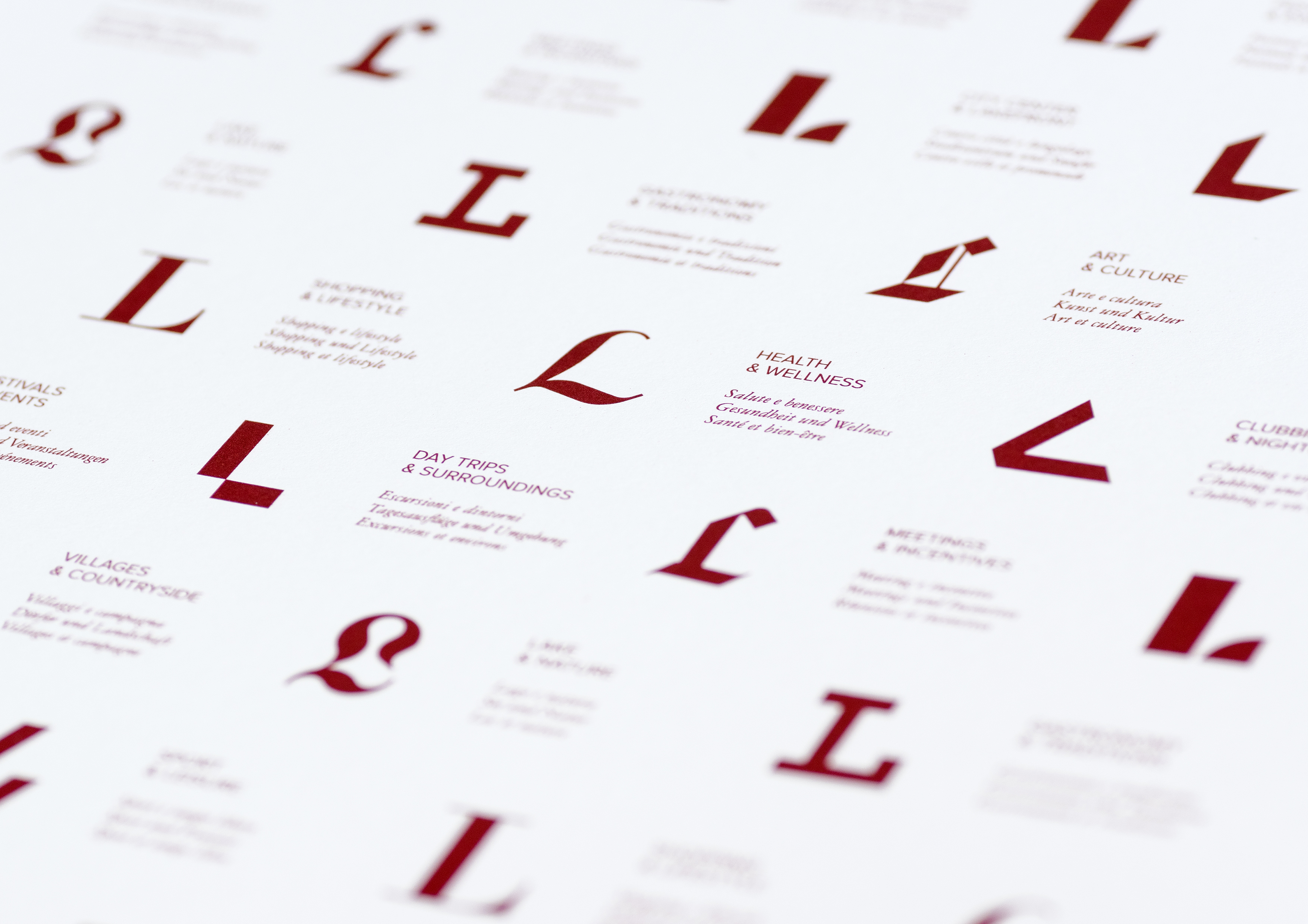
Territorial branding for Lugano Region: a very atypical destination within Switzerland where Mediterranean weather can be found in a safe and efficient Swiss environment. The brand essence that emerged is “differently Swiss” which has been translated visually in an alteration of the Swiss flag to form the letter “L”.


view website

  • CHALLENGE
  • SOLUTION
  • IMPACT
  • MORE
  • A new law from 2015 re-defined the borders of the region, enlarging the metropolitan area of Lugano to the countryside and the villages around it. The law also allowed the region to promote itself independently, where previously a single national authority was designated to promote the entire territory. The project proposal was developed with two main objectives: to create a brand suitable to represent the uniqueness of the region, which could be functiona for the promotion abroad, and to build a feeling of membership and belonging among the residents.

  • The branding process included the creation of a graphic system that aims at displaying the variety of the regional offer. The offer has been re-organized in 12 different categories and for each category we designed a specific font in order to give each time a different connotation to the letter "L" of Lugano. Aligned with the new naming “My own Lugano Region”, this allows to express the many faces of a single reality: a place where each resident or visitor can find his own personal way of living it.

  • The launch of the brand has been broadcasted on national tv during the news and was featured on the front page of all main newspapers. In terms of results, shortly after the launch 2 of the most important municipalities of the Region have requested to host branded installations on their territory, while all main economical players have proposed their help in spreading the brand through out the territory, showing great willingness to be represented by the new brand, and an extraordinary spirit of belonging.

  • The project has been developed keeping in mind the key features of Swiss graphic design traditions: Swiss Style (or International Typographic Style) became the way to link even more the region to its territory and local excellences. In this way, not only we paid a tribute to the design pioneers of the fifties but we also made a strong statement about the fact that Lugano is in Switzerland, with all the positive connotations that go with it.