L.POINT Brand Design & Identity

  • 2016

  • Communication
    Branding and Identity

Commissioned By:

LOTTE Members

Designed In:

South Korea

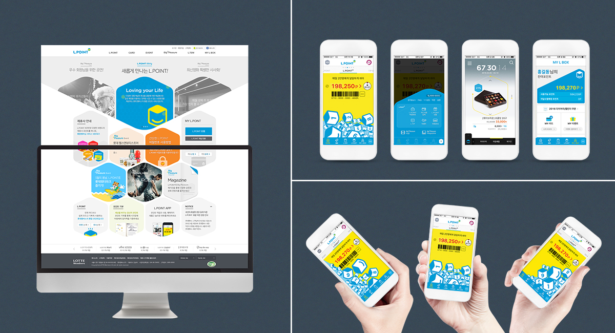
L.POINT is a consolidated loyalty program, which integrates a variety of brand partners including 45 affiliates and more than 15,000 merchant accounts-shopping, culture, dining, entertainment, financial services and so on-, and provides the same type of rewards.

The loyalty rewards are tied to the payment and can be used like cash.


view website
view facebook

  • CHALLENGE
  • SOLUTION
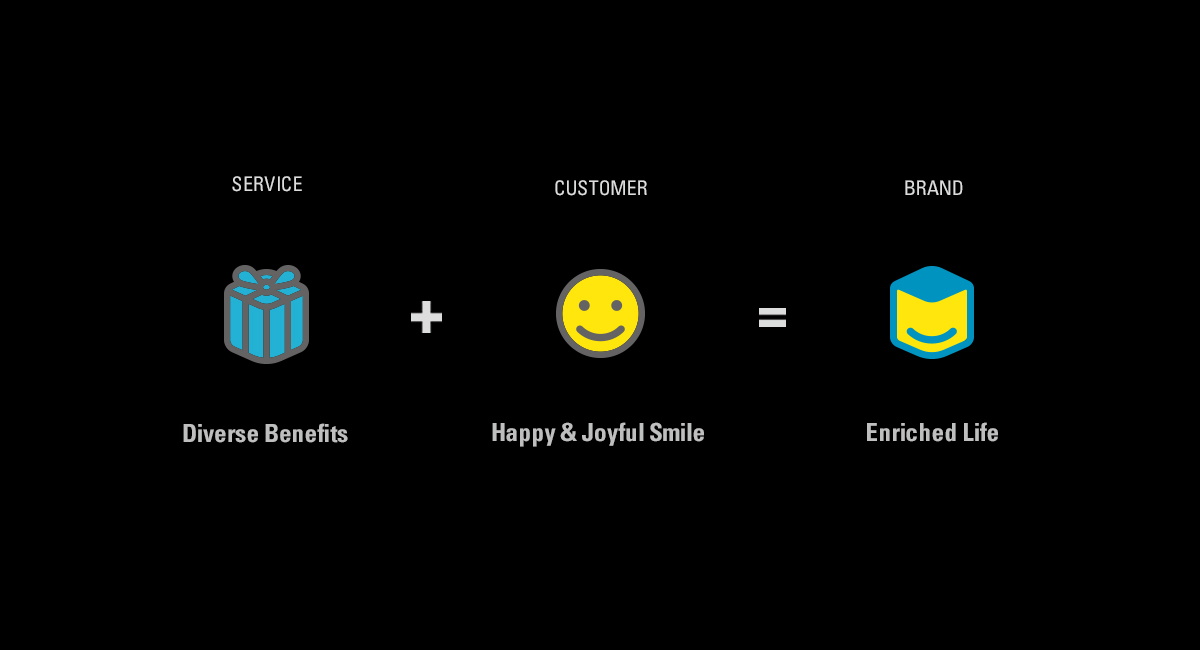
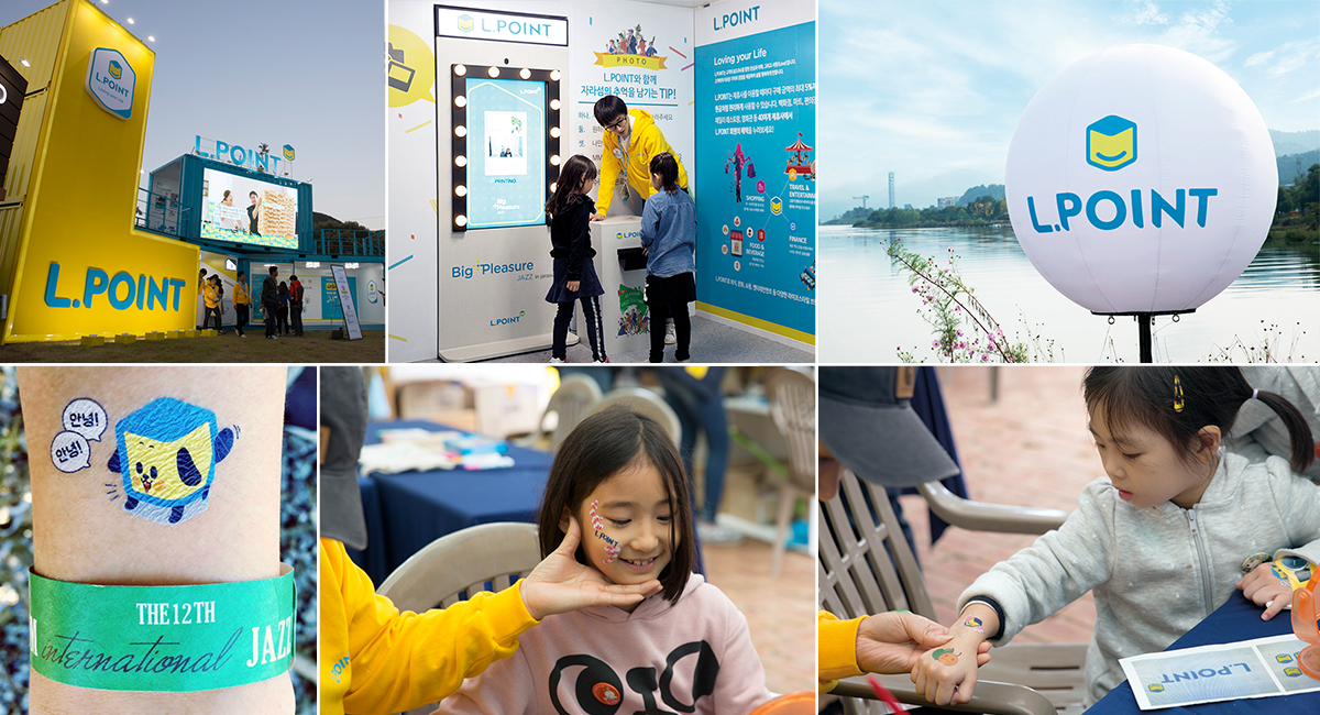
  • The L.POINT represents a core value that it would make our members happy by providing beneficial and valuable experiences. First, the initial “L” in the word L.POINT symbolizes life and love. It portrays an image that we are interested in, understand, and love people's life. In addition, our cube emblem stands for a gift box of happiness and joy containing diverse benefits. That offers benefits tailored to each individual customer to ensure that people would enjoy an enriched life anytime and anywhere; further it shows a willingness to become a point-reward program for presenting greater happiness and smiling. Our blue color is to inspire values at abundant life; the yellow is to evoke a happy and joyful smile.

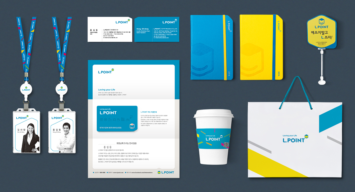
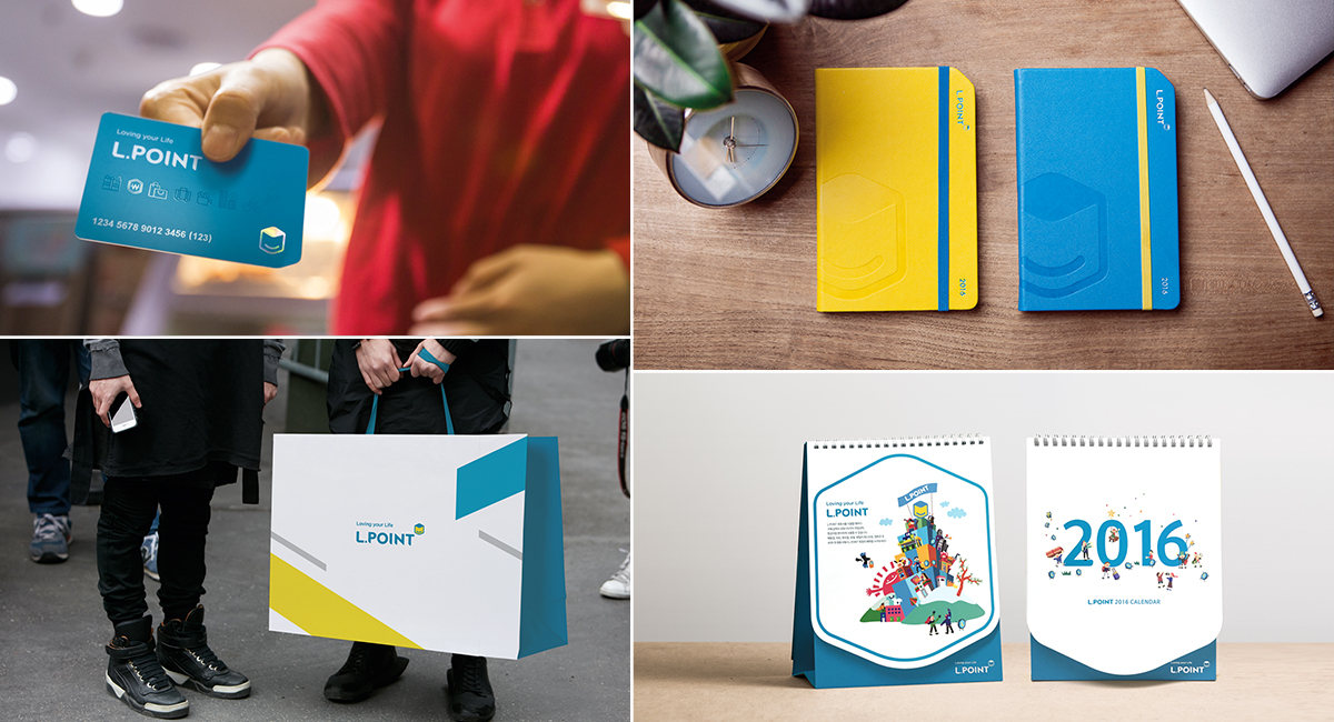
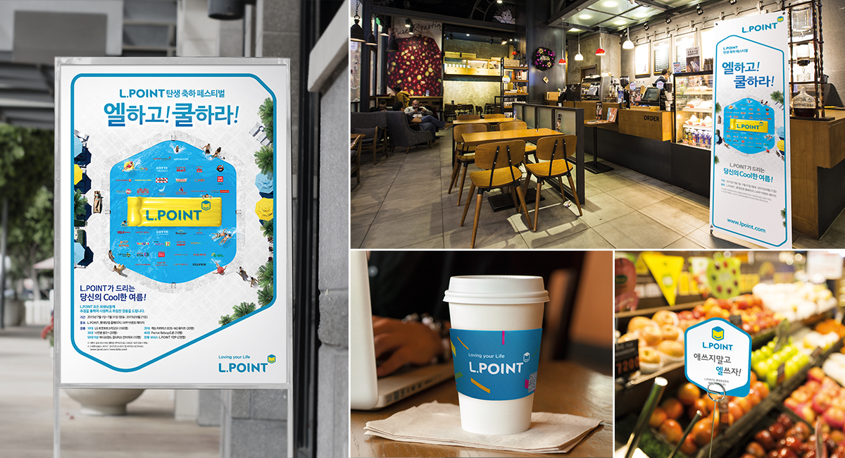
  • Our blue color is to inspire values at abundant life; the yellow is to evoke a happy and joyful smile. Both of them are used as the symbol hues of our brand in the first place. The brand identity of L.POINT is revealed through graphic templates and motifs that are the expanded versions of our cube emblem. And the five colors, which we use, represent our typical partner groups: Shopping, F&B, Entertainment, Travel and Finance.