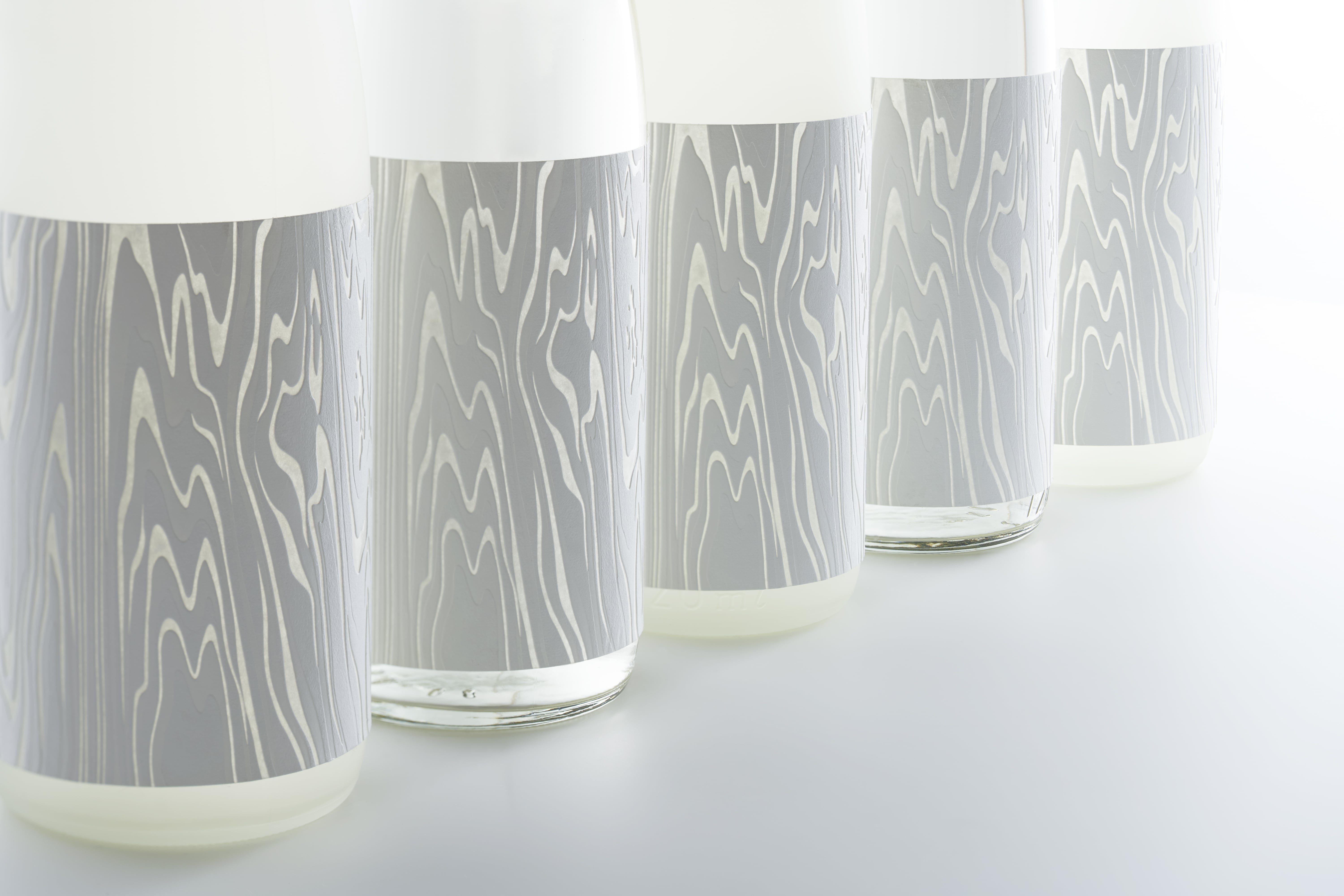
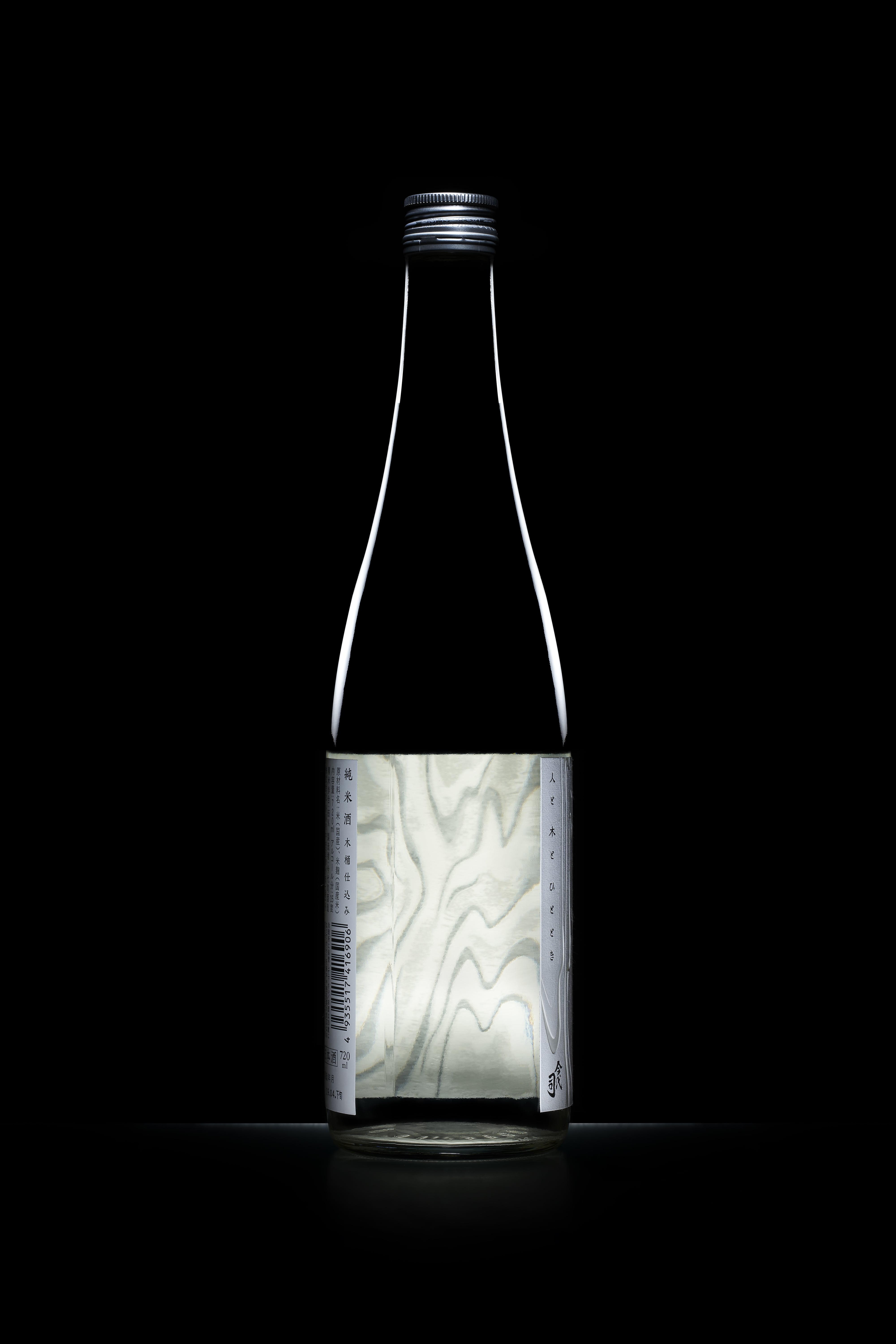
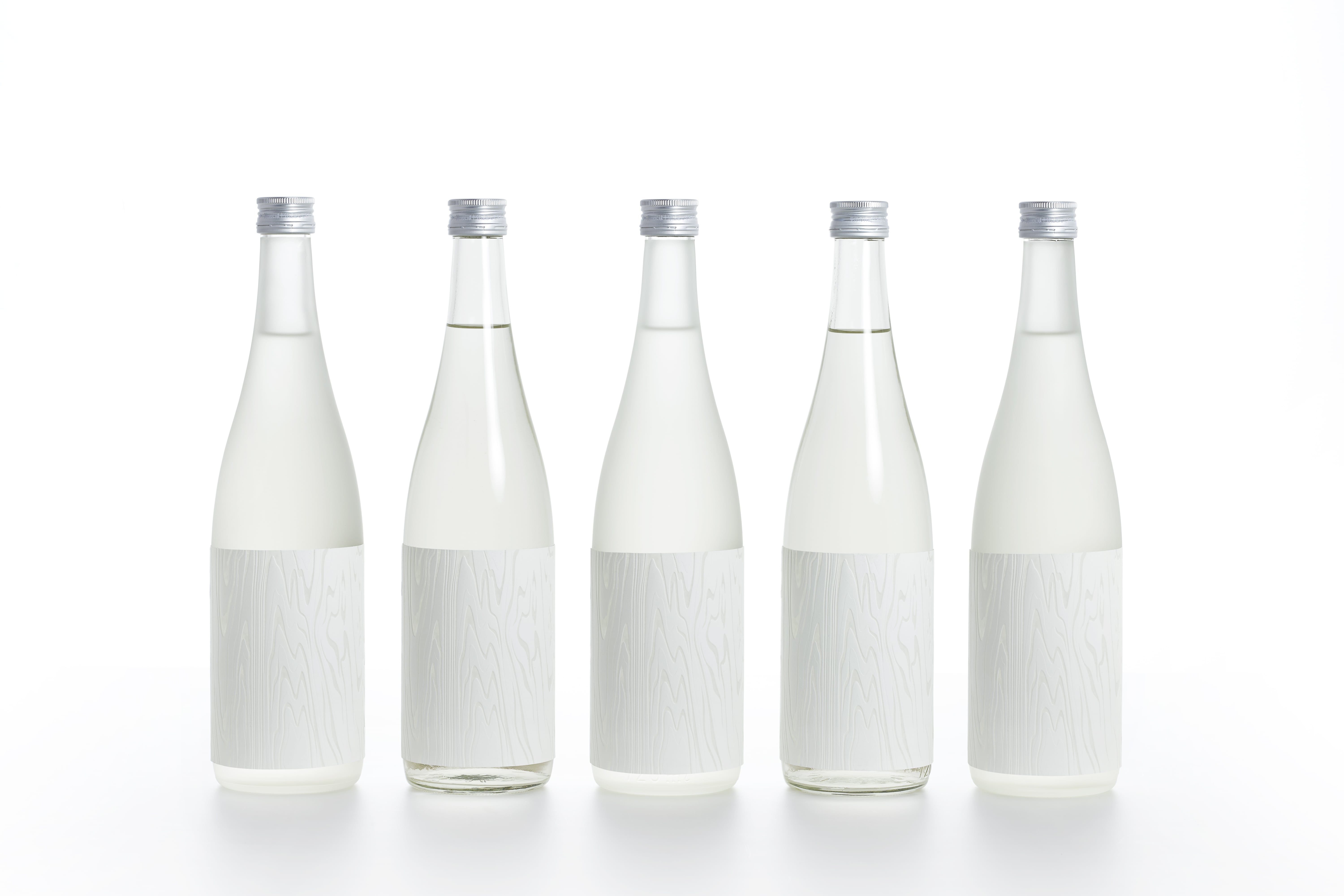
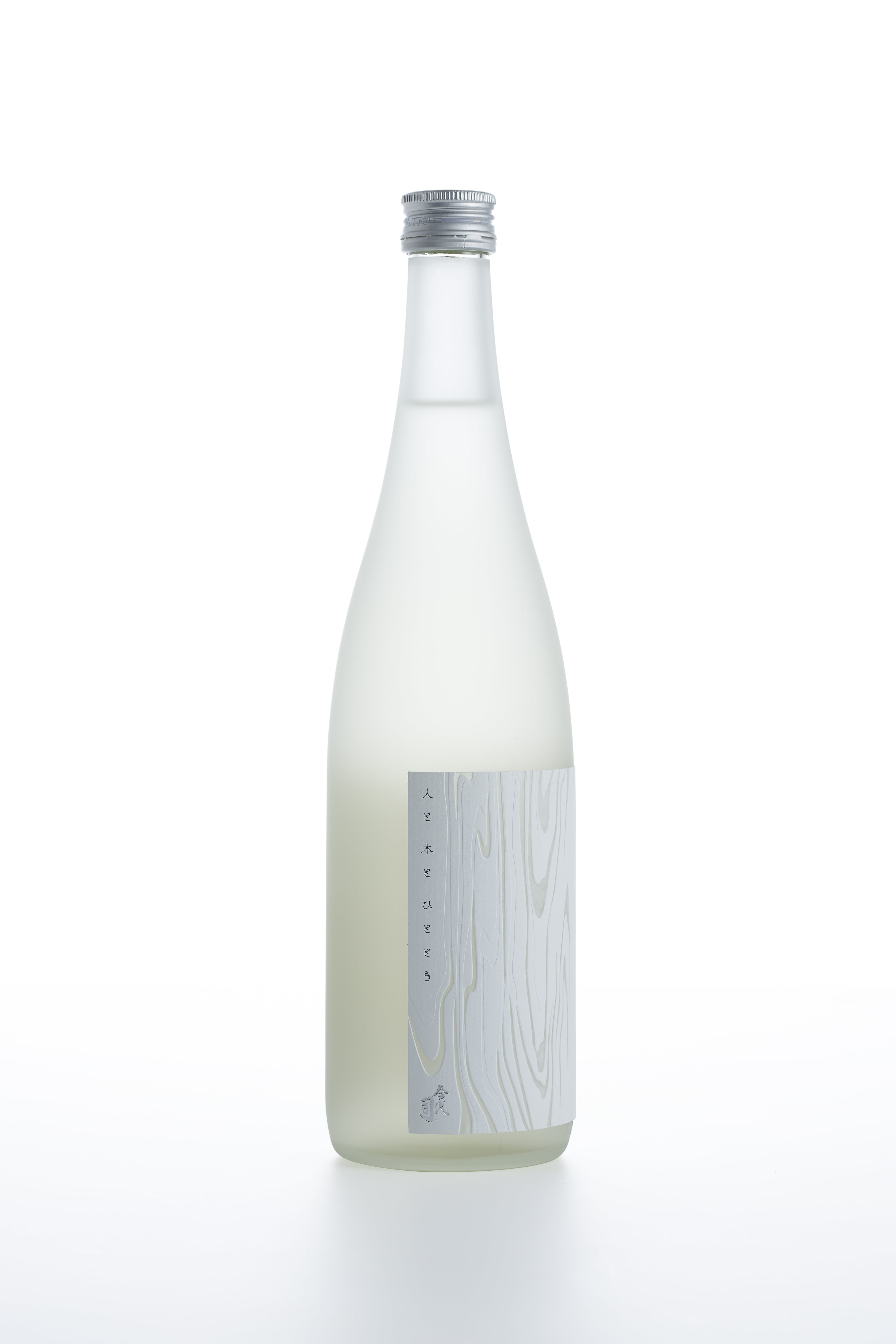
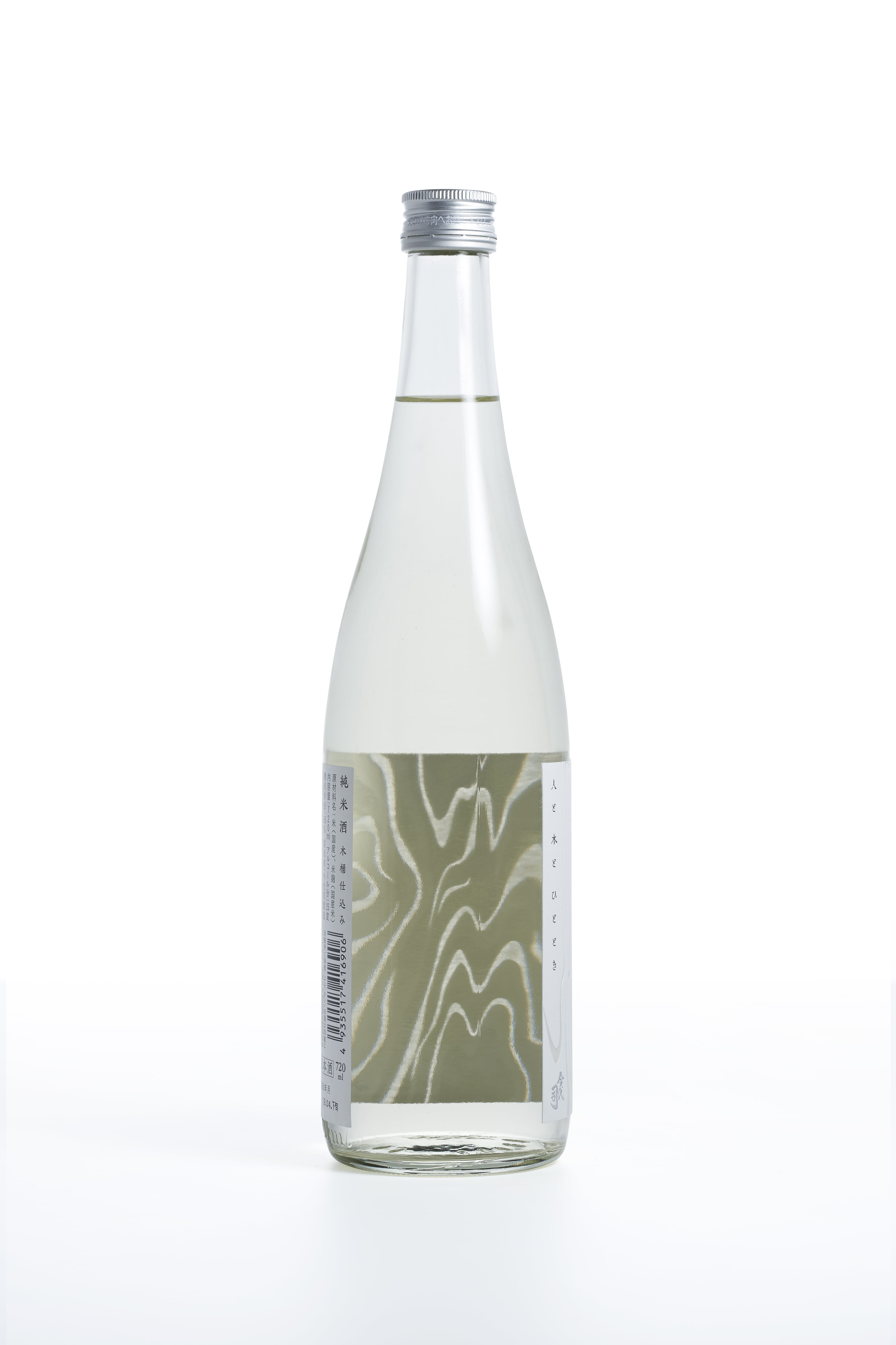
HITO to KI to HITOTOKI

good-design-award_winner_rgb_blk_logo
  • 2021

  • Communication
    Packaging

Designed By:

Designed In:

Japan

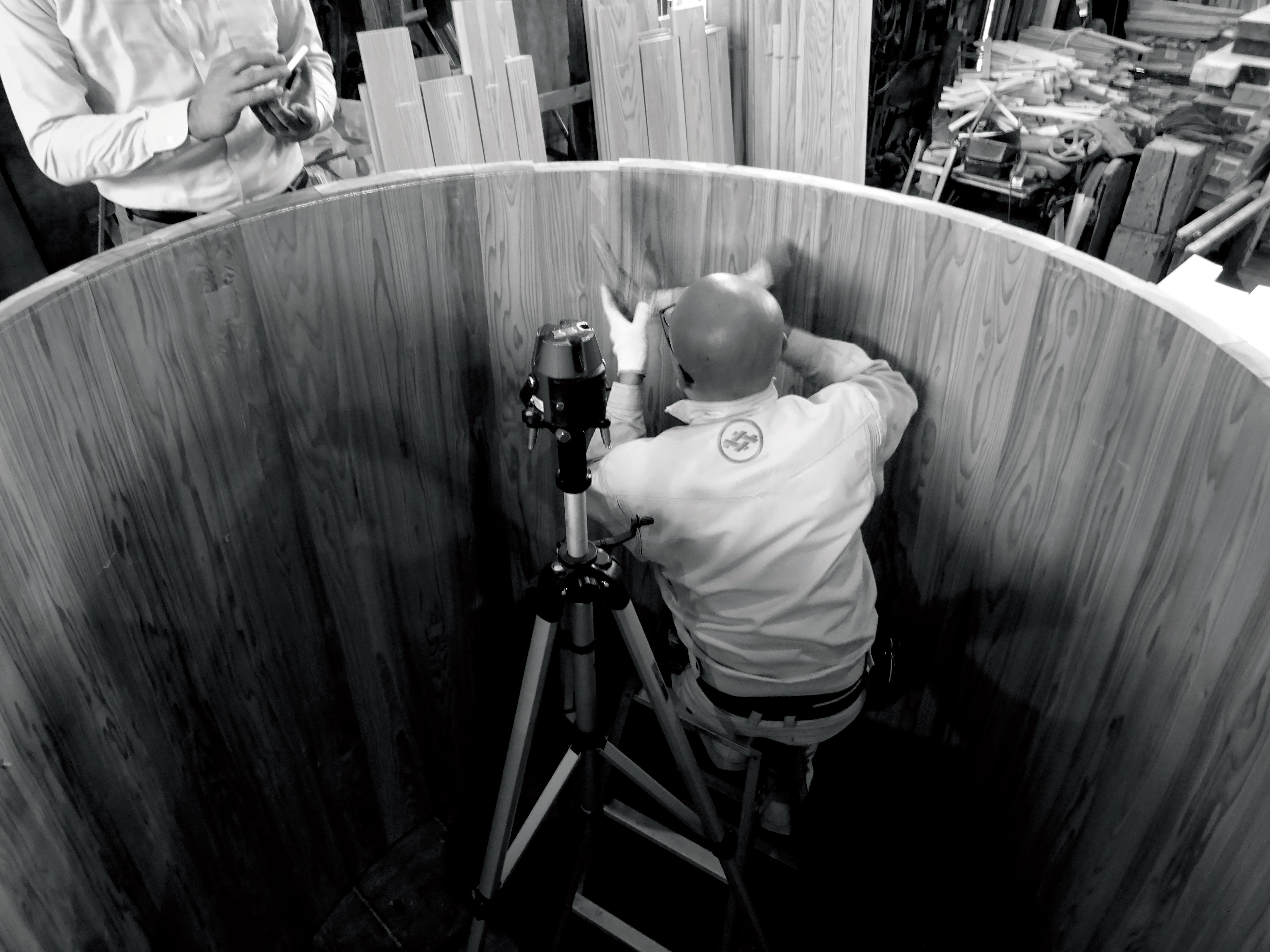
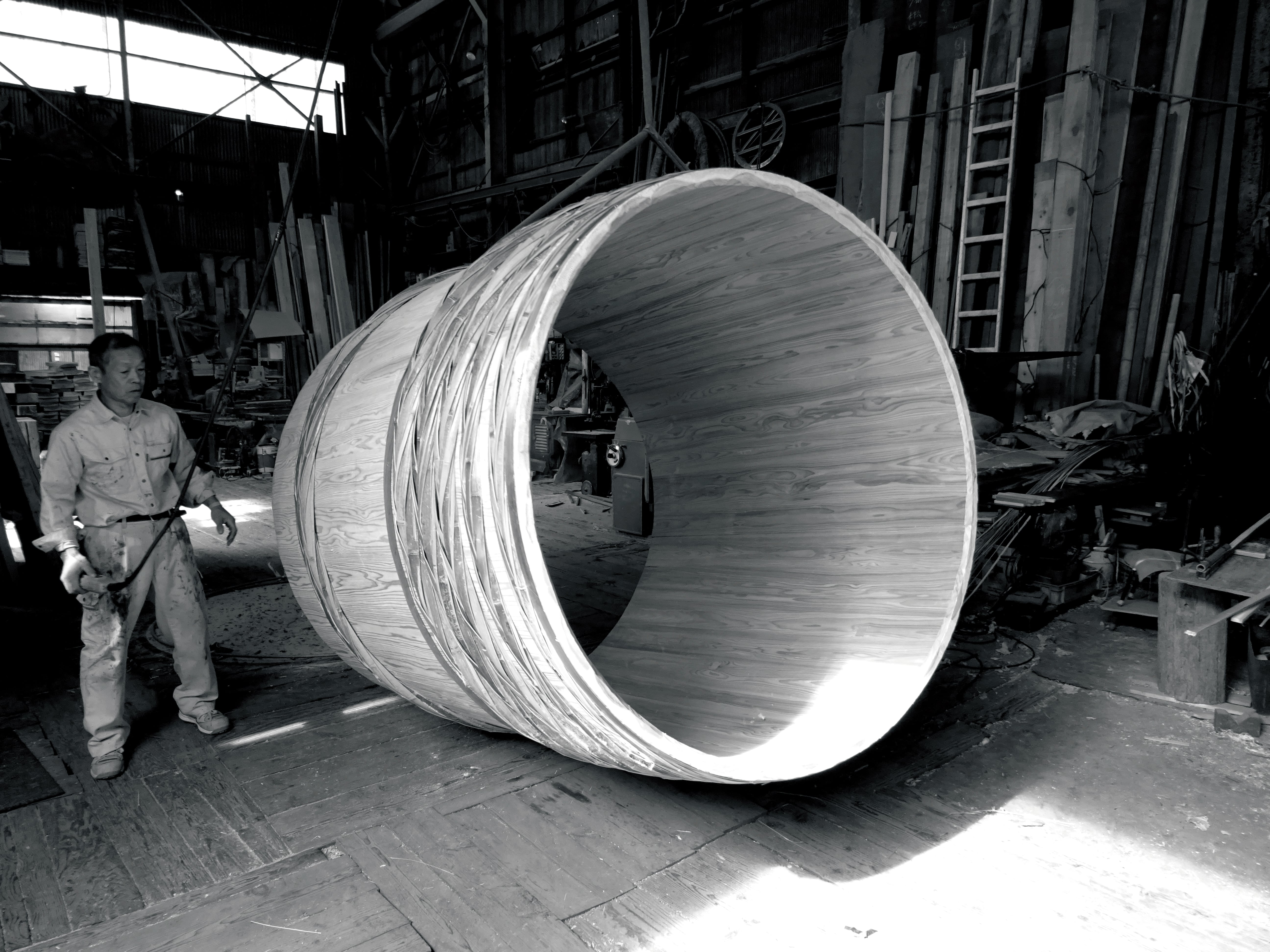
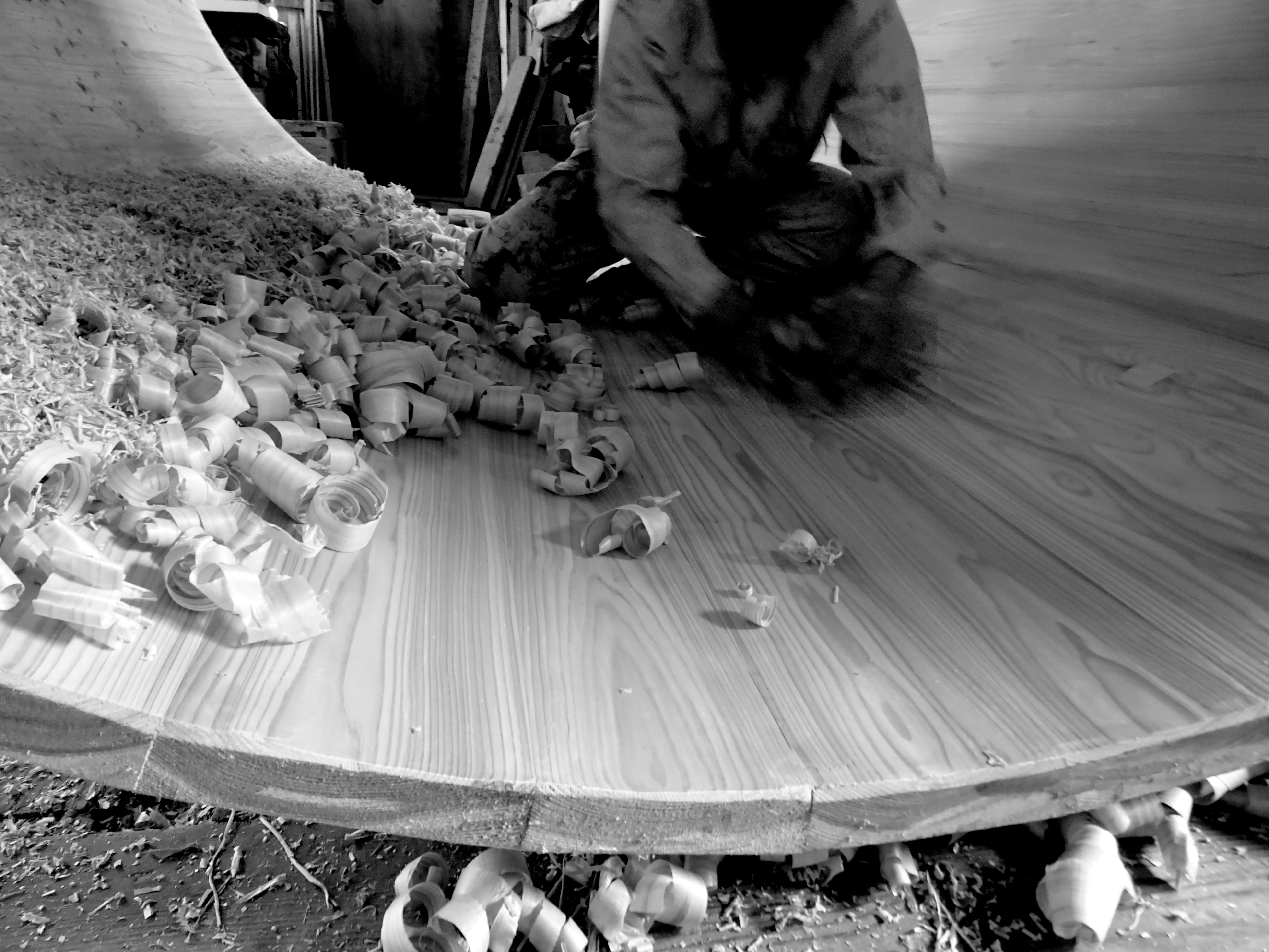
The tradition of brewing sake in wooden barrels is traditional Japanese sake culture. The sake brewed in those barrels has been named “Hitoto Kito Hitotoki“ —Japanese words meaning “human, wood and moment.” For the label design, we traced a part of the grain pattern from the cedar wood barrels.


Image: Semi-transparent label of the grain of the wood
Image: From the back
Image: White embossed unevenness
Image: Large wooden barrels production
Image: Product name
Image: From the back
  • CHALLENGE
  • SOLUTION
  • IMPACT
  • MORE
  • There is only one company remaining in Japan that is capable of building the large wooden barrels. Struggling to find successors to carry on the tradition, wooden barrels are rapidly disappearing from the brewing scene. Determined to maintain the culture of wooden barrel brewing for the next 100 years, Imayo Tsukasa Sake Brewery commissioned craftsmen to build a pair of new 4,000-liter-class wooden barrels, and employees of the brewery took active part in their production as well. The design of its label needed to live up to the special passion behind the creation of this sake.

  • The label is made of a special paper called Pachica, which melts and turns translucent when heated in the debossing process. By applying two different levels of pressure, a sense of depth was achieved in the wood grain pattern. The pattern was decided to be white because it is meant to complement the sake in a graceful manner. The product name is also written on the edge of the label to give a subtle impression. Through this design, we wanted to encourage the viewer to touch and feel the product rather than read and understand the information on it.

  • You should actually purchase and drink this sake to feel its essence. That is because the importance of handing down the barrel brewing culture is not a theory to ponder in your head, but something you should come to believe in through experience. The appealing label design beckons viewers to touch and obtain it, and it has effectively led many to purchase the product. The design approach has been featured on various news media, and the instantly recognizable concept-the pattern of wood to signify wooden barrel brewing-has left a striking impression on a large number of people.

  • For the label design, we traced a part of the grain pattern from the cedar wood barrels which the brewery's employees had poured their hearts into. Sake brewed in a wooden barrel takes on a light yellow color, which can be seen through the translucent part of the wood grain pattern, and it is also interesting to see the label through the liquid from the back.