Cho Cho San Brand Refresh

good-design-award_gold-winner_rgb_blk_logo
  • 2017

  • Communication
    Branding and Identity

Designed By:

Commissioned By:

Cho Cho San

Designed In:

Australia

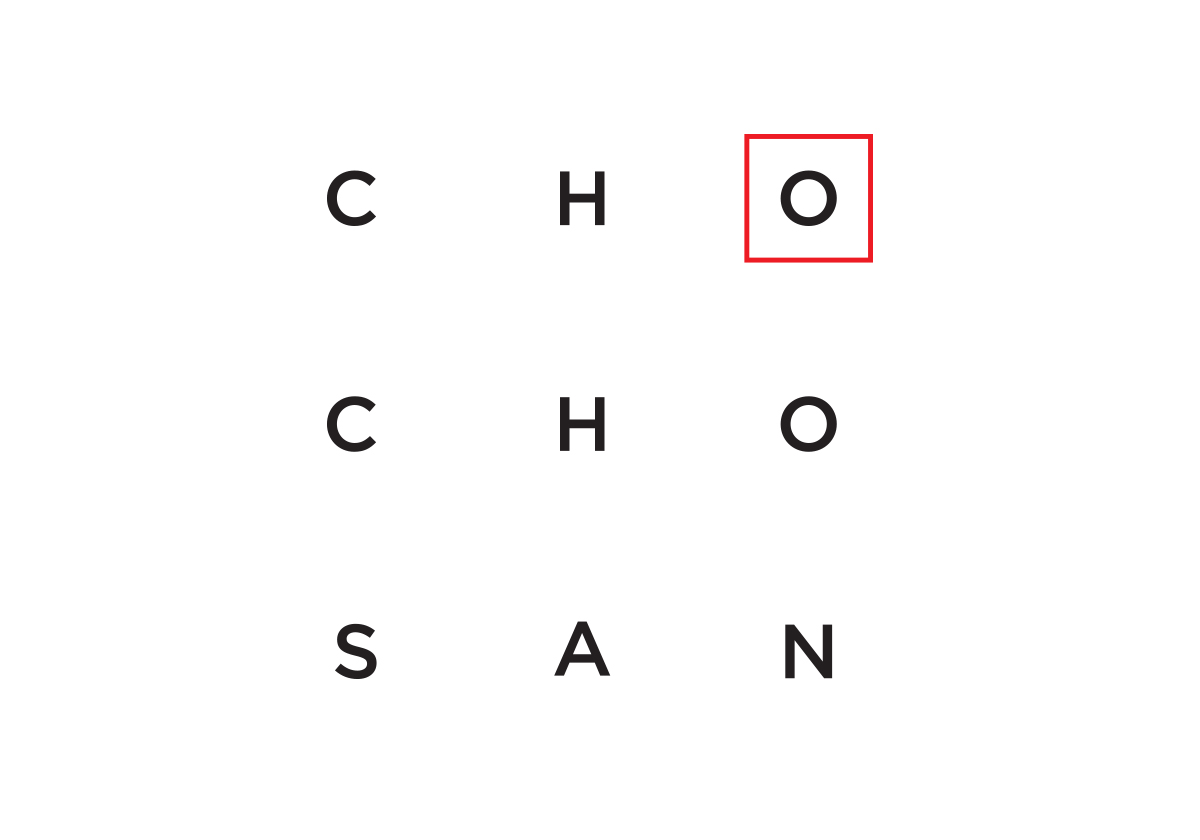
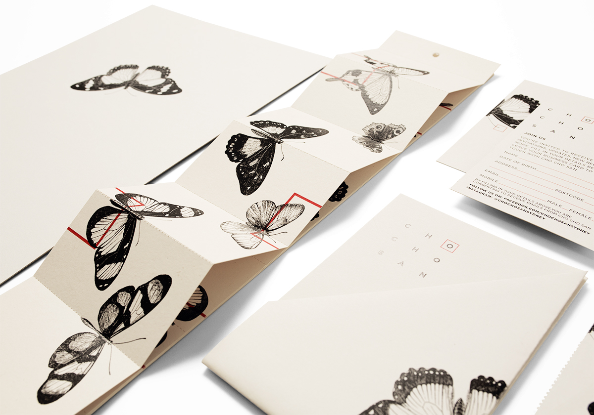
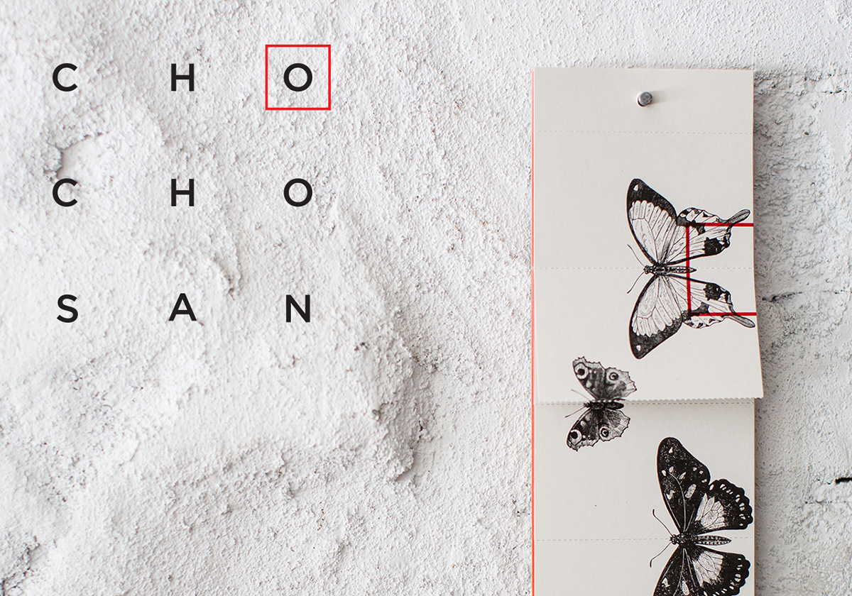
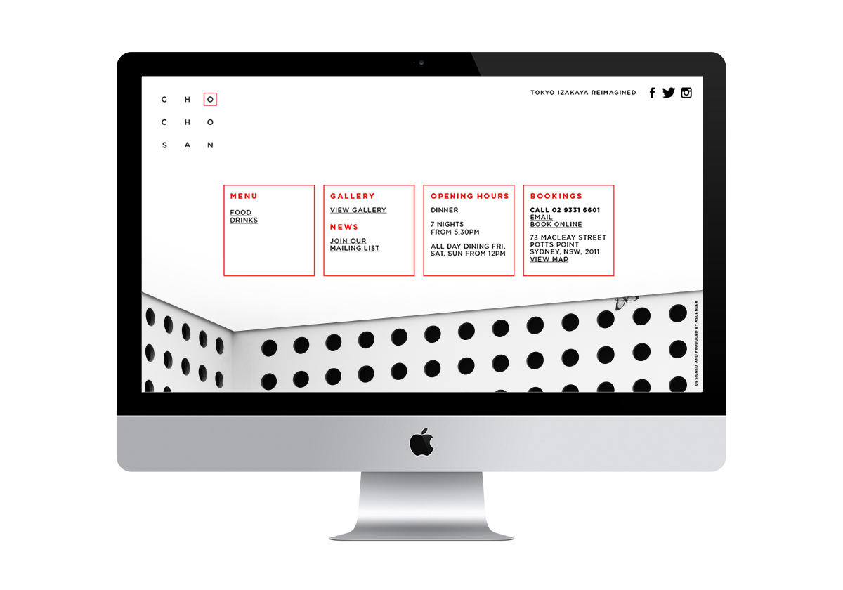
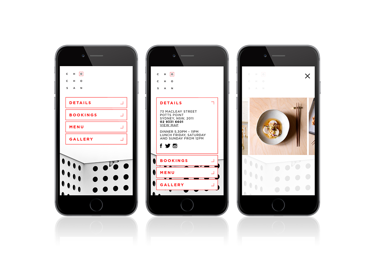
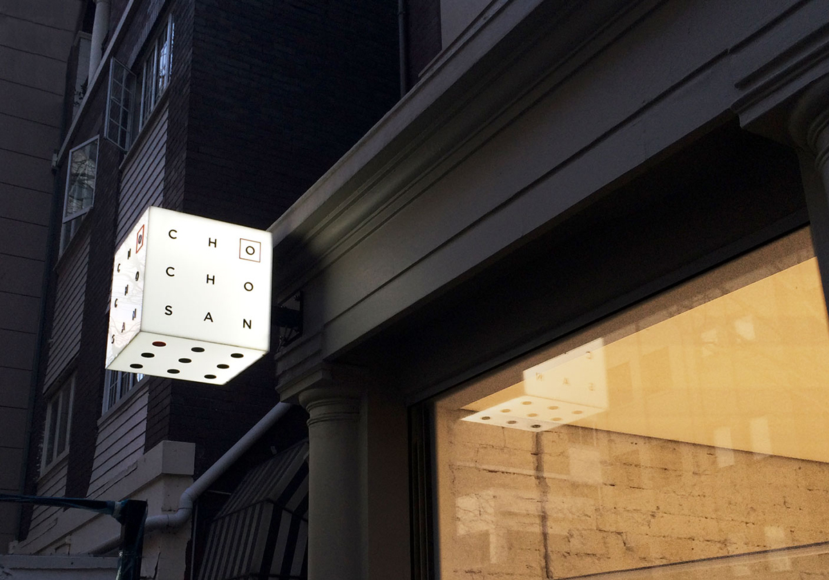
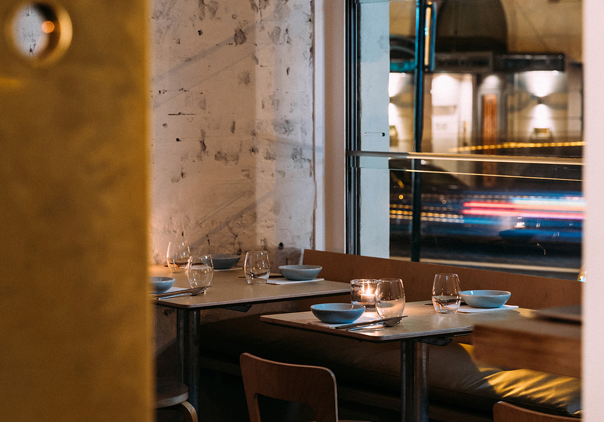
We explored the tragic story of Cho Cho San in Puccini’s Madame Butterfly depicting the Butterfly motif upside-down. We aligned and refined the typography in the logo with the circle pattern in interior design and explored the Japanese concept of Wabi Sabi; a world view centred on the acceptance of imperfection.


view website

  • CHALLENGE
  • SOLUTION
  • IMPACT
  • We explored the tragic story of Cho Cho San in Puccini's Madame Butterfly depicting the Butterfly motif upside-down. We used an innovative business card print technique, whereby diners would rip off a card from a larger sheet, each time a card was torn a butterfly illustration would be ripped in half. The butterfly motif was also hidden around the restaurant, the back of menus, and on the website for the discerning diner to discover.

  • How do you take a restaurant experience online? Use the very best food photography and design a digital user experience that feels like the interior design. We utilised existing visual styles in the restaurant, dots, copper, concrete.

  • Unify elements, create balance and harmony across all collateral. The brand refresh has been rolled out across signage, menus, bill folds, gift cards, website and social media.