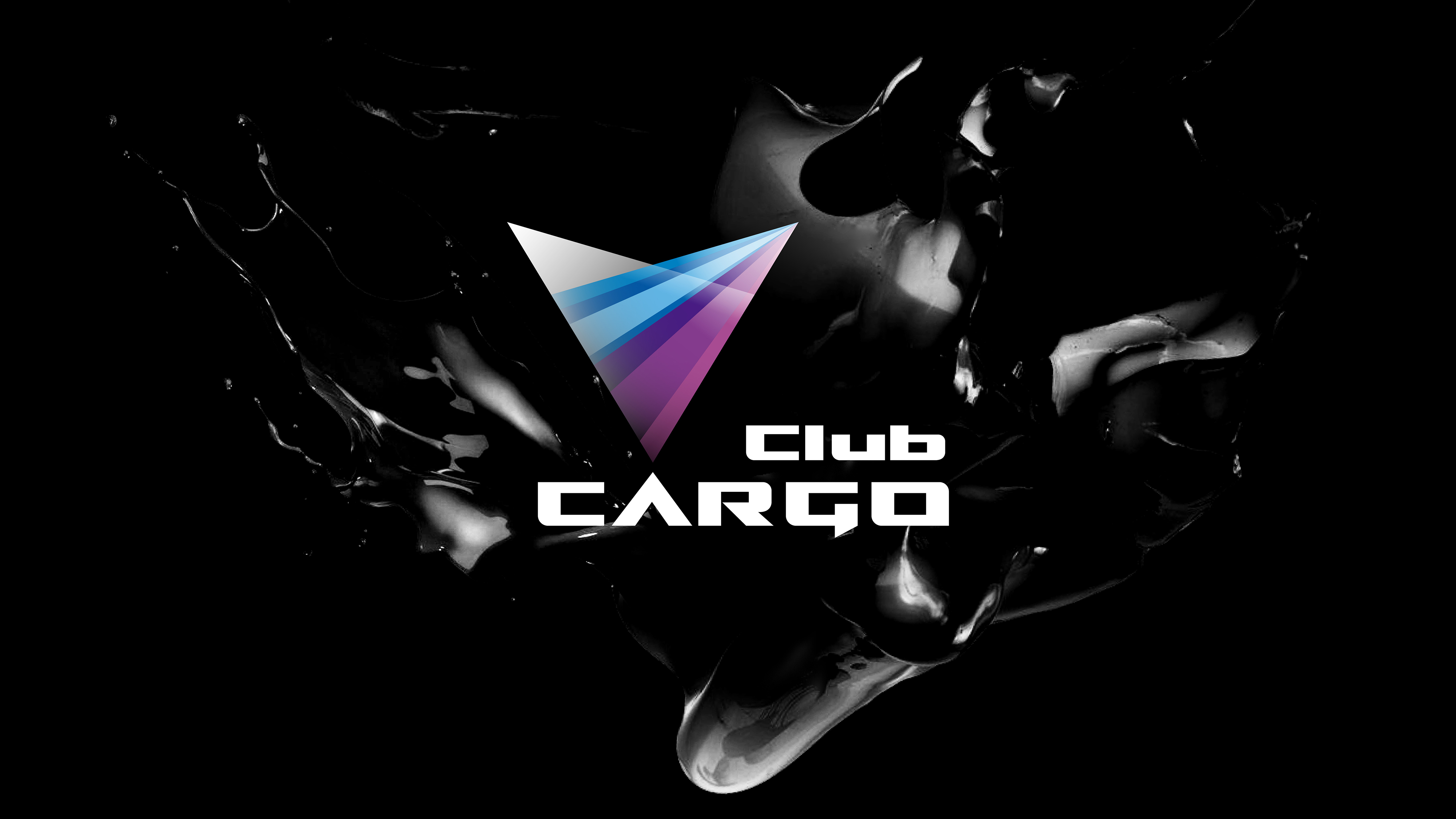
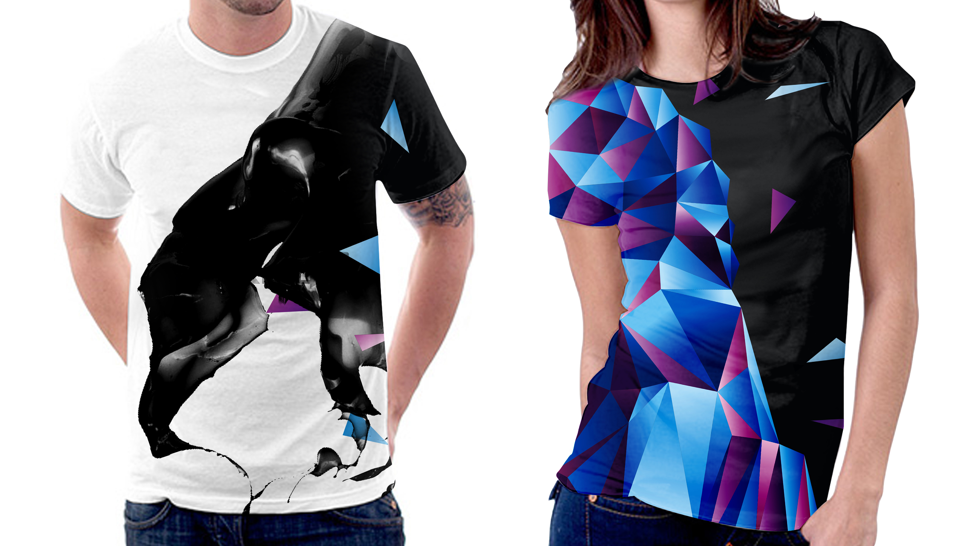
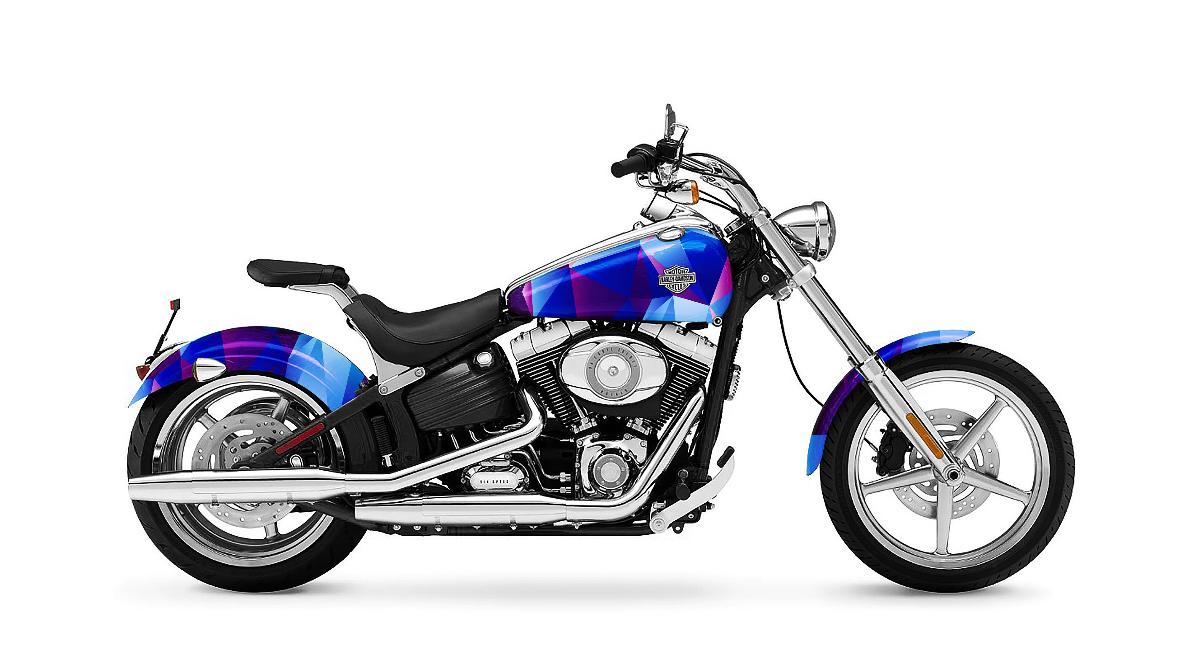
Cargo Club

  • 2016

  • Communication
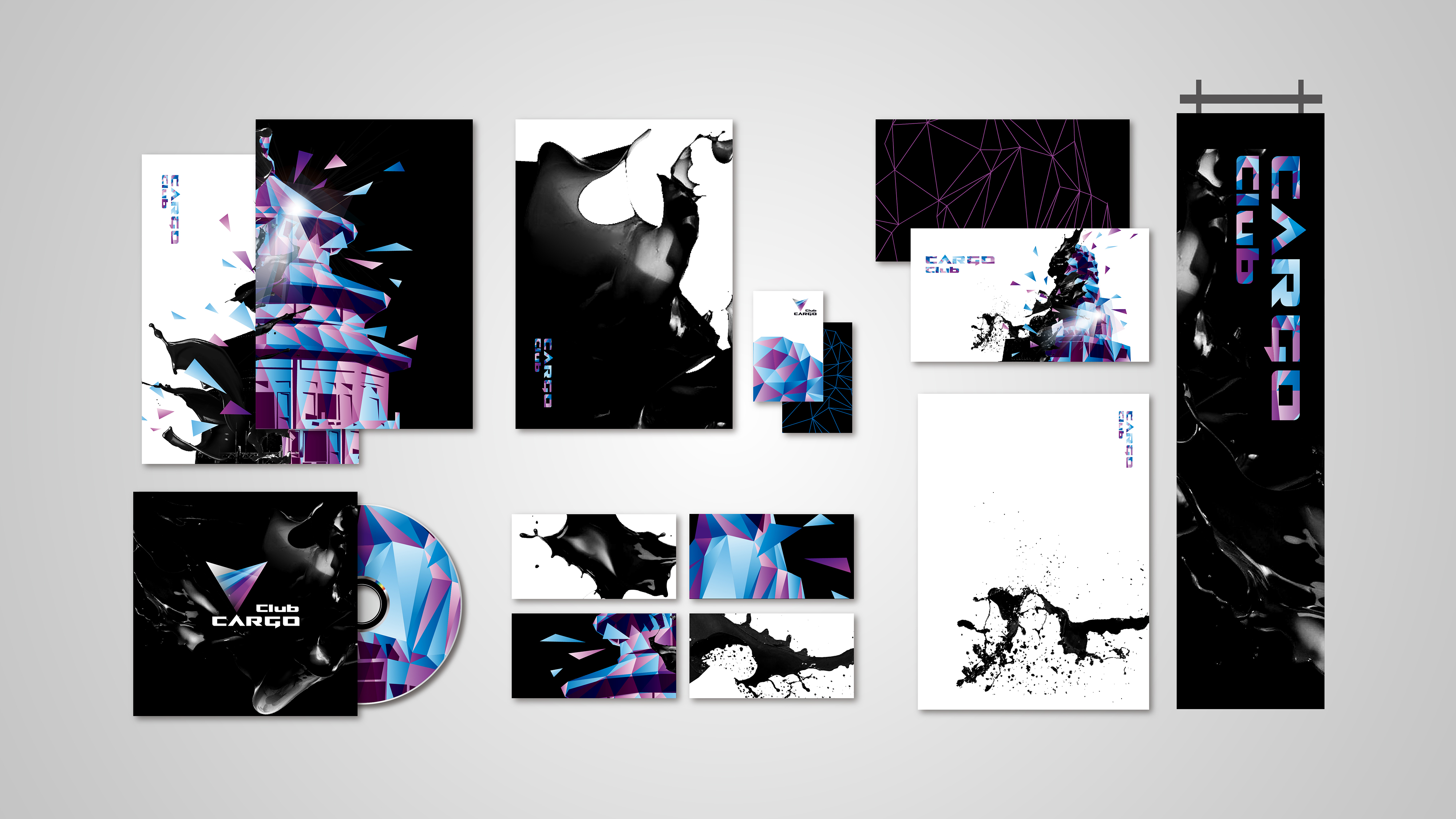
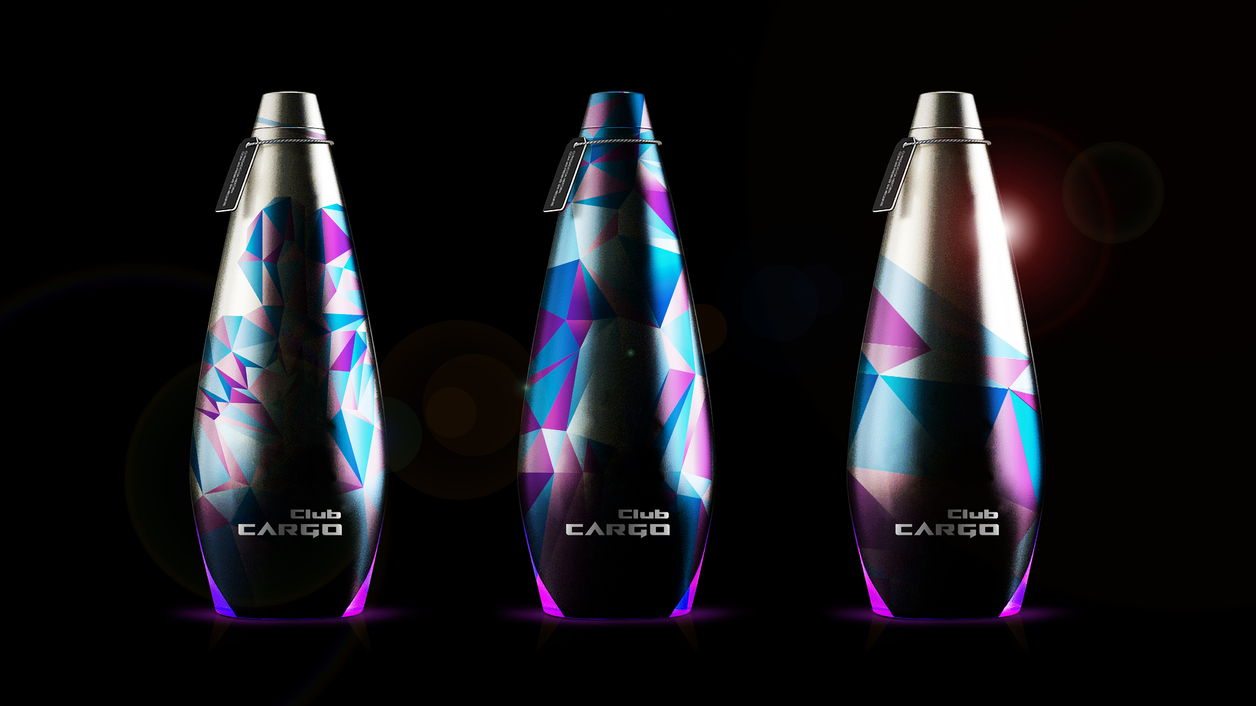
    Branding and Identity

Commissioned By:

Cargo Club Beijing

Designed In:

China

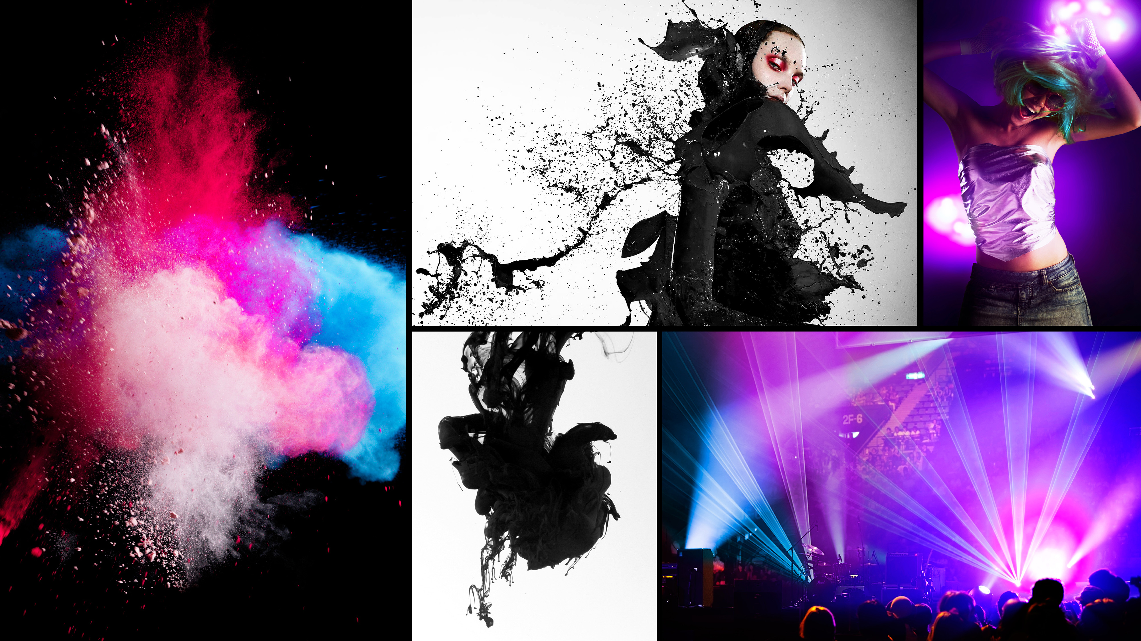
Cargo Club is one of the most well-known night clubs in Beijing. It is practically a fusion of Chinese traditional music and pop music. After seven years in operation, Cargo Club had its grand comeback recently, and totally rebranded its identity. We pioneered a completely new brand image.


  • CHALLENGE
  • SOLUTION
  • Clients hope the brand image would convey a mixed expression of fashion and culture, so as to build a landmark featuring Beijing culture and fashion. Our logo is composed of two rays of light focusing on the stage. The two rays of light are black and white, while the other is colored, a common and popular feature in night clubs. The two lazer lights joins together which symbolize the mergence between Eastern and Western cultures as well as music.

  • As an entity, the logo looks like a five-pointed star, which is the very symbol of Beijing hard rock. From another point of view, the black/white light resonates with traditional Chinese painting, whereas the colored one indicates Western fashion. This can also be found in the subsequent visual presentation which also conveys a combined visual theme of the ink painting and neon light. The sprayed ink and clash on the traditional stone lions, the Temple of Heaven, and the Beijing Opera figures symbolize the madness and rebel impression towards night clubs, as well as people's expression and their emotions.