Biodiversity Council

good-design-award_winner_rgb_blk_logo
  • 2023

  • Communication
    Branding and Identity

Designed By:

Commissioned By:

Biodiversity Council

Designed In:

Australia

The Biodiversity Council is a newly-formed collective representing 11 leading universities, Indigenous knowledge-holders and philanthropists working together to develop real solutions to Australia’s biodiversity crisis. Principals was tasked with developing a brand positioning, story, design and language system to introduce the Council nationally and motivate every Australian to act.
view website

  • CHALLENGE
  • SOLUTION
  • IMPACT
  • MORE
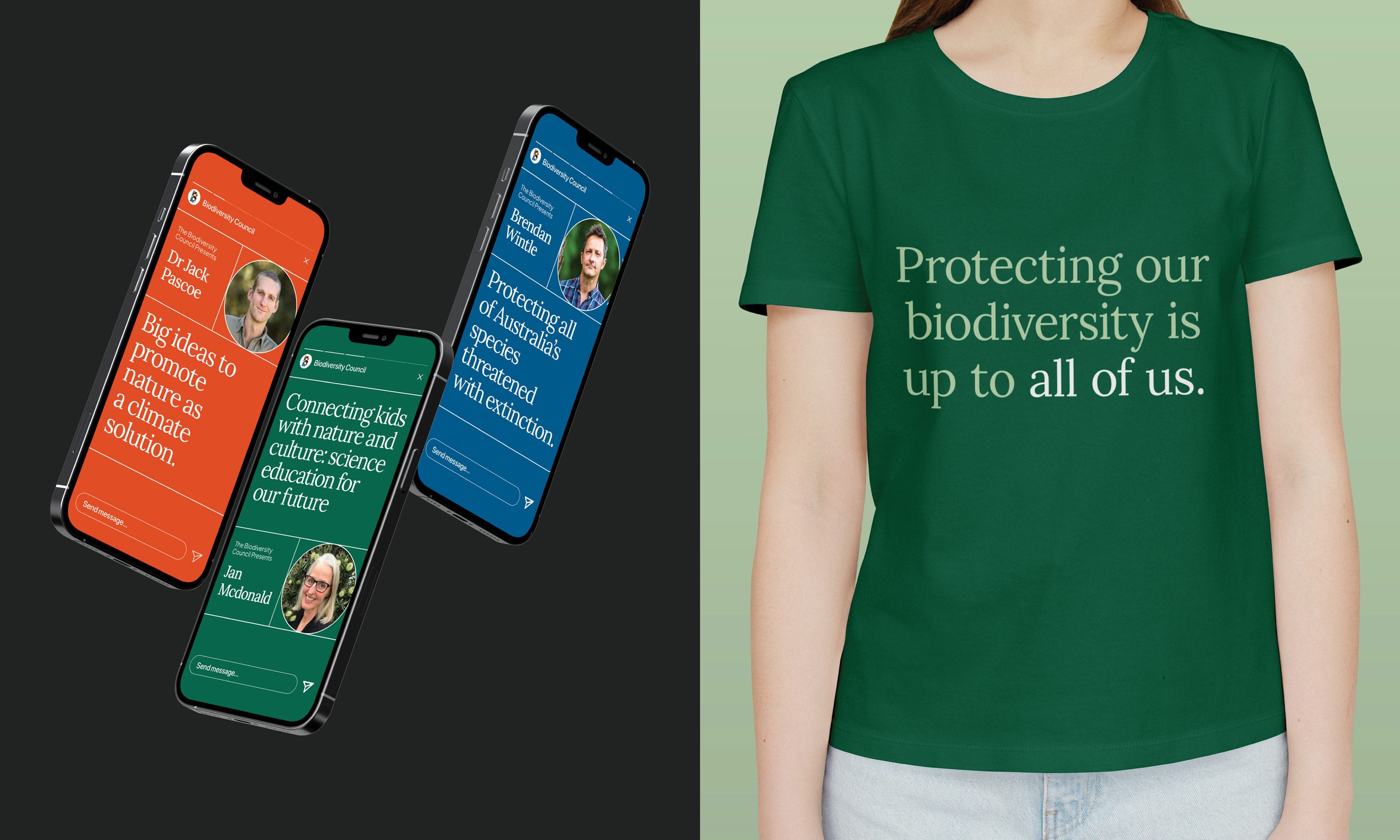
  • As a trusted voice in matters of biodiversity loss and regeneration, the new Biodiversity Council seeks to inform and empower Australians to act. It makes action feel possible by clearly communicating the straightforward, achievable things every person can do to help reverse biodiversity loss. This accessible platform led us to a powerful brand idea – ‘it’s up to all of us’. We’ve created a warm and inclusive brand to connect with diverse audiences, from concerned citizens to business leaders and policy makers, driving engagement around the pressing issue of biodiversity loss in a way that’s informative, constructive and, of course, action-oriented.

  • Australia’s biodiversity is declining dangerously fast. But until now, there has been no specialist body with the express goal of formulating solutions that can halt extinctions and reverse biodiversity loss. There has been no body that united expertise across sectors to comment on policy, speak to government and industry and engage and enlist the general population. To answer this aching need, the Biodiversity Council was formed. The new brand unites Australia’s leading experts in the field, including Indigenous knowledge-holders, philanthropists and 11 Australian universities to form Australia’s primary voice on biodiversity.

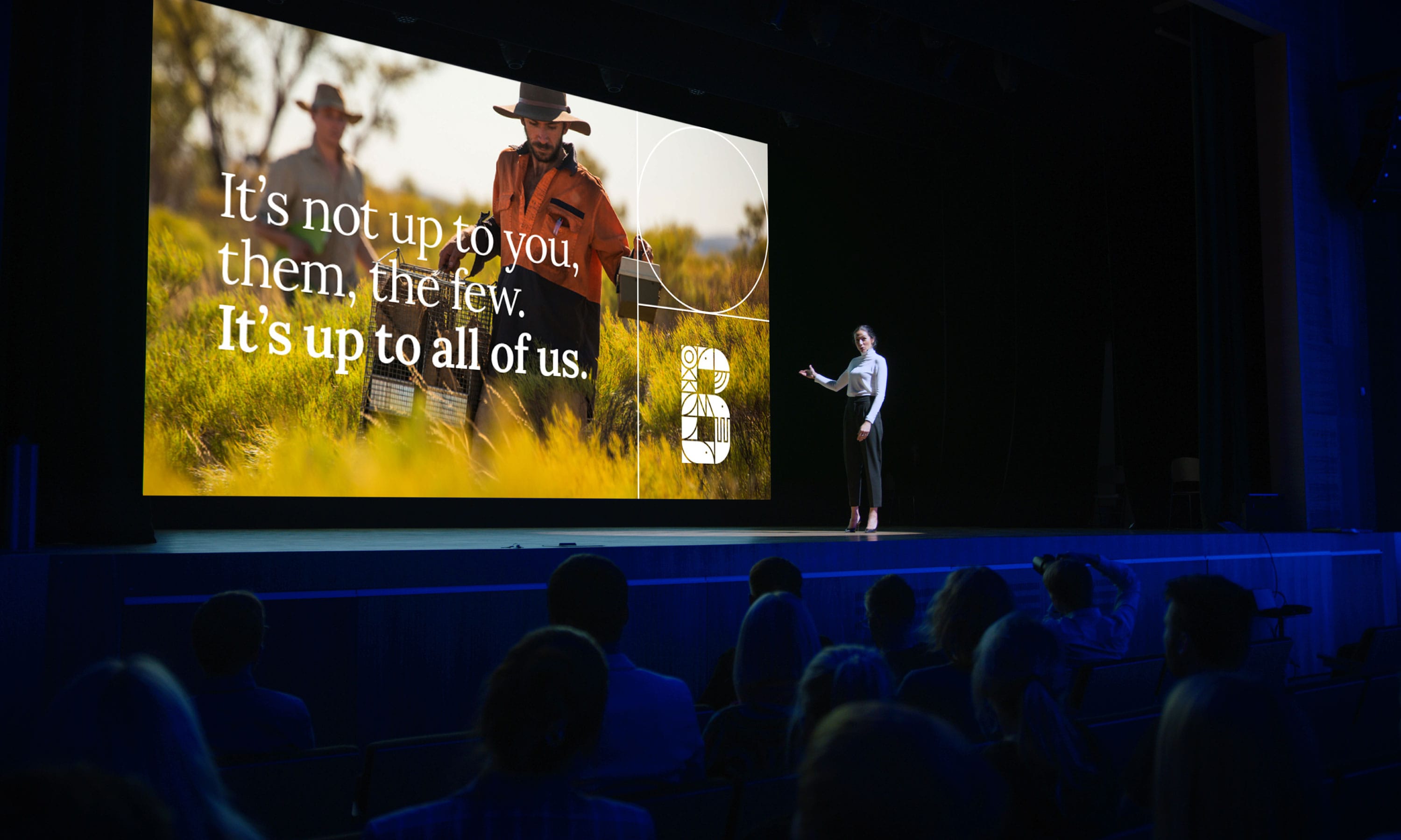
  • The new brand identity and voice were unveiled at the Biodiversity Council launch in December 2022. Lead Councillor Professor Brendan Wintle shared these words at the event, succinctly capturing our impact: “The Biodiversity Council is a complex organisation that brings together diverse experts to advocate for better outcomes for nature and people. Principals guided us through a process of articulating our purpose and mission and crystallising our story. The process helped us understand ourselves. As a result, the narrative and visual identity that emerged was embraced confidently by the whole organisation. With a sense of purpose, we are growing strongly.”

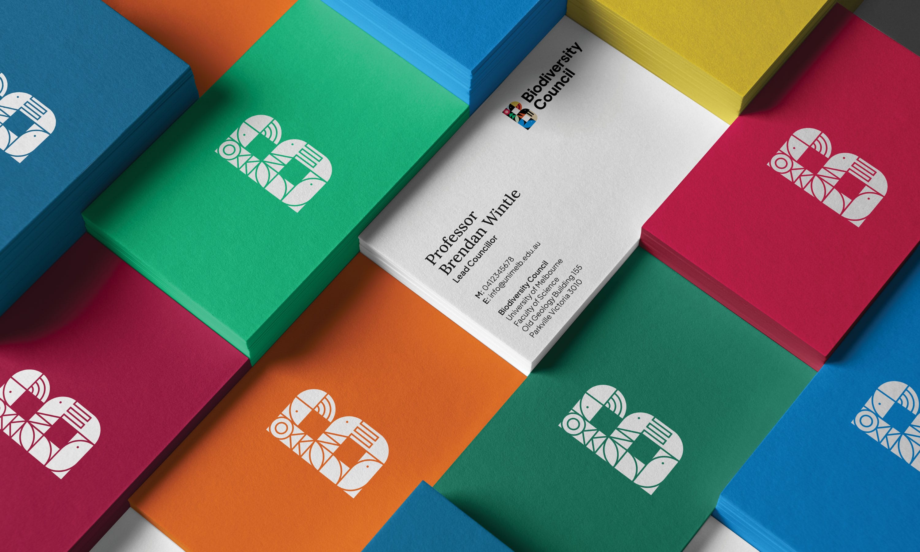
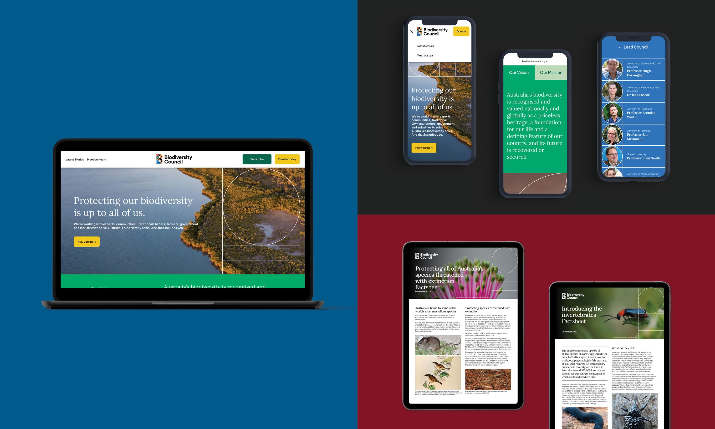
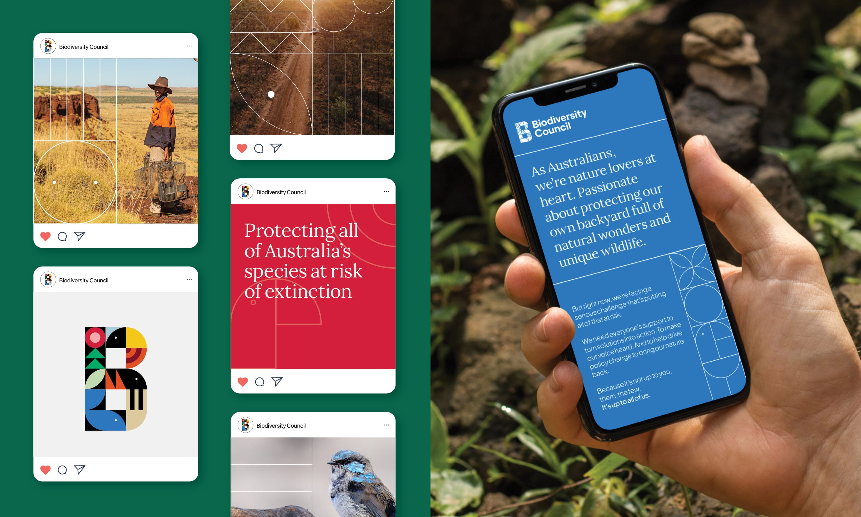
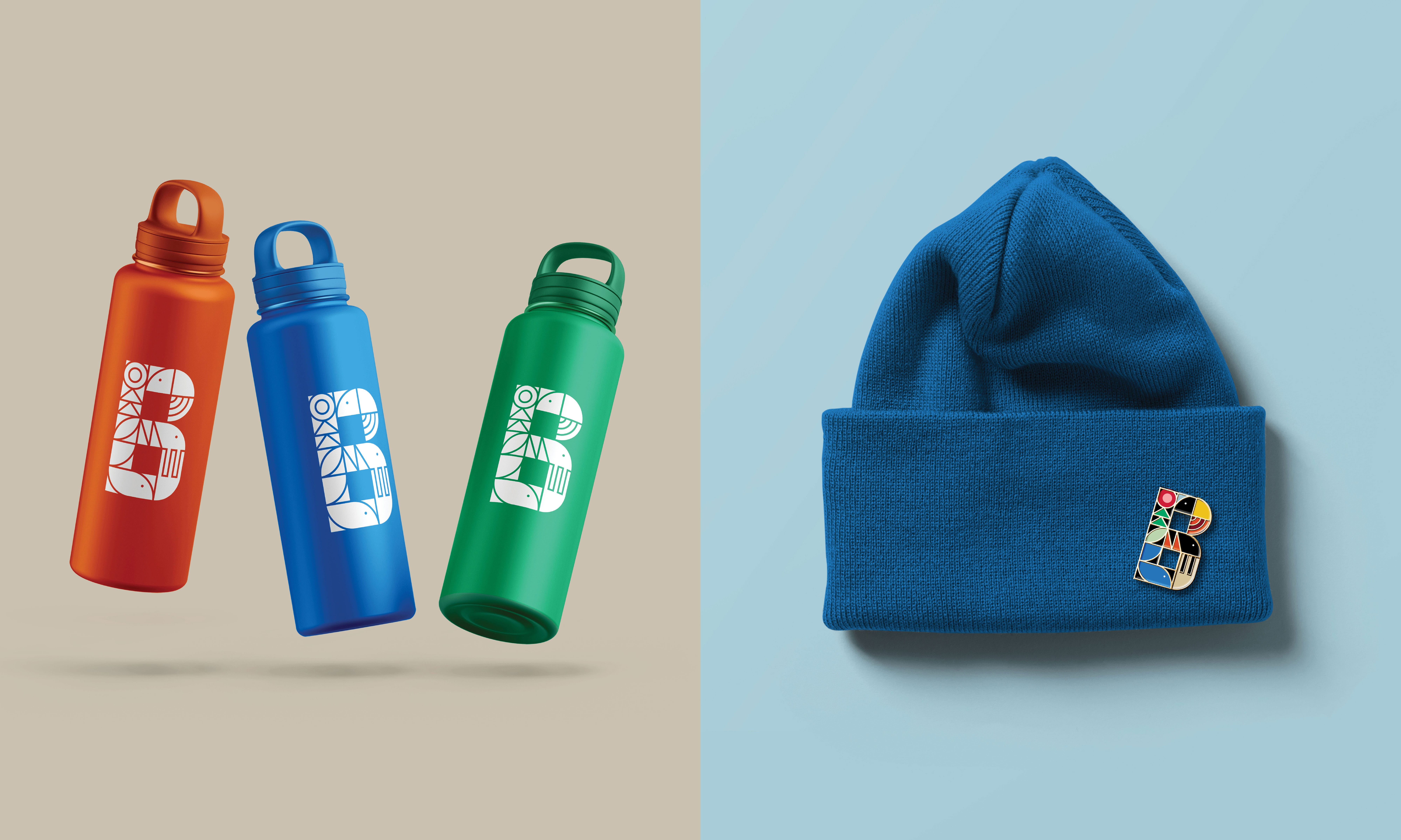
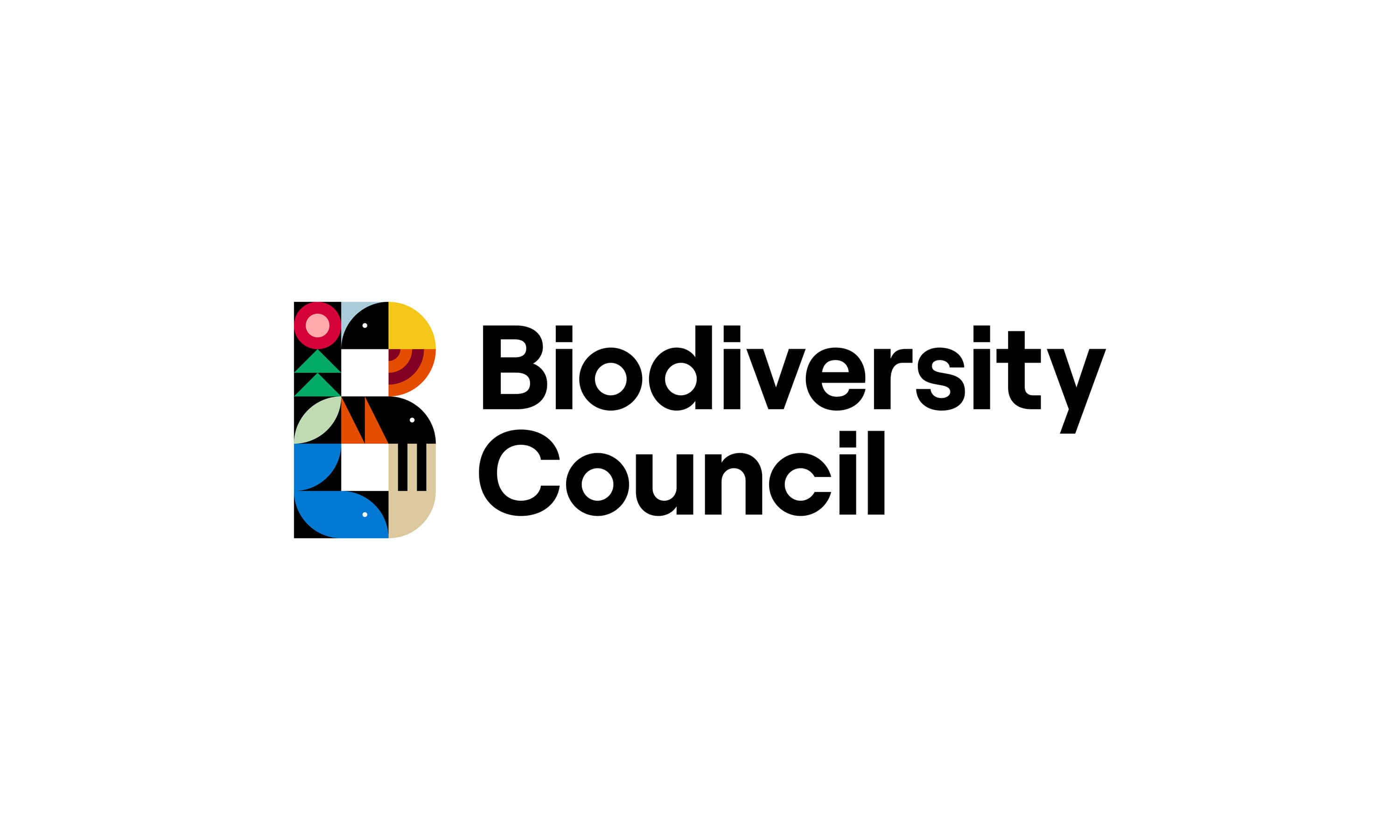
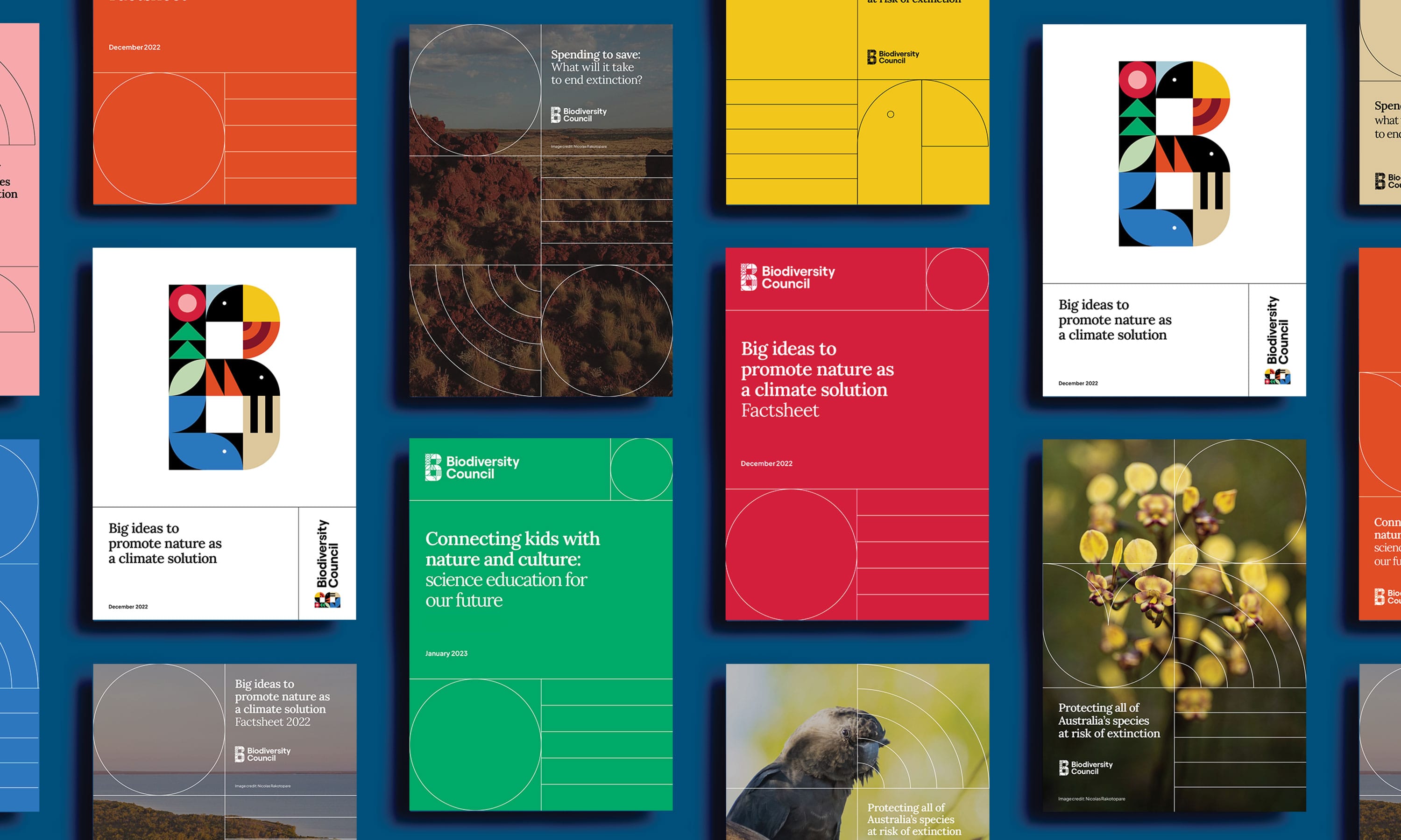
  • Making up the heart of the new visual identity are representations of life’s building blocks. These are used in a modular design system and capture the vibrancy of life through a variety of contemporary and colourful abstract forms. The blocks create the logo and inform an extended visual language across all of the Council’s touchpoints. We created a nature-inspired colour palette to capture the breadth of Australia’s diverse landscape, from the sparkling hues of our coasts and silvery forest greens to the rich red soils of the desert and granite grey mountain ranges. We featured photography supplied by the Council to show some of the unique species and places the Council will advocate for. The rich editorial style powerfully brings home the beauty, and stark reality, of habitats at risk. We chose a digital-first, screen optimised serif font to convey knowledge and instil trust, paired with a more utilitarian and versatile sans serif font for setting body copy. The resulting visual identity elegantly and convincingly connects scientific credibility to our rich, vibrant natural world.